Playfulness as brand foundation
Weilands festival
about the project
Delivered products
- Brand strategy
- Logo-design
- Color palette & typography
- Design Language
- Festival posters
- Merchandise
- Social media templates
- Signage
- On-site branding
Client
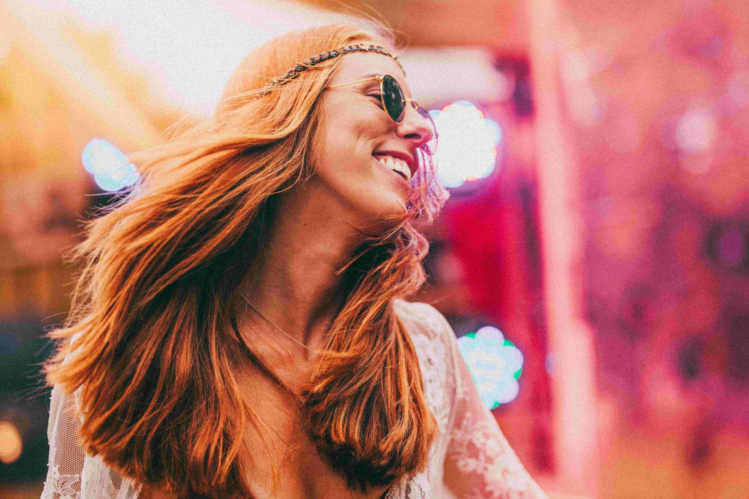
Weilands is a festival that brings together music, art, and human connection. What once started as a small camping weekend has grown into a fully-fledged event with its own identity. Visitors come looking for joy and togetherness. With the festival’s growth came the need for a clear brand identity that not only preserved the atmosphere but amplified it.
Challenge
The organization wanted to translate the free, playful energy of Weilands into a consistent visual style. At the time, there was no cohesive strategy, and the festival risked losing the sharpness of its character. The key question: How do you make the festival experience visible and recognizable through branding?
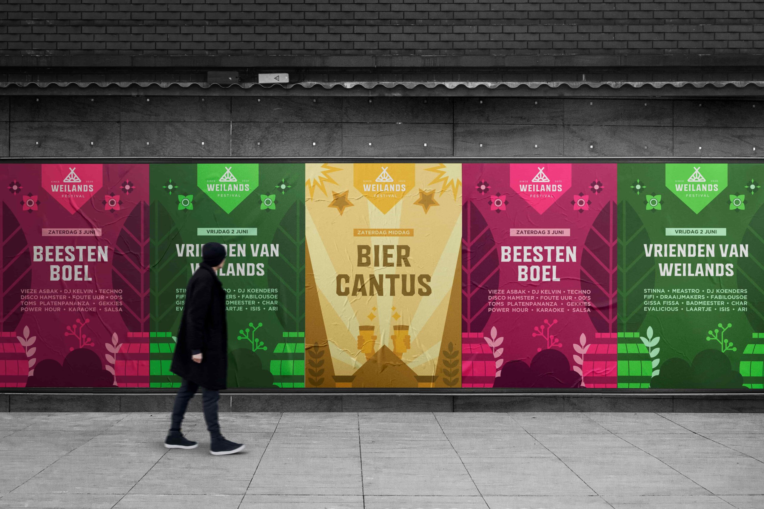
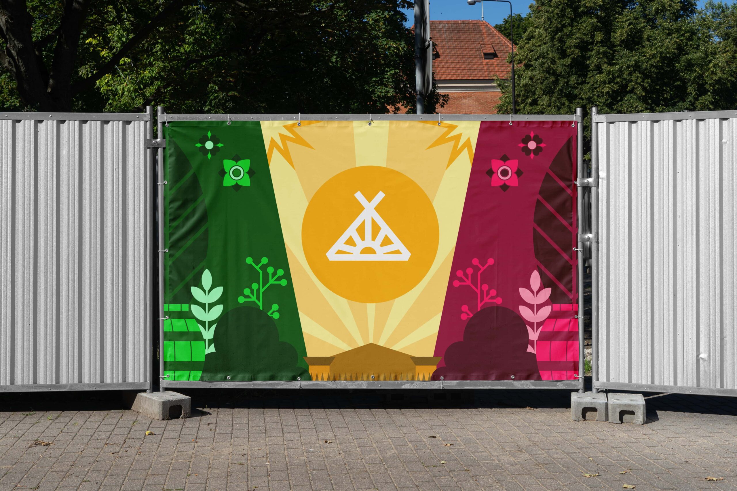
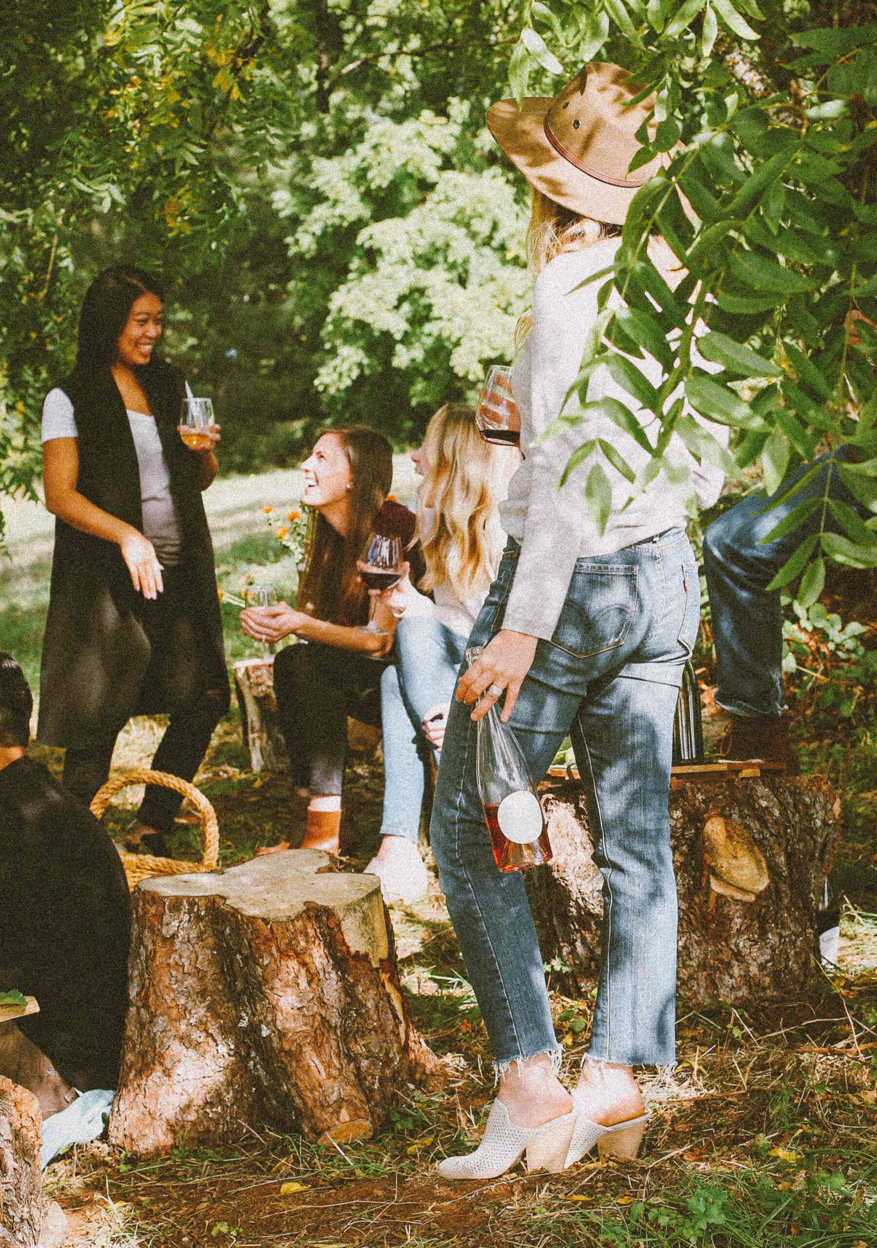
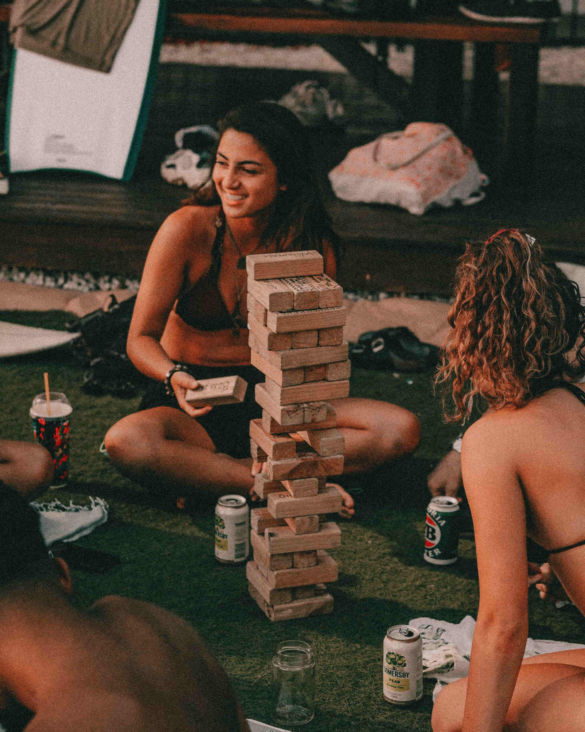
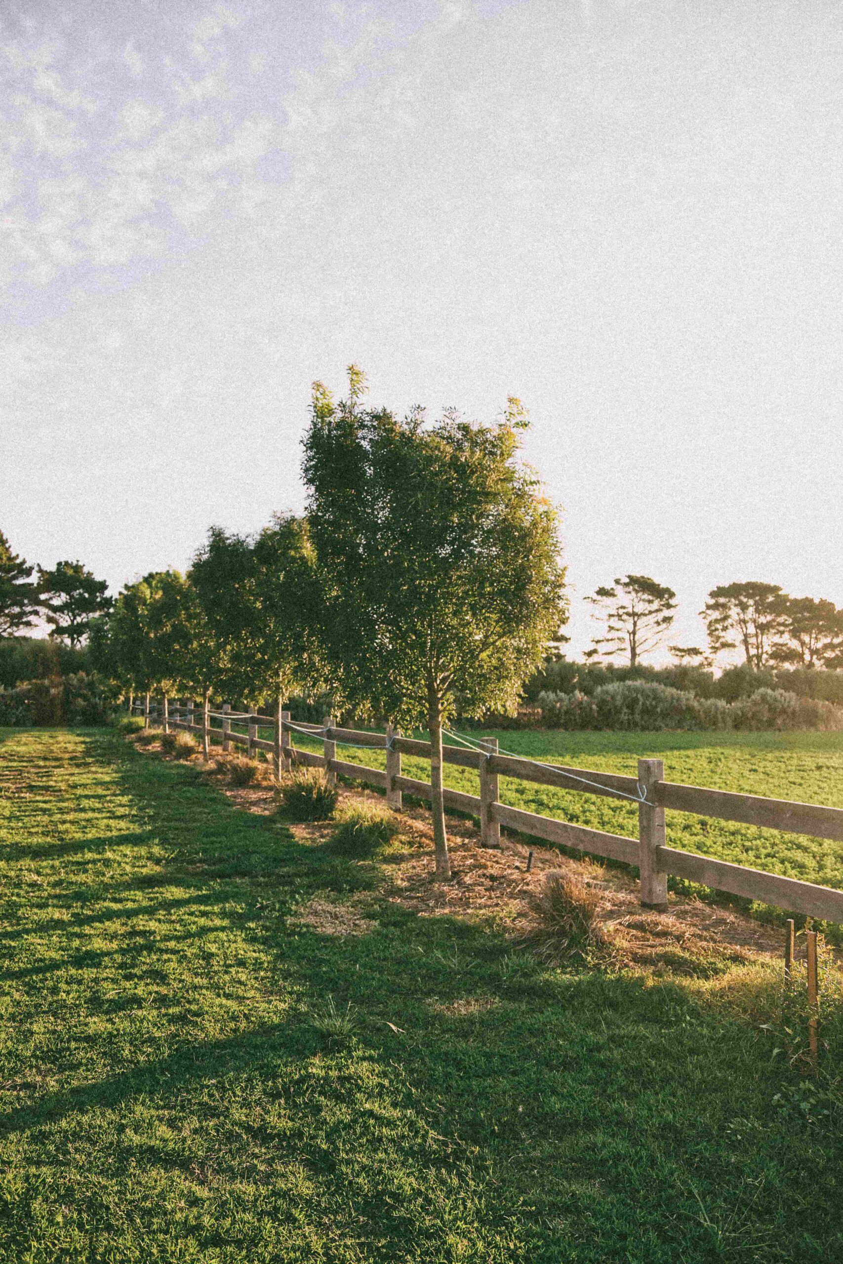
The concept Field of Play sits at the heart of the visual identity. It refers not only to the meadow as a physical space but also to the sense of freedom, to play, create, and connect. This idea is reflected in the composition, the use of bold color blocks, and the dynamic illustration style. Weilands is presented as a place where anything can happen: a creative playground for music, art, and togetherness.
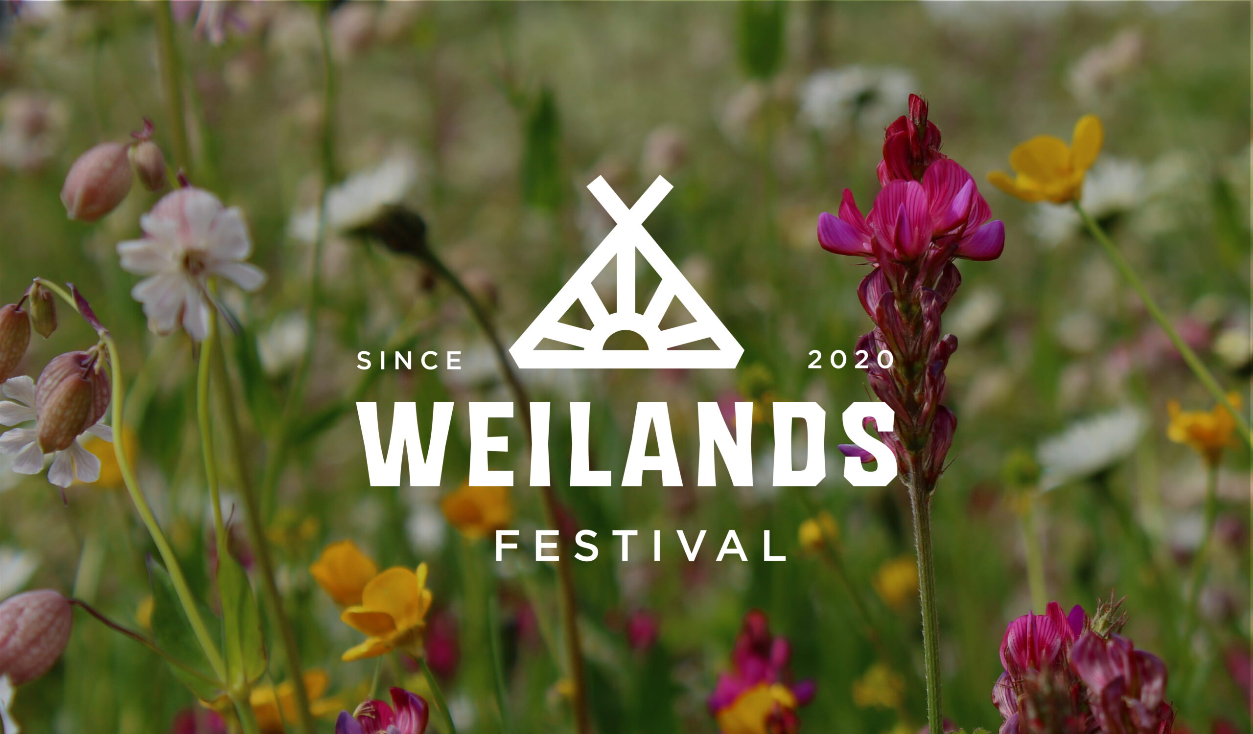
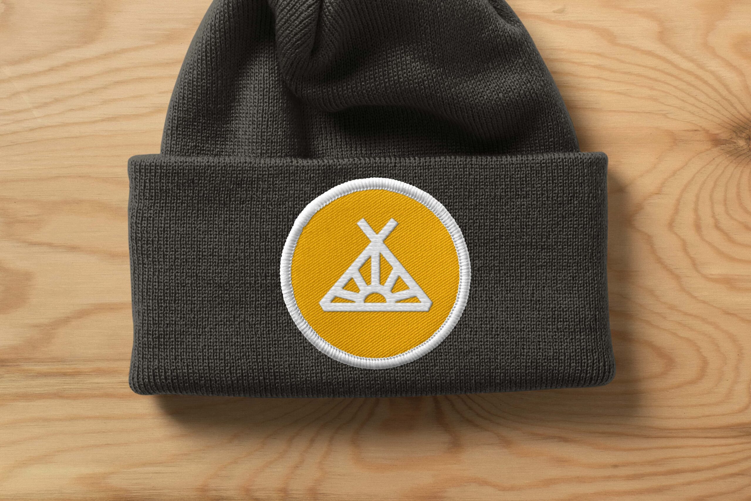
The logo draws inspiration from Weilands’ roots as a camping weekend while reflecting the energy of today’s festival experience. Its geometric structure gives it strength and recognizability, while the open lines emphasize accessibility and movement, capturing the festival’s welcoming spirit.
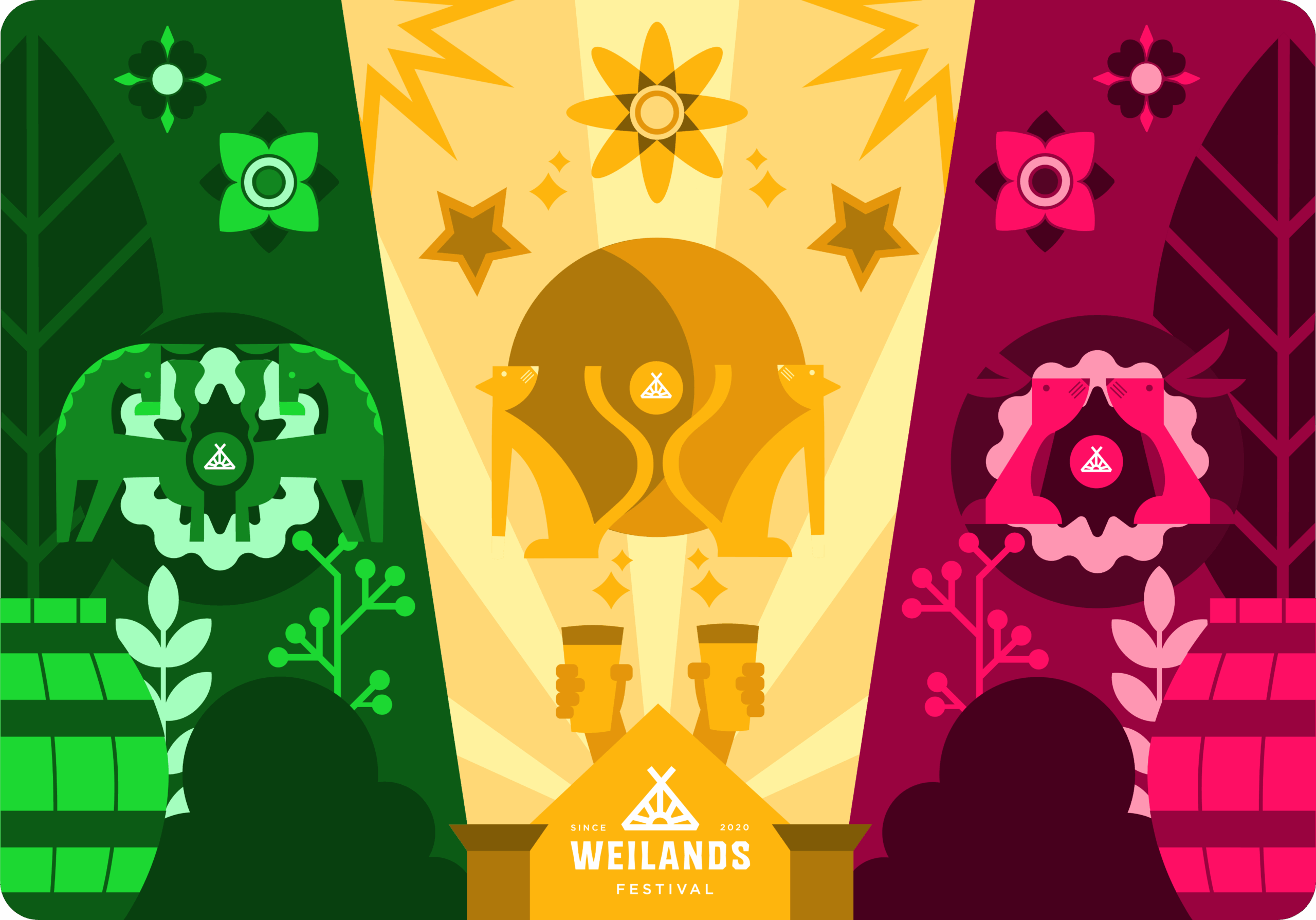
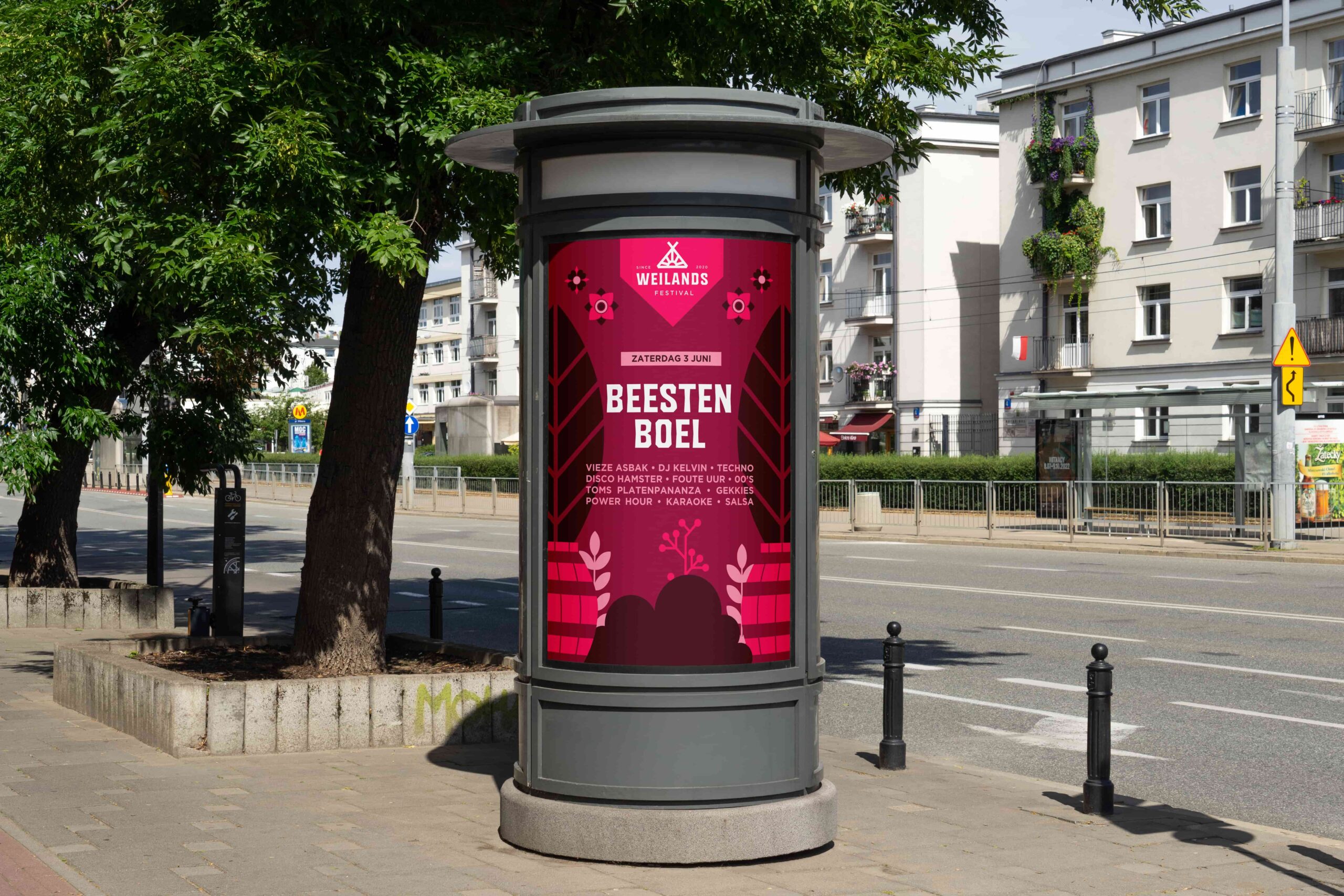
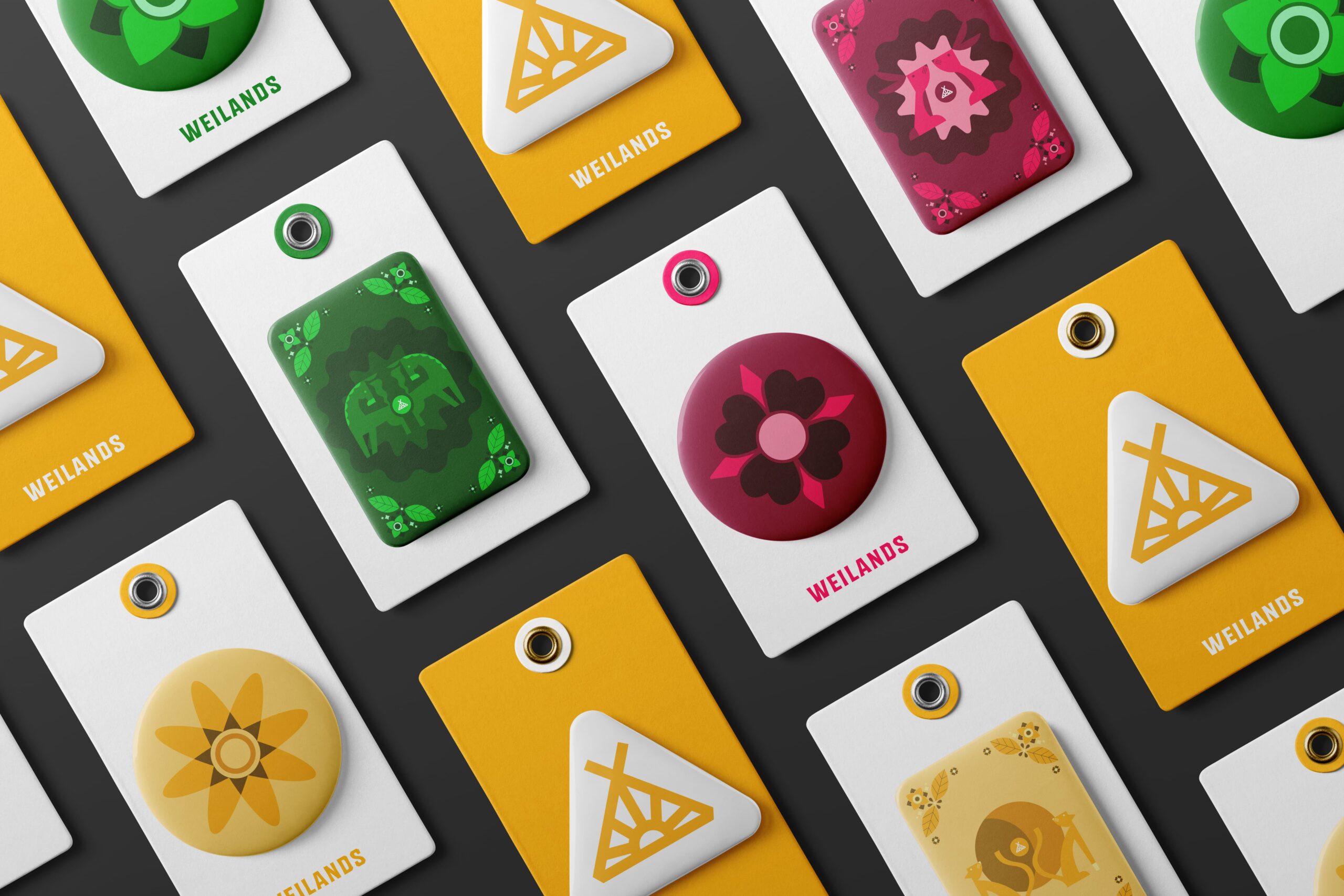
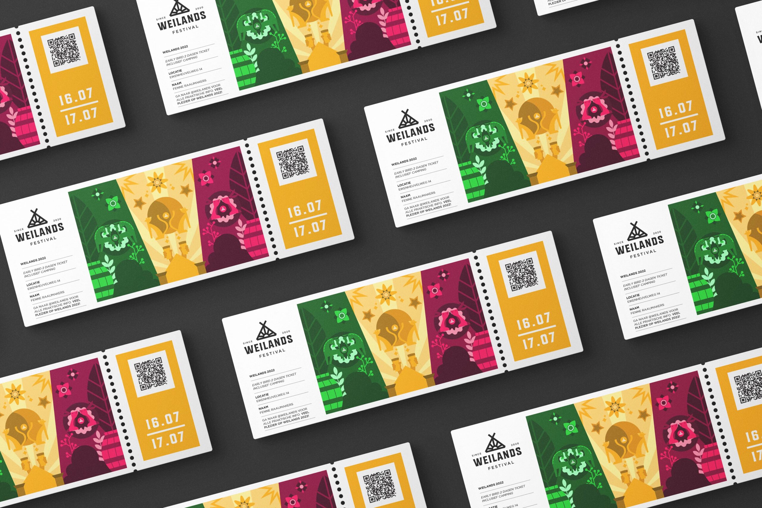
Geometric mascots bring individuality to each part of the festival. Their shapes and colors are inspired by natural elements, animals, flowers, sunlight, forming a visual language that’s both playful and refined. Combined with the vibrant color palette, they create a lively and distinctive style that enhances the festival atmosphere on every level.
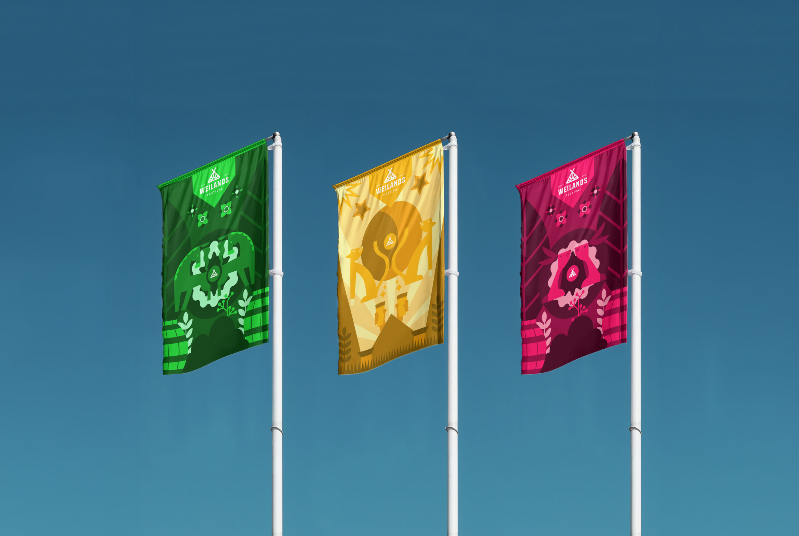
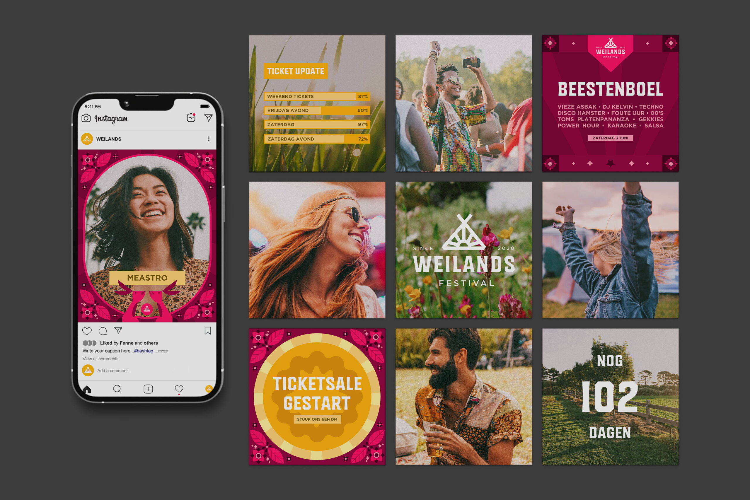
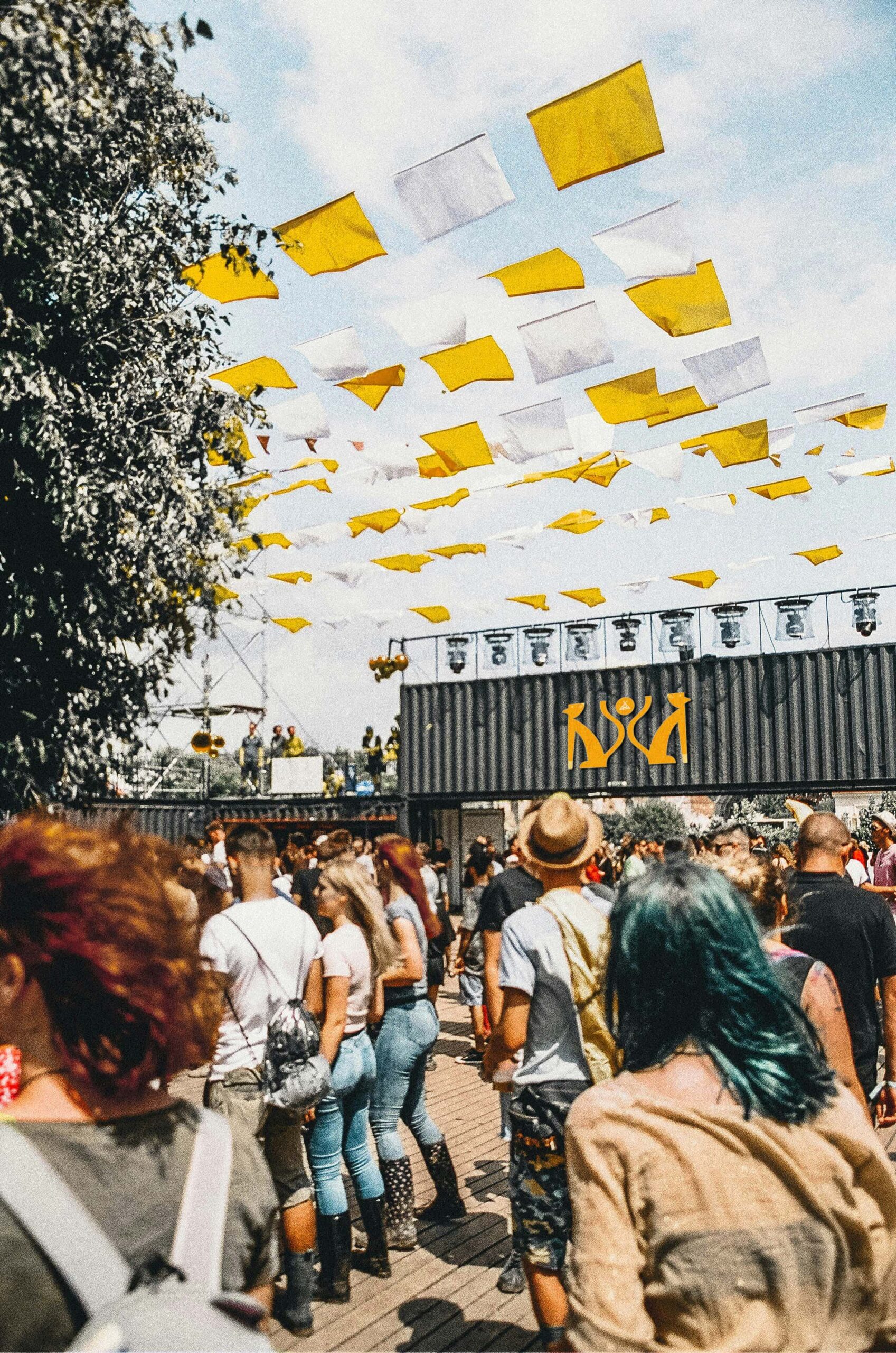
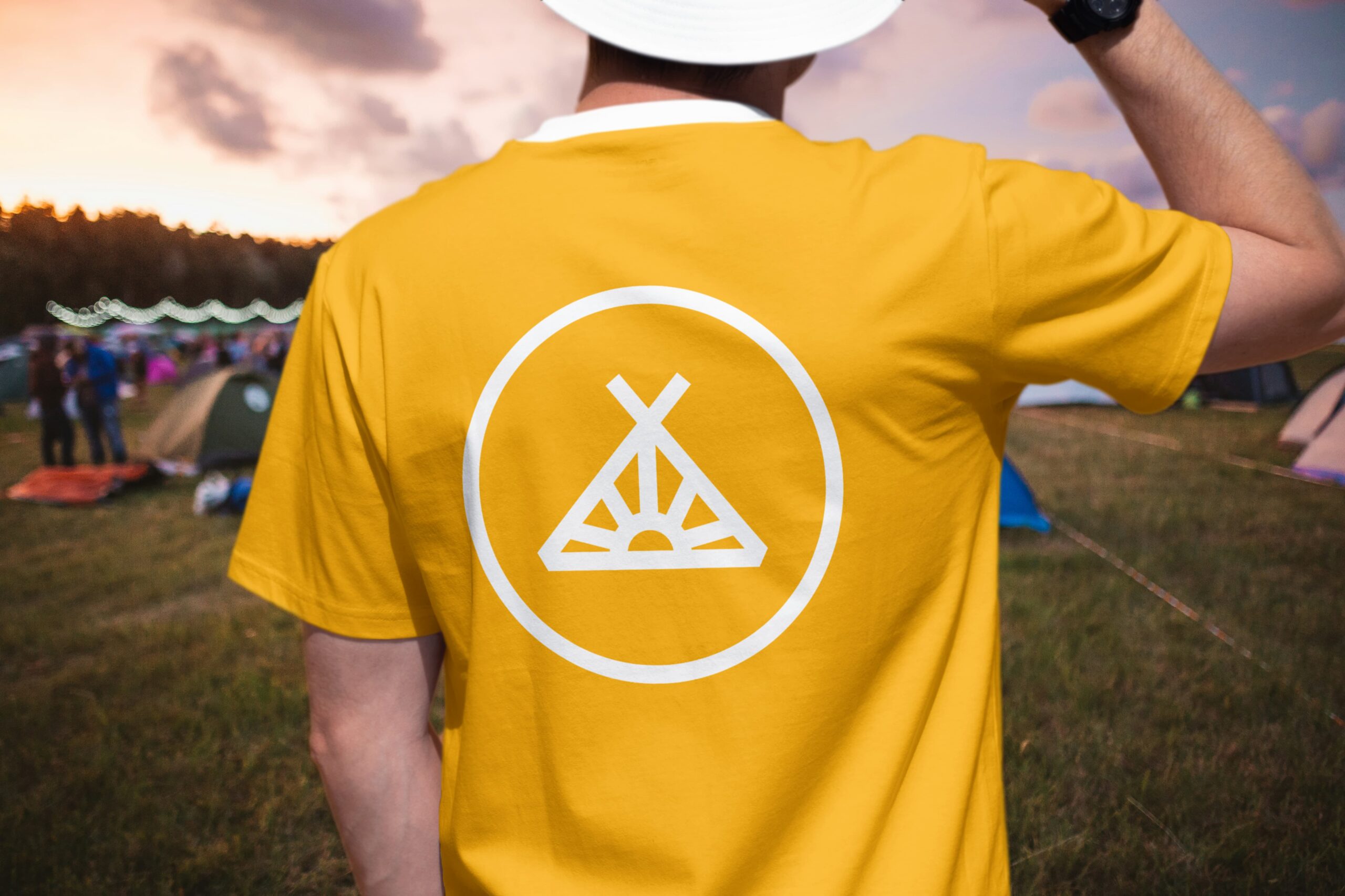
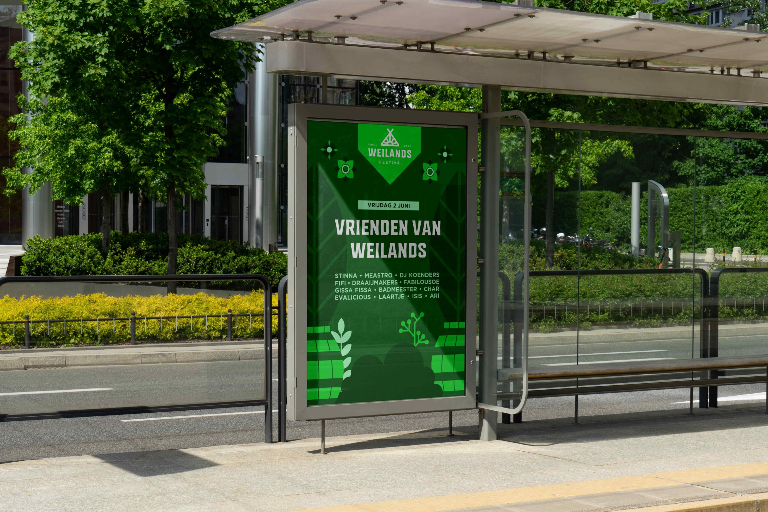
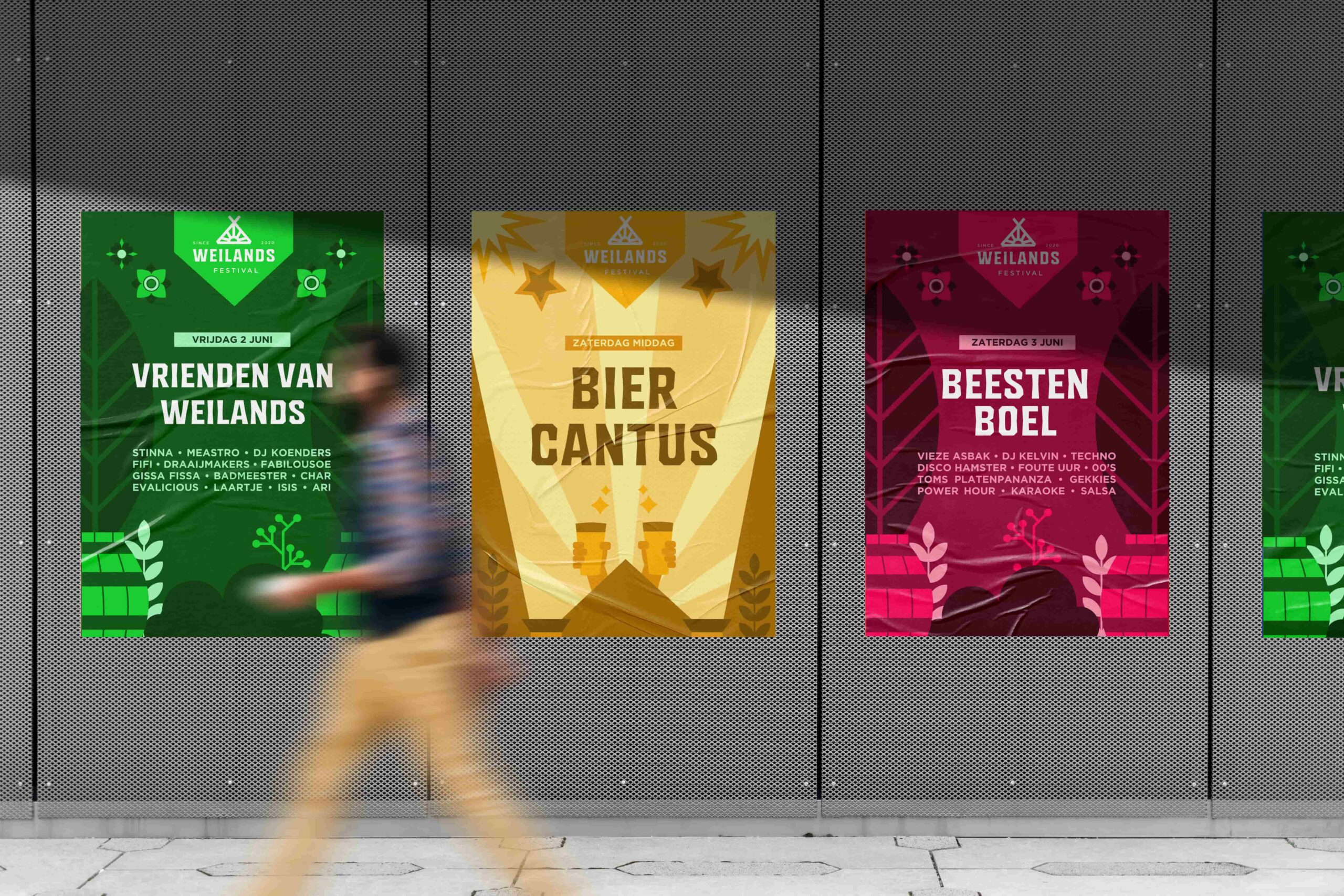
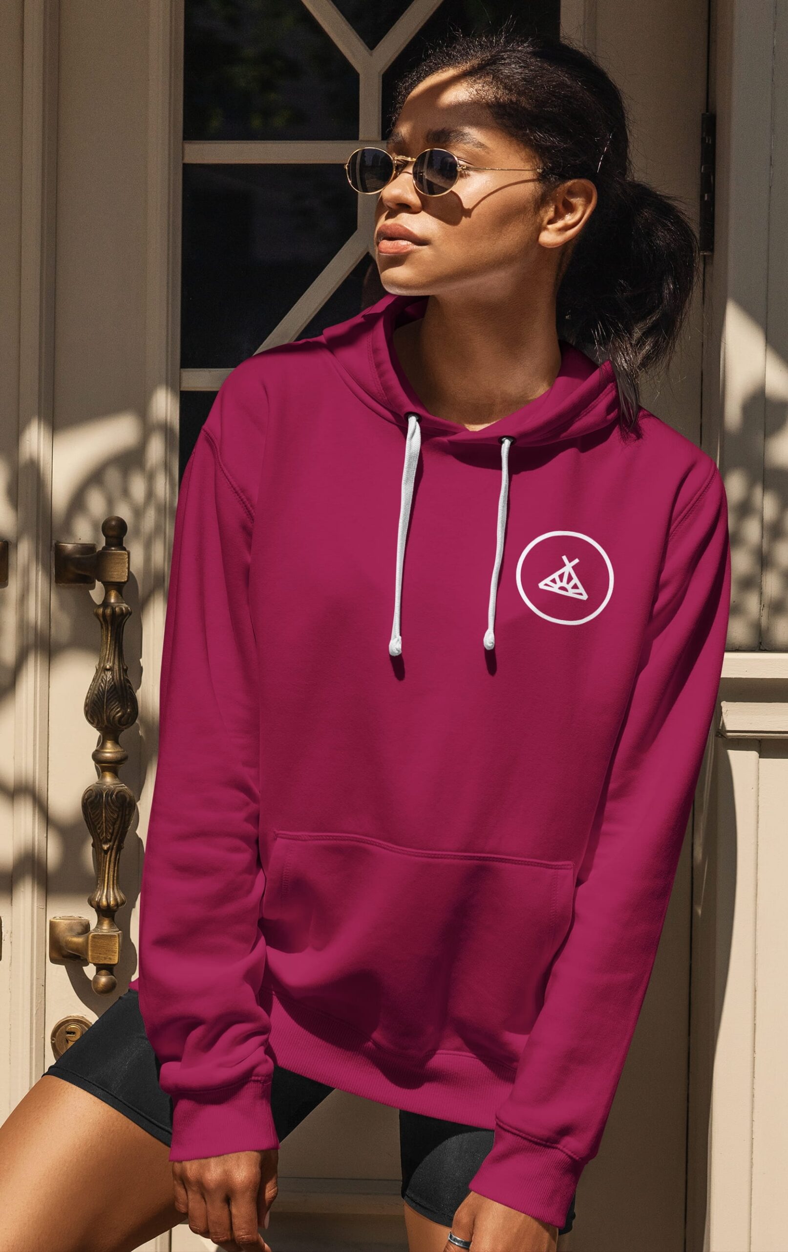
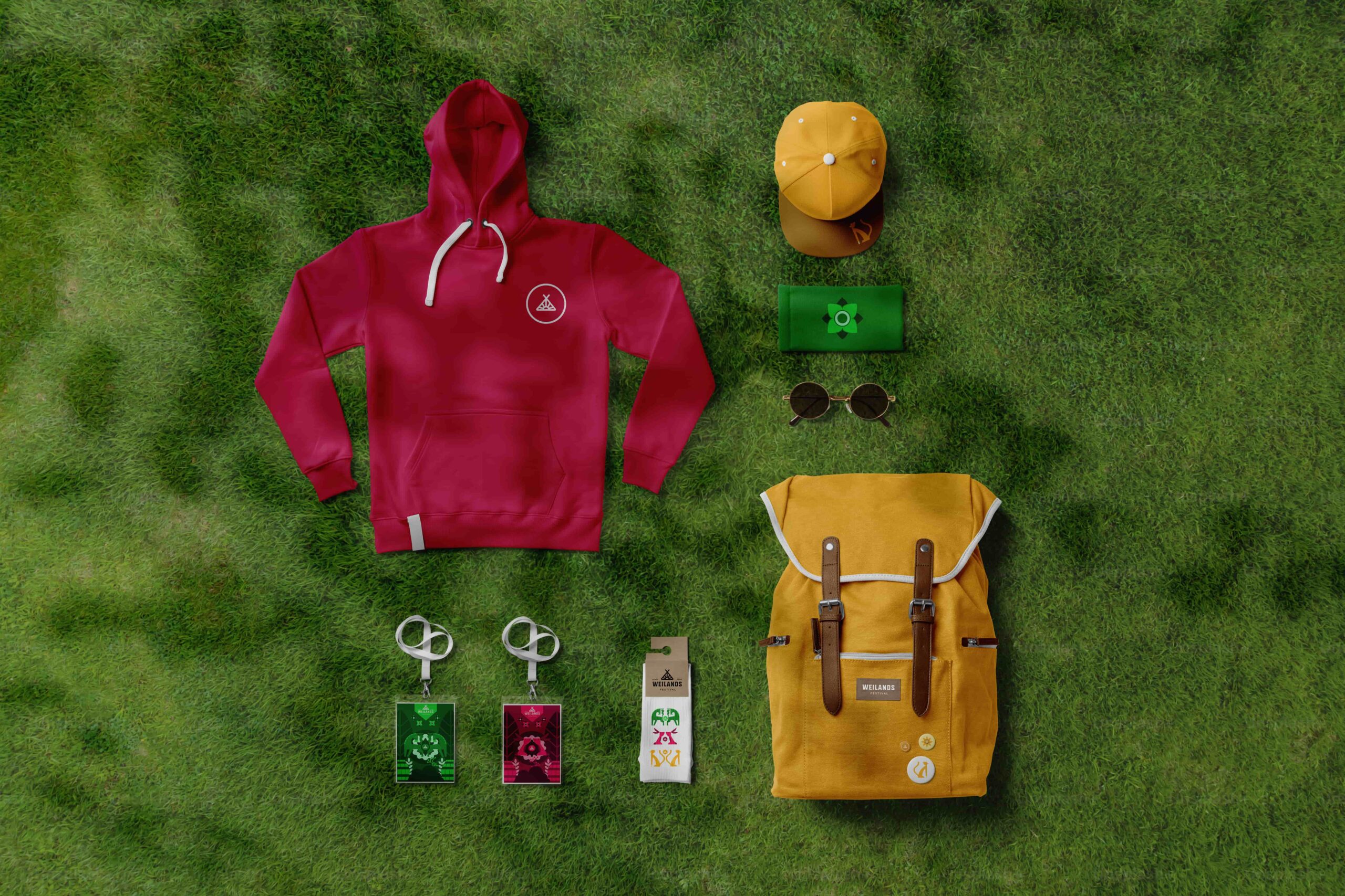
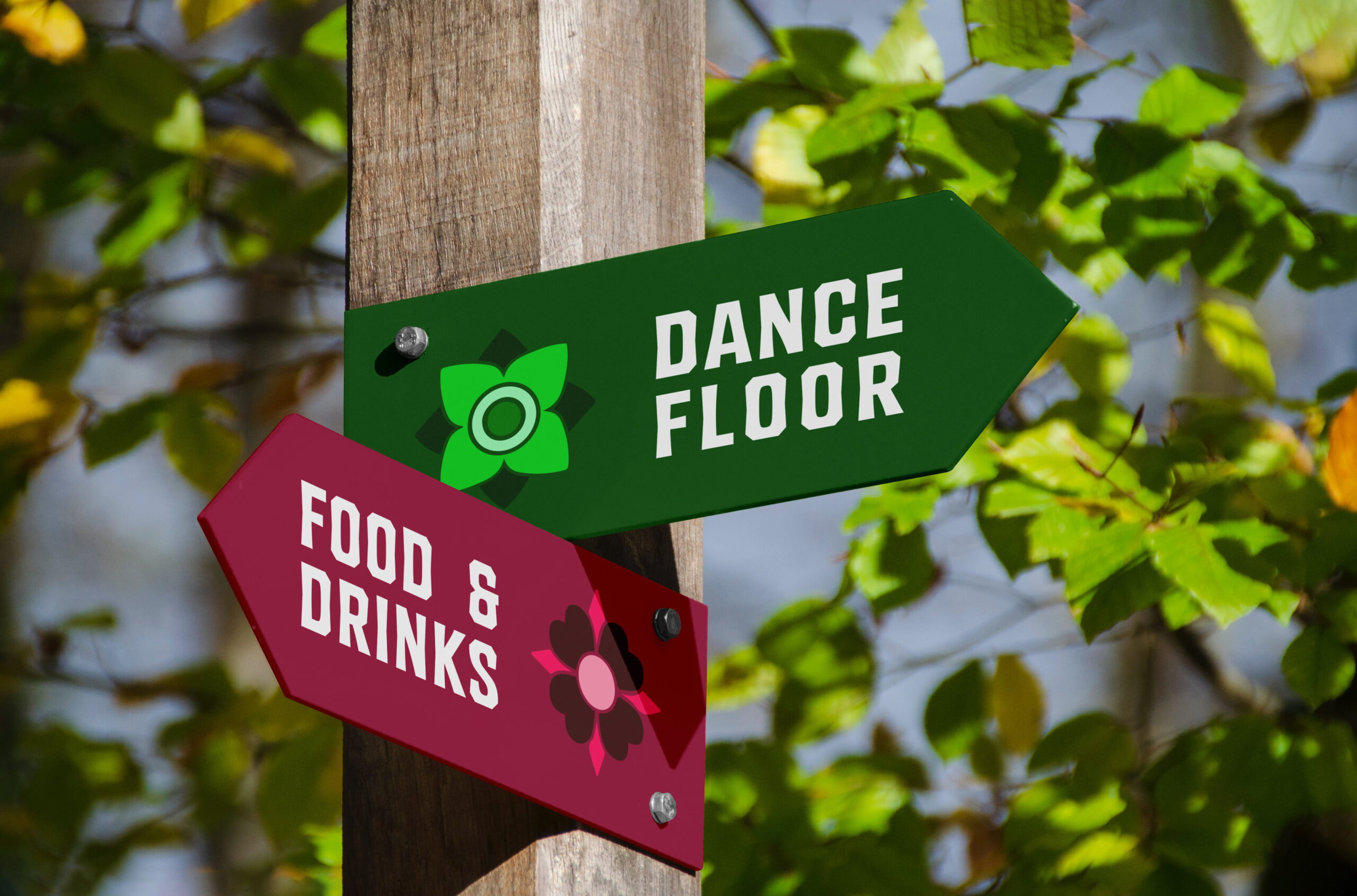
From posters and signage to merchandise, the design consistently carries the same playful energy. Repeating shapes, contrasting colors, and friendly typography make Weilands instantly recognizable, whether online or across the festival grounds. Through this visual and tonal consistency, the identity doesn’t just stand out; it’s felt.
Brands build on big ideas
Next project
Paper Club shows how paper packaging can contribute to a sustainable and enjoyable picnic experience.
The Coffice offers a co-working space that, with a fresh identity and its own visual style, became recognizable and inviting.
Join our community!
Sign up for our newsletter
Building a strong brand starts with inspiration. With our newsletter, you’ll receive that spark exactly when you need it, straight to your inbox. At Fraaij Makers, we believe a brand isn’t built in a single day. It’s a process of creating, adjusting, and continuously learning. Our newsletter is your gentle reminder to pause, reflect on your brand, and gain fresh insights, tips, and ideas to help your brand grow even further.
Playfulness as brand foundation
Weilands festival
about the project
Delivered products
- Brand strategy
- Logo-design
- Color palette & typography
- Design Language
- Festival posters
- Merchandise
- Social media templates
- Signage
- On-site branding
Client
Weilands is a festival that brings together music, art, and human connection. What once started as a small camping weekend has grown into a fully-fledged event with its own identity. Visitors come looking for joy and togetherness. With the festival’s growth came the need for a clear brand identity that not only preserved the atmosphere but amplified it.
Challenge
The organization wanted to translate the free, playful energy of Weilands into a consistent visual style. At the time, there was no cohesive strategy, and the festival risked losing the sharpness of its character. The key question: How do you make the festival experience visible and recognizable through branding?


The concept Field of Play sits at the heart of the visual identity. It refers not only to the meadow as a physical space but also to the sense of freedom, to play, create, and connect. This idea is reflected in the composition, the use of bold color blocks, and the dynamic illustration style. Weilands is presented as a place where anything can happen: a creative playground for music, art, and togetherness.


The logo draws inspiration from Weilands’ roots as a camping weekend while reflecting the energy of today’s festival experience. Its geometric structure gives it strength and recognizability, while the open lines emphasize accessibility and movement , capturing the festival’s welcoming spirit.


Geometric mascots bring individuality to each part of the festival. Their shapes and colors are inspired by natural elements, animals, flowers, sunlight, forming a visual language that’s both playful and refined. Combined with the vibrant color palette, they create a lively and distinctive style that enhances the festival atmosphere on every level.


From posters and signage to merchandise, the design consistently carries the same playful energy. Repeating shapes, contrasting colors, and friendly typography make Weilands instantly recognizable, whether online or across the festival grounds. Through this visual and tonal consistency, the identity doesn’t just stand out; it’s felt.


Brands build on big ideas
Volgende project
Paper Club shows how paper packaging can contribute to a sustainable and enjoyable picnic experience.
The Coffice offers a co-working space that, with a fresh identity and its own visual style, became recognizable and inviting.
Join our community!
Sign up for our newsletter
Building a strong brand starts with inspiration. With our newsletter, you’ll receive that spark exactly when you need it—straight to your inbox. At Fraaij Makers, we believe a brand isn’t built in a single day. It’s a process of creating, adjusting, and continuously learning. Our newsletter is your gentle reminder to pause, reflect on your brand, and gain fresh insights, tips, and ideas to help your brand grow even further.
Playfulness as brand foundation
Weilands festival
over het project
Delivered products
- Brand strategy
- Logo-design
- Color palette & typography
- Design Language
- Festival posters
- Merchandise
- Social media templates
- Signage
- On-site branding
Client
Weilands is a festival that brings together music, art, and human connection. What once started as a small camping weekend has grown into a fully-fledged event with its own identity. Visitors come looking for joy and togetherness. With the festival’s growth came the need for a clear brand identity that not only preserved the atmosphere but amplified it.
Challenge
The organization wanted to translate the free, playful energy of Weilands into a consistent visual style. At the time, there was no cohesive strategy, and the festival risked losing the sharpness of its character. The key question: How do you make the festival experience visible and recognizable through branding?


The concept Field of Play sits at the heart of the visual identity. It refers not only to the meadow as a physical space but also to the sense of freedom, to play, create, and connect. This idea is reflected in the composition, the use of bold color blocks, and the dynamic illustration style. Weilands is presented as a place where anything can happen: a creative playground for music, art, and togetherness.


The logo draws inspiration from Weilands’ roots as a camping weekend while reflecting the energy of today’s festival experience. Its geometric structure gives it strength and recognizability, while the open lines emphasize accessibility and movement, capturing the festival’s welcoming spirit.


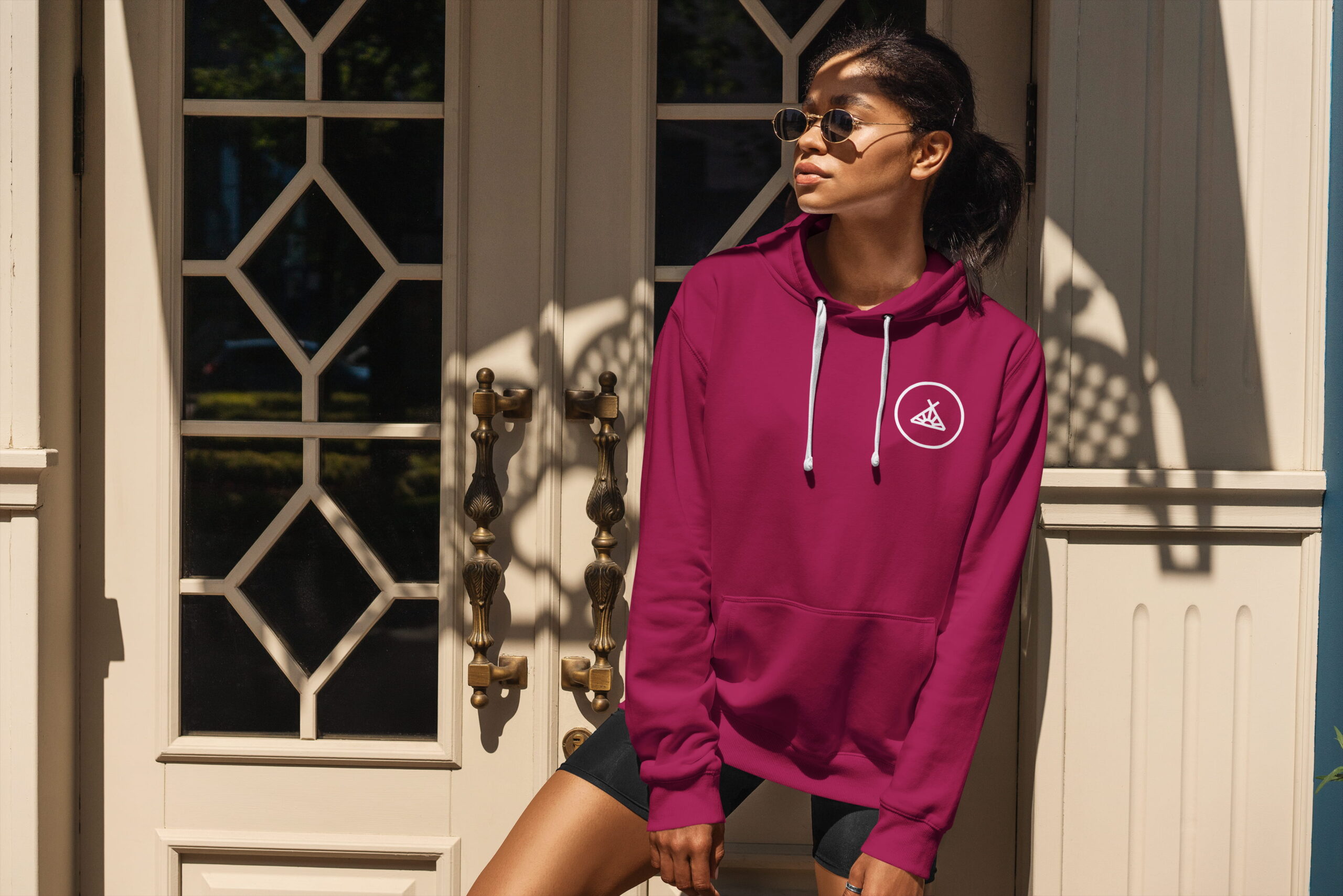

Geometric mascots bring individuality to each part of the festival. Their shapes and colors are inspired by natural elements, animals, flowers, sunlight, forming a visual language that’s both playful and refined. Combined with the vibrant color palette, they create a lively and distinctive style that enhances the festival atmosphere on every level.

From posters and signage to merchandise, the design consistently carries the same playful energy. Repeating shapes, contrasting colors, and friendly typography make Weilands instantly recognizabl, whether online or across the festival grounds. Through this visual and tonal consistency, the identity doesn’t just stand out; it’s felt.


Brands build on big ideas
Next project
Paper Club shows how paper packaging can contribute to a sustainable and enjoyable picnic experience.
The Coffice offers a co-working space that, with a fresh identity and its own visual style, became recognizable and inviting.
Join our community!
Sign up for our newsletter
Building a strong brand starts with inspiration. With our newsletter, you’ll receive that spark exactly when you need it, straight to your inbox. At Fraaij Makers, we believe a brand isn’t built in a single day. It’s a process of creating, adjusting, and continuously learning. Our newsletter is your gentle reminder to pause, reflect on your brand, and gain fresh insights, tips, and ideas to help your brand grow even further.
About us
Neem contact op via: