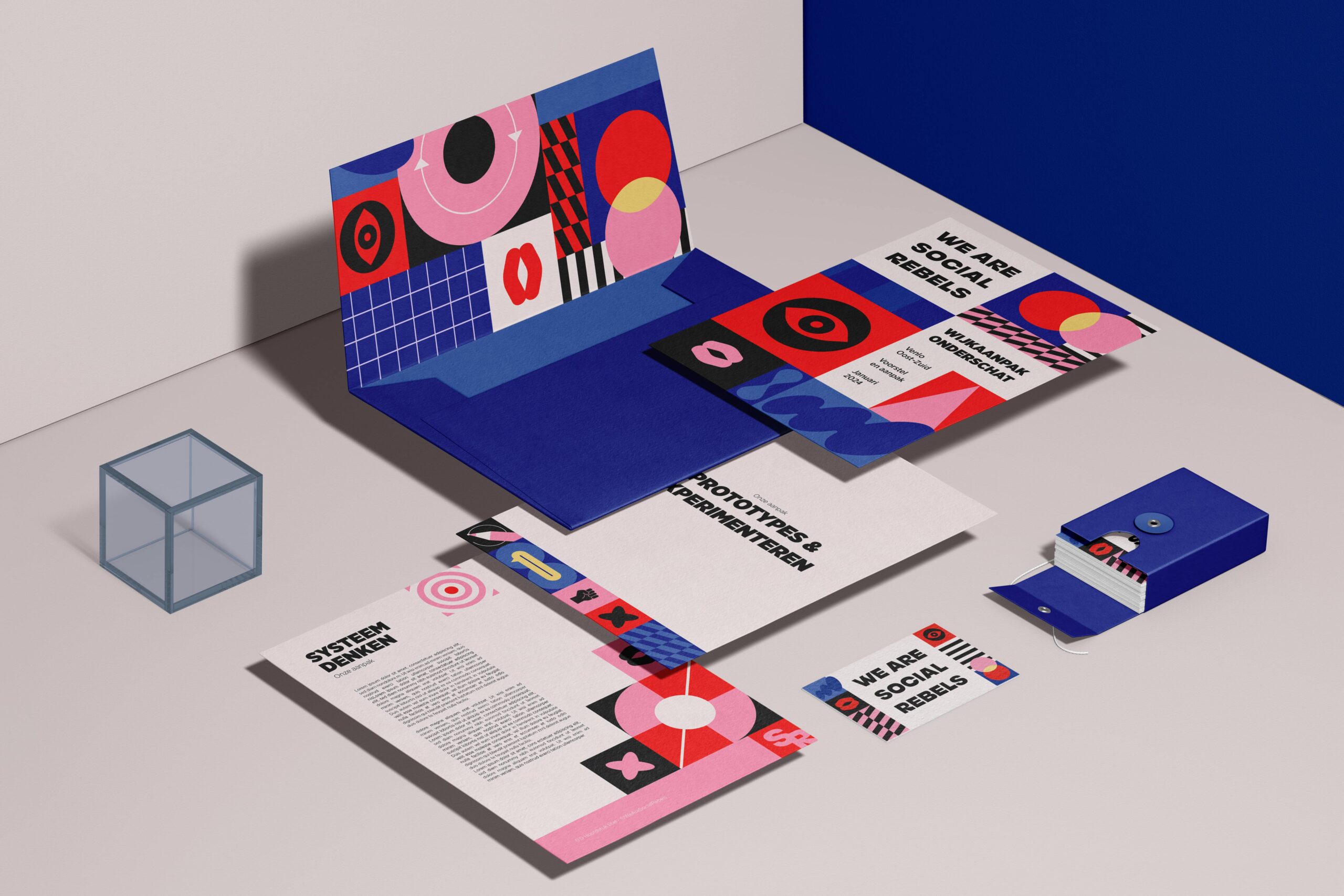
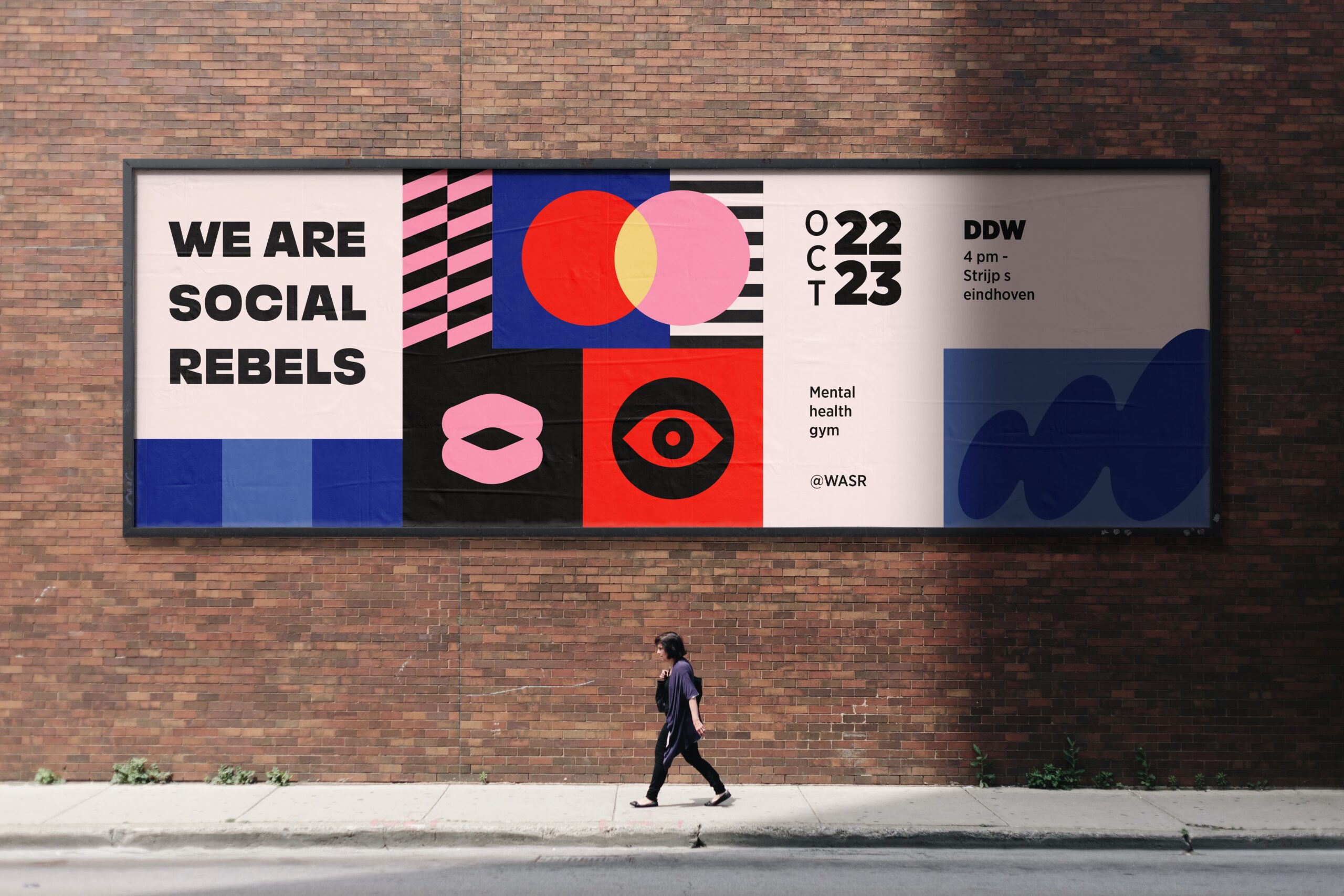
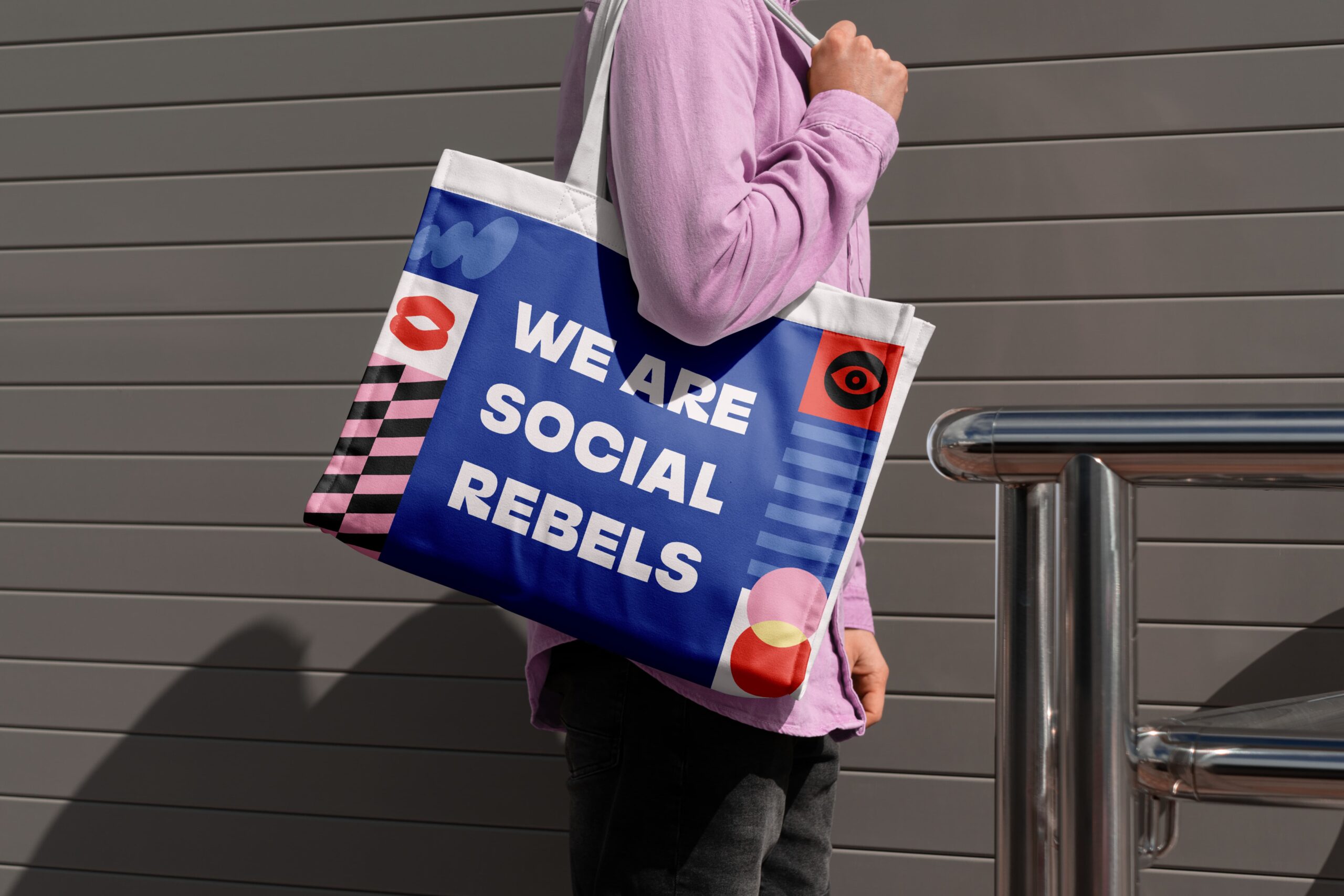
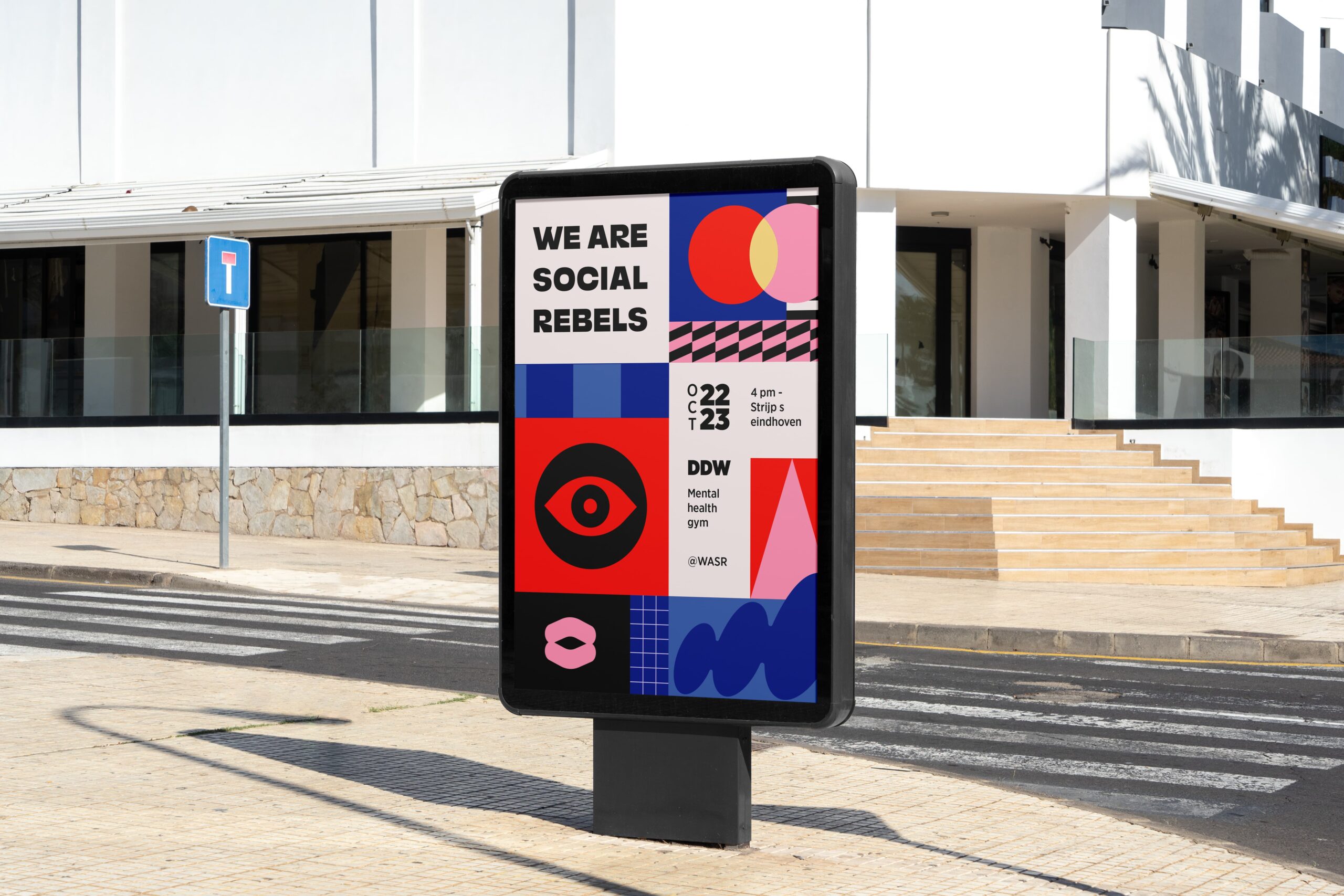
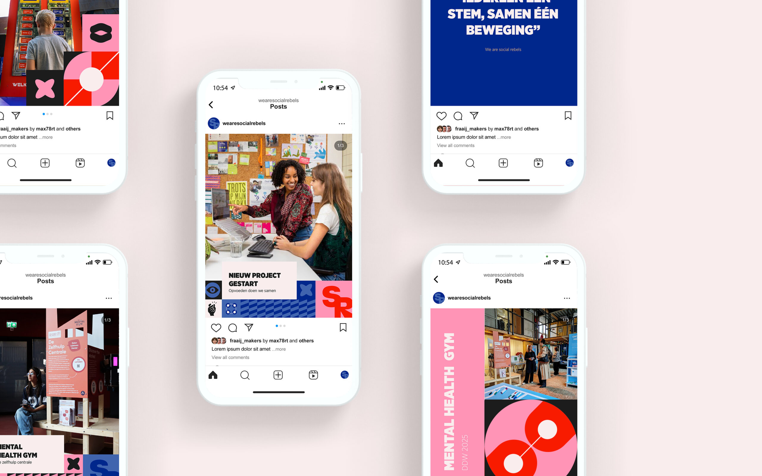
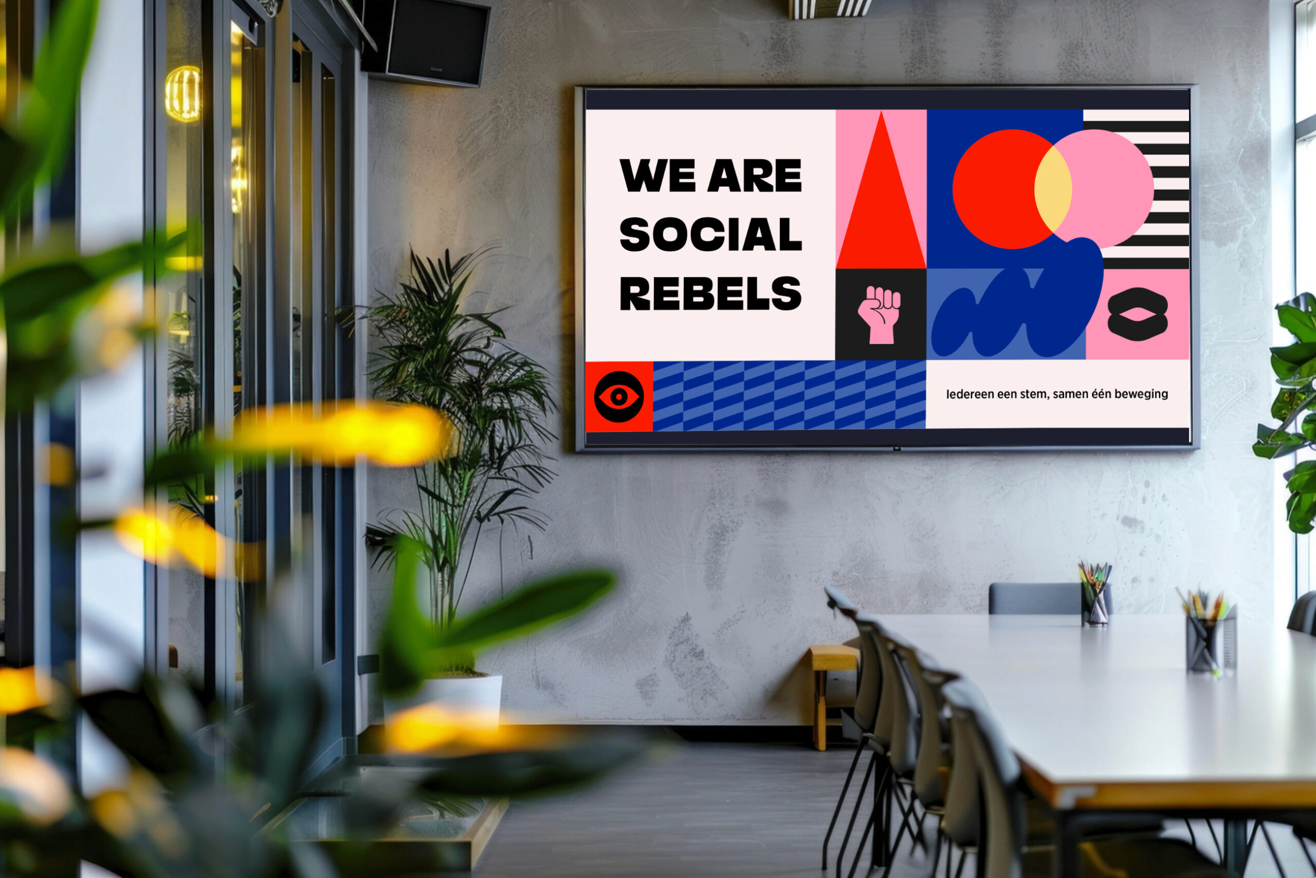
Deliverables
- Logo
- Color palette and typography
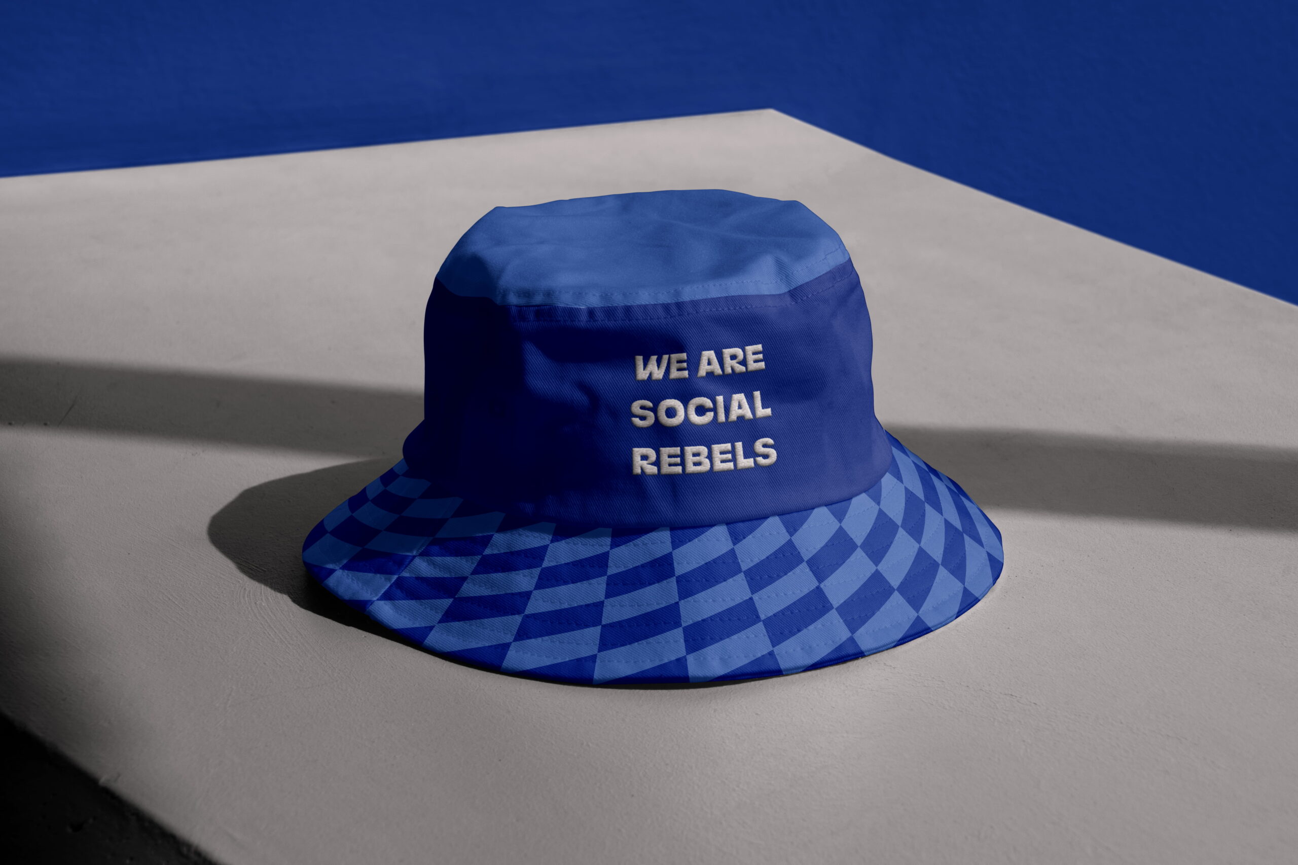
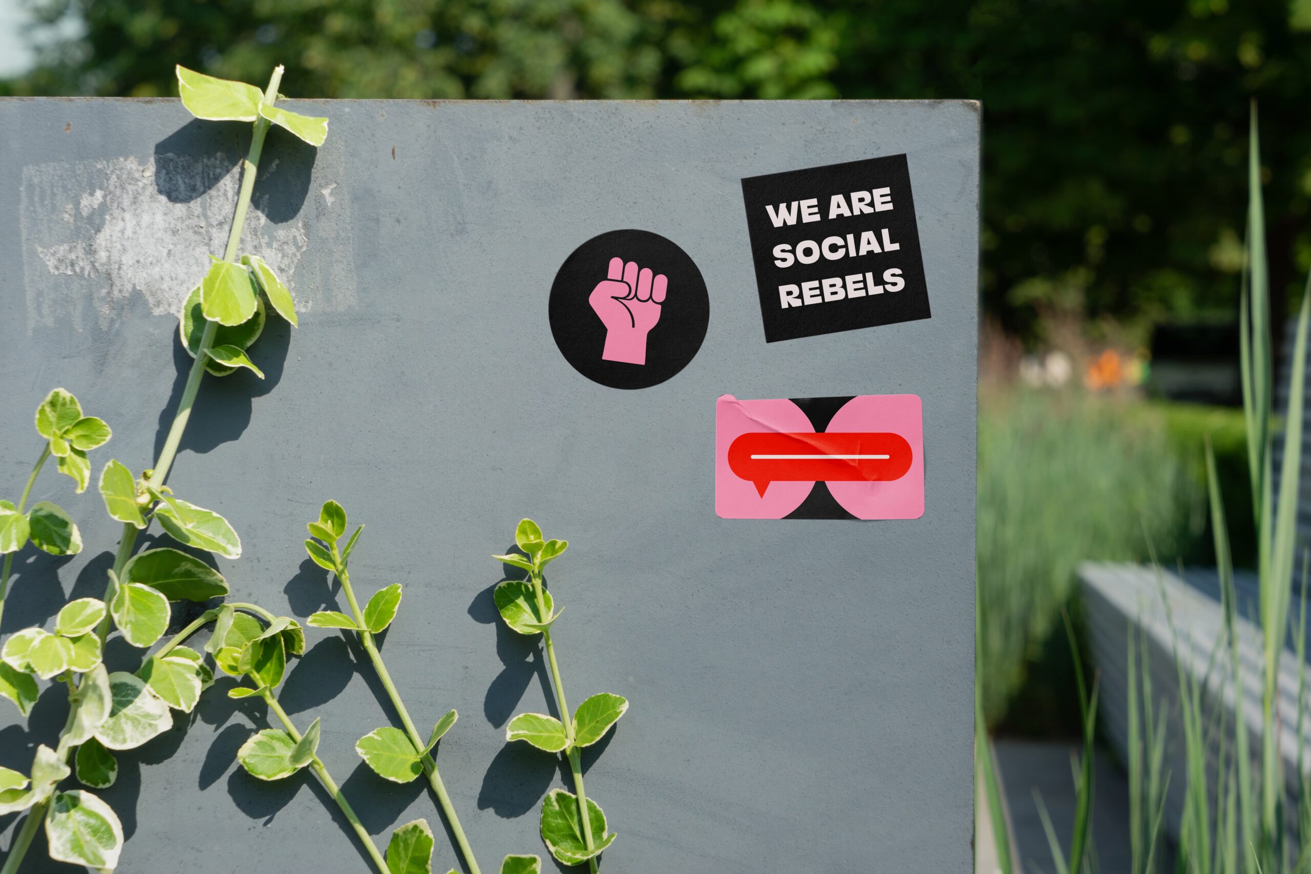
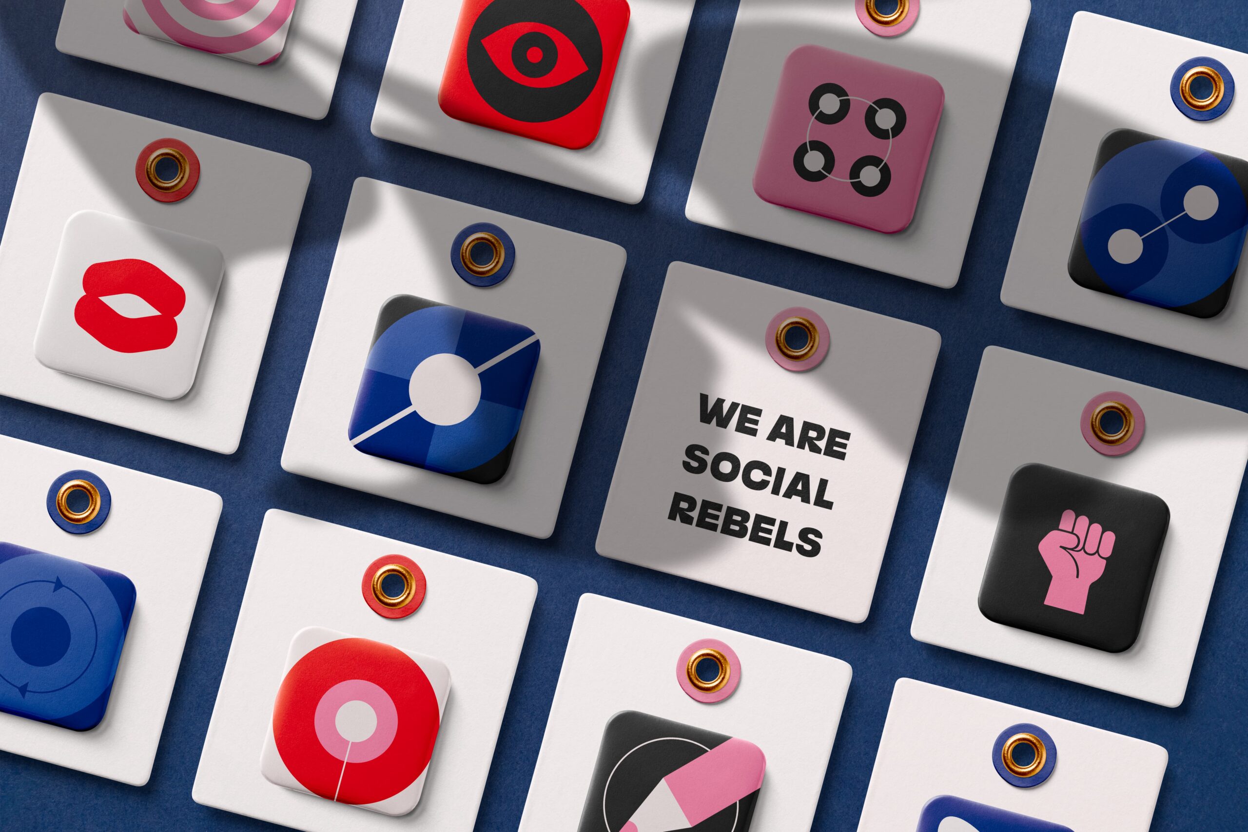
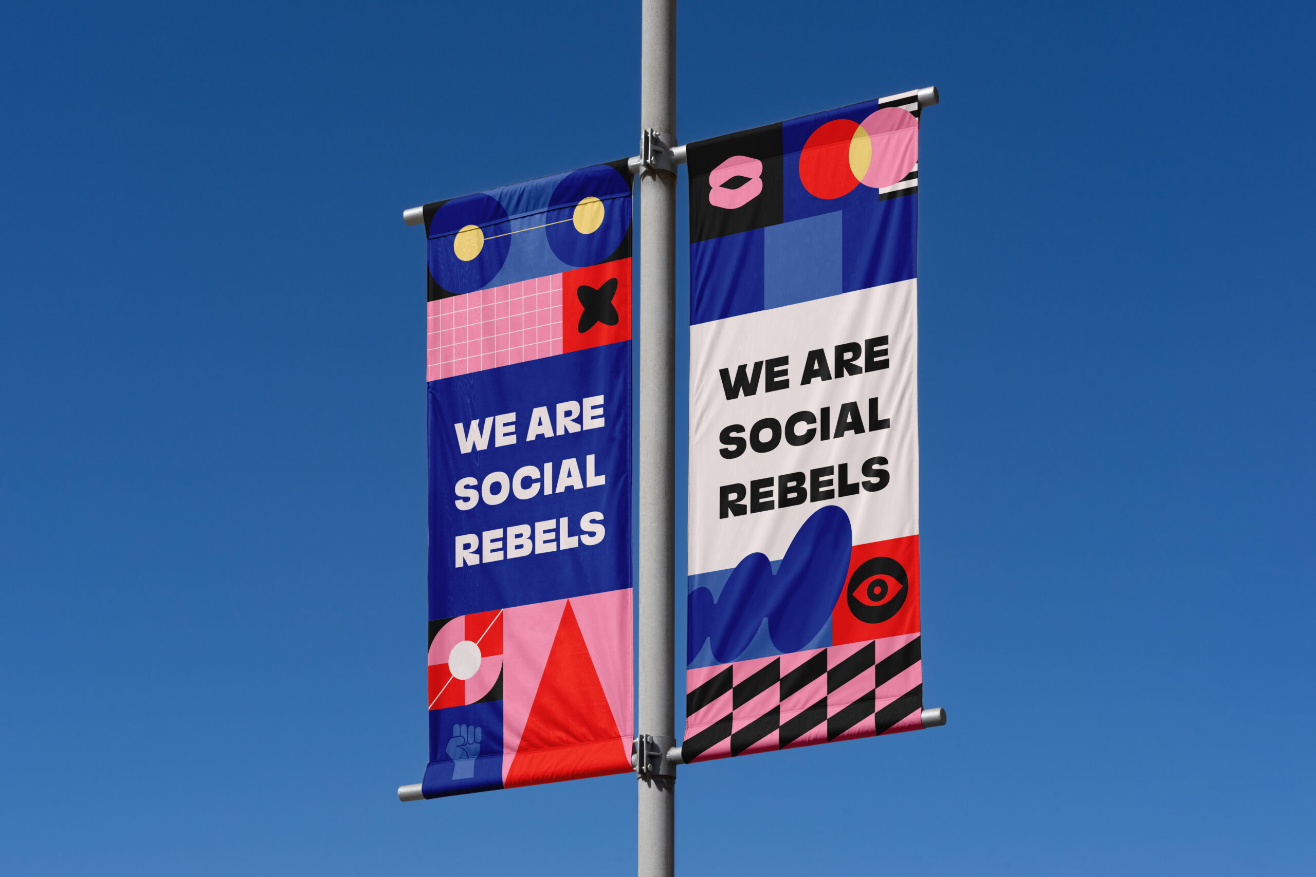
- Visual language
- Motion design
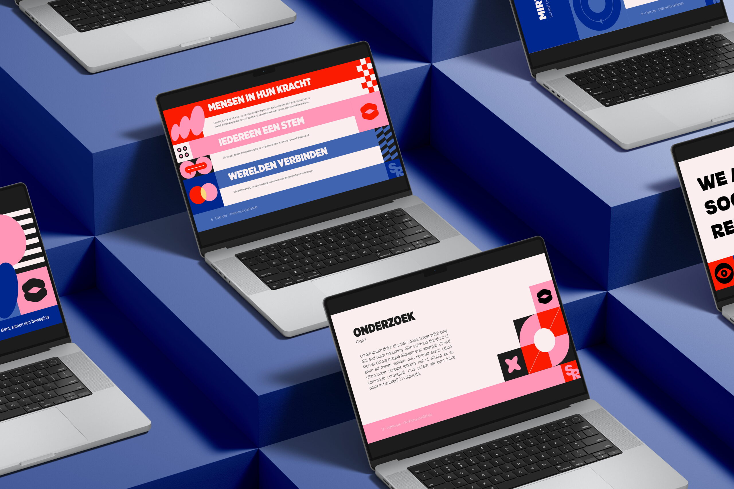
- Website
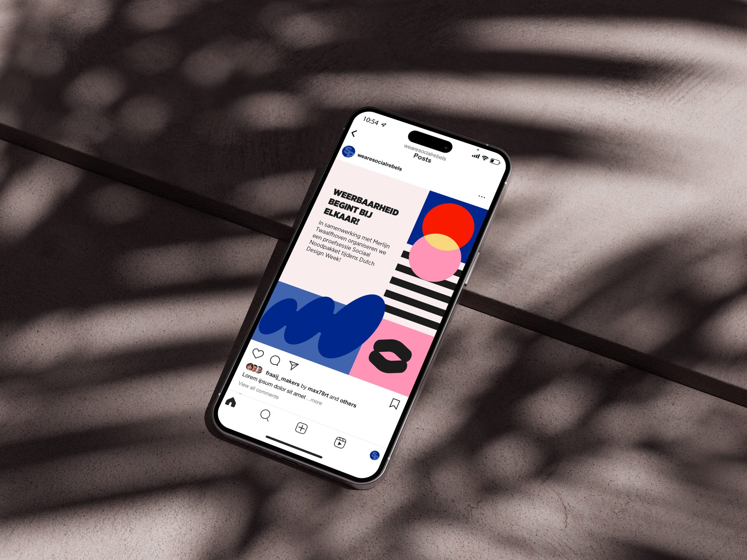
- Social media templates
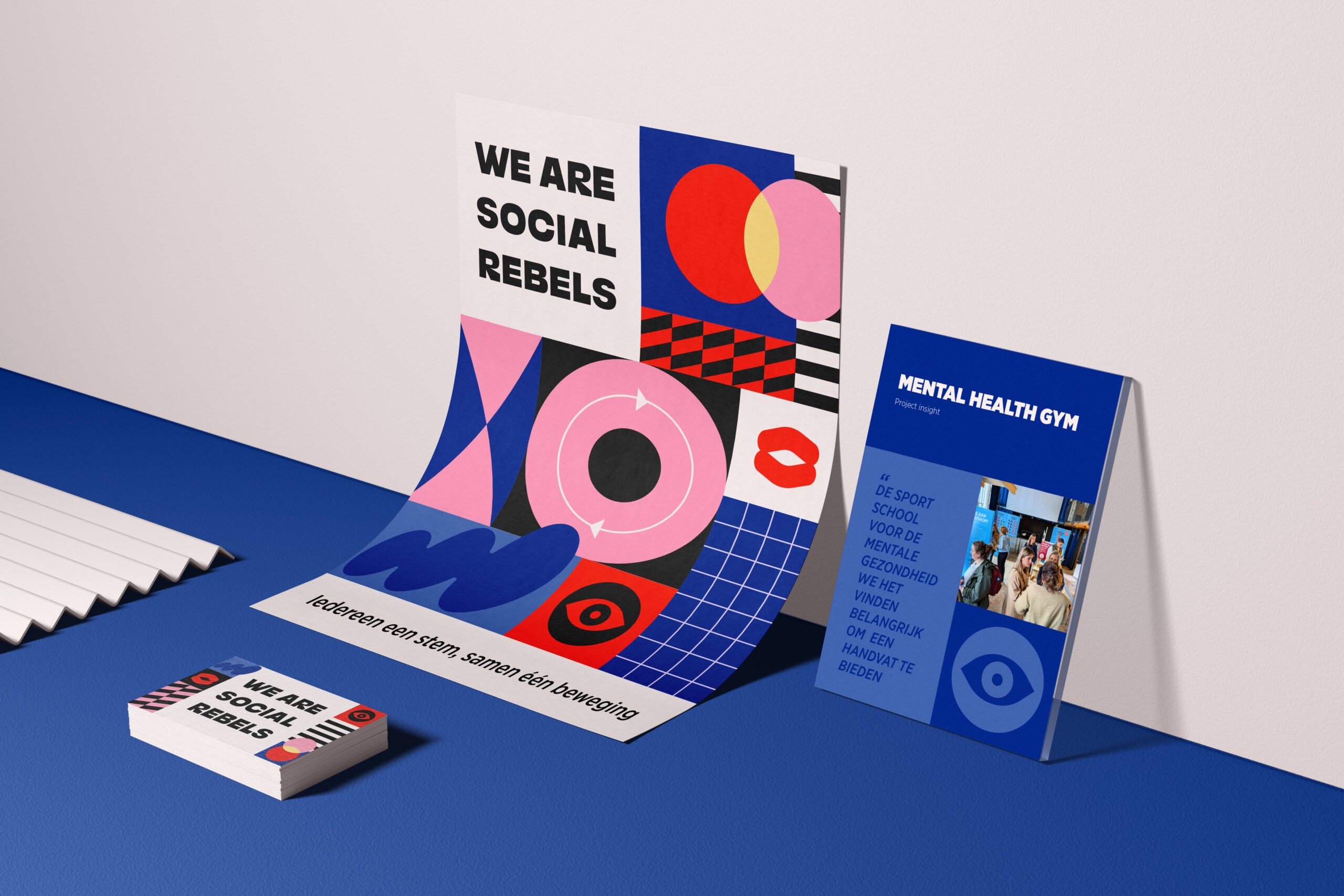
- Stationery
- Invoice template
- Presentation template
The client
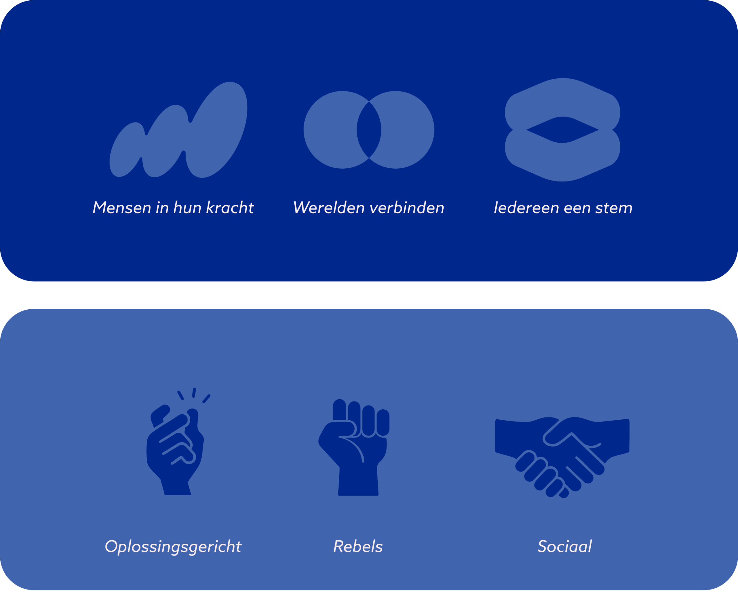
We Are Social Rebels is a social design agency based in Eindhoven. With creativity and boldness, they tackle social issues and redesign systems so they work for people. They are designers, thinkers and doers, but above all, they bring people together. Alongside organizations, professionals and communities, they work towards a society where every voice counts.
The challenge
As the company continued to grow, the need for a more professional and scalable brand identity became clear. It wasn’t just about refreshing the visuals, but about creating a brand that reflects both sides of their character: socially driven and unafraid to challenge the norm. Our role was to shape a visual identity that brings their mission to life; through form, color and shape.