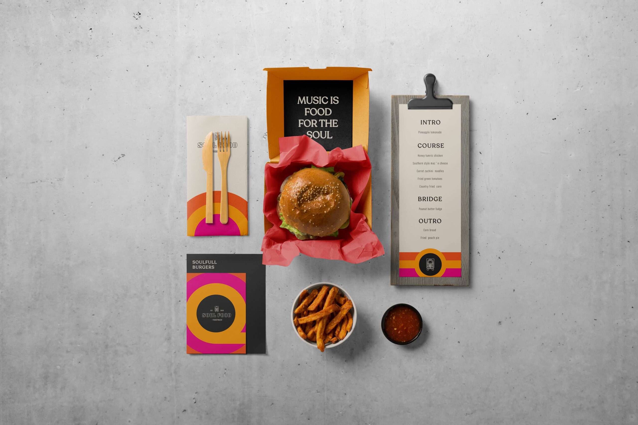
Delivered products
- Logo design
- Color palette & typography
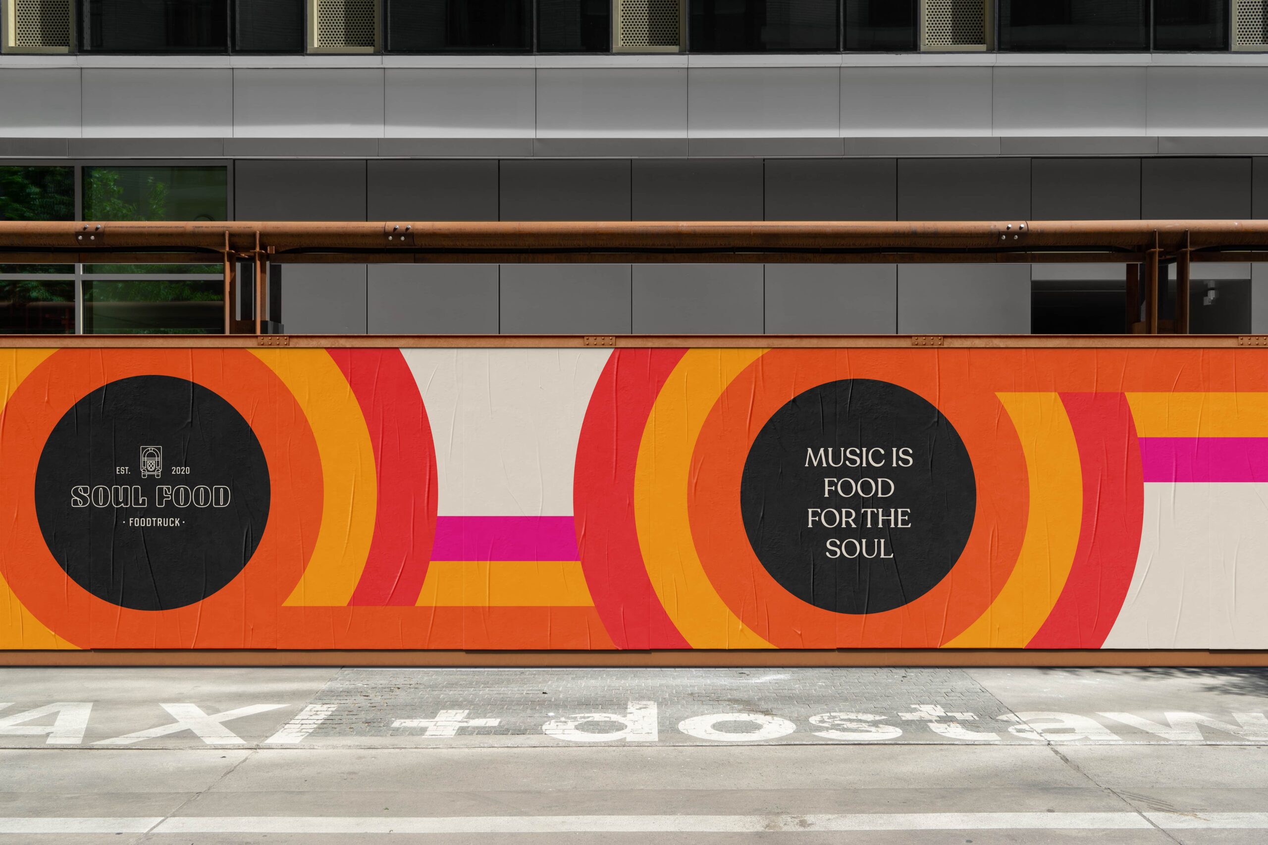
- Design Language
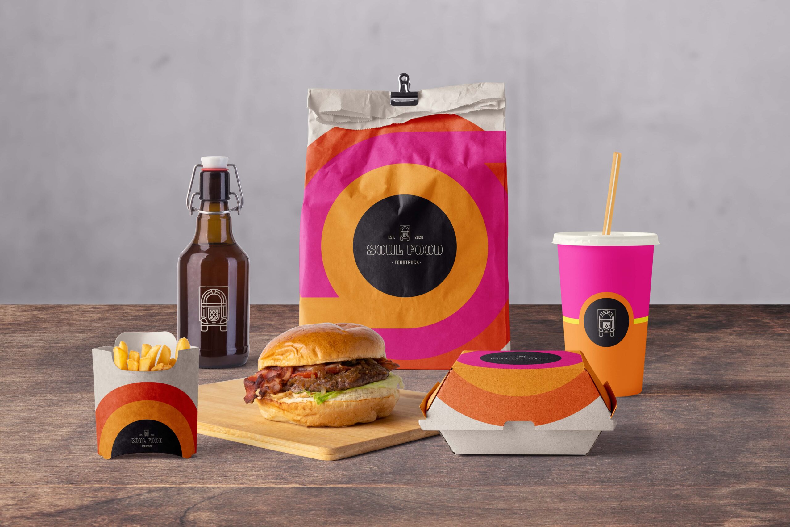
- Packaging
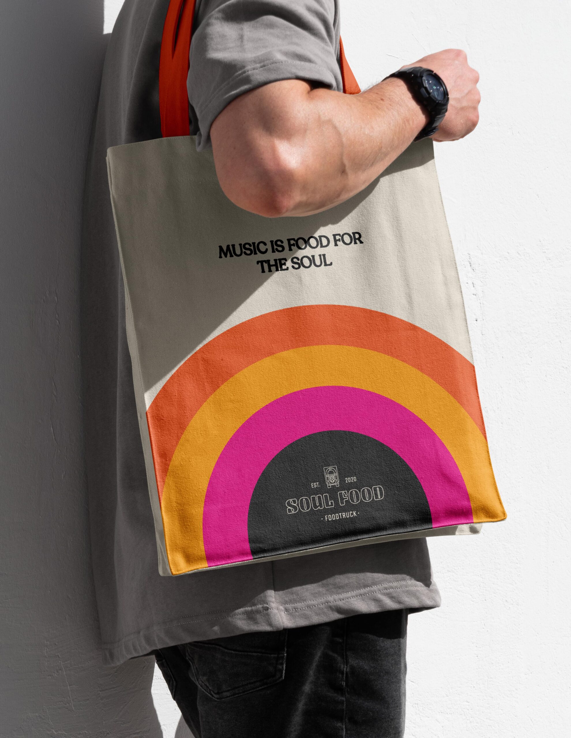
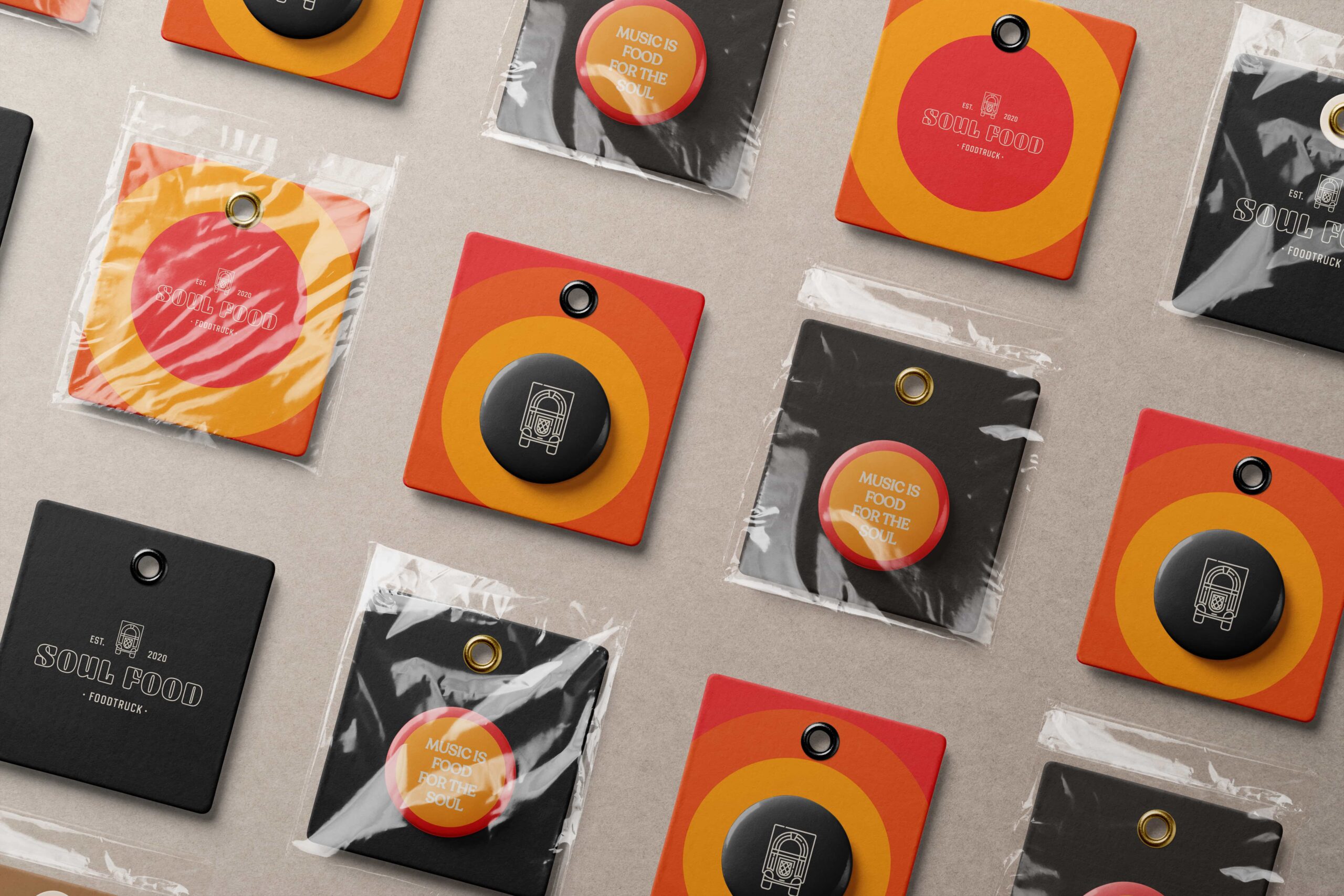
- Merchandise
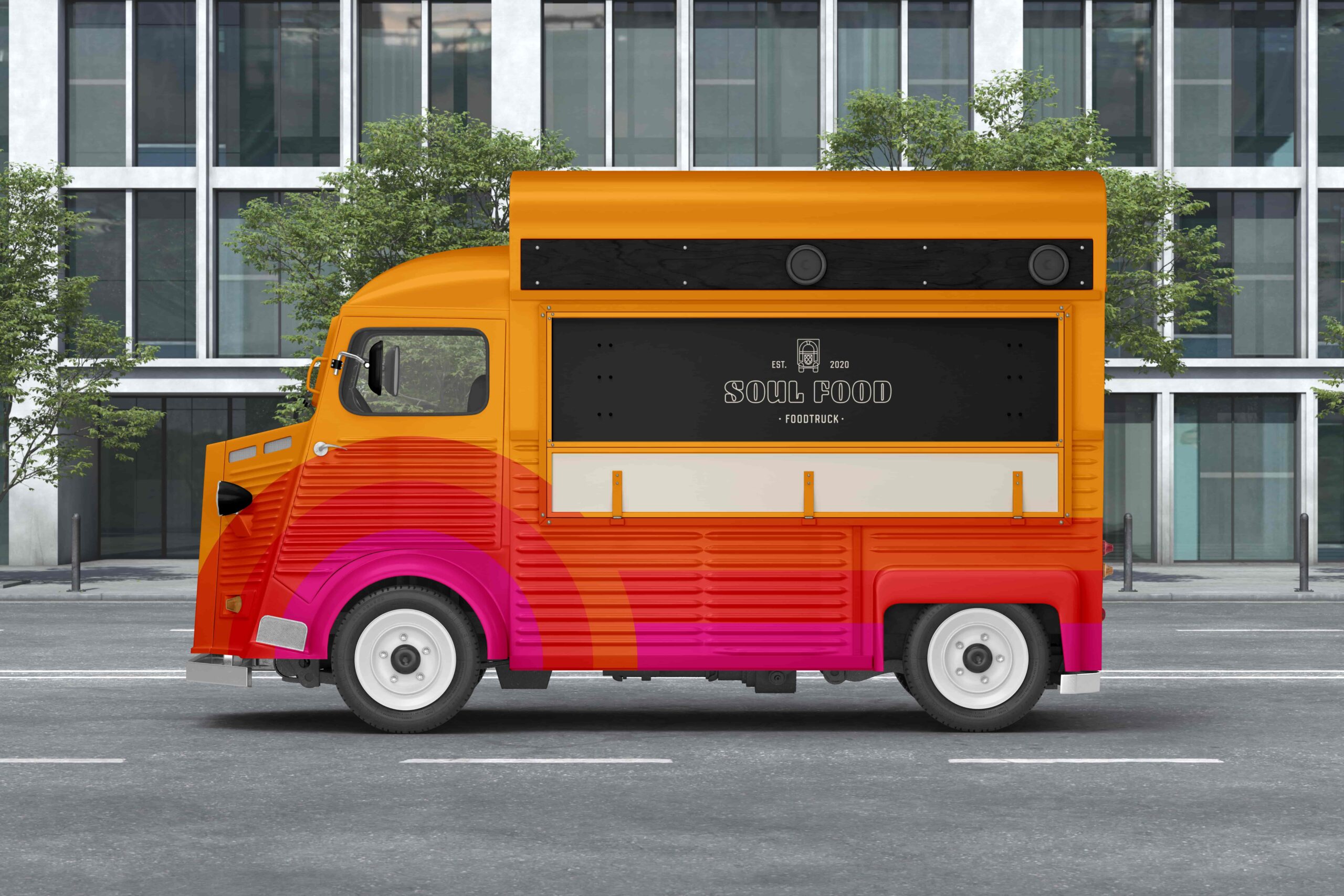
- Signage & food truck design
Client
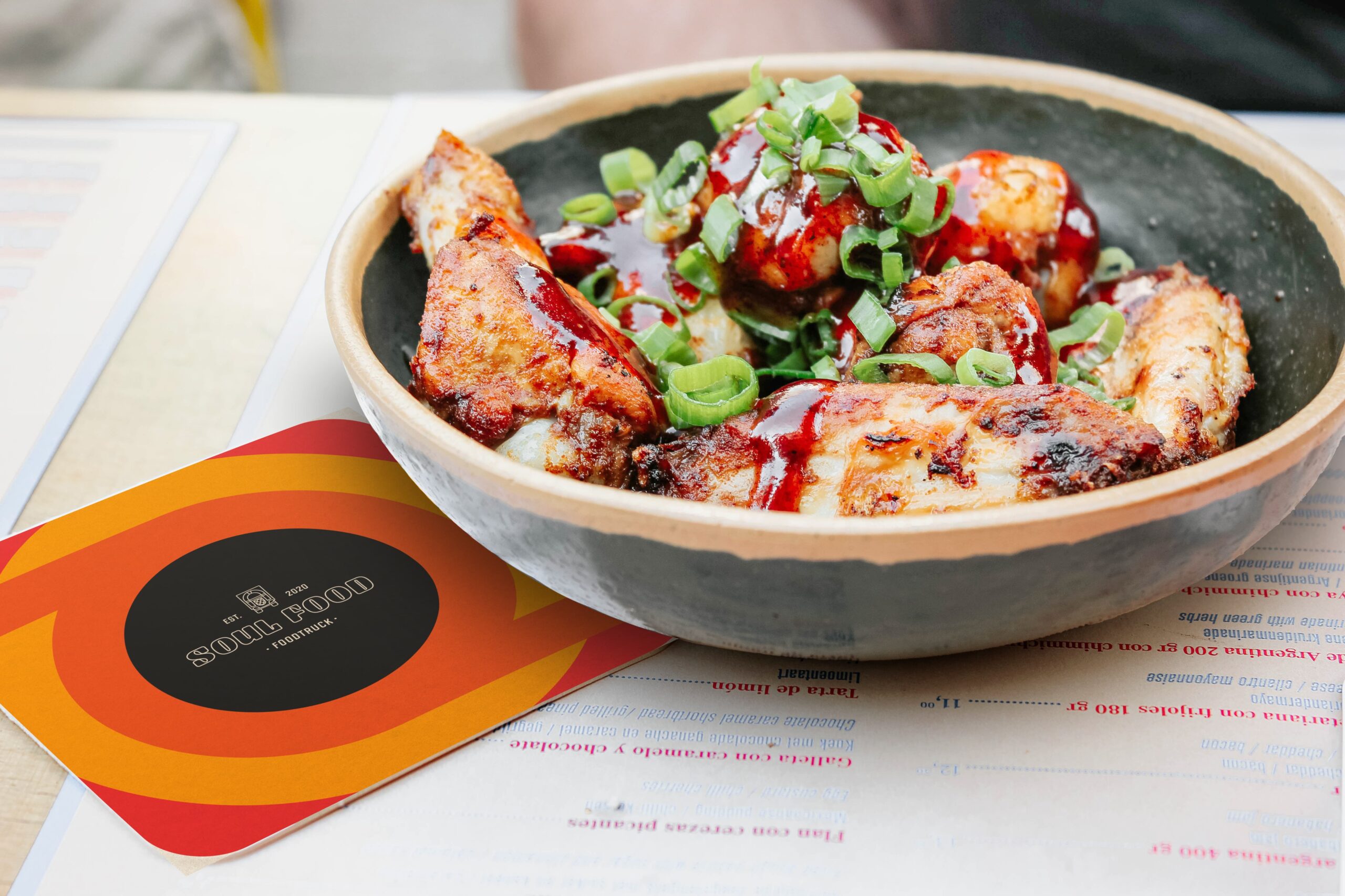
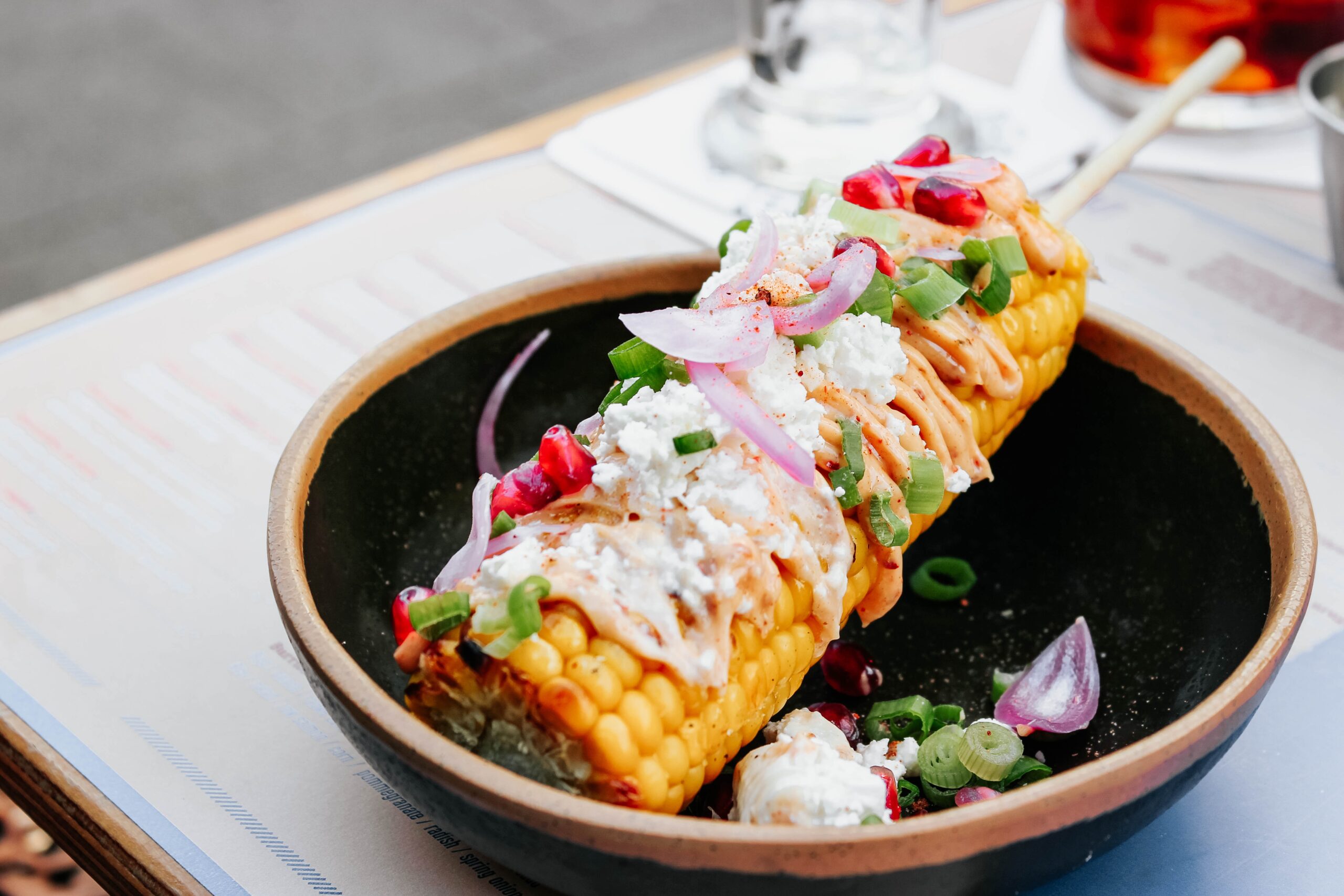
Soul Food is a food truck that aims to be more than just a place to grab a meal. The concept revolves around the fusion of flavorful dishes and the warmth of soul music. Visitors experience the truck not only as a spot to eat, but also as a meeting place where rhythm and taste come together. To capture that feeling, the brand identity needed to convey both culinary quality and cultural experience.
Challenge
The challenge was to translate music and taste into a consistent visual identity. How do you create a brand style that stands out on the street, remains recognizable in crowded environments, and reflects the vibe of soul music? Soul Food asked for a style that feels lively and energetic, while still looking convincing at festivals, events, and among food lovers.