Delivered products
- Concept development
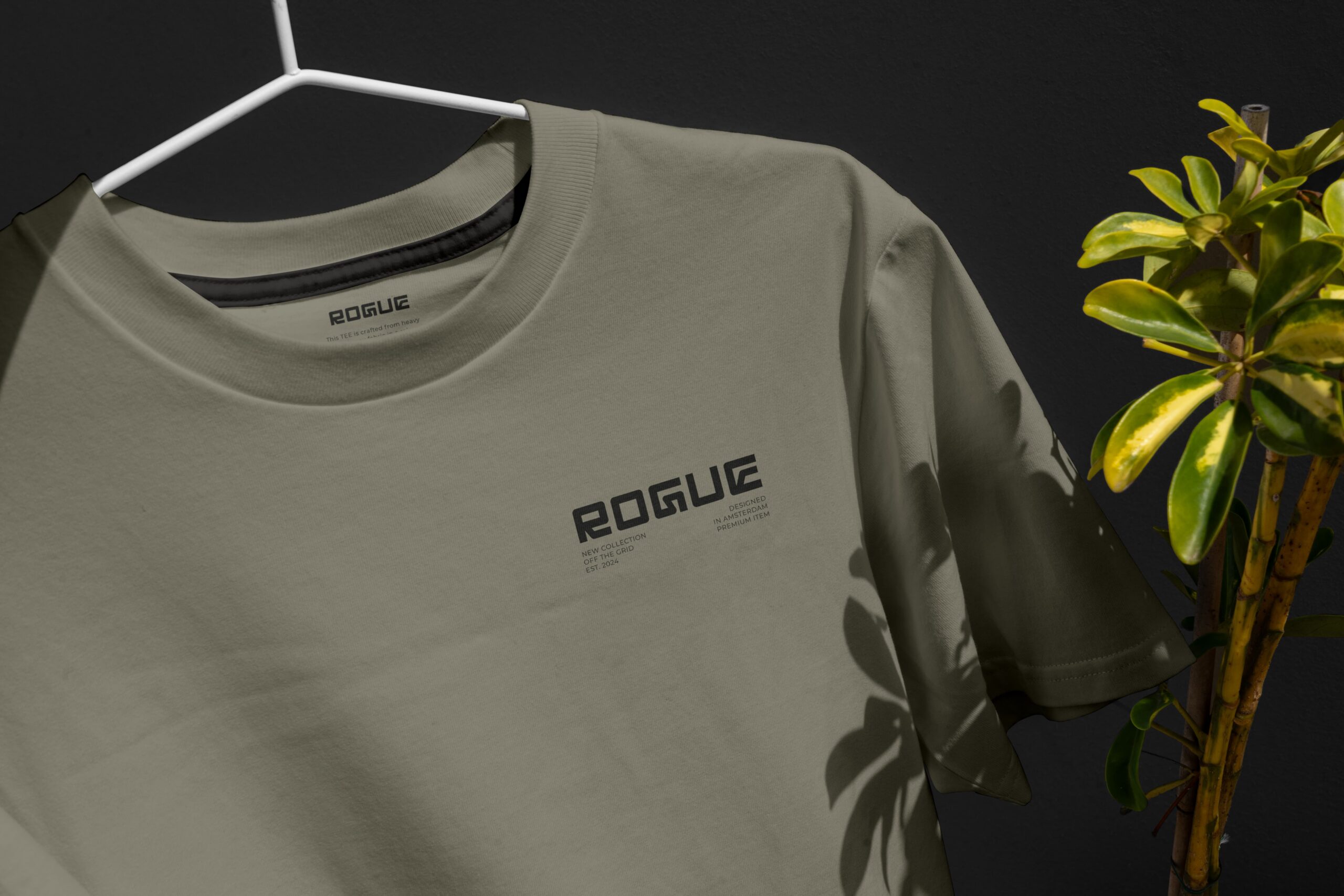
- Logo-design
- Color palette & typography
- Design Language
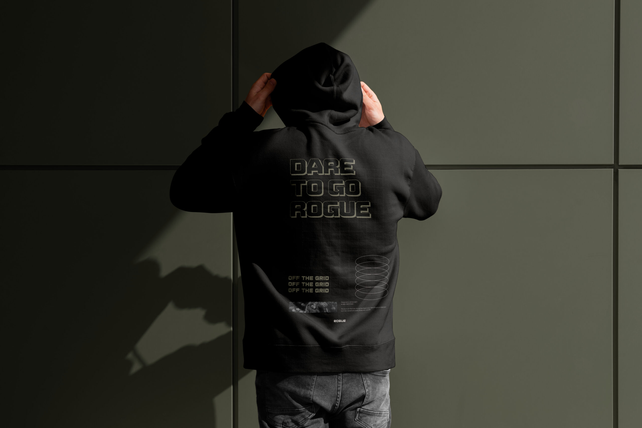
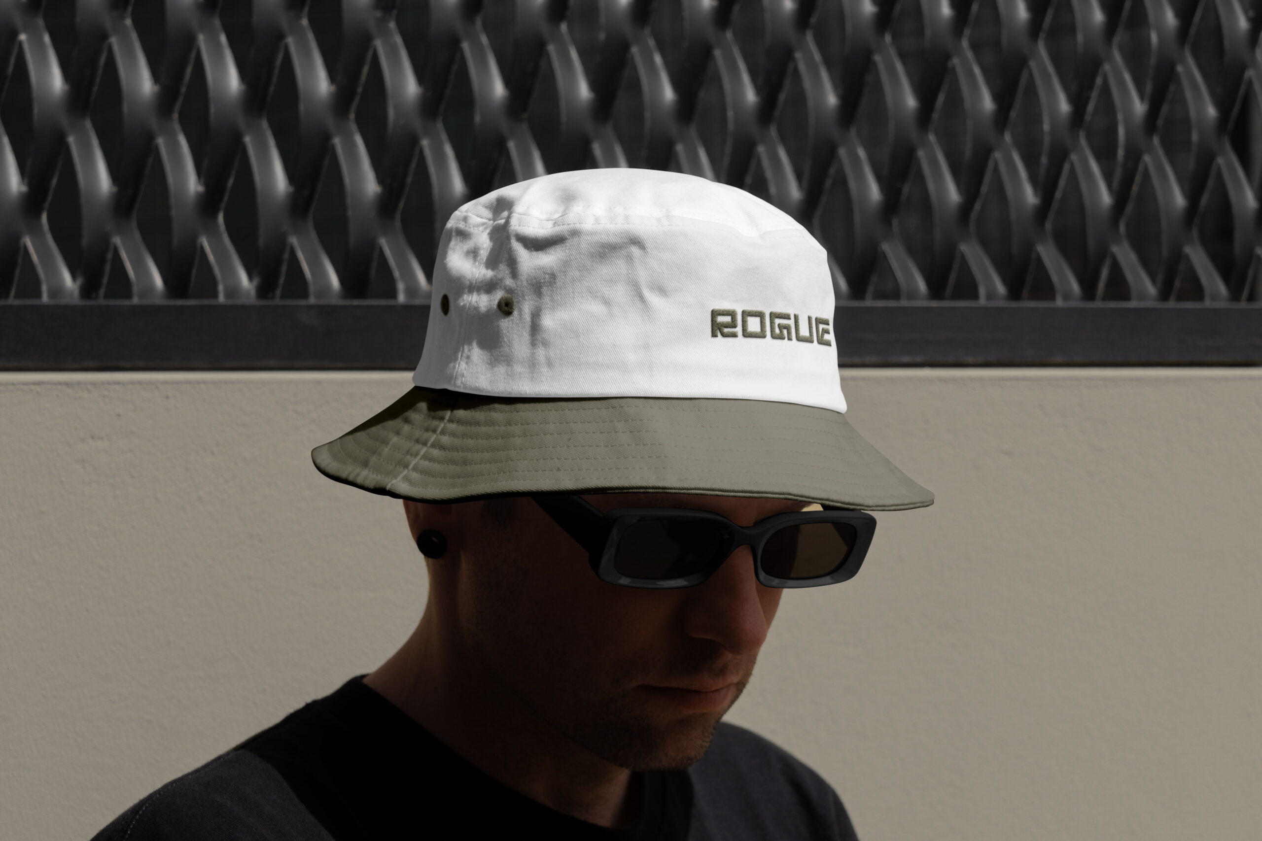
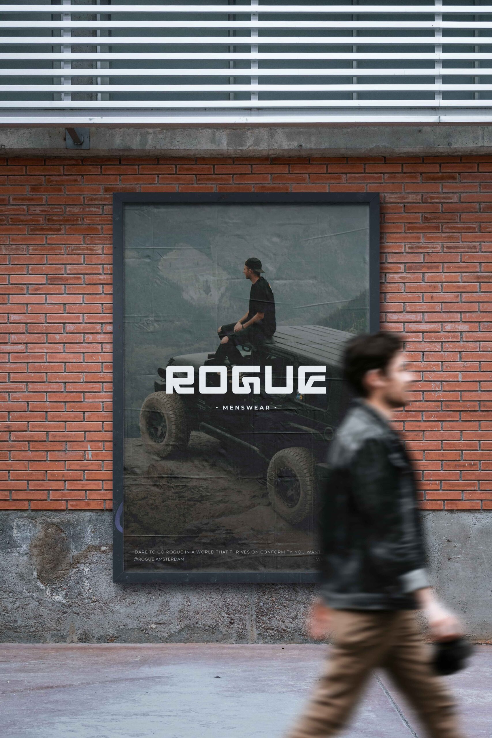
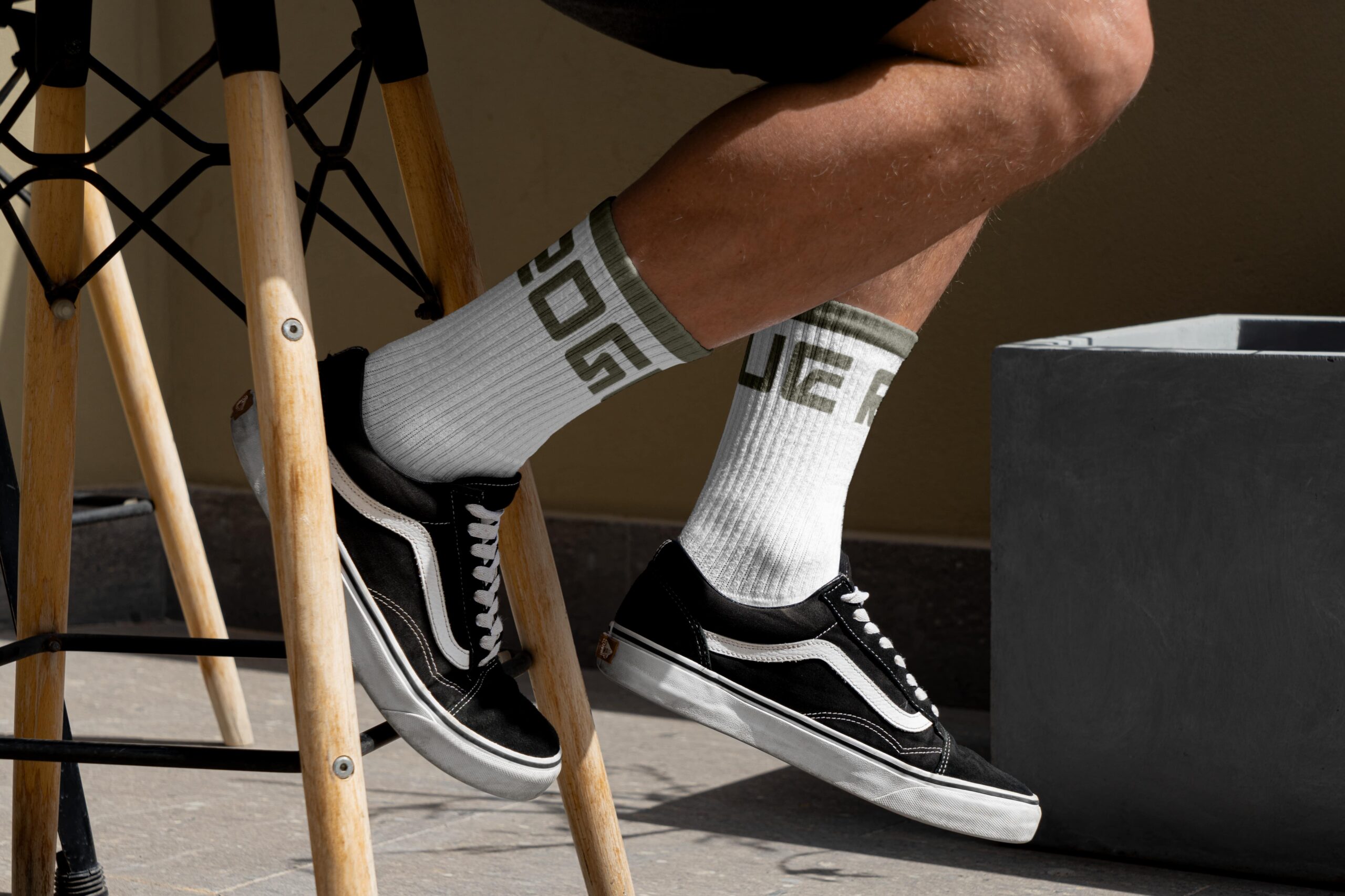
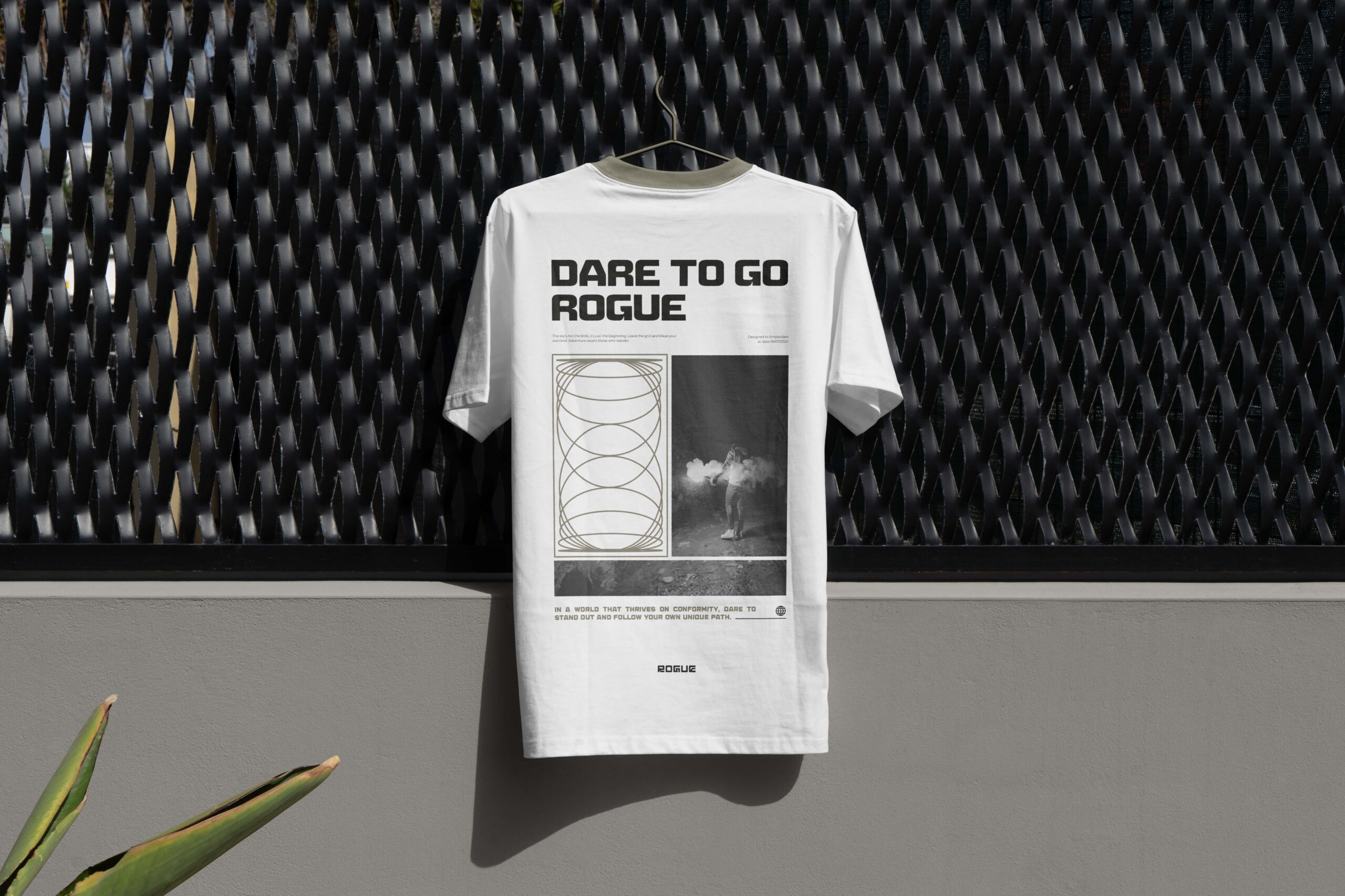
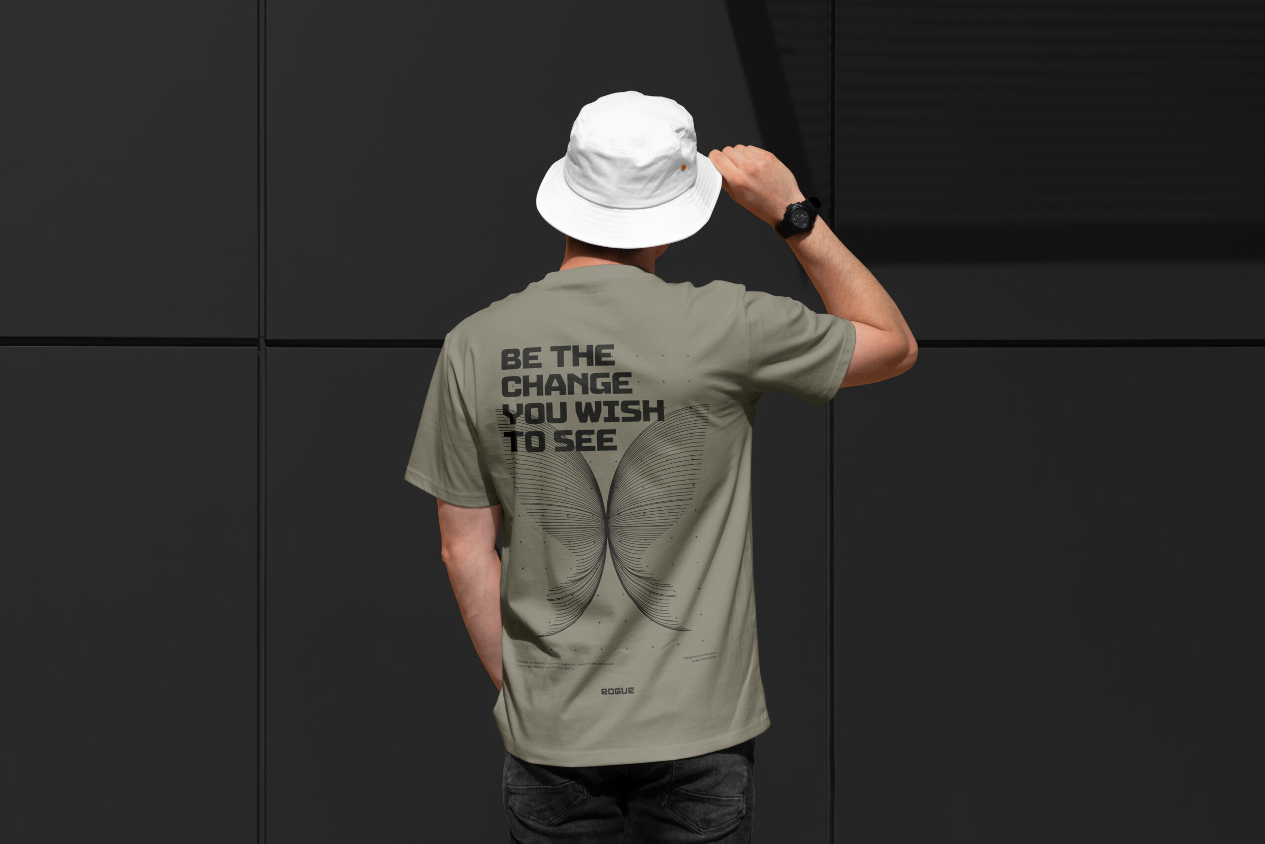
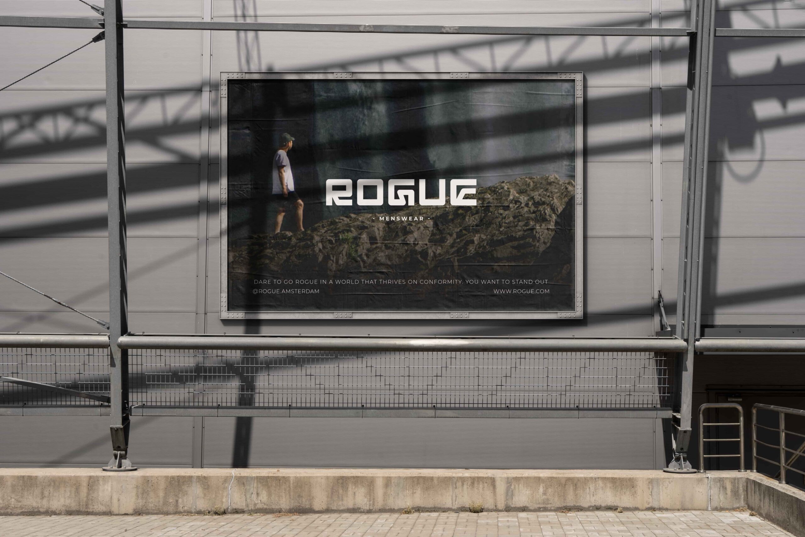
- Campaign material
- Social media templates
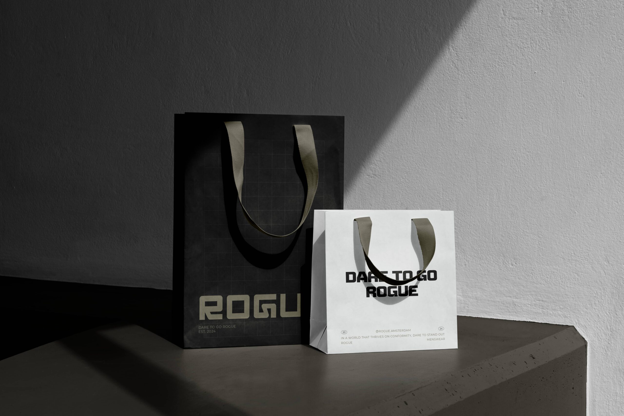
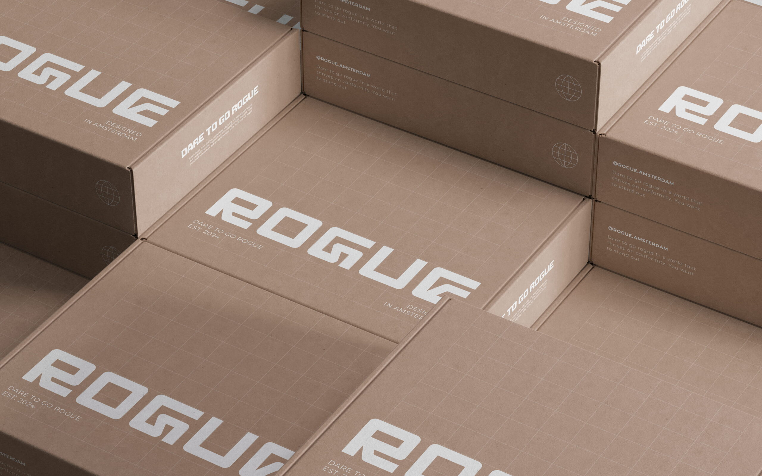
- Packaging & labels
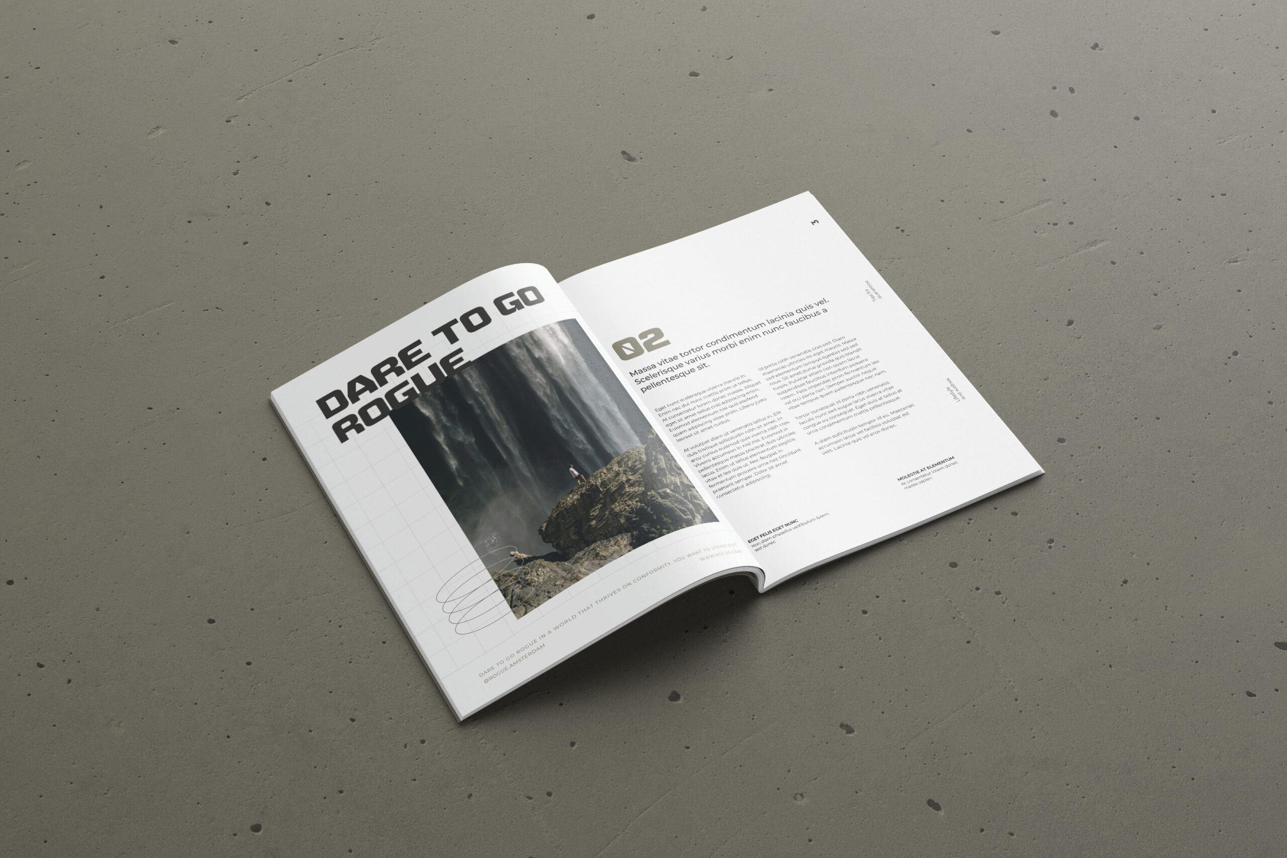
- Magazine
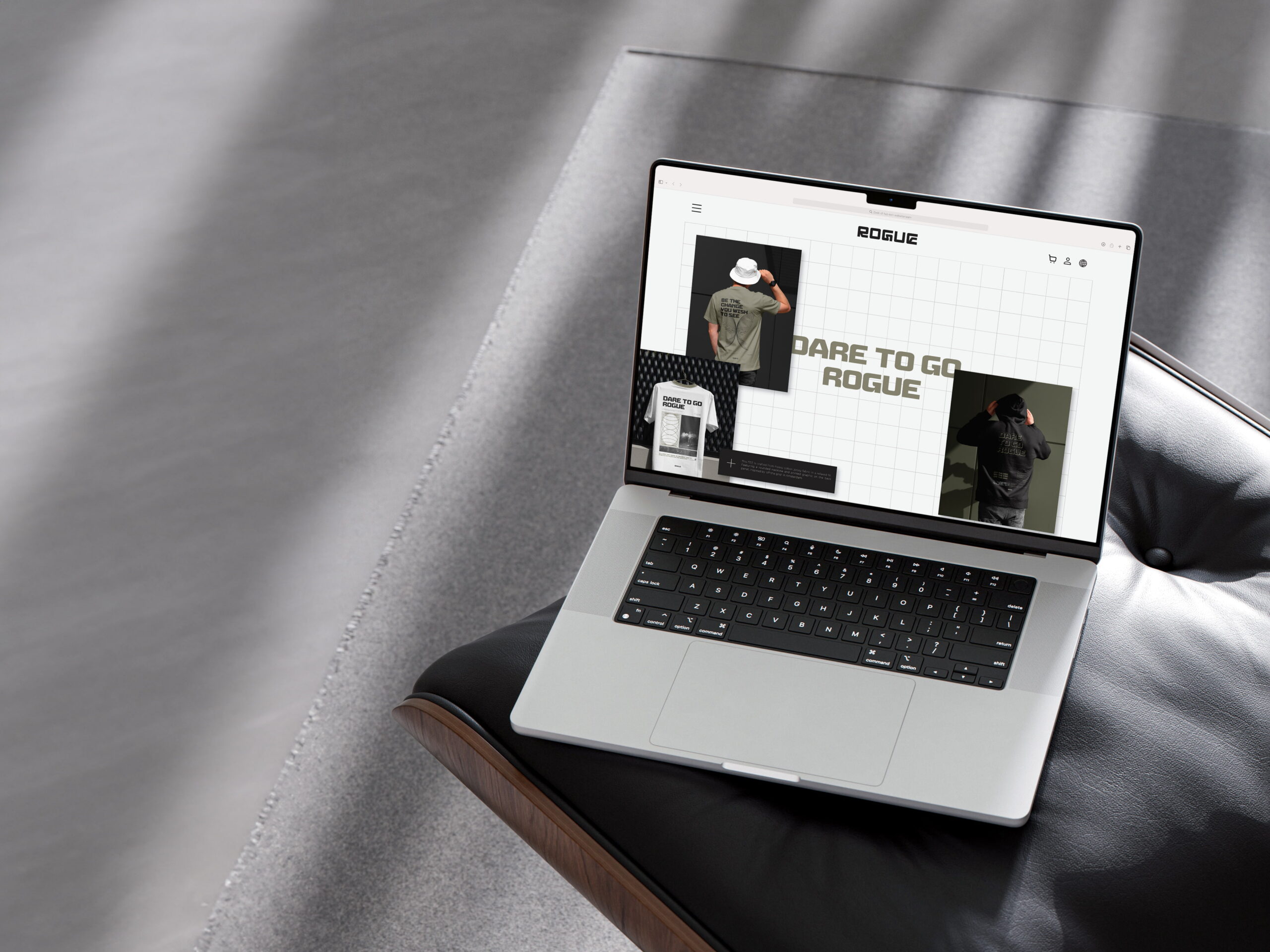
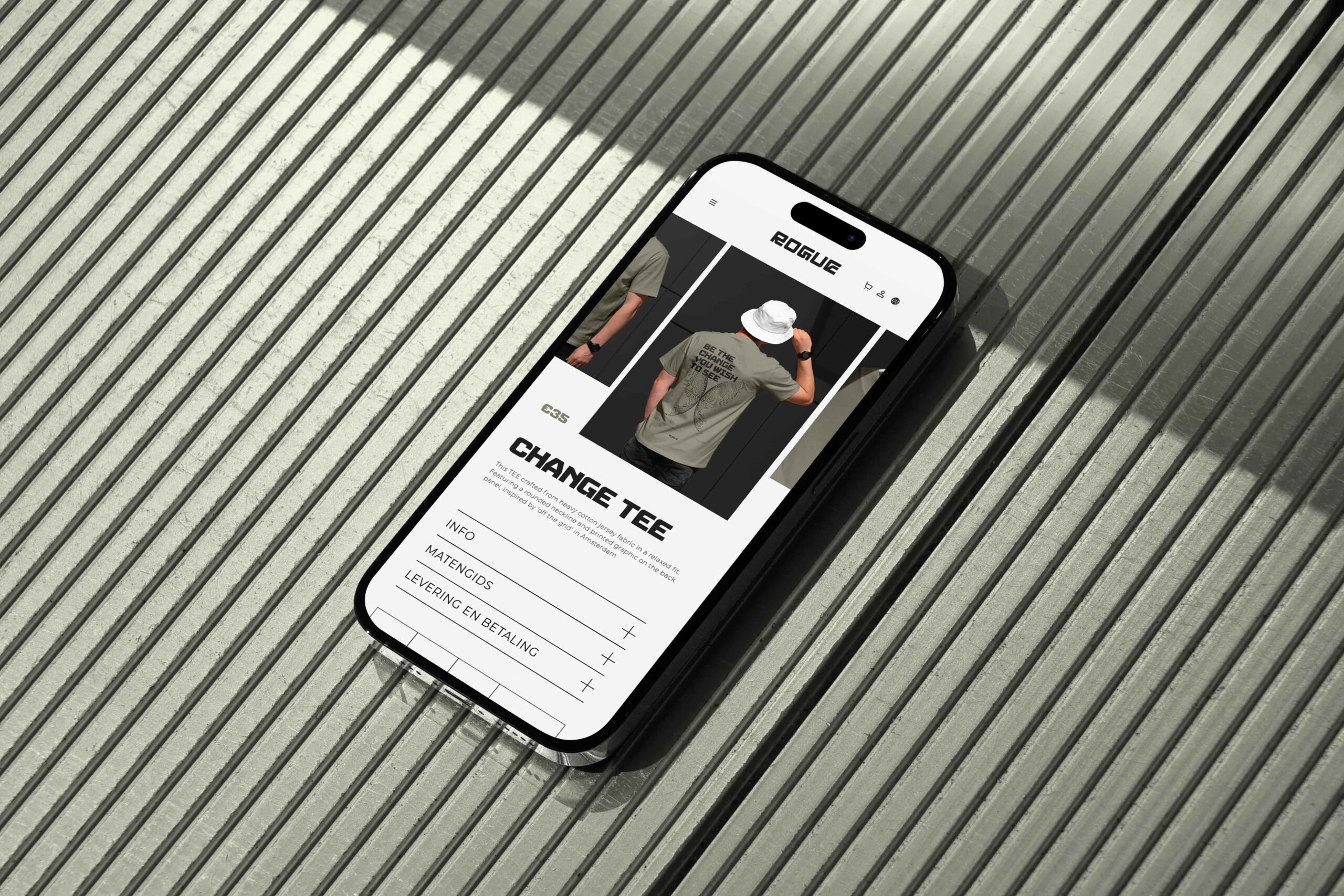
- Website (concept)
Client
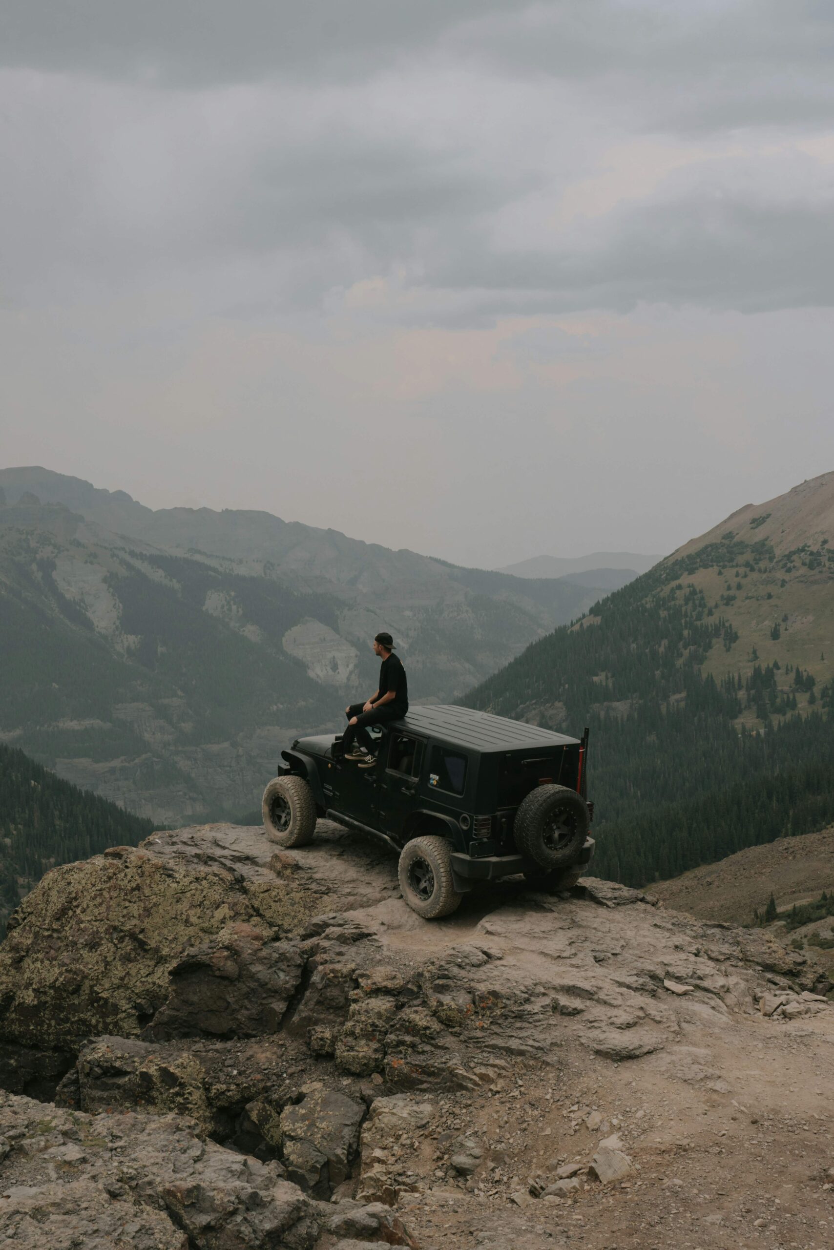
Rogue is a streetwear brand built on individuality. Its audience consists of young people who feel at home in a world of discovery and adventure. For them, clothing is more than style, it’s a statement. Rogue asked for a visual identity that radiates strength and independence.
Challenge
How do you create a brand style that feels tough and outspoken without falling into clichés? At the same time, the style needed to be recognizable and versatile, across clothing labels, packaging, and social media. The challenge was to develop a visual language that feels raw and adventurous, yet remains unique and future-proof.