Delivered products
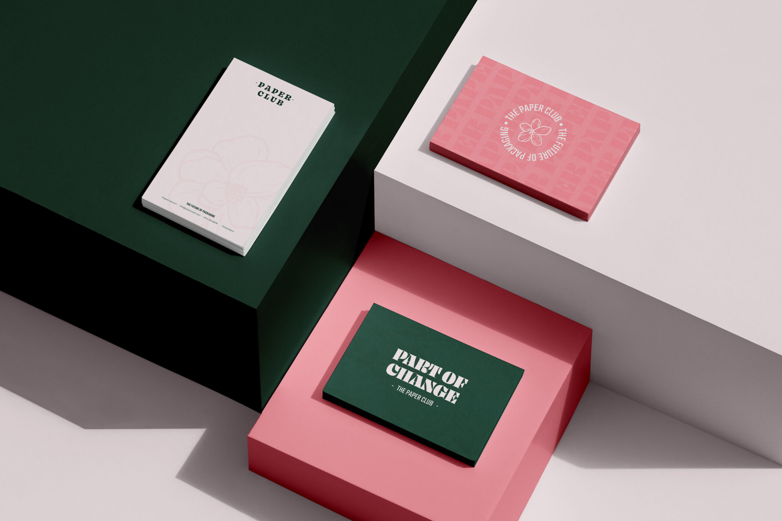
- Brand strategy
- Logo design
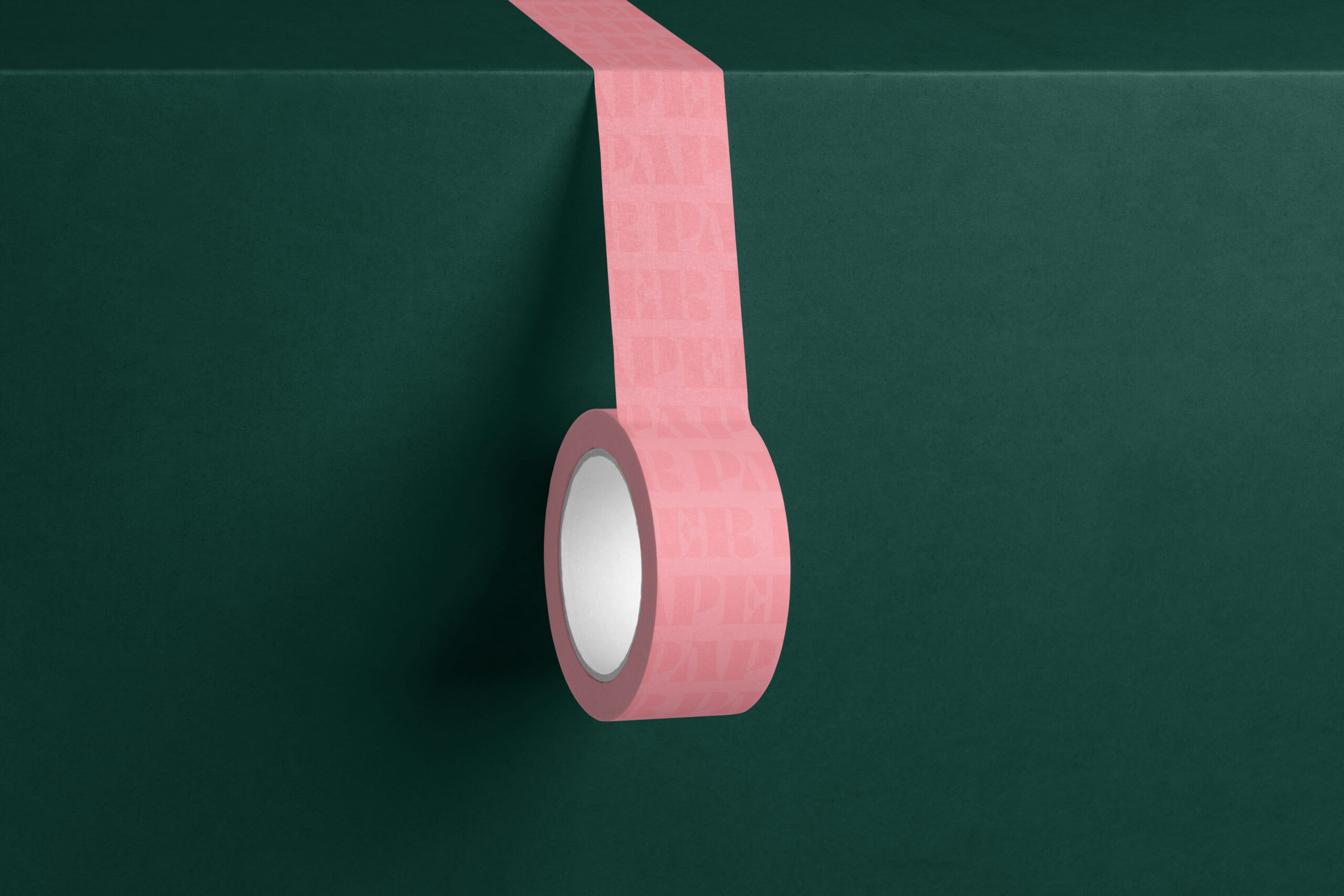
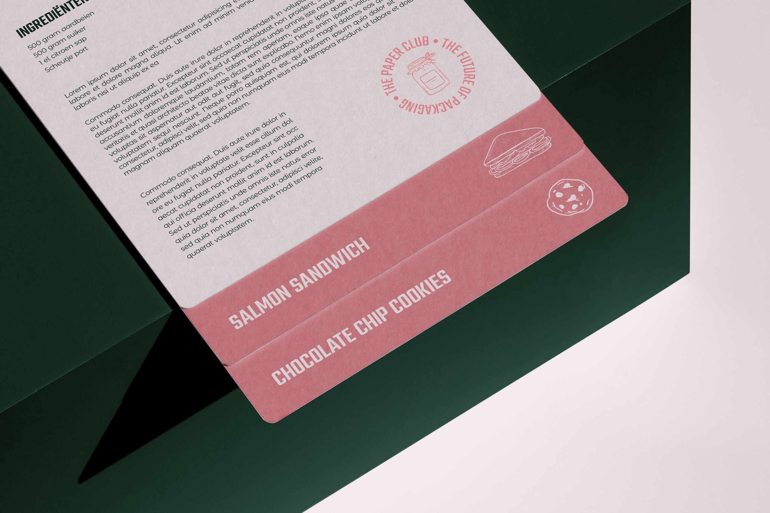
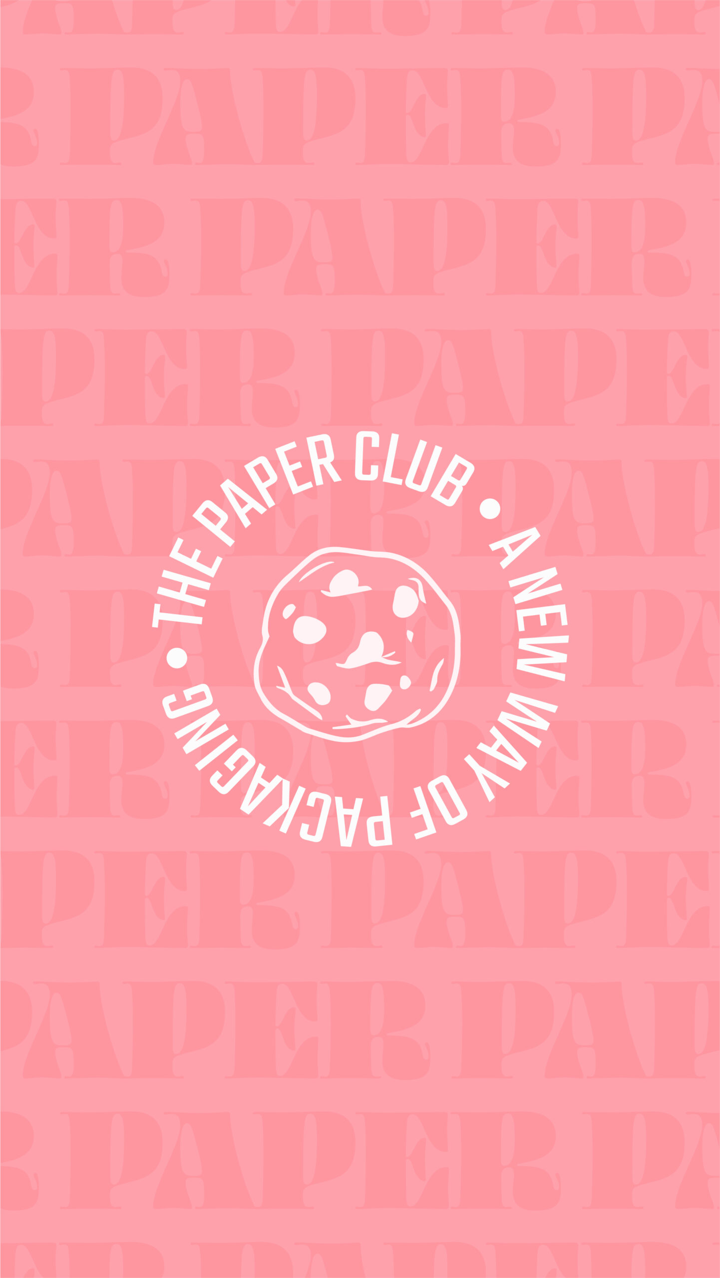
- Color palette & typography
- Design Language
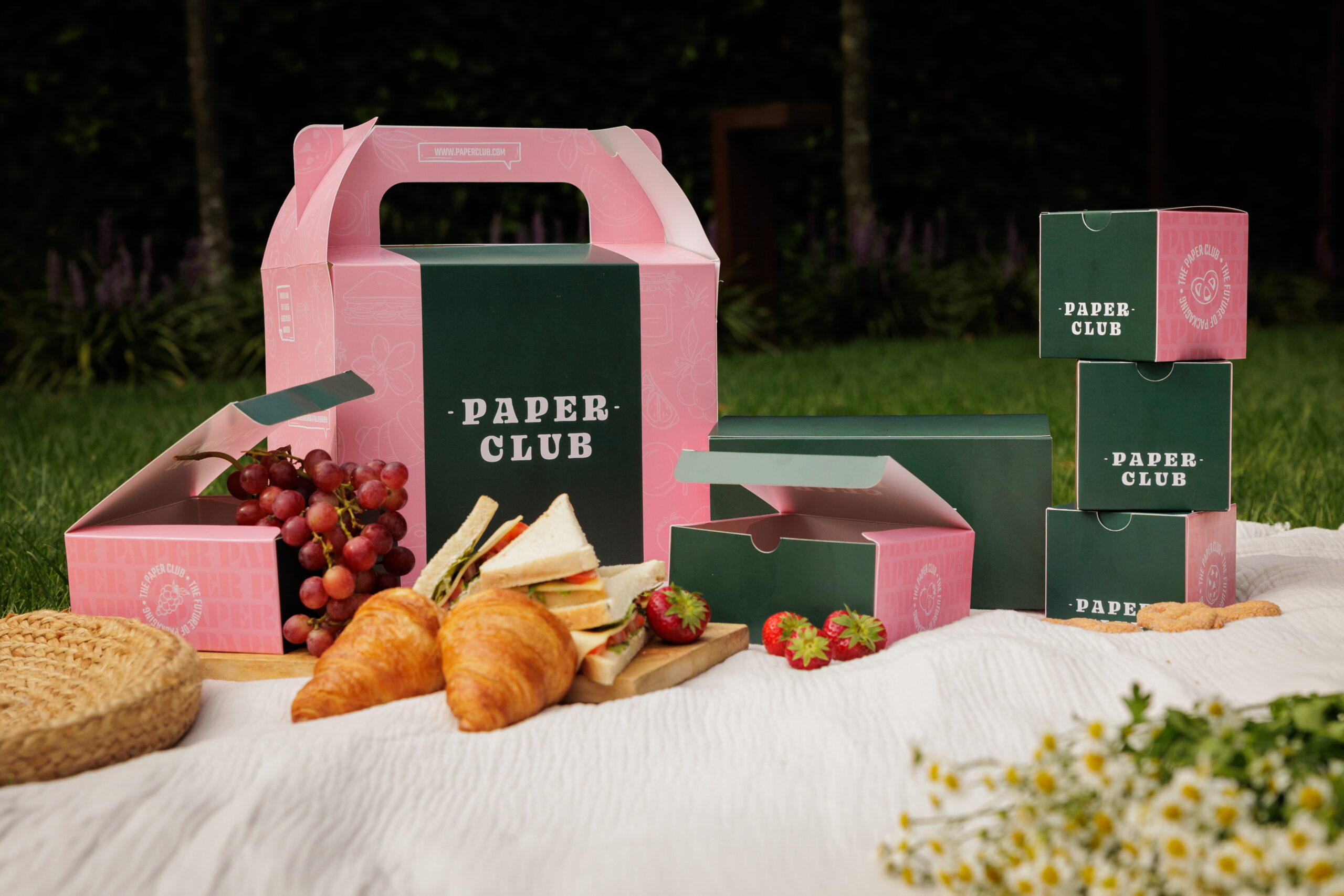
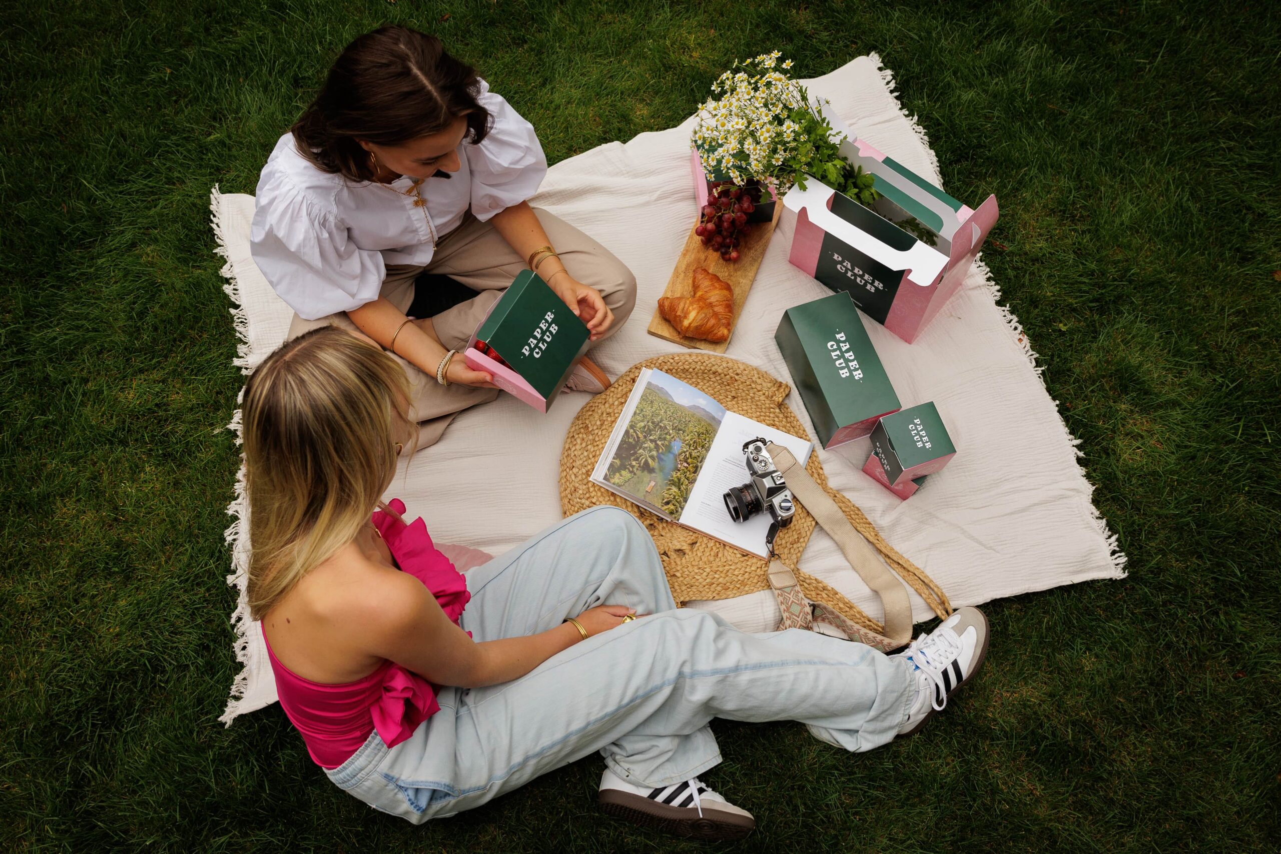
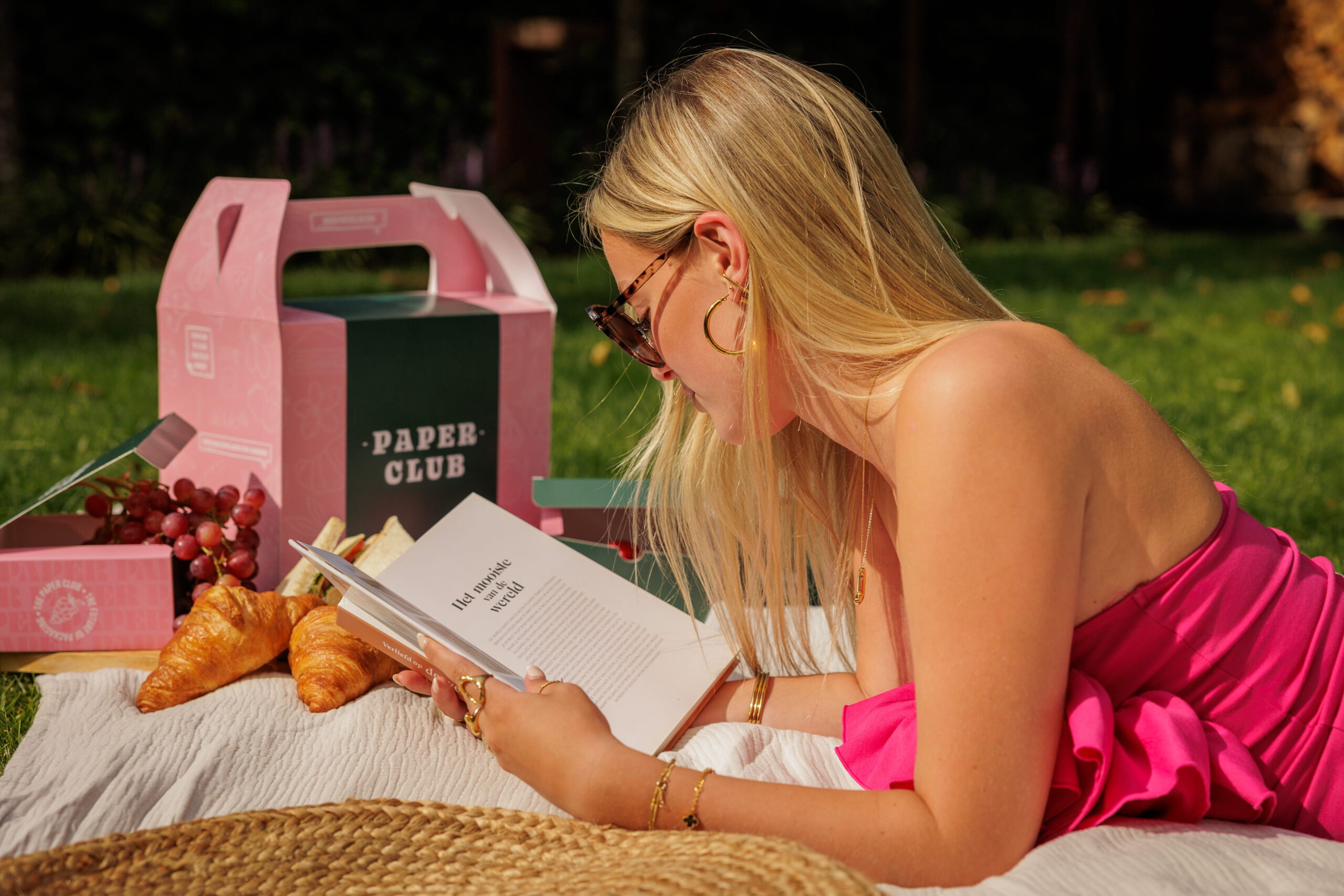
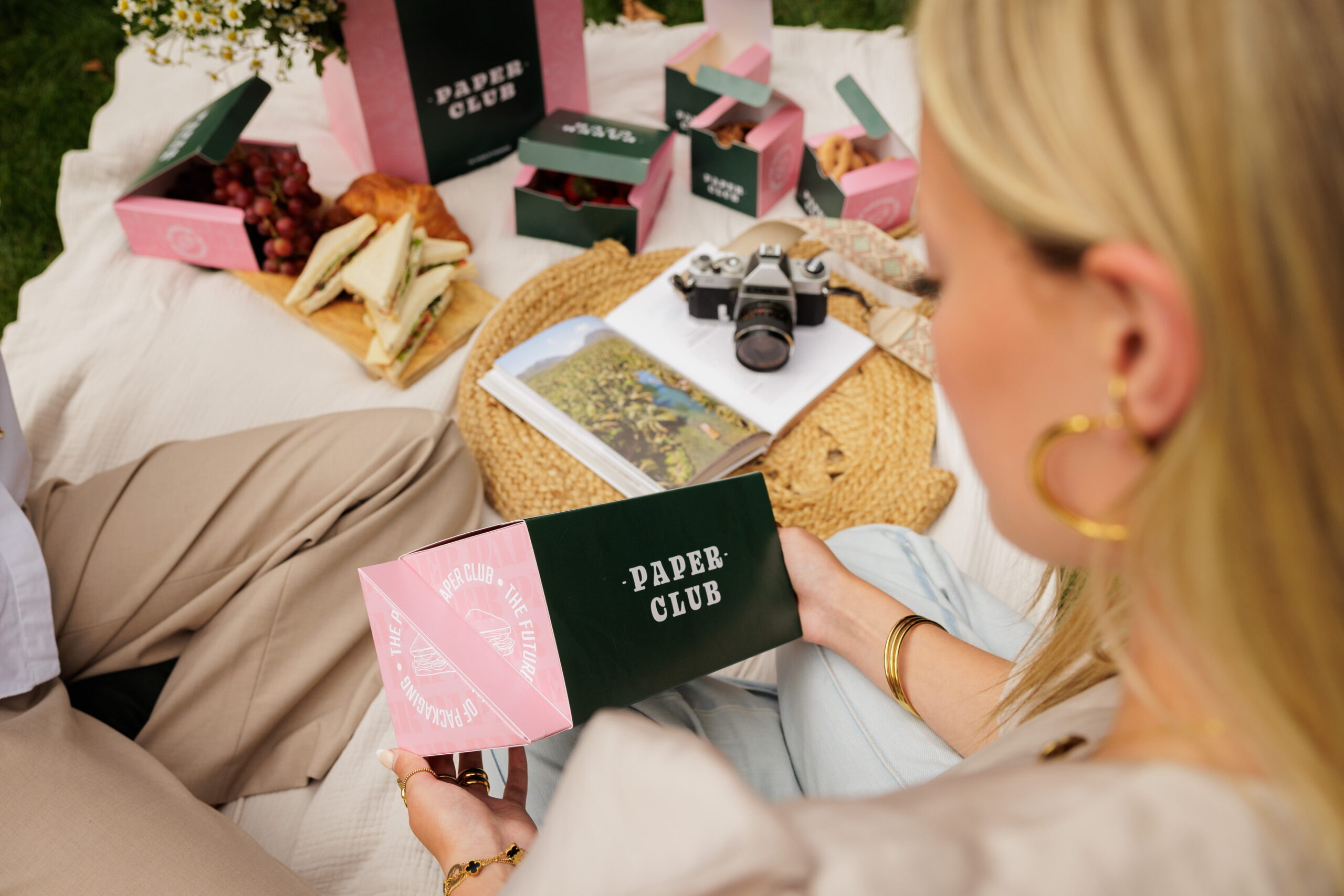
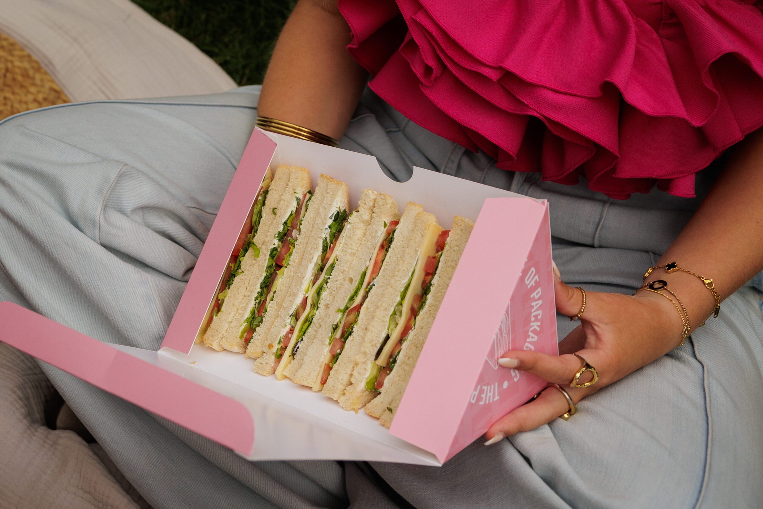
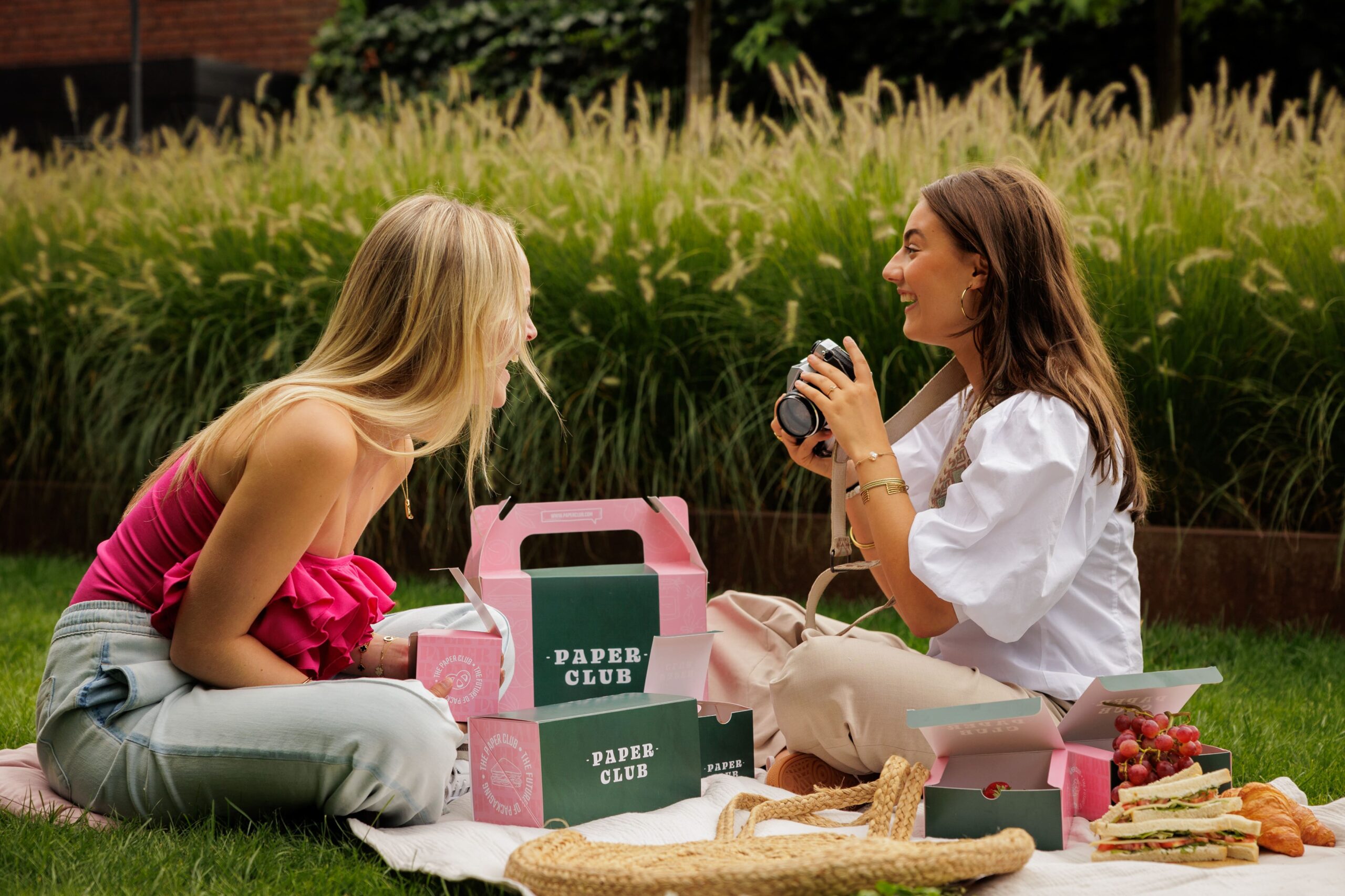
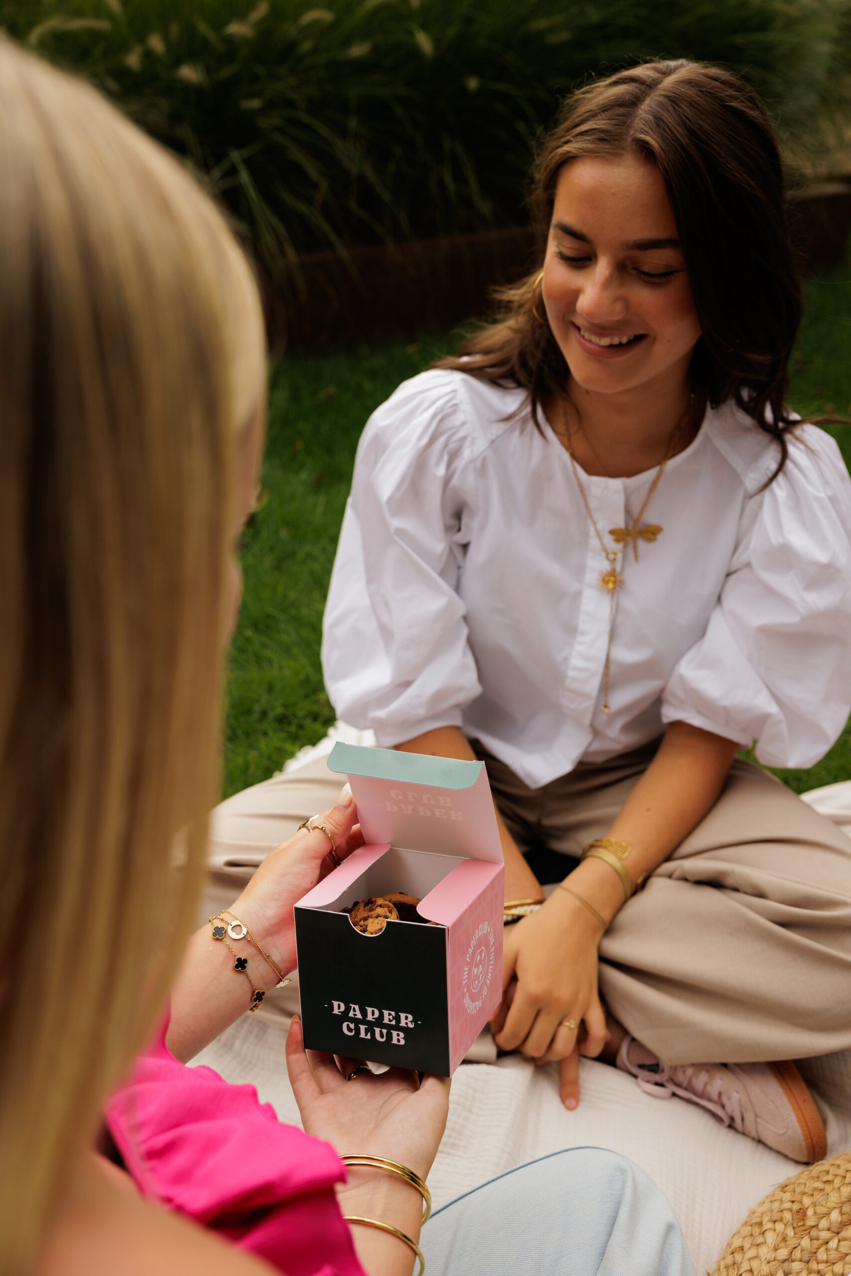
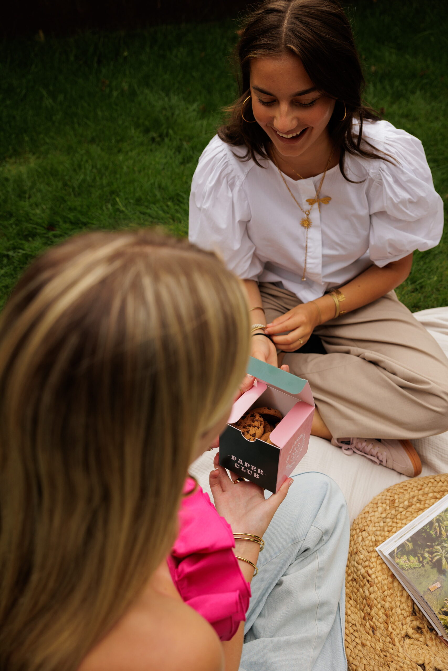
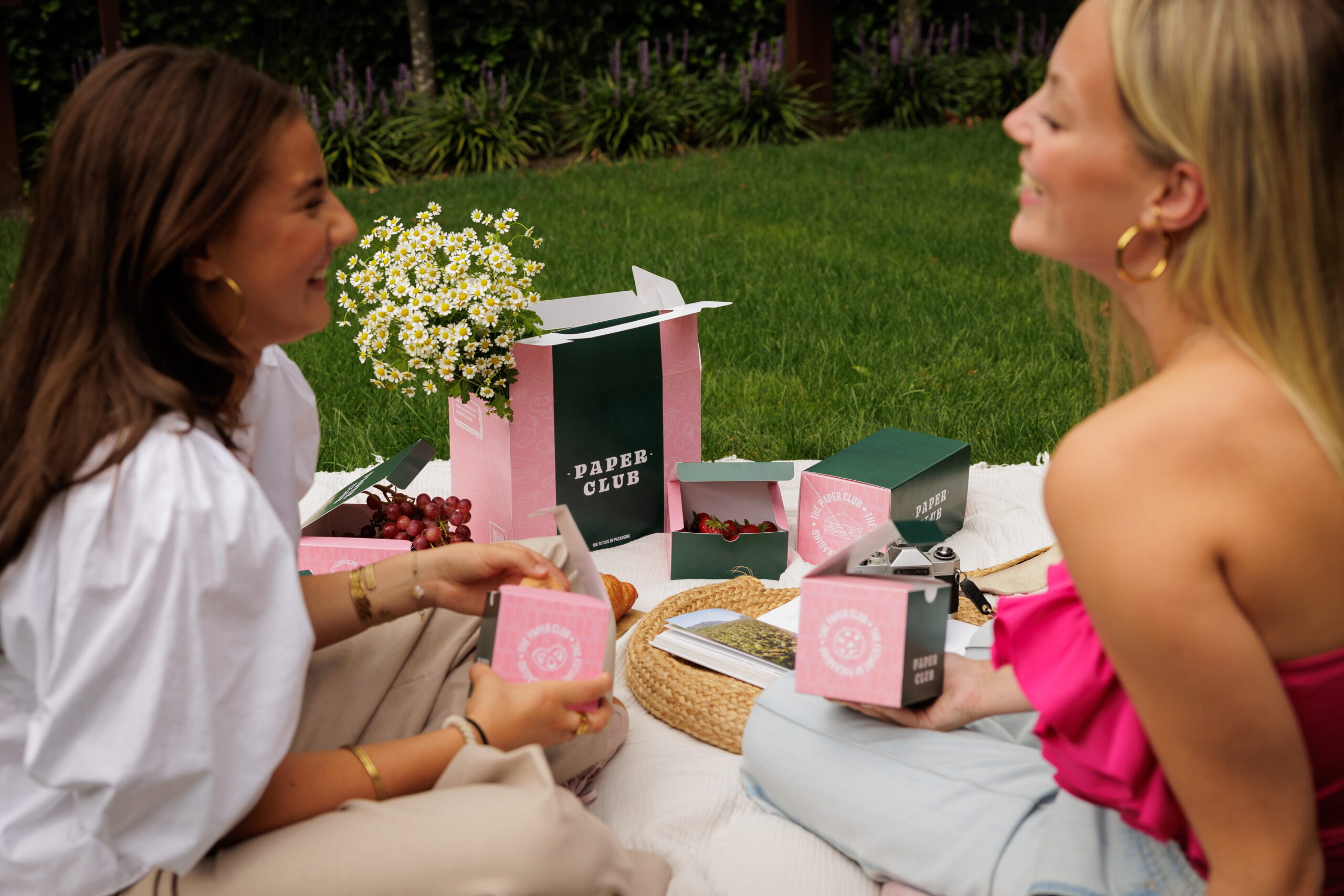
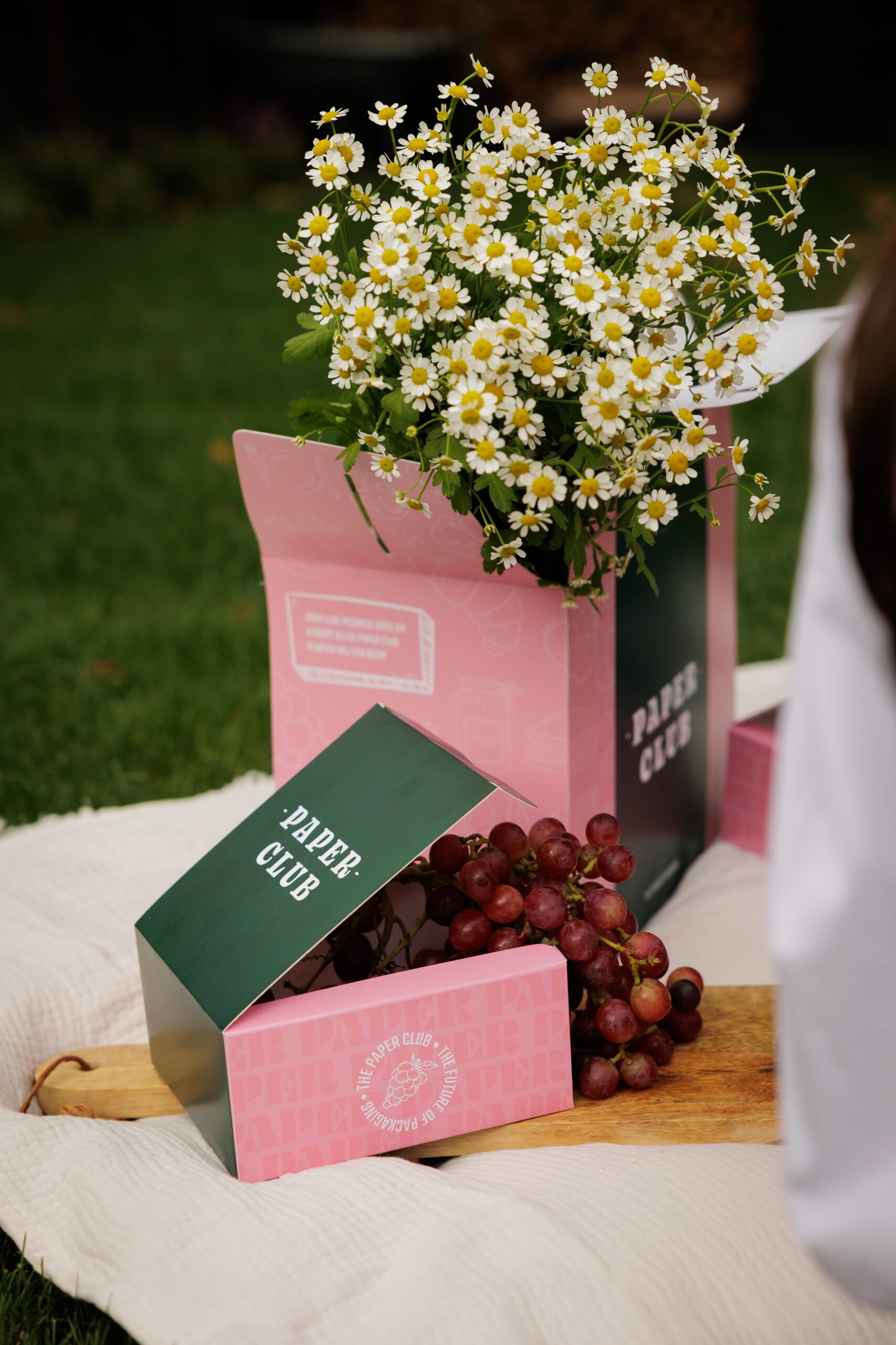
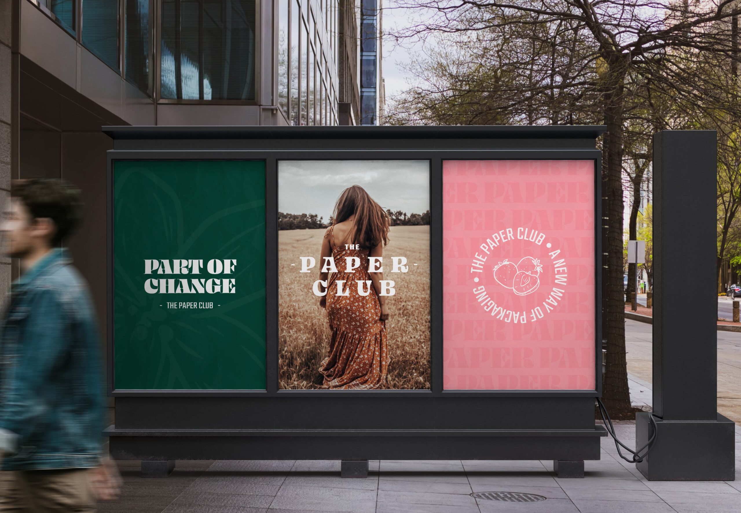
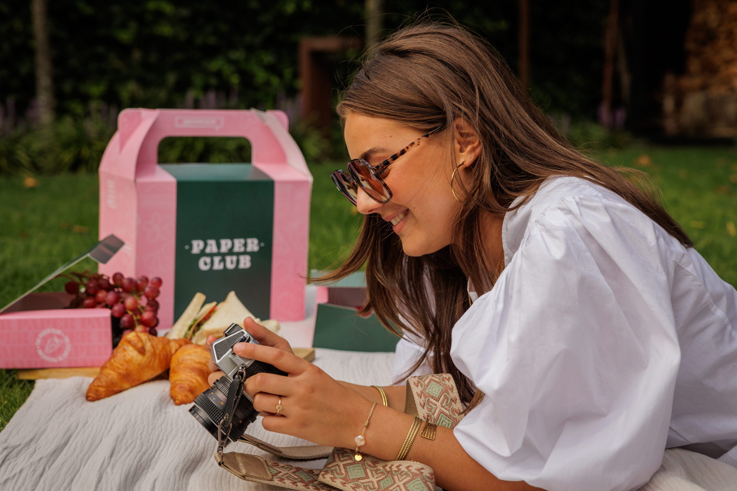
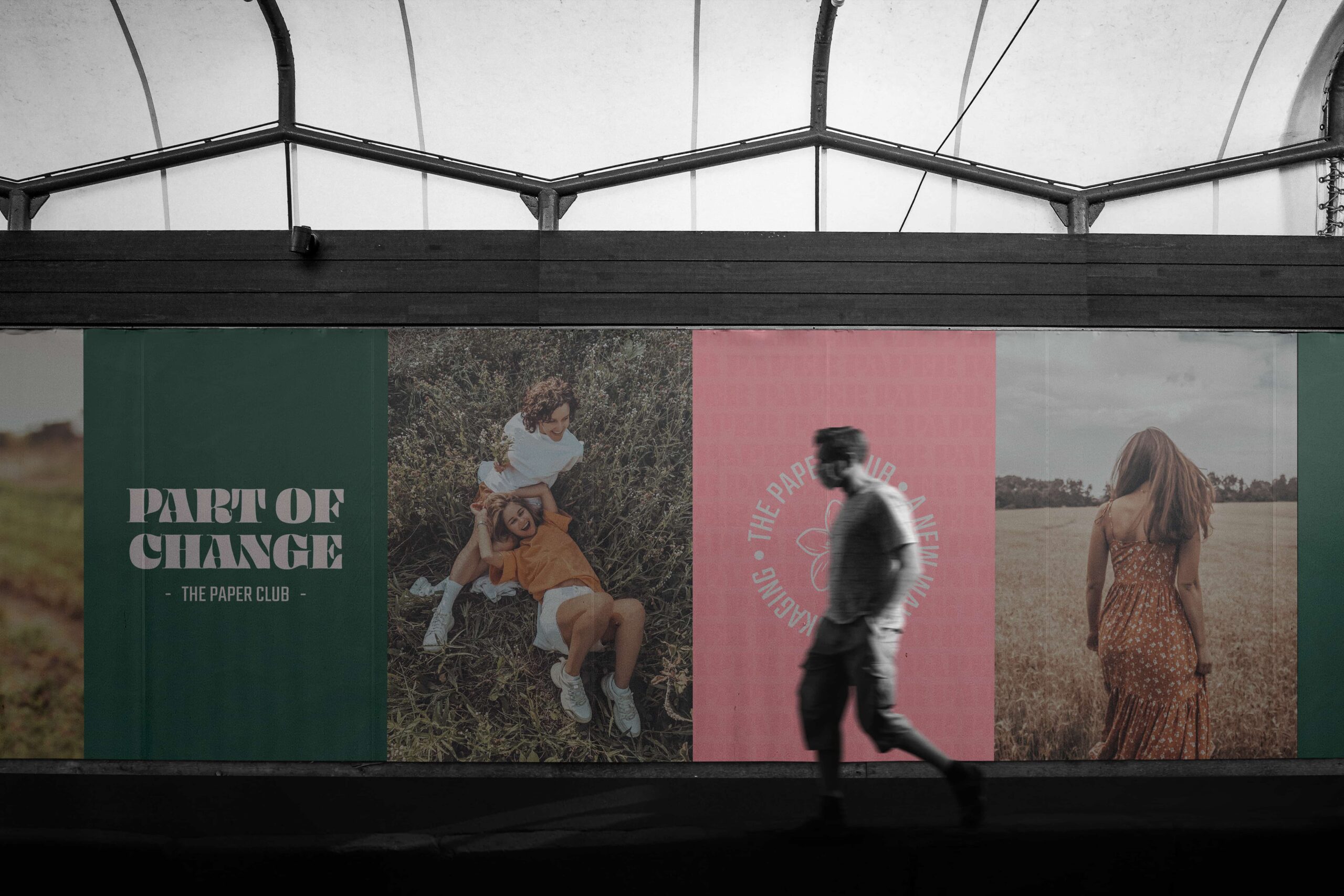
- Packaging design
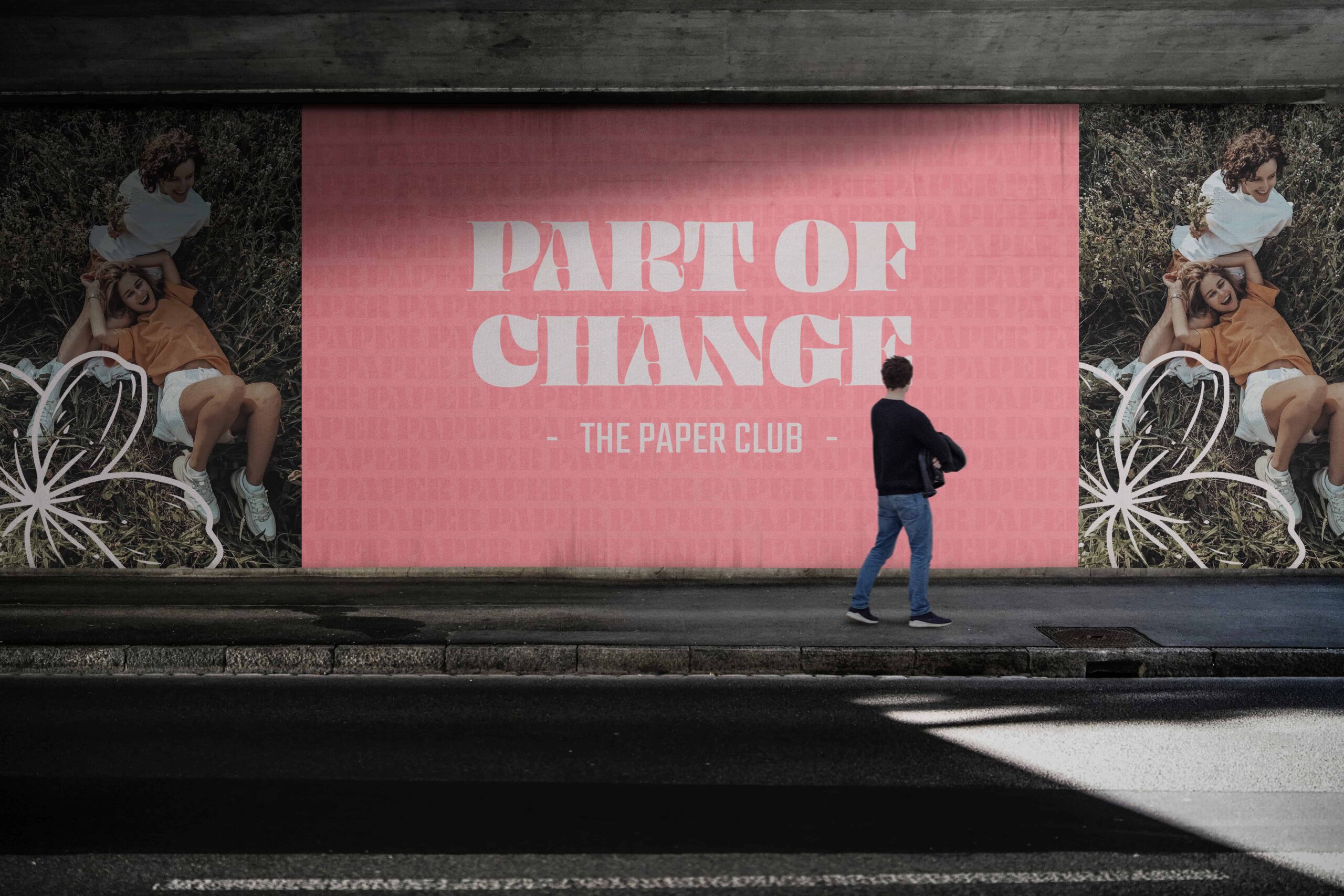
- Campaign materials
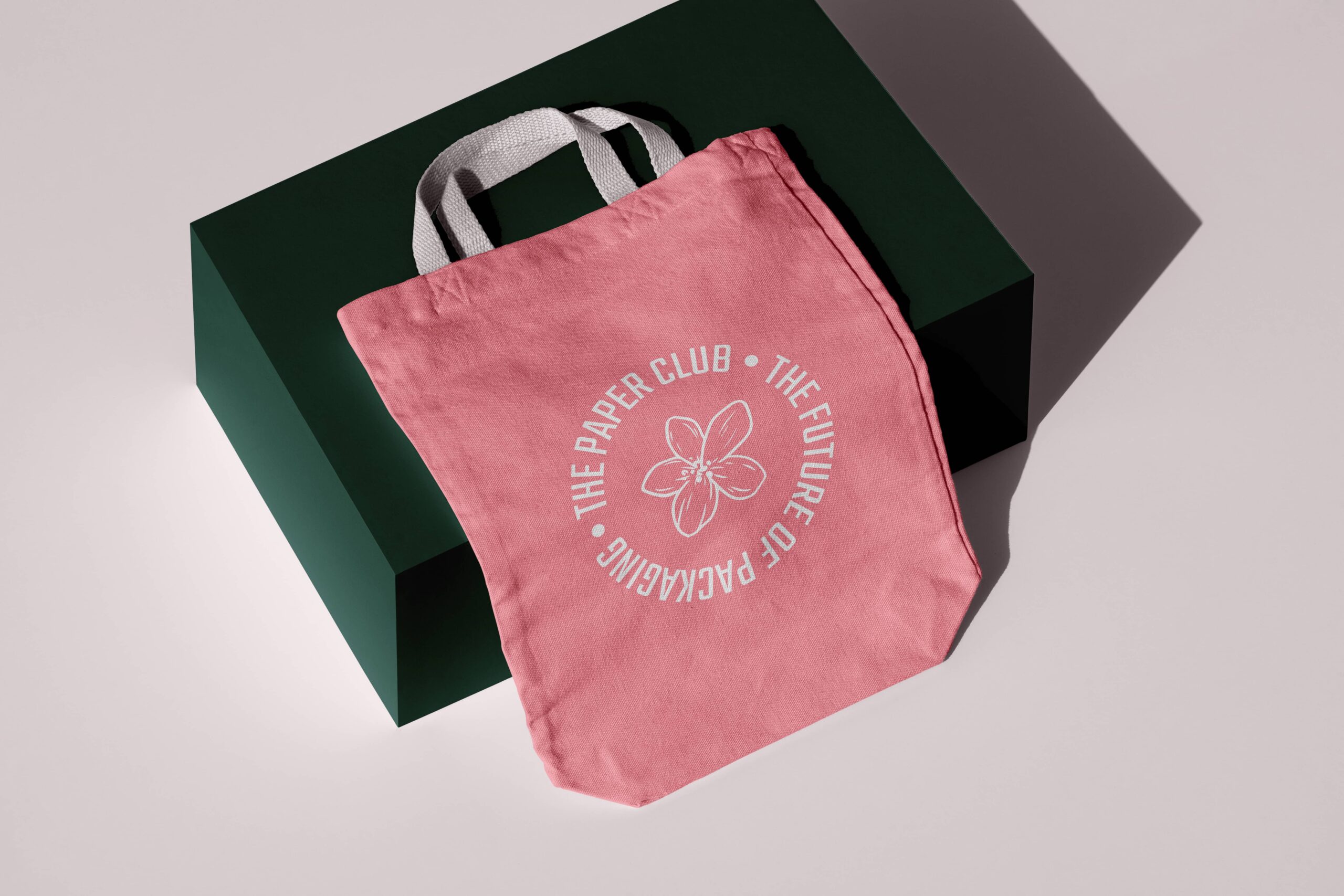
- Merchandise & tote bags
- Social media templates
Client
Paper Club wanted to showcase the versatility of paper packaging and link it to the joy of eating, sharing, and spending time together. This concept created space to connect sustainability with fun and accessibility. The outcome needed to prove that eco-friendly choices aren’t boring, but actually enhance the experience.
Challenge
The challenge was to present paper, an everyday material, in a surprising way. How do you make consumers see that paper packaging is not only functional, but also attractive and inspiring? Paper Club asked for an identity that was both educational and inviting, with a look and feel that resonates with young, eco-conscious consumers.