Automation with a Human Touch
Madeworkers
about the project
Delivered products
- Logo-design
- Color palette & typography
- Design Language
- Business cards
- Stationery
- Website
- Presentation templates
- Social media templates
Client
Madeworkers is an AI tool that automates repetitive financial administration. The company targets entrepreneurs and organizations seeking greater efficiency without losing control. Since AI can often be perceived as cold and distant, Madeworkers wanted a brand identity that communicates trust, humanity, and clarity. The identity needed to highlight both the innovative technology and the user-friendliness of the platform.
Challenge
The challenge was to balance the technical power of the tool with customers’ need for simplicity and trust. How do you create a brand that looks professional and future-oriented, yet warm and approachable at the same time? Madeworkers asked for a visual style that makes complex technology easy to understand, without compromising on reliability or credibility.
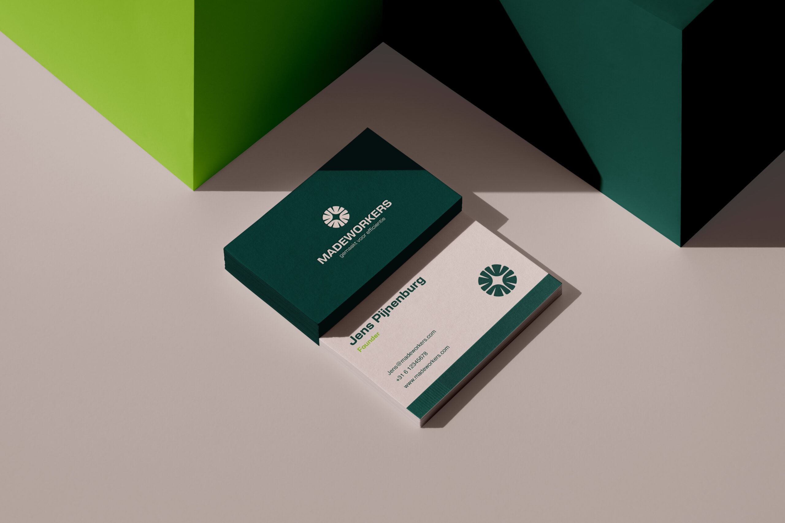
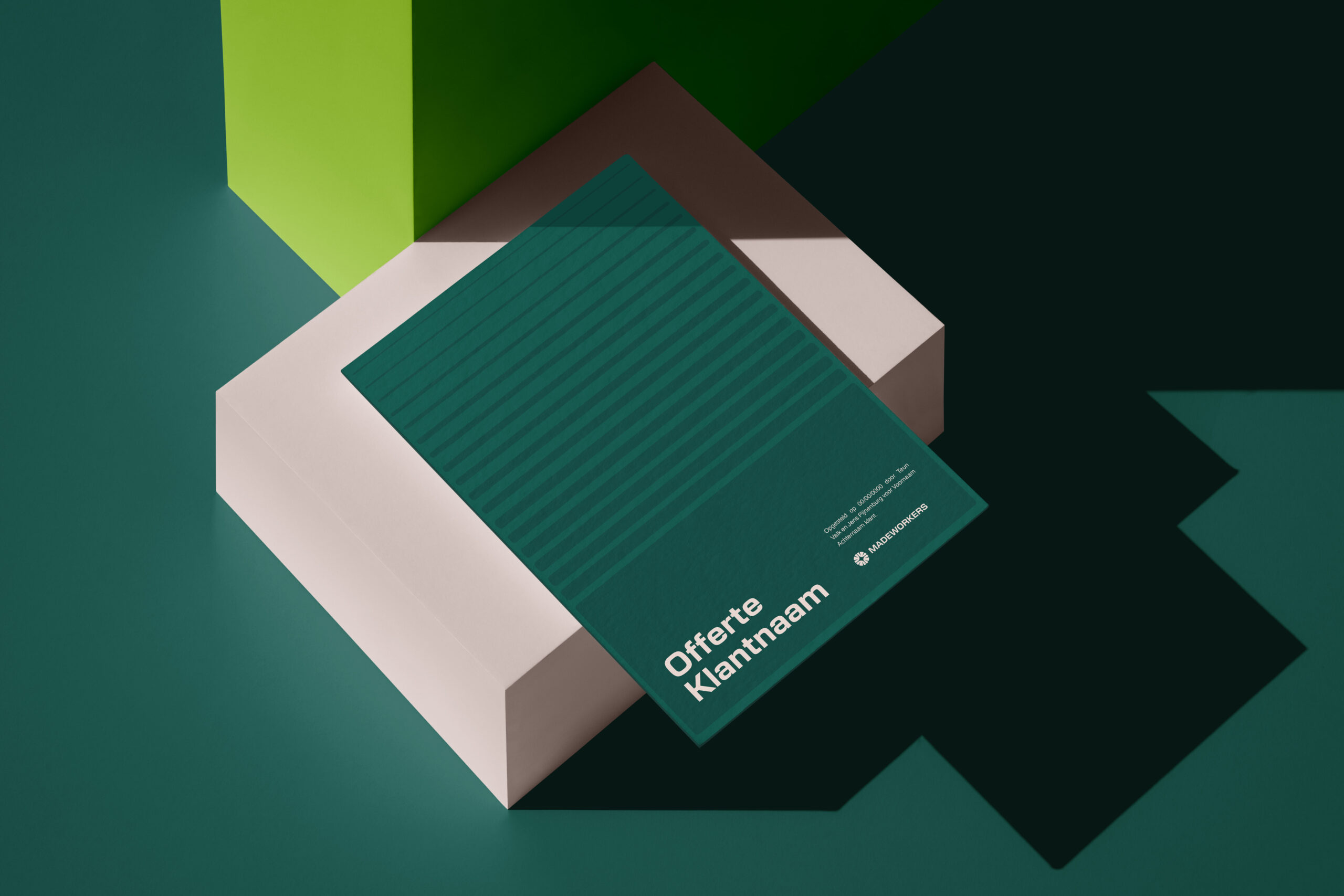
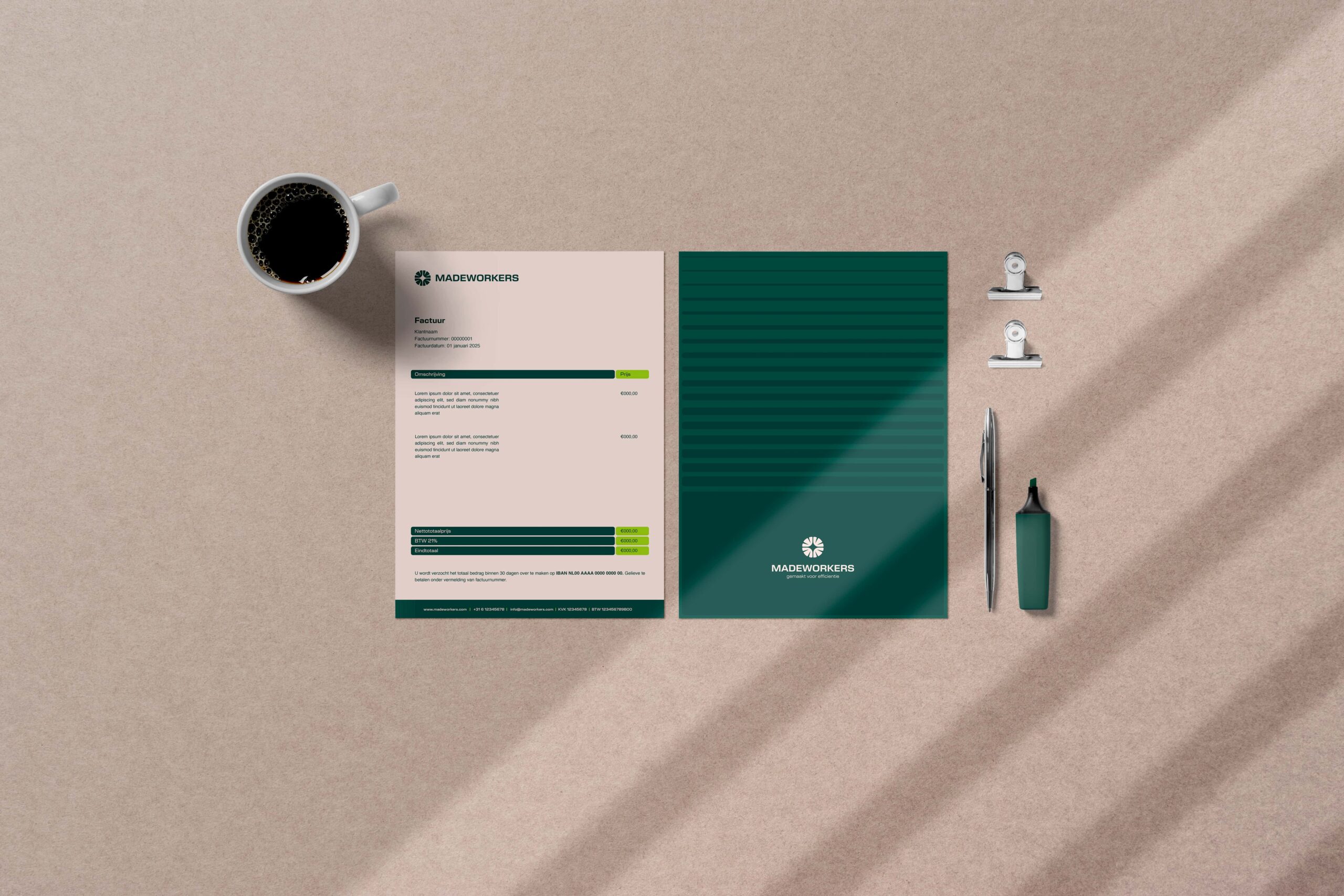
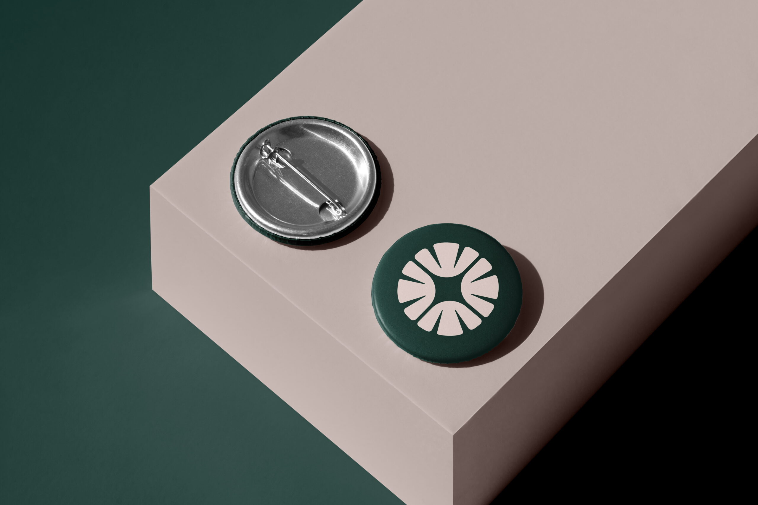
The logo takes shape from a circle a subtle reference to the world of AI and automation. Inside, the letters M and W form the foundation of the mark, creating a small star at the center symbolizes clarity and purpose. It captures what Madeworkers stands for: technology that empowers people rather than replaces them.
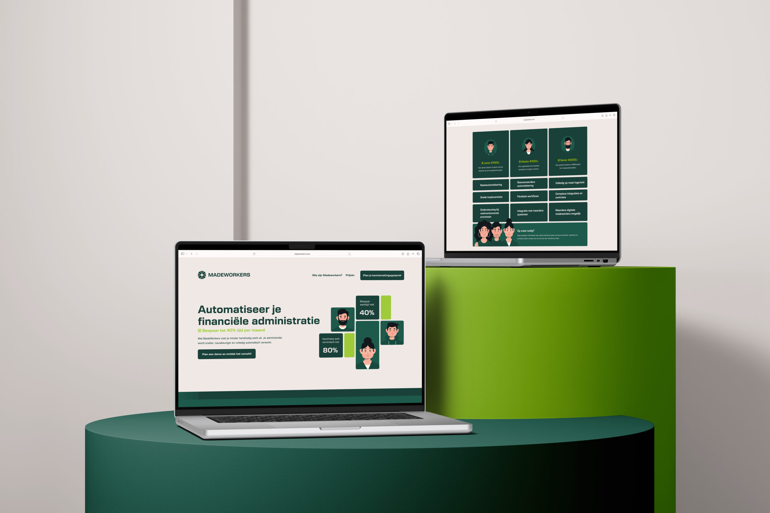
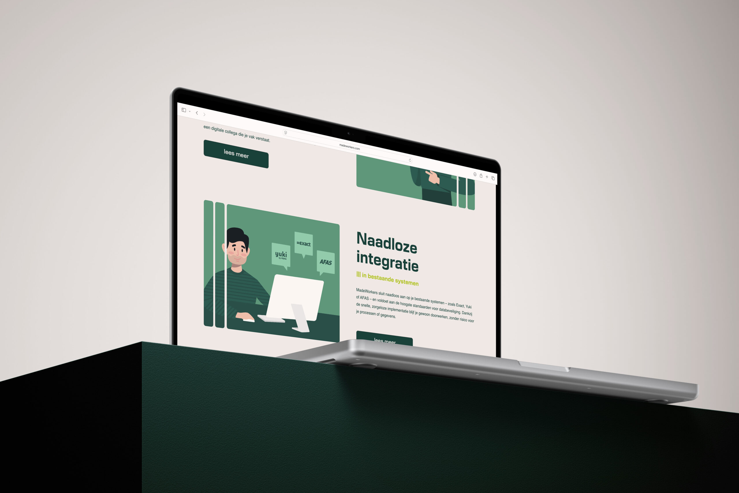


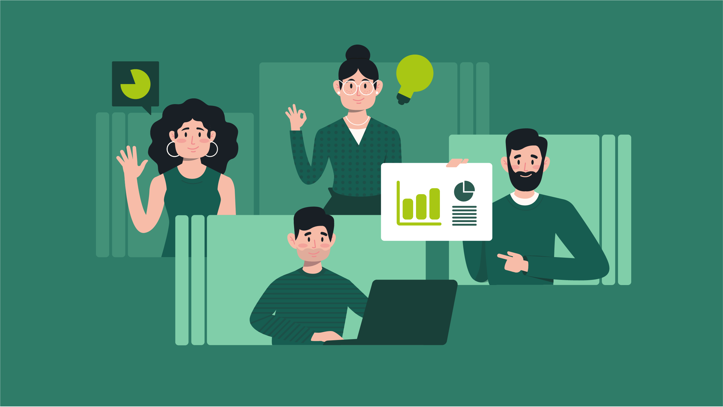
To make the technology more approachable, we created a series of illustrated digital characters, the “Madeworkers” themselves. They embody the human side of innovation: friendly, dependable, and easy to relate to. Through them, the brand feels less like a tool and more like a trusted partner.
To make the technology more approachable, we created a series of illustrated digital characters, the “Madeworkers” themselves. They embody the human side of innovation: friendly, dependable, and easy to relate to. Through them, the brand feels less like a tool and more like a trusted partner.


Brands built on big ideas
Next project
Join our community!
Sign up for our newsletter
Building a strong brand starts with inspiration. With our newsletter, you’ll receive that inspiration right when you need it, in your inbox. At Fraaij Makers, we believe a brand isn’t built in a day. It’s a process of building, adjusting, and continuous learning. Our newsletter is your reminder to pause and reflect on your brand. It offers insights, tips, and ideas to help your brand keep growing.
Automation with a Human Touch
Madeworkers
about the project
Delivered products
- Logo-design
- Color palette & typography
- Design Language
- Business cards
- Stationery
- Website
- Presentation templates
- Social media templates
Client
Madeworkers is an AI tool that automates repetitive financial administration. The company targets entrepreneurs and organizations seeking greater efficiency without losing control. Since AI can often be perceived as cold and distant, Madeworkers wanted a brand identity that communicates trust, humanity, and clarity. The identity needed to highlight both the innovative technology and the user-friendliness of the platform.
Challenge
The challenge was to balance the technical power of the tool with customers’ need for simplicity and trust. How do you create a brand that looks professional and future-oriented, yet warm and approachable at the same time? Madeworkers asked for a visual style that makes complex technology easy to understand, without compromising on reliability or credibility.


The logo takes shape from a circle a subtle reference to the world of AI and automation. Inside, the letters M and W form the foundation of the mark, creating a small star at the center symbolizes clarity and purpose. It captures what Madeworkers stands for: technology that empowers people rather than replaces them.


The visual pattern is made up of lines that gradually merge into one continuous form. It reflects the way Madeworkers transforms scattered processes into smooth, efficient systems, bringing order, speed, and connection. This sense of flow runs like a quiet thread through all brand materials, from stationery to presentations.


To make the technology more approachable, we created a series of illustrated digital characters, the “Madeworkers” themselves. They embody the human side of innovation: friendly, dependable, and easy to relate to. Through them, the brand feels less like a tool and more like a trusted partner.


Brands built on big ideas
Next project
Join our community!
Sign up for our newsletter
Building a strong brand starts with inspiration. With our newsletter, you’ll receive that inspiration right when you need it, in your inbox. At Fraaij Makers, we believe a brand isn’t built in a day. It’s a process of building, adjusting, and continuous learning. Our newsletter is your reminder to pause and reflect on your brand. It offers insights, tips, and ideas to help your brand keep growing.
Automatisering met een menselijk gezicht
Madeworkers
about the project
Delivered products
- Logo-design
- Color palette & typography
- Design Language
- Business cards
- Stationery
- Website
- Presentation templates
- Social media templates
Client
Madeworkers is an AI tool that automates repetitive financial administration. The company targets entrepreneurs and organizations seeking greater efficiency without losing control. Since AI can often be perceived as cold and distant, Madeworkers wanted a brand identity that communicates trust, humanity, and clarity. The identity needed to highlight both the innovative technology and the user-friendliness of the platform.
Challenge
The challenge was to balance the technical power of the tool with customers’ need for simplicity and trust. How do you create a brand that looks professional and future-oriented, yet warm and approachable at the same time? Madeworkers asked for a visual style that makes complex technology easy to understand, without compromising on reliability or credibility.


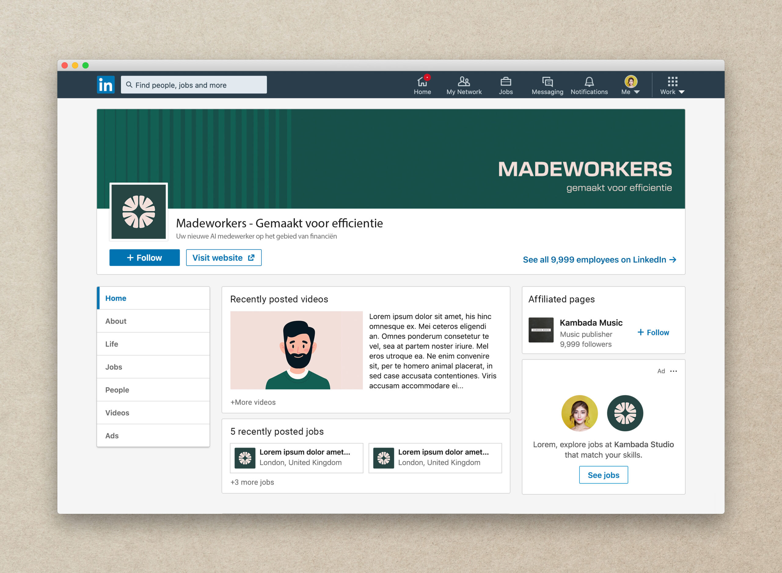
The visual pattern is made up of lines that gradually merge into one continuous form. It reflects the way Madeworkers transforms scattered processes into smooth, efficient systems, bringing order, speed, and connection. This sense of flow runs like a quiet thread through all brand materials, from stationery to presentations.


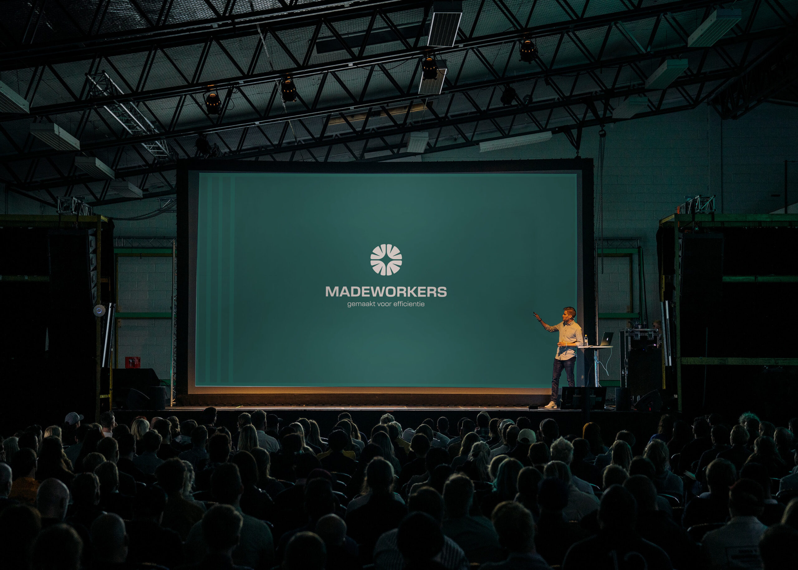
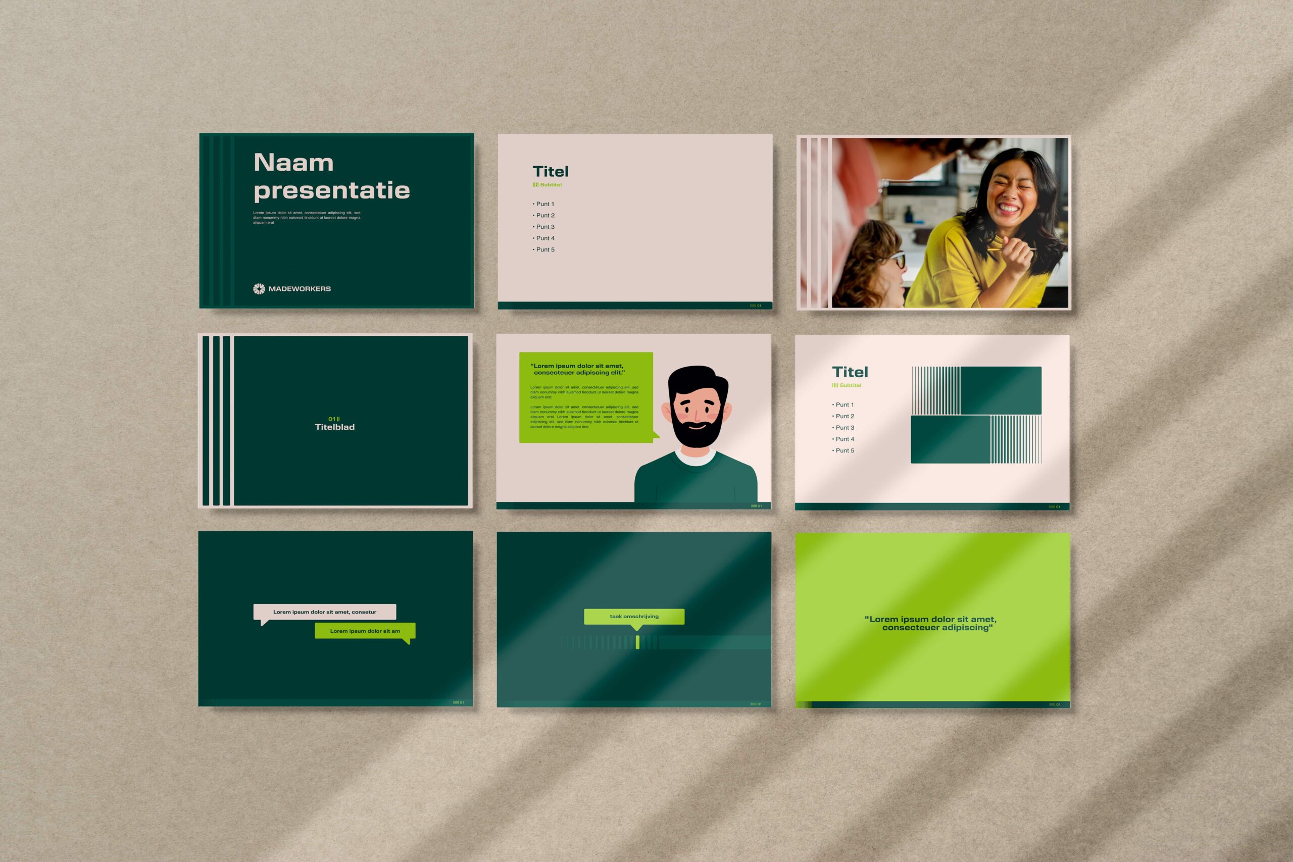
Brand touchpoints such as business cards, presentation templates, and stationery carry the identity consistently into daily use.


To make the technology more approachable, we created a series of illustrated digital characters, the “Madeworkers” themselves. They embody the human side of innovation: friendly, dependable, and easy to relate to. Through them, the brand feels less like a tool and more like a trusted partner.


Brands built on big ideas
Next project
Join our community!
Sign up for our newsletter
Building a strong brand starts with inspiration. With our newsletter, you’ll receive that inspiration right when you need it, in your inbox. At Fraaij Makers, we believe a brand isn’t built in a day. It’s a process of building, adjusting, and continuous learning. Our newsletter is your reminder to pause and reflect on your brand. It offers insights, tips, and ideas to help your brand keep growing.
Contact us: