Elegant identity for the modern woman
Laque
about the project
Delivered products
- Logo design
- Color palette
The client
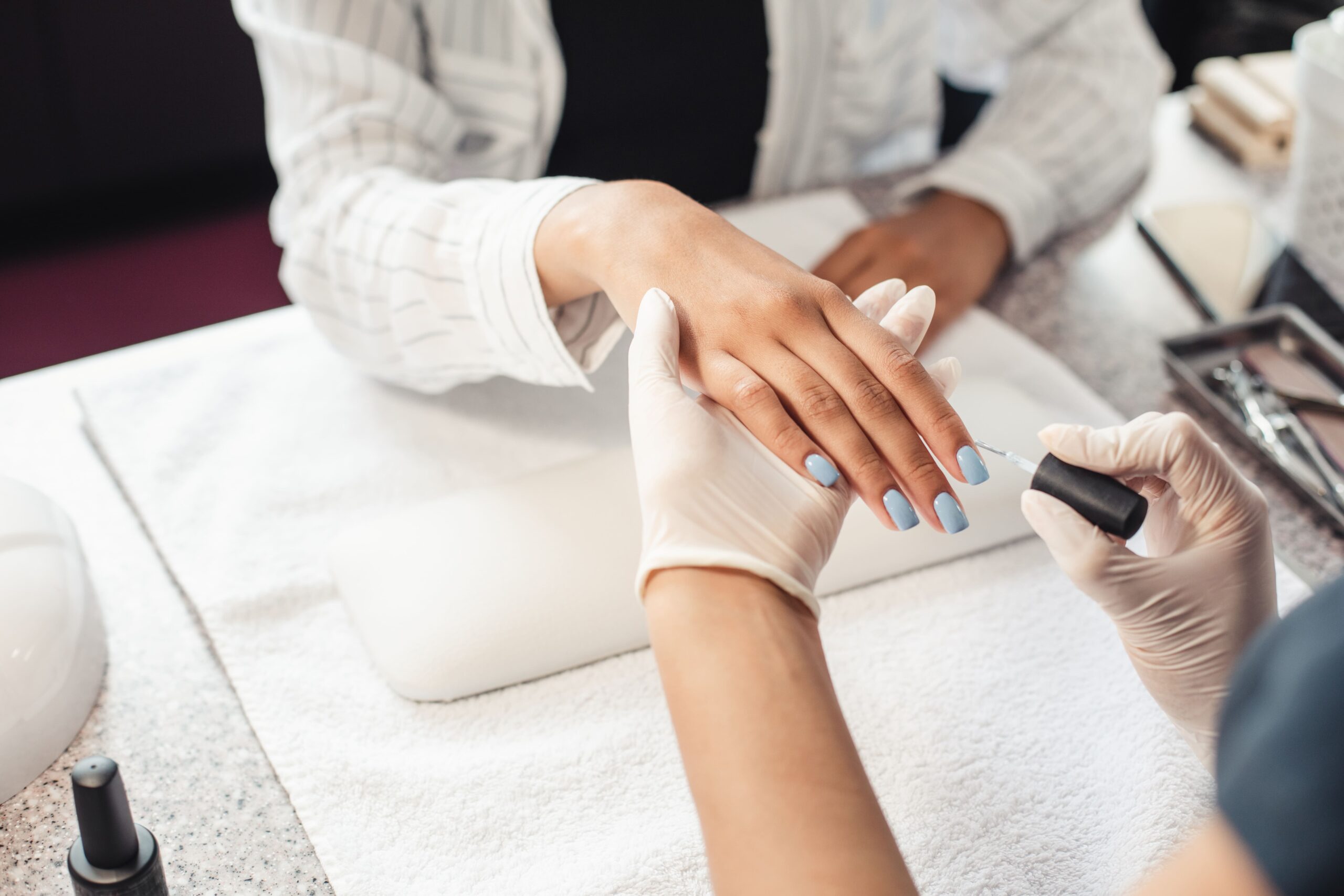
Laque is a modern nail salon aimed at the style-conscious woman. The existing logo and visual identity no longer matched the salon’s ambitions and look. The owner wanted an identity that radiates sophistication, quality, and modernity. The brand needed to appeal to clients seeking a polished and stylish experience, while also standing out in a crowded market.
The challenge
How do you translate the atmosphere of a salon into a visual identity that conveys both luxury and accessibility? The challenge was to create a style that resonates with the modern woman and inspires trust—without falling into clichés or overstatement. The new branding needed to be versatile while consistently maintaining a high-end appearance.
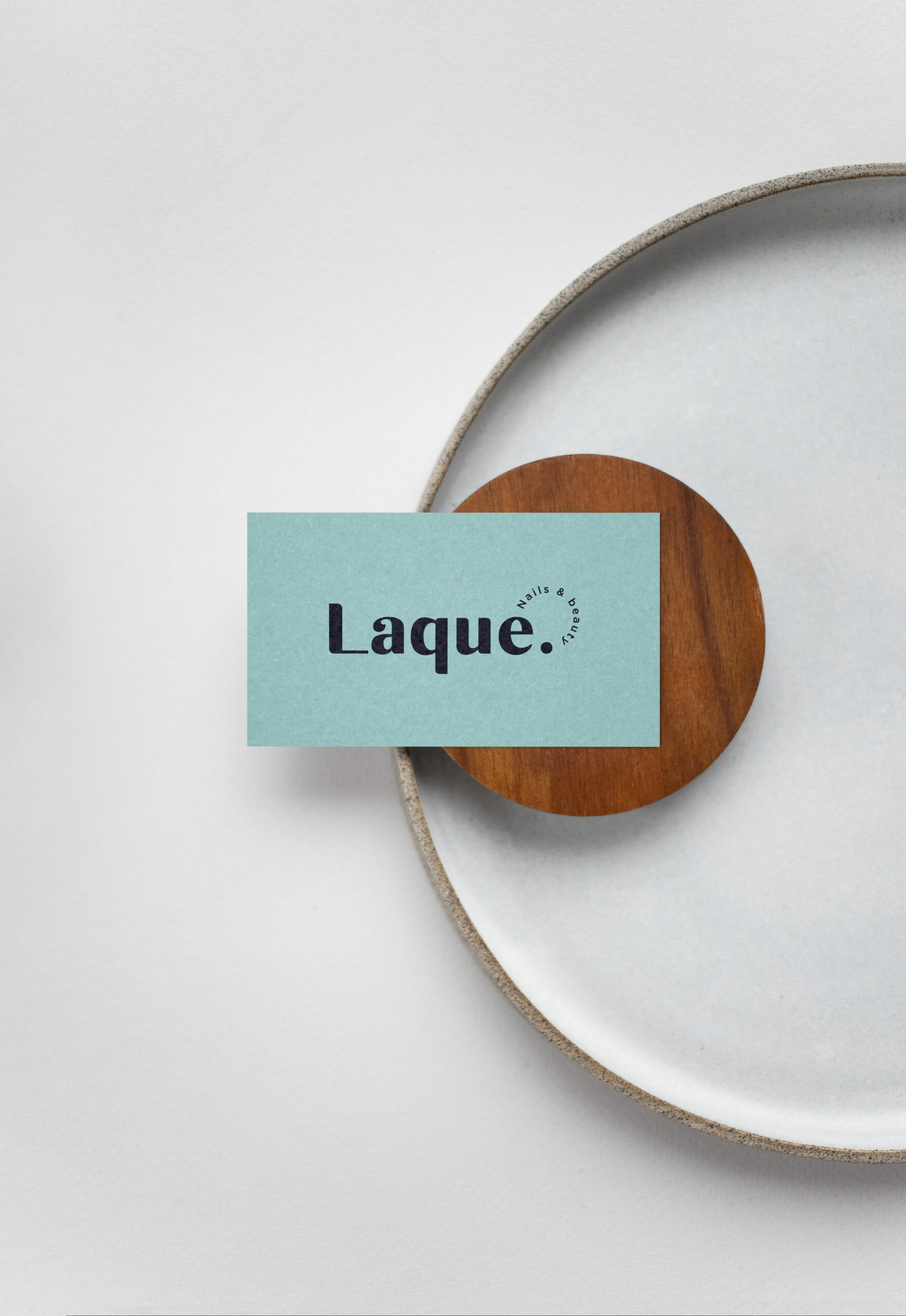
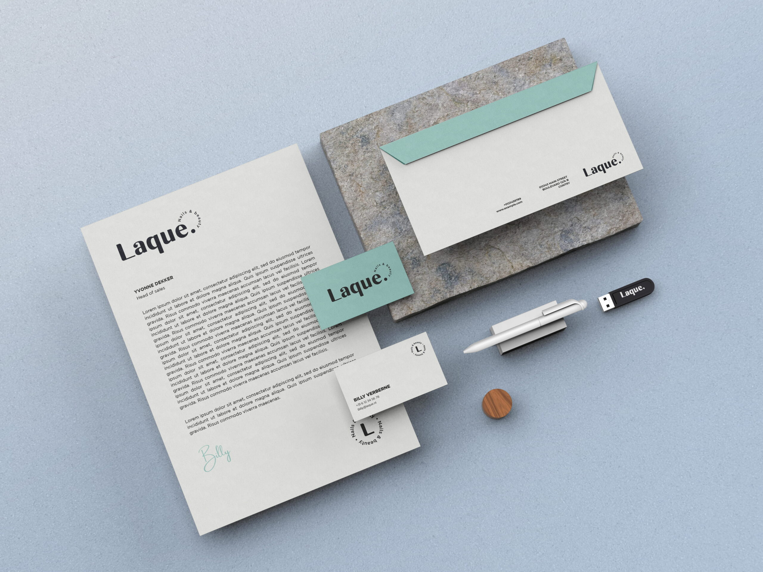

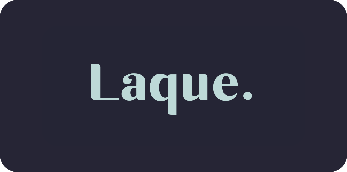
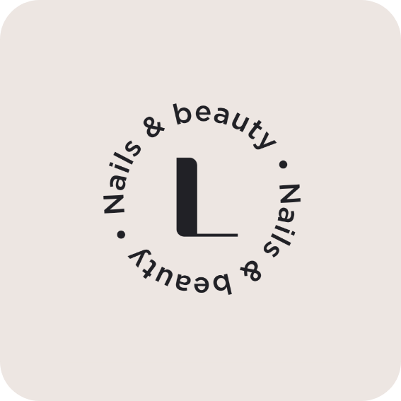
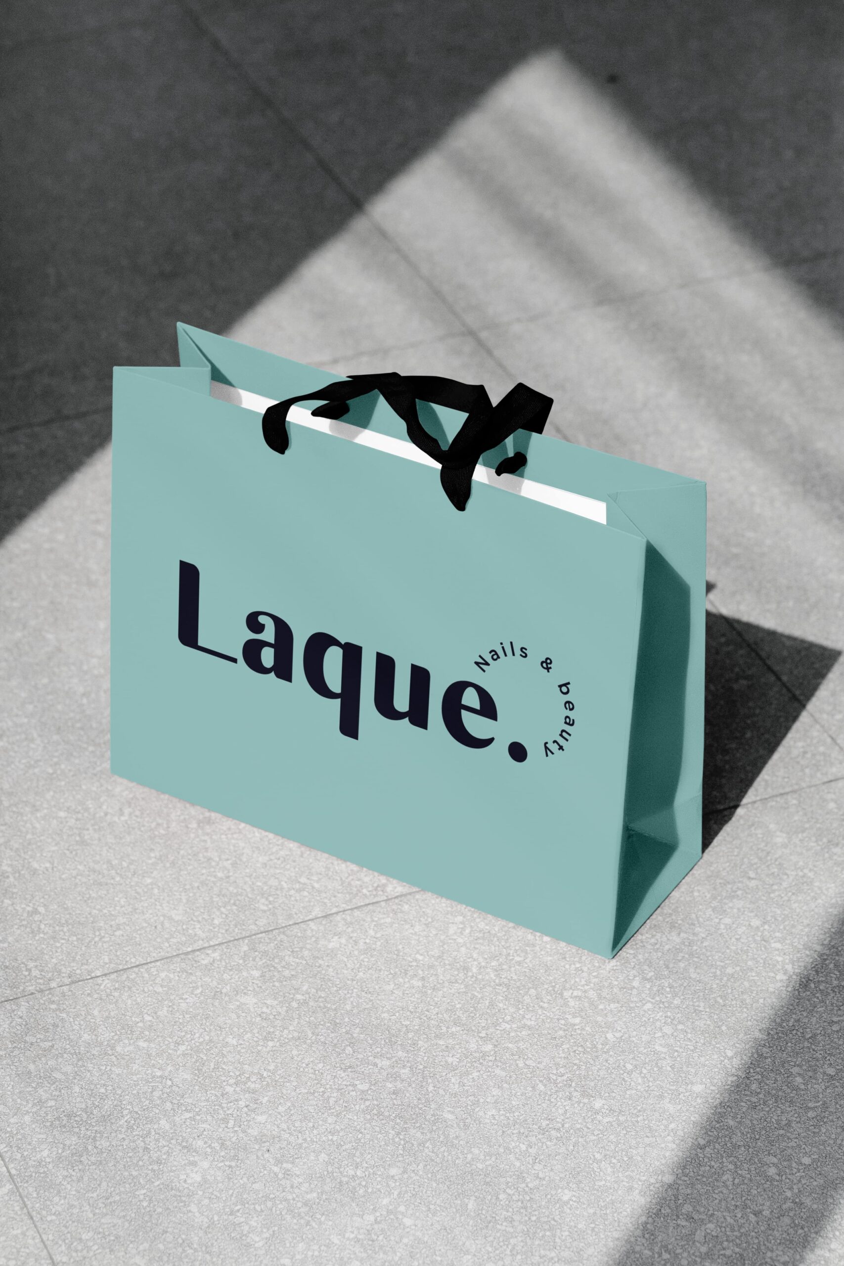
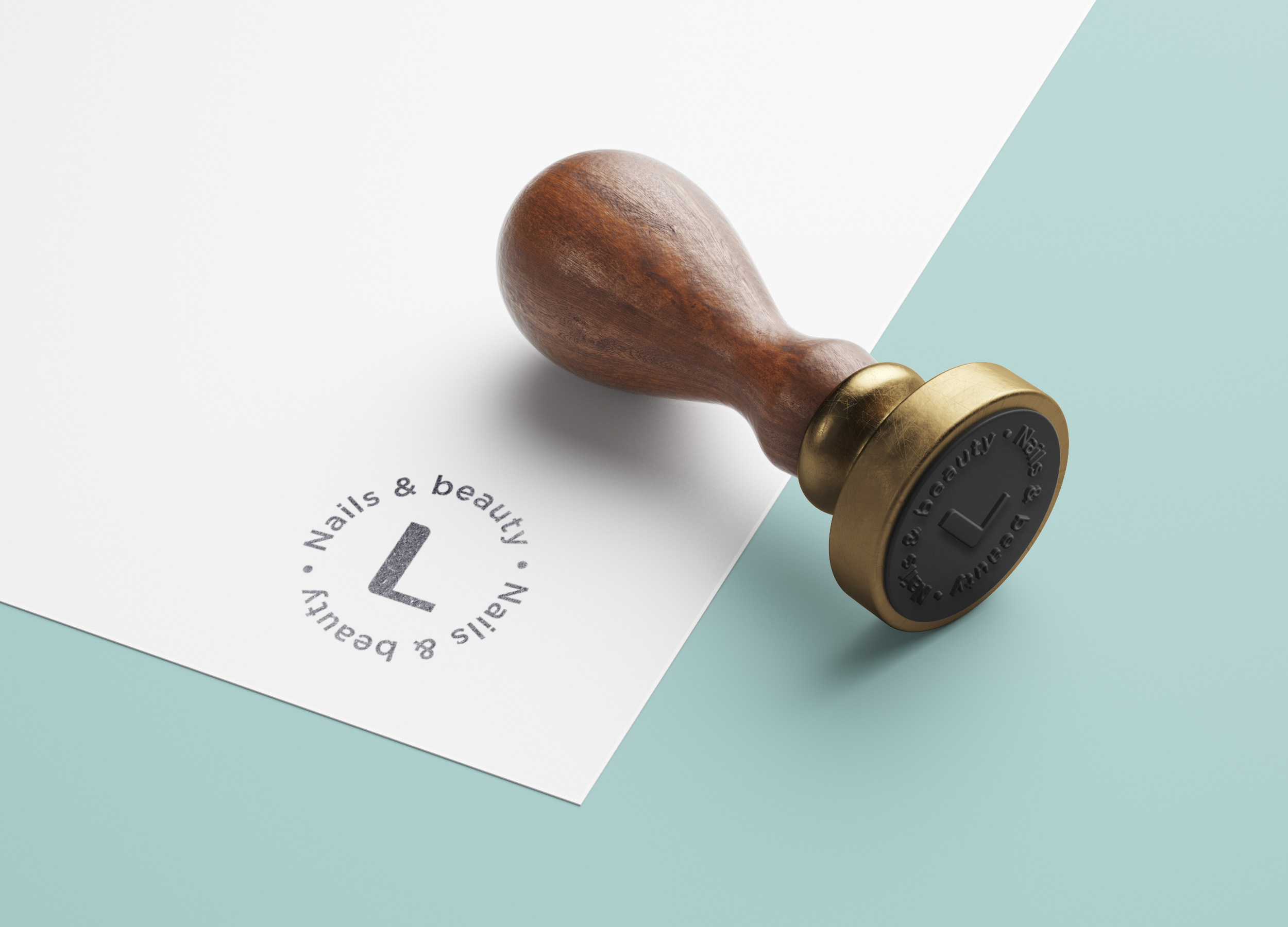
The new logo strikes a perfect balance between elegance and modernity, reflecting the salon’s values beautifully.
Brands built on big ideas
Next project
Join our community!
Sign up for our newsletter
Building a strong brand starts with inspiration. With our newsletter, you’ll receive that inspiration right when you need it, in your inbox. At Fraaij Makers, we believe a brand isn’t built in a day. It’s a process of building, adjusting, and continuous learning. Our newsletter is your reminder to pause and reflect on your brand. It offers insights, tips, and ideas to help your brand keep growing.
Elegant identity for the modern woman
Laque
about the project
Delivered products
- Logo design
- Color palette
The client
Laque is a modern nail salon aimed at the style-conscious woman. The existing logo and visual identity no longer matched the salon’s ambitions and look. The owner wanted an identity that radiates sophistication, quality, and modernity. The brand needed to appeal to clients seeking a polished and stylish experience, while also standing out in a crowded market.
The challenge
How do you translate the atmosphere of a salon into a visual identity that conveys both luxury and accessibility? The challenge was to create a style that resonates with the modern woman and inspires trust—without falling into clichés or overstatement. The new branding needed to be versatile while consistently maintaining a high-end appearance.


The new logo strikes a perfect balance between elegance and modernity, reflecting the salon’s values beautifully.


Brands built on big ideas
Next project
Join our community!
Sign up for our newsletter
Building a strong brand starts with inspiration. With our newsletter, you’ll receive that inspiration right when you need it, in your inbox. At Fraaij Makers, we believe a brand isn’t built in a day. It’s a process of building, adjusting, and continuous learning. Our newsletter is your reminder to pause and reflect on your brand. It offers insights, tips, and ideas to help your brand keep growing.
Elegant identity for the modern woman
Laque
about the project
Delivered products
- Logo design
- Color palette
The client
Laque is a modern nail salon aimed at the style-conscious woman. The existing logo and visual identity no longer matched the salon’s ambitions and look. The owner wanted an identity that radiates sophistication, quality, and modernity. The brand needed to appeal to clients seeking a polished and stylish experience, while also standing out in a crowded market.
The challenge
How do you translate the atmosphere of a salon into a visual identity that conveys both luxury and accessibility? The challenge was to create a style that resonates with the modern woman and inspires trust—without falling into clichés or overstatement. The new branding needed to be versatile while consistently maintaining a high-end appearance.


The new logo strikes a perfect balance between elegance and modernity, reflecting the salon’s values beautifully.


Brands built on big ideas
Next project
Join our community!
Sign up for our newsletter
Building a strong brand starts with inspiration. With our newsletter, you’ll receive that inspiration right when you need it, in your inbox. At Fraaij Makers, we believe a brand isn’t built in a day. It’s a process of building, adjusting, and continuous learning. Our newsletter is your reminder to pause and reflect on your brand. It offers insights, tips, and ideas to help your brand keep growing.
Contact us: