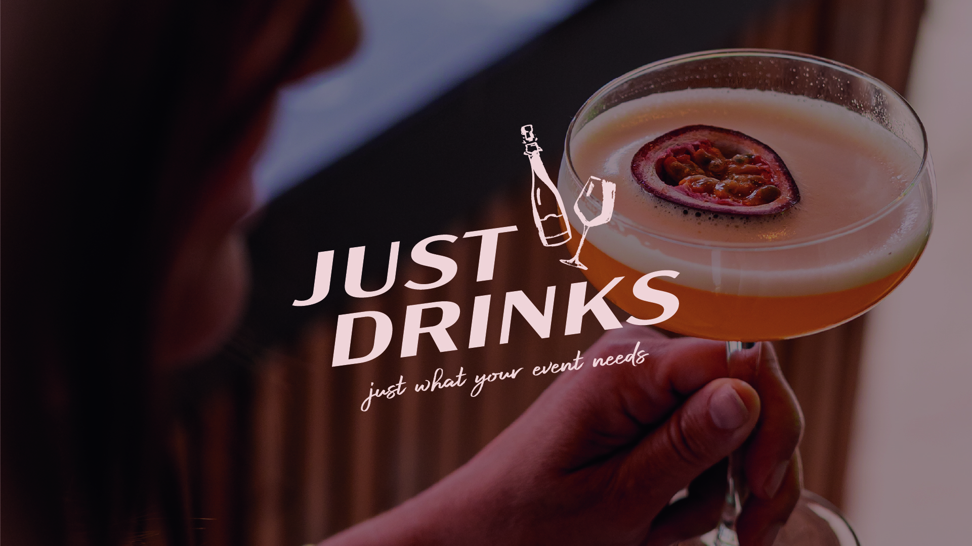
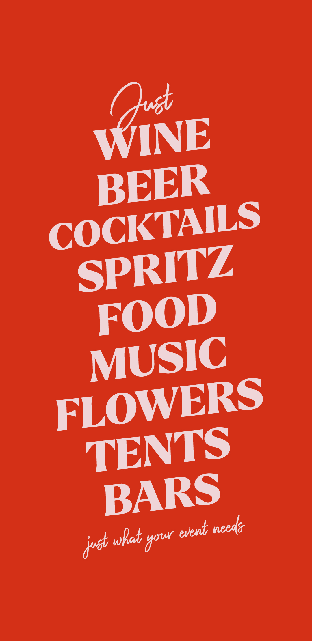
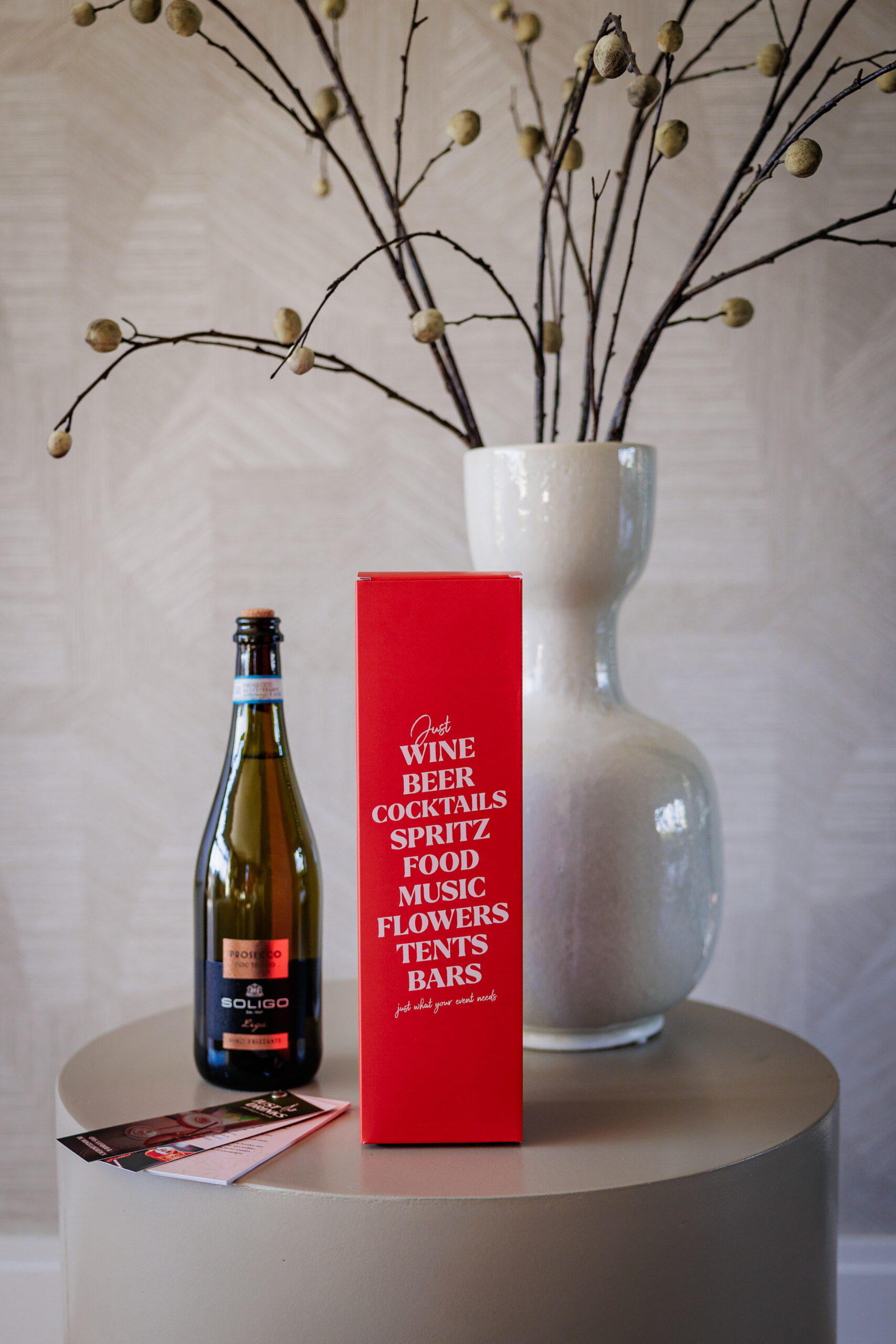
The new tagline came straight from the strategy: Just what your event needs. This is a flexible format that shifts with the event. Just Wine, Just Beer, Just Music, Just Food; always tailored, never generic. It reflects how Just Drinks operates: adapting to the needs of each event, with a seamless presence that elevates the experience. This principle also shaped the visual language.
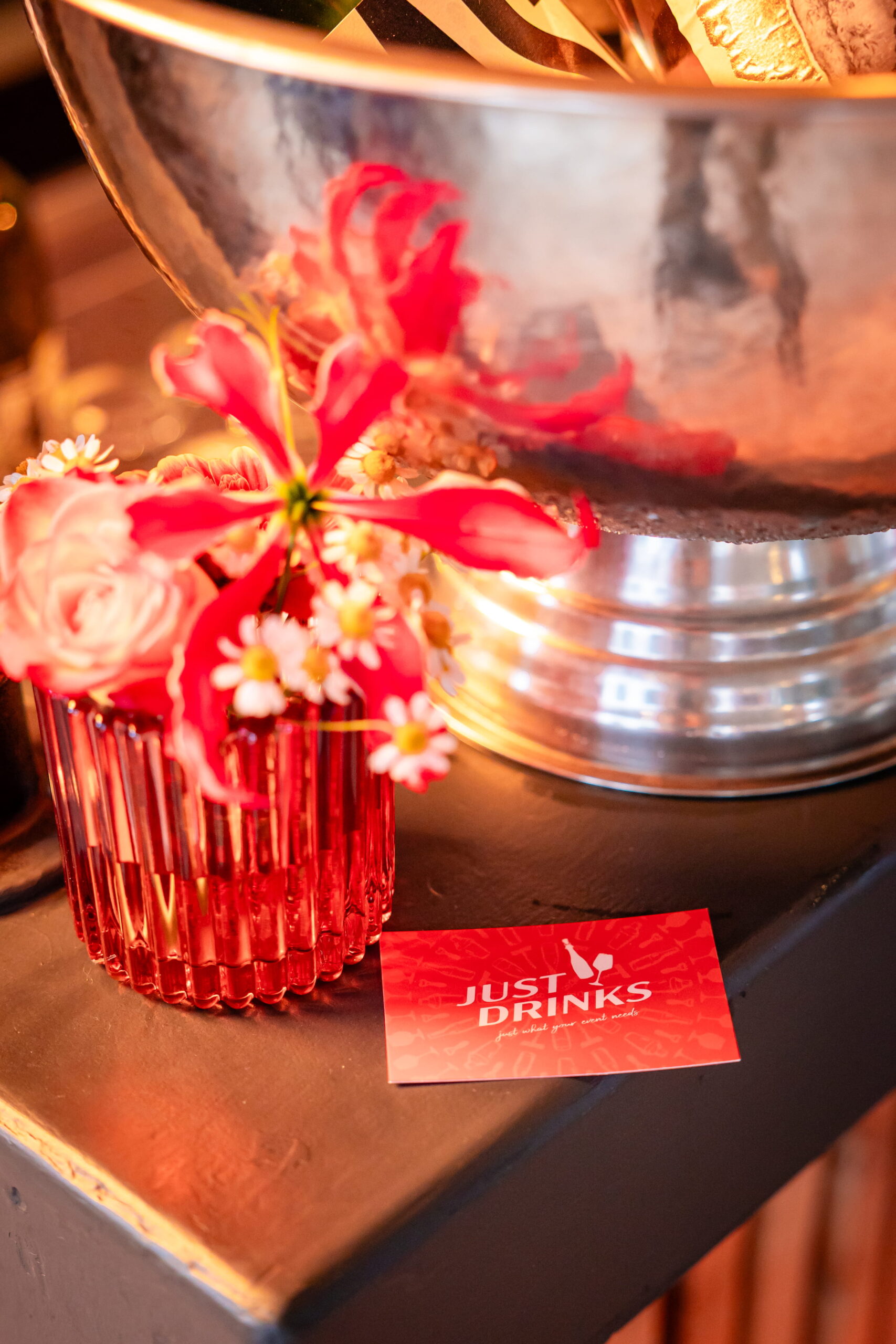
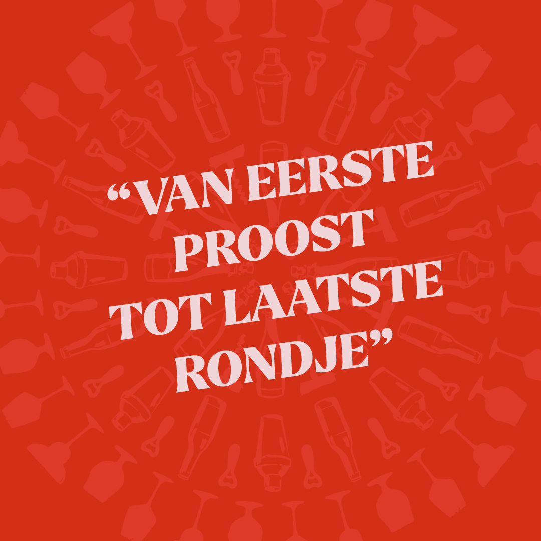
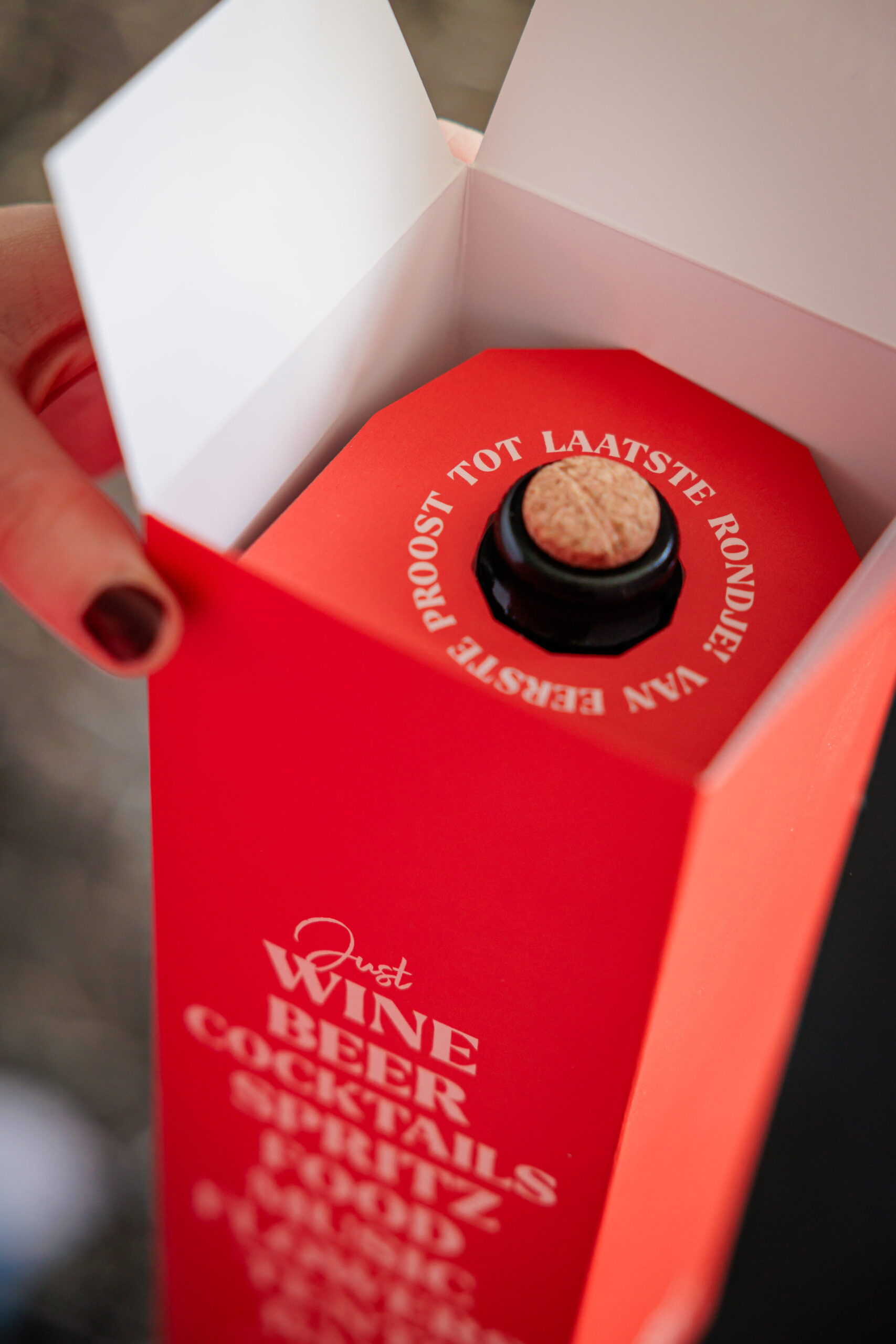
The colour palette is deliberately restrained to convey clarity and premium quality. Using a signature orange, adding a spark of energy and a sense of hospitality that’s central to the brand.
The typography strikes a similar balance: strong and structured, yet softened by rounded details that make it feel welcoming. It’s straightforward, stylish, and easy to apply across touchpoints, just like the service Just Drinks provides.
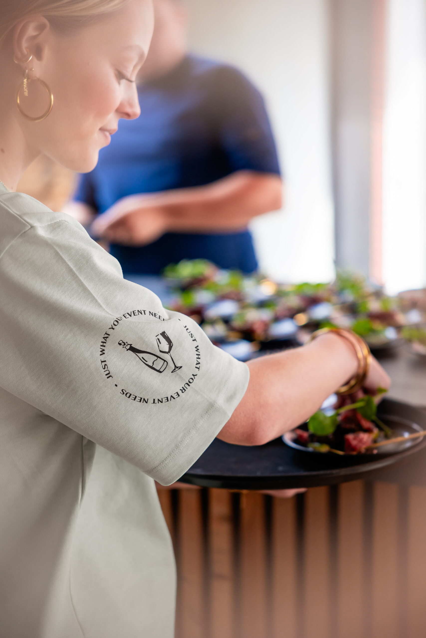
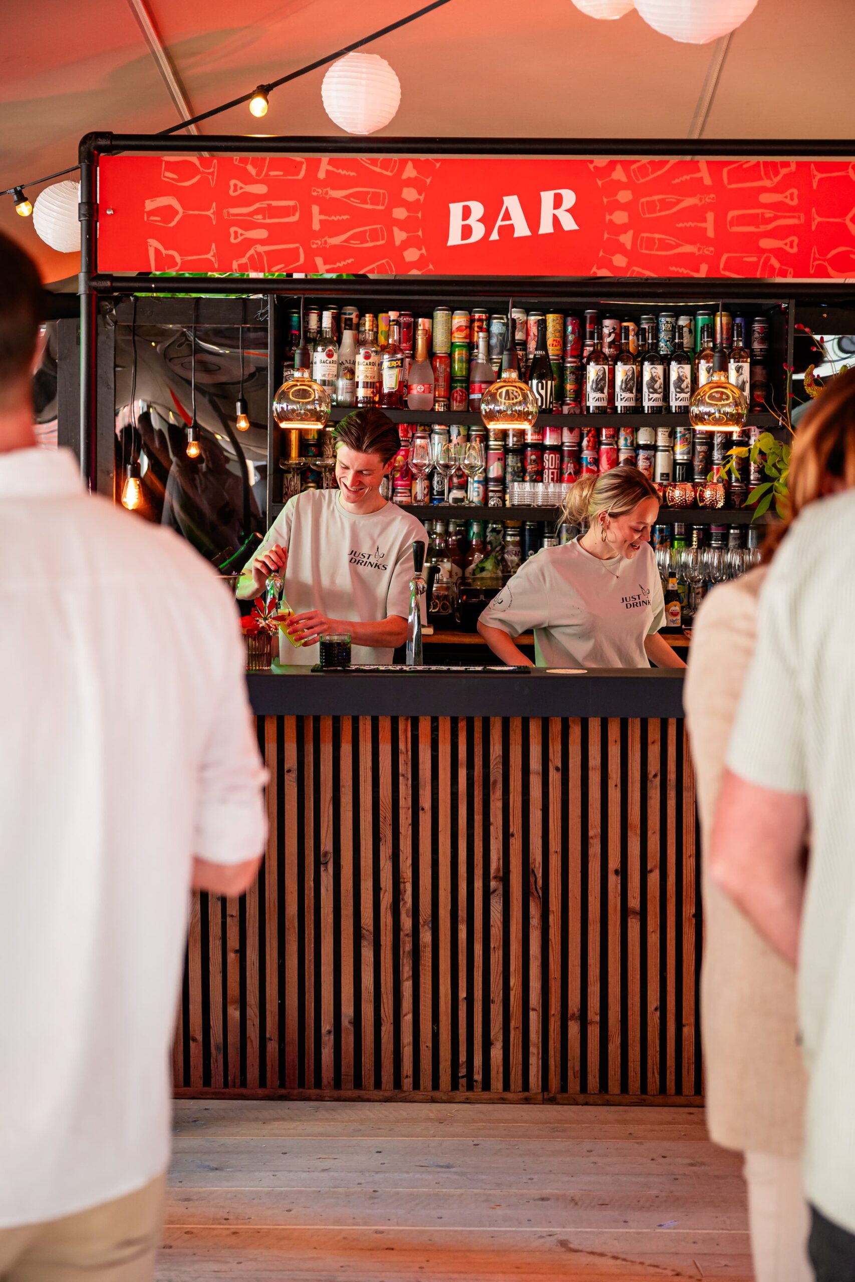
To bring the brand story to life, we developed a brand video, social content, and a robust image library. These assets don’t just set a mood; they reveal the people, gestures, and behind-the-scenes effort that make each event unmistakably Just Drinks.
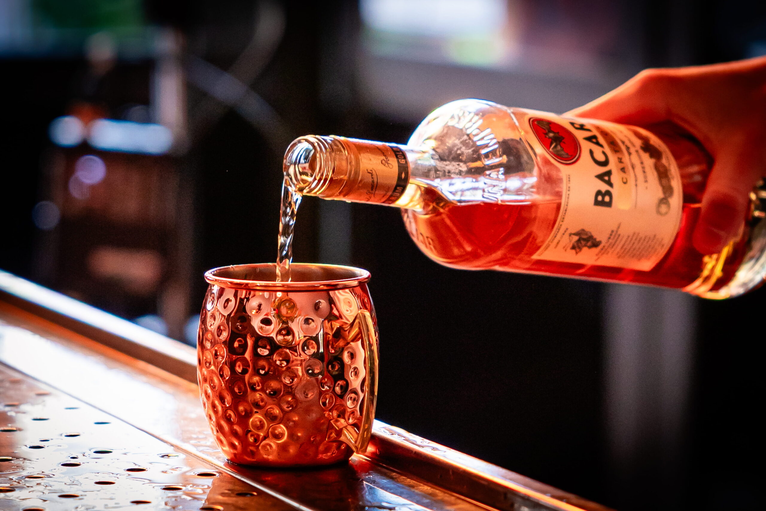
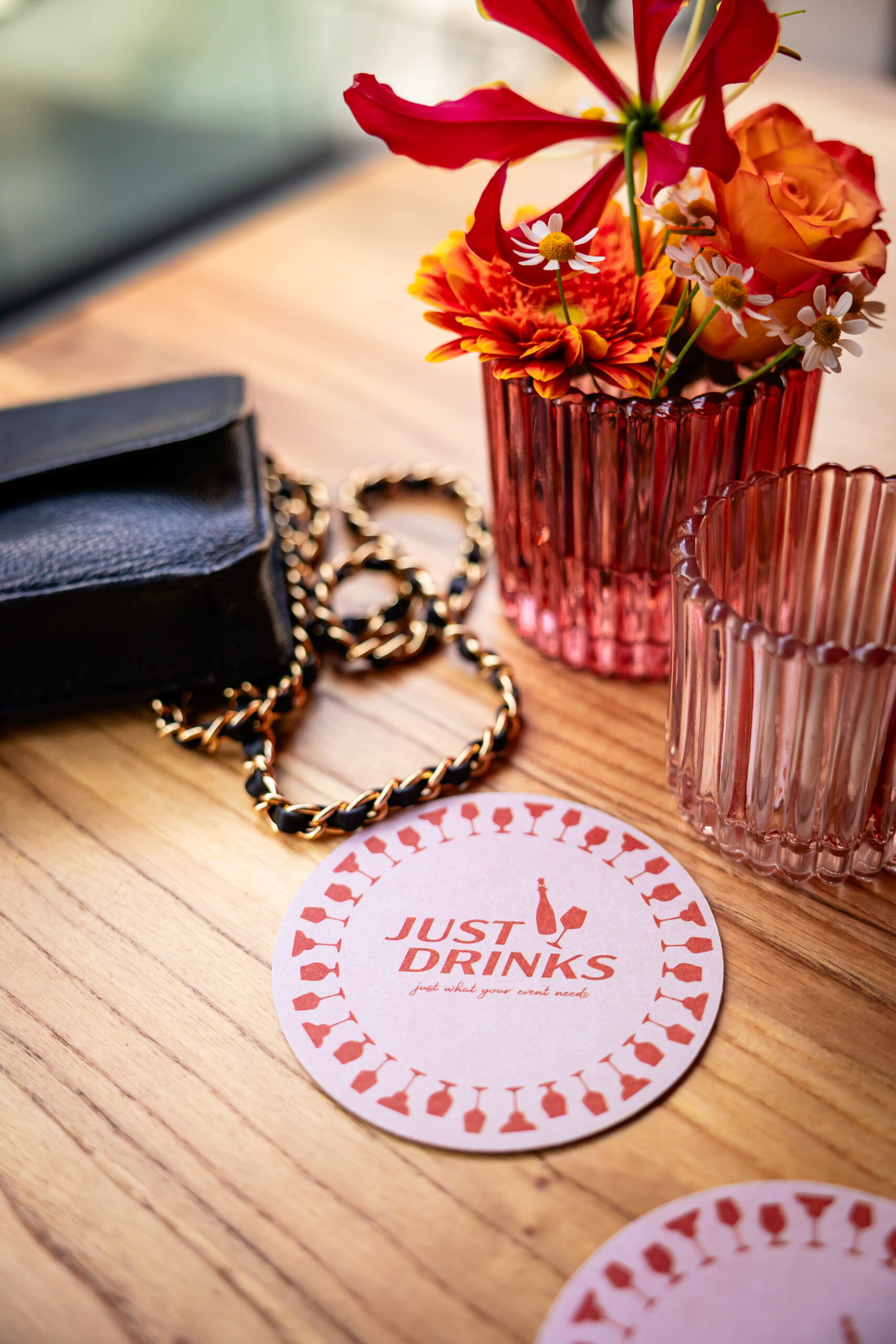
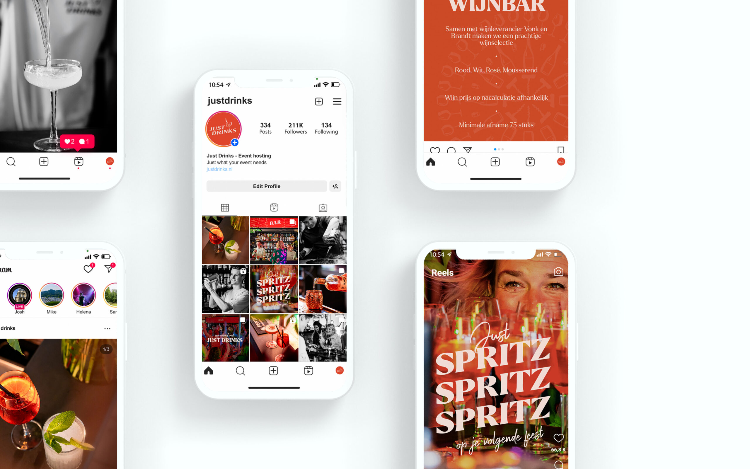
We built the imagery concept around two distinct perspectives: the guest’s experience and the view from behind the scenes. While guests immerse themselves in the moment, Just Drinks works in the background, keeping drinks flowing, the space tidy and the energy just right. We visualised this duality by showing the guest’s world in colour, full of life and atmosphere, while the Just Drinks view is rendered in black and white: calm, focused and professional. Together, they tell the full story: joyful celebration, effortlessly supported.
Brands build on big ideas
Next project
SIGN UP FOR OUR NEWSLETTER
Building a strong brand starts with inspiration. With our newsletter, you’ll receive that spark exactly when you need it, straight to your inbox. At Fraaij Makers, we believe a brand isn’t built in a single day. It’s a process of creating, adjusting, and continuously learning. Our newsletter is your gentle reminder to pause, reflect on your brand, and gain fresh insights, tips, and ideas to help your brand grow even further.
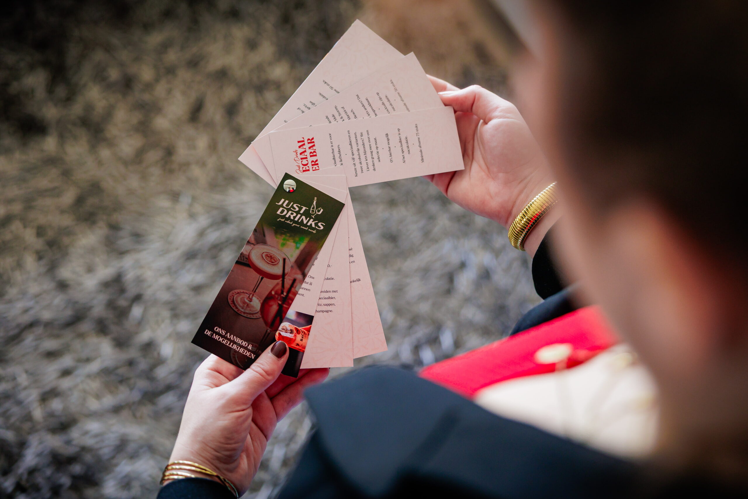
The new tagline came straight from the strategy: Just what your event needs. This is a flexible format that shifts with the event. Just Wine, Just Beer, Just Music, Just Food; always tailored, never generic. It reflects how Just Drinks operates: adapting to the needs of each event, with a seamless presence that elevates the experience. This principle also shaped the visual language.
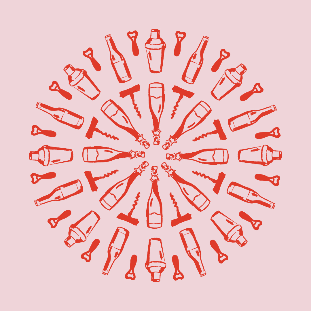
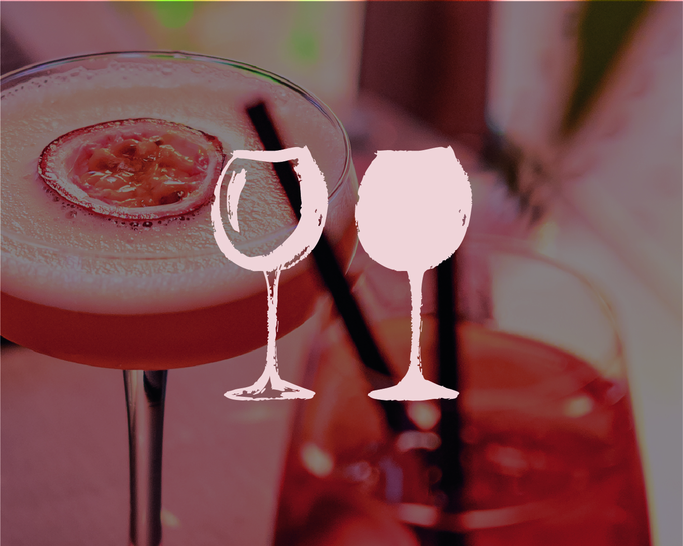
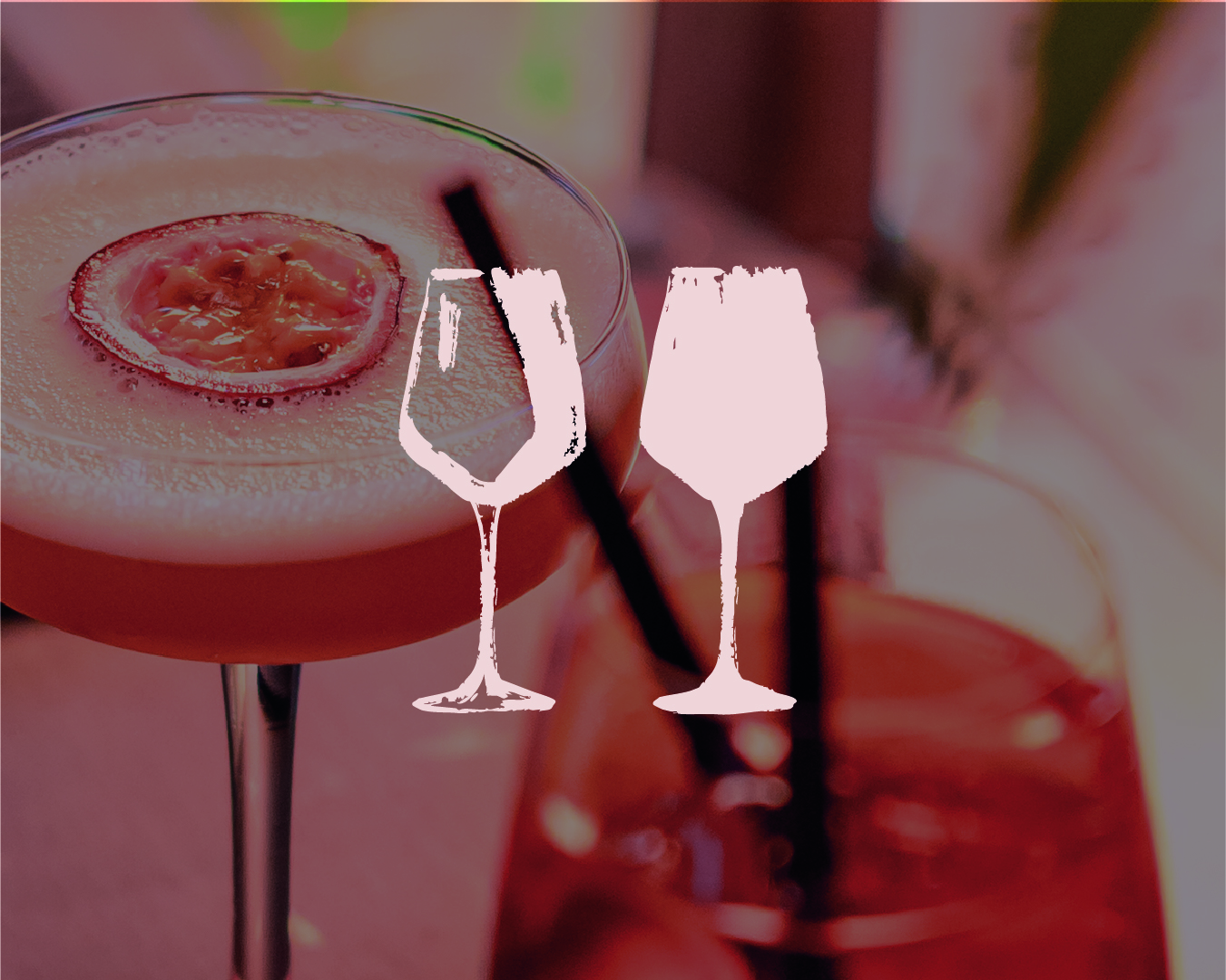
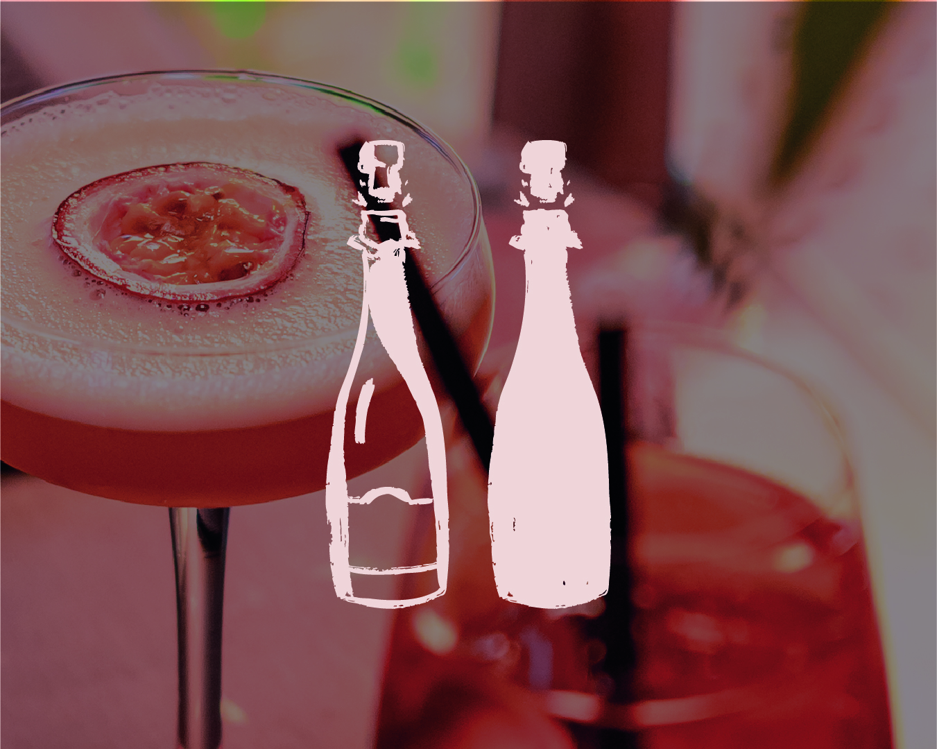
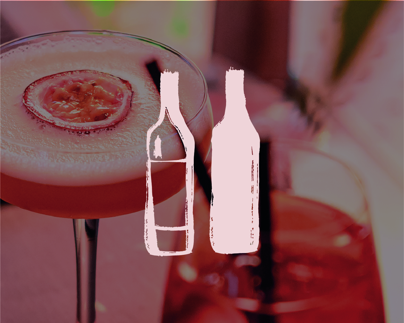
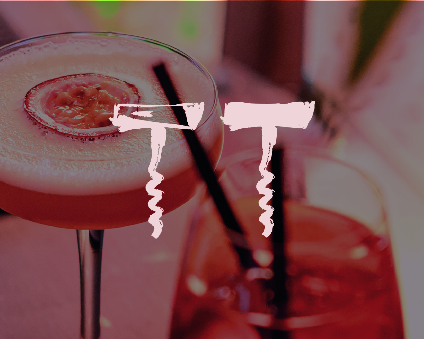
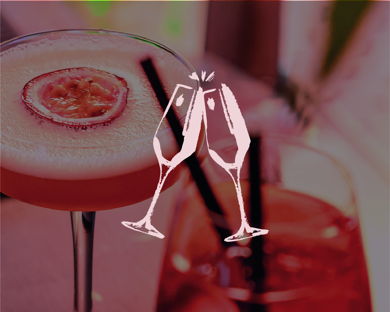
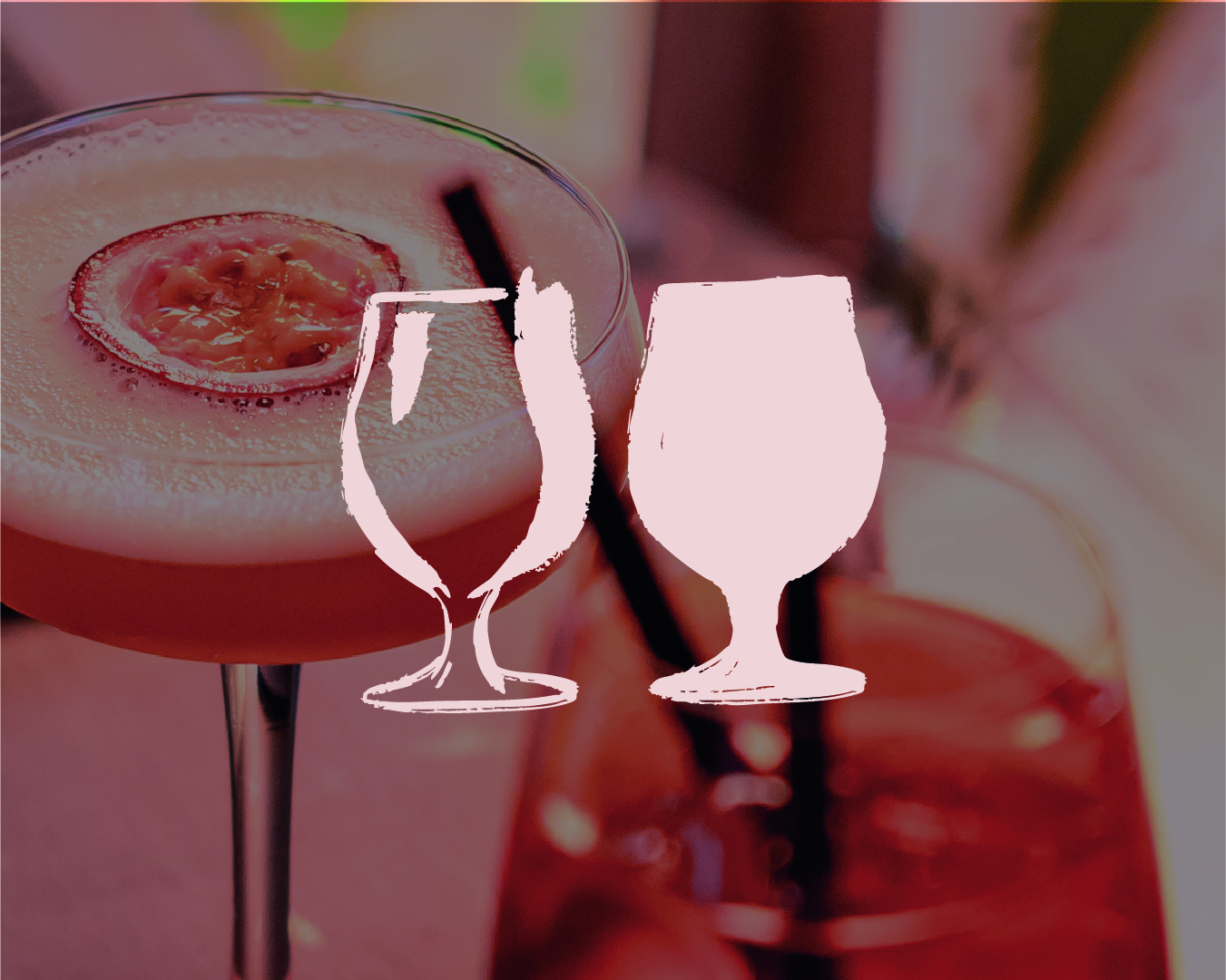
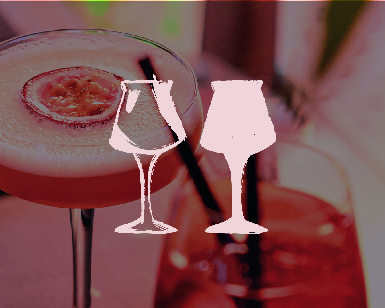
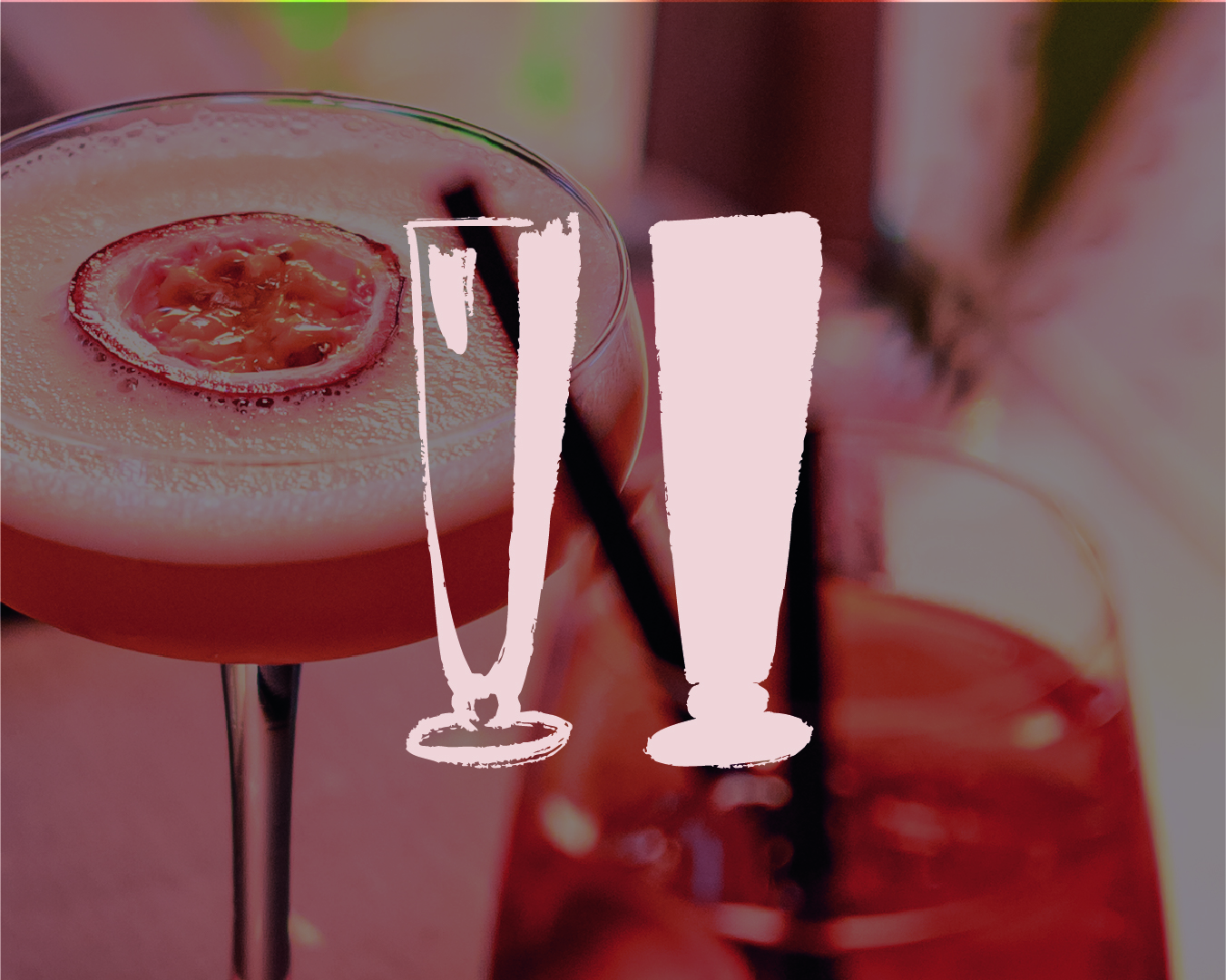
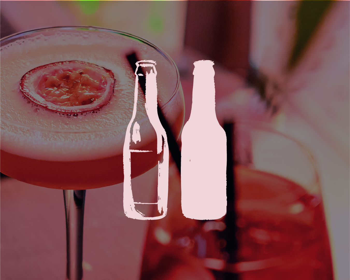
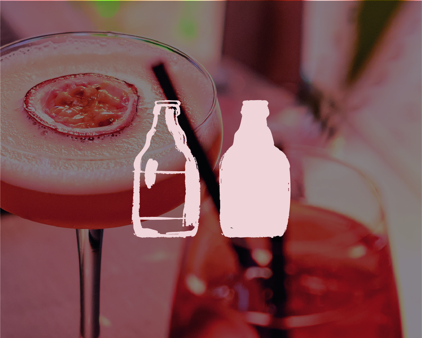
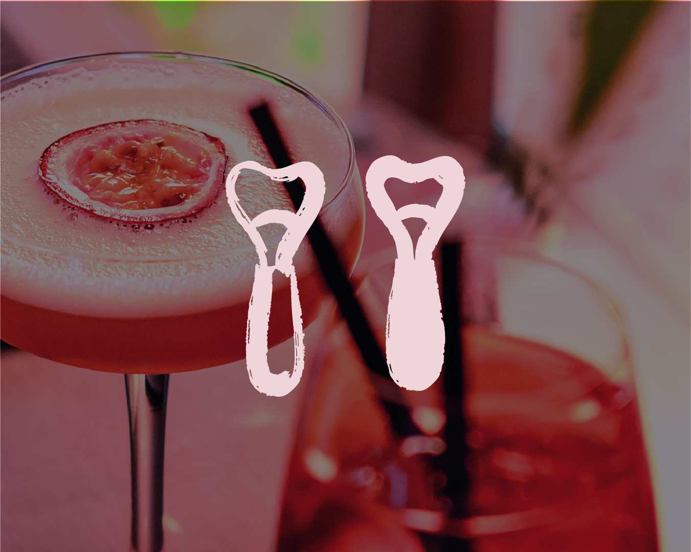
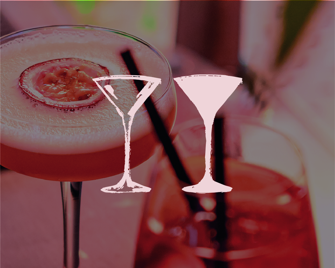
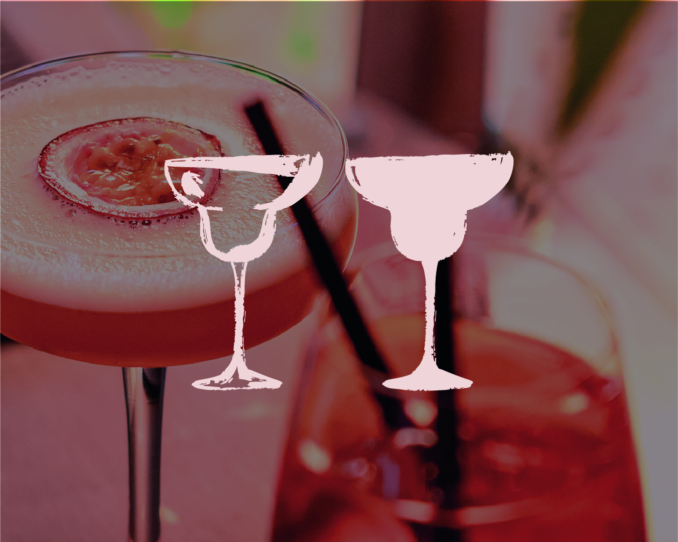
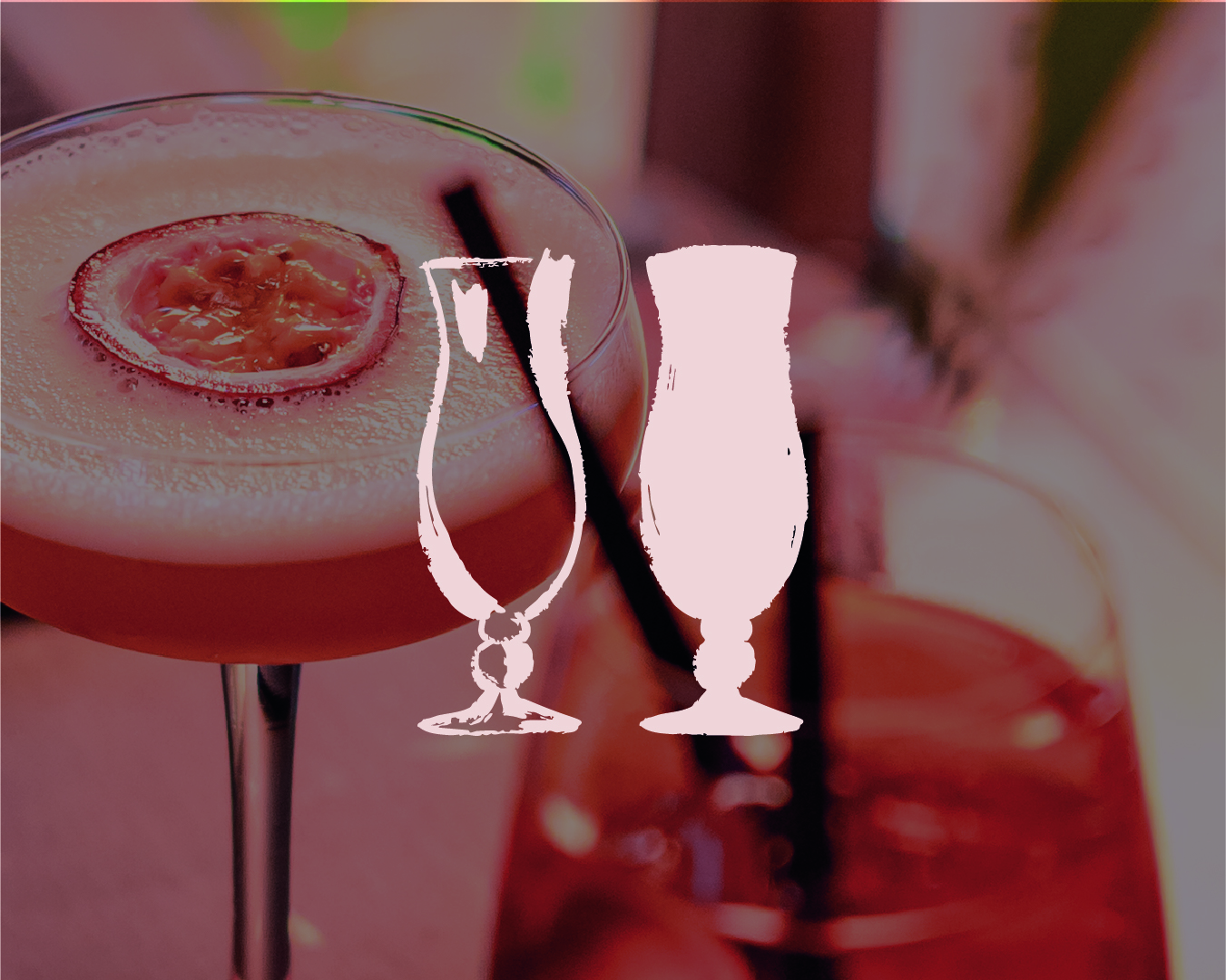
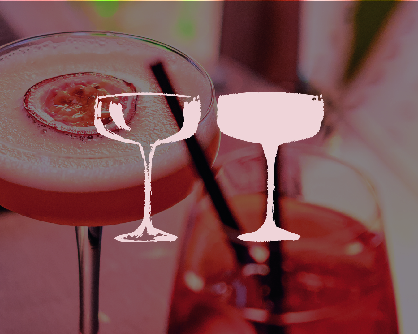
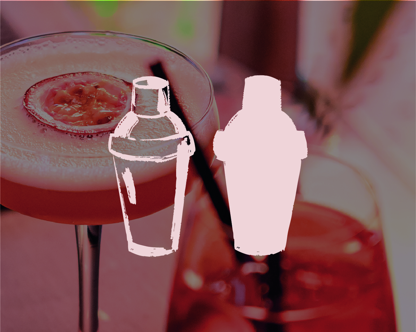
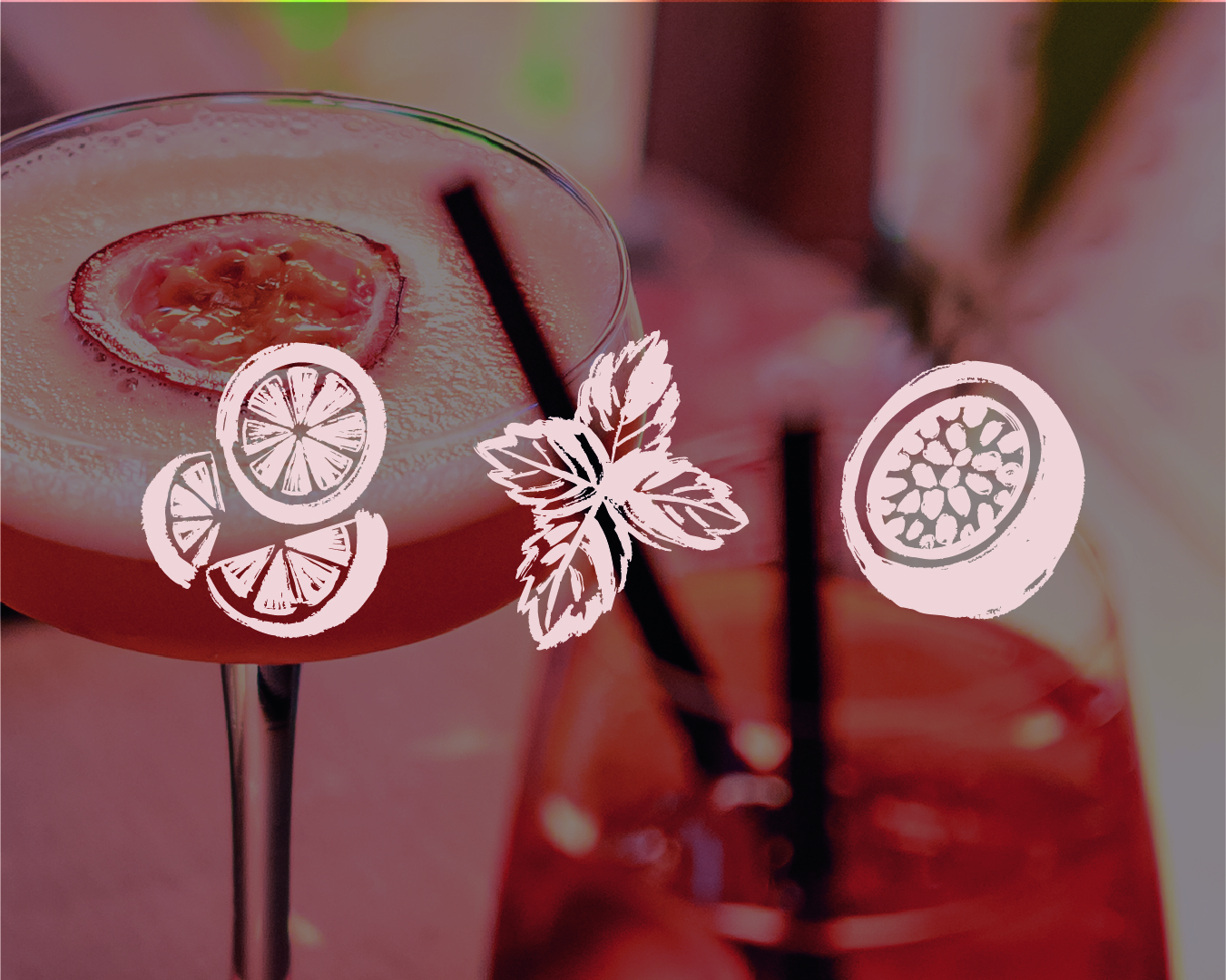
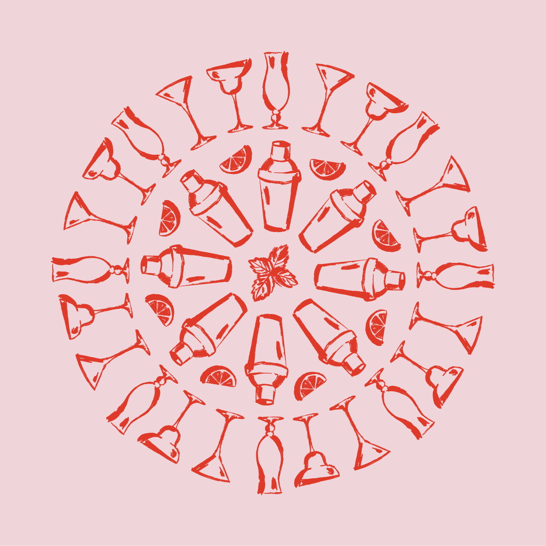
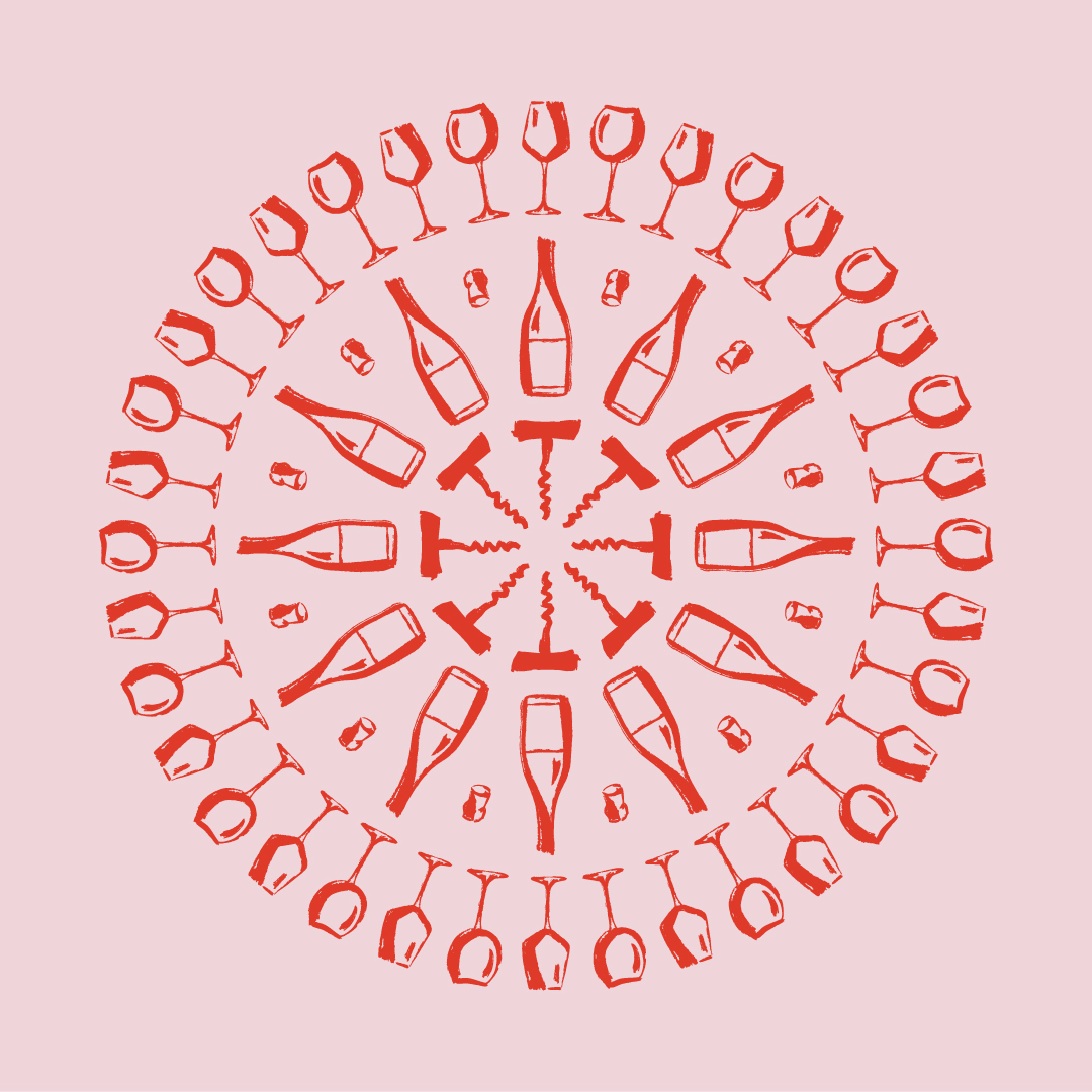
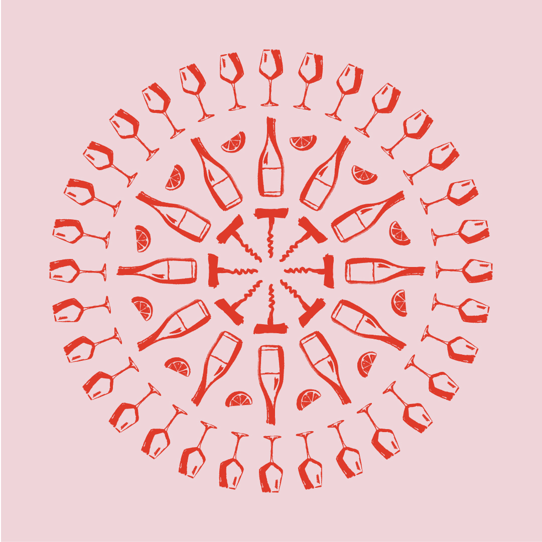
We designed a set of custom illustrations (wine glasses, corkscrews, cocktail shakers) arranged into dynamic mandalas that form the heart of the visual identity. These patterns show up across packaging, coasters, uniforms and social media. Because the mandalas are modular, they offer endless flexibility. Each version can be tailored to fit the vibe of a specific event. Hosting a wine tasting? Build a mandala with wine elements. Throwing a cocktail night? Switch to shakers and garnishes. It’s a visual system that mirrors how Just Drinks works: curated, responsive, always in tune with the occasion.
The colour palette is deliberately restrained to convey clarity and premium quality. Using a signature orange, adding a spark of energy and a sense of hospitality that’s central to the brand.
The typography strikes a similar balance: strong and structured, yet softened by rounded details that make it feel welcoming. It’s straightforward, stylish, and easy to apply across touchpoints, just like the service Just Drinks provides.
To bring the brand story to life, we developed a brand video, social content, and a robust image library. These assets don’t just set a mood; they reveal the people, gestures, and behind-the-scenes effort that make each event unmistakably Just Drinks.
We built the imagery concept around two distinct perspectives: the guest’s experience and the view from behind the scenes. While guests immerse themselves in the moment, Just Drinks works in the background, keeping drinks flowing, the space tidy and the energy just right. We visualised this duality by showing the guest’s world in colour, full of life and atmosphere, while the Just Drinks view is rendered in black and white: calm, focused and professional. Together, they tell the full story: joyful celebration, effortlessly supported.
Brands build on big ideas
Next project
SIGN UP FOR OUR NEWSLETTER
Building a strong brand starts with inspiration. With our newsletter, you’ll receive that spark exactly when you need it, straight to your inbox. At Fraaij Makers, we believe a brand isn’t built in a single day. It’s a process of creating, adjusting, and continuously learning. Our newsletter is your gentle reminder to pause, reflect on your brand, and gain fresh insights, tips, and ideas to help your brand grow even further.
The new tagline came straight from the strategy: Just what your event needs. This is a flexible format that shifts with the event. Just Wine, Just Beer, Just Music, Just Food; always tailored, never generic. It reflects how Just Drinks operates: adapting to the needs of each event, with a seamless presence that elevates the experience. This principle also shaped the visual language.
We designed a set of custom illustrations (wine glasses, corkscrews, cocktail shakers) arranged into dynamic mandalas that form the heart of the visual identity. These patterns show up across packaging, coasters, uniforms and social media. Because the mandalas are modular, they offer endless flexibility. Each version can be tailored to fit the vibe of a specific event. Hosting a wine tasting? Build a mandala with wine elements. Throwing a cocktail night? Switch to shakers and garnishes. It’s a visual system that mirrors how Just Drinks works: curated, responsive, always in tune with the occasion.
To bring the brand story to life, we developed a brand video, social content, and a robust image library. These assets don’t just set a mood; they reveal the people, gestures, and behind-the-scenes effort that make each event unmistakably Just Drinks.
We built the imagery concept around two distinct perspectives: the guest’s experience and the view from behind the scenes. While guests immerse themselves in the moment, Just Drinks works in the background, keeping drinks flowing, the space tidy and the energy just right. We visualised this duality by showing the guest’s world in colour, full of life and atmosphere, while the Just Drinks view is rendered in black and white: calm, focused and professional. Together, they tell the full story: joyful celebration, effortlessly supported.
Brands build on big ideas
Next project