A warm light in dark times
Ellen
about the project
Delivered products
- Brand strategy
- Logo design
- Color palette & typography
- Visual language
- Website
- Social media templates
- Stationery
- Brochure
Client
Ellen started out as a farewell photographer, with the wish to make her expertise visible in a recognizable and authentic way. Since farewell photography is still relatively unknown, it was essential that her brand identity conveyed both warmth and trust. The branding needed to align with her personal style: careful and with genuine attention to the person behind the moment.
Challenge
How do you create a brand for such a sensitive field that radiates both warmth and trust? Ellen wanted an identity that was accessible to bereaved families while also being distinctive within her profession. The branding had to project calm, provide reassurance in an emotionally charged time, and clearly communicate the value of farewell photography. The challenge was to find the balance between professionalism and empathy, so families feel understood and choose Ellen with confidence.

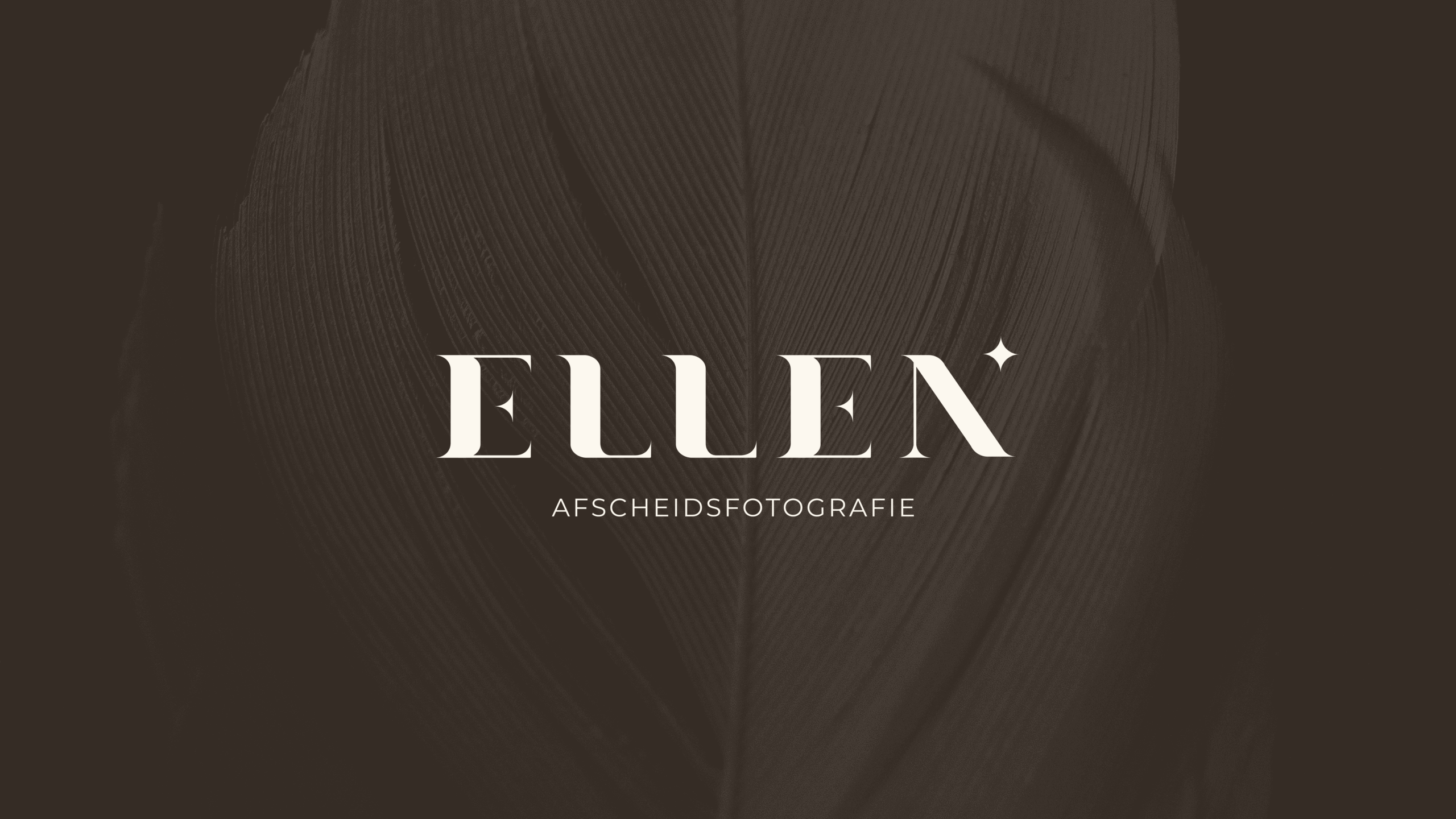
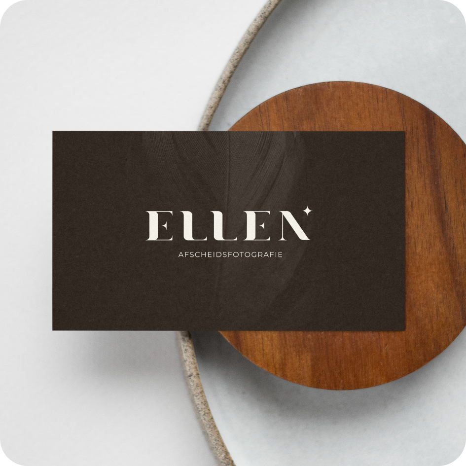
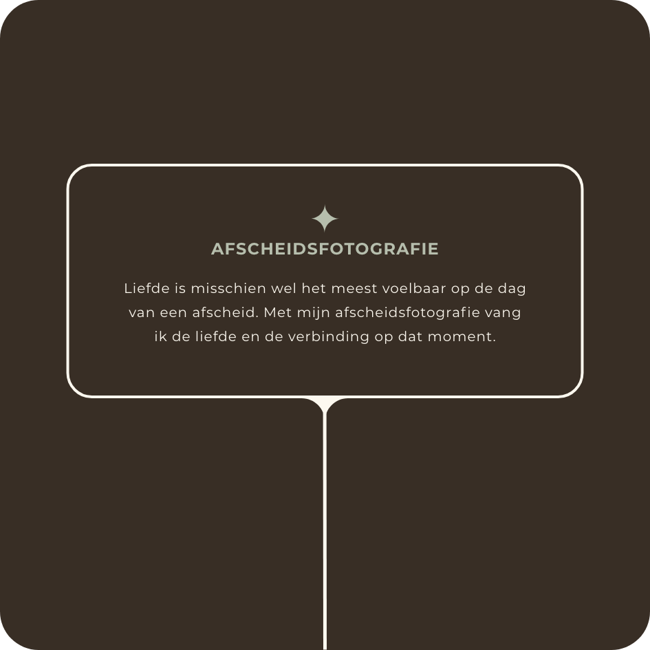

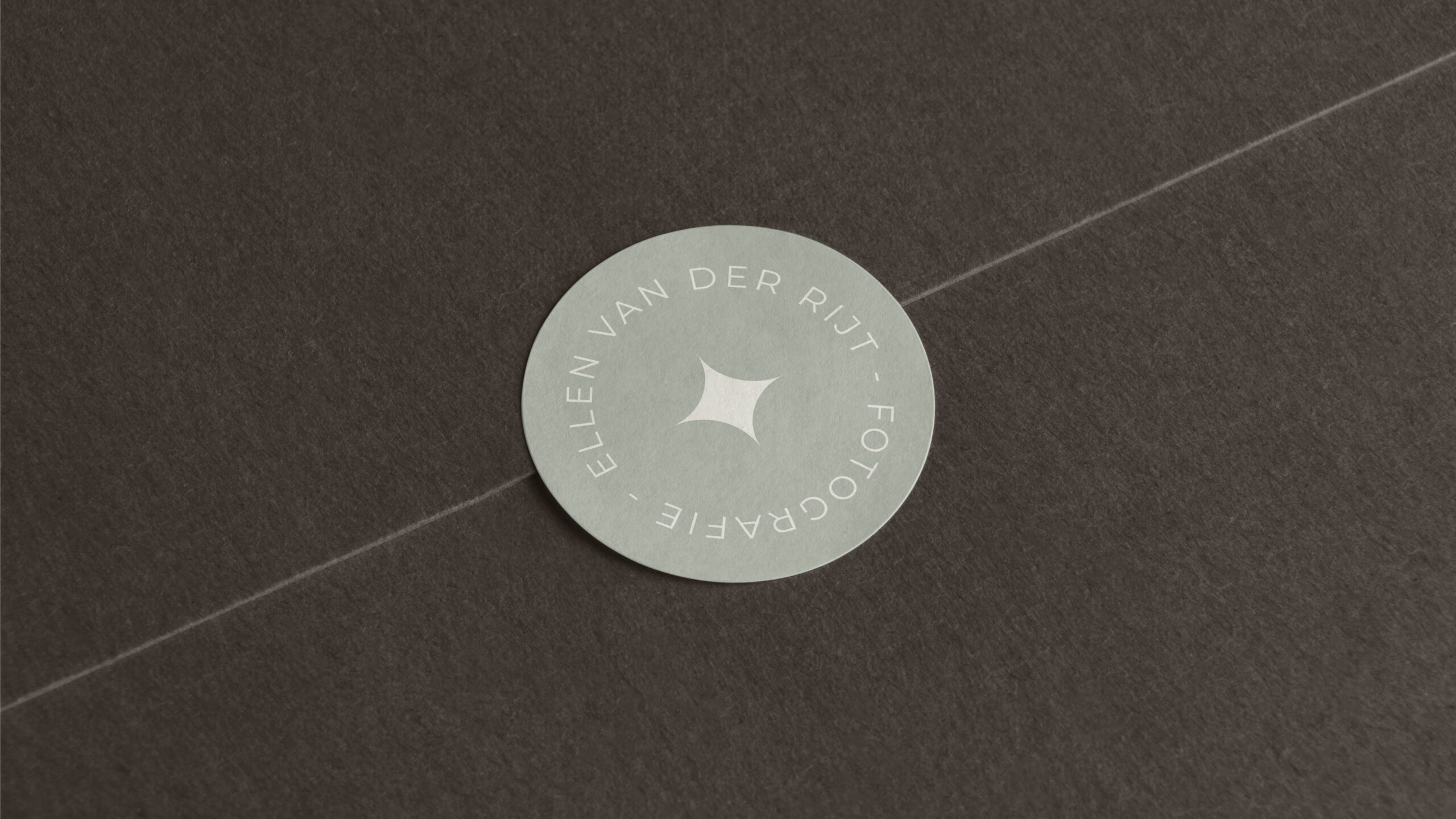

The small star in the logo symbolizes light and comfort. Subtle yet present, just like Ellen’s role during a farewell. It brings balance to the logo and adds a recognizable detail that conveys warmth and softness. The star appears throughout the entire visual identity, from quotation marks to the proportions of the rounded corners.
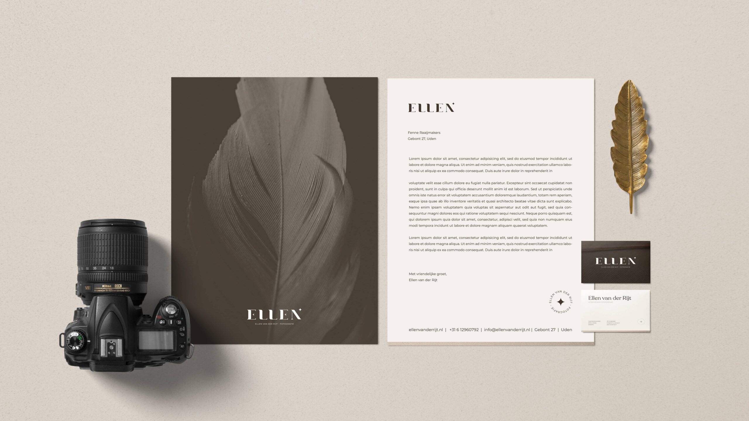
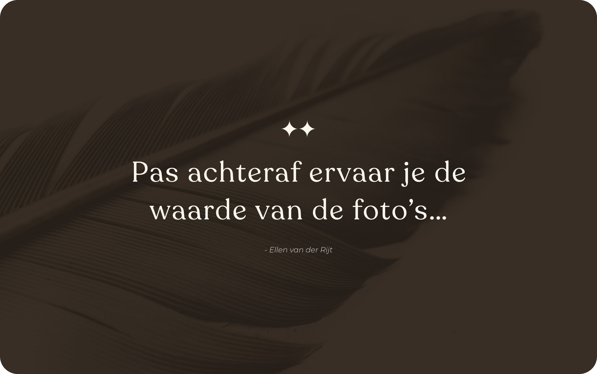
The feather runs as a visual thread through the identity. It represents letting go, remembrance, and gentleness. Core values that reflect Ellen’s way of working. Combined with warm brown tones and calming white space, the feather can be felt in color, texture, and imagery without ever being dominant.
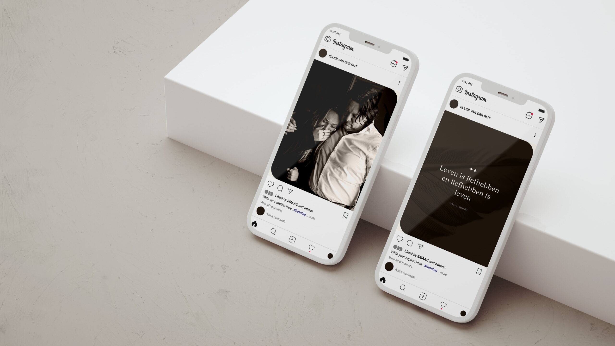
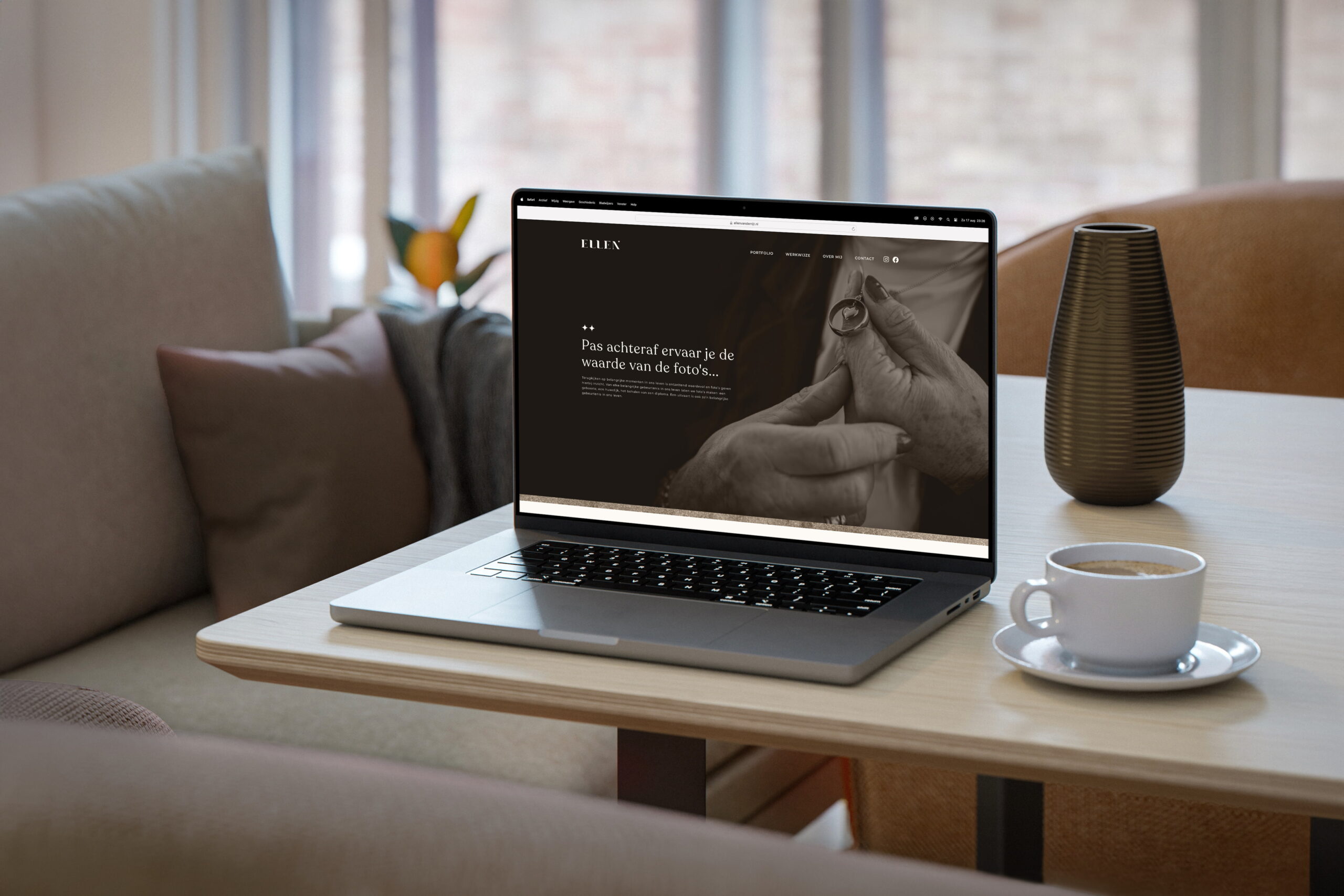
Because funeral photography is such a sensitive subject, we chose a restrained communication strategy. The branding focuses primarily on personal contact through undertakers and encourages mouth-of-mouth recommendations. The carefully designed brochure and photo books express the quality and empathy in Ellen’s work, both in words and in images.


Brands built on big ideas
Next project
Paper Club shows how paper packaging can contribute to a sustainable yet enjoyable picnic experience.
Zeep transforms daily care into a colorful and joyful experience that is instantly recognizable.
Join our community!
Sign up for our newsletter
Building a strong brand starts with inspiration. With our newsletter, you’ll receive that inspiration right when you need it, in your inbox. At Fraaij Makers, we believe a brand isn’t built in a day. It’s a process of building, adjusting, and continuous learning. Our newsletter is your reminder to pause and reflect on your brand. It offers insights, tips, and ideas to help your brand keep growing.
A warm light in dark times
Ellen
about the project
Delivered products
- Brand strategy
- Logo design
- Color palette & typography
- Visual language
- Website
- Social media templates
- Stationery
- Brochure
Client
Ellen started out as a farewell photographer, with the wish to make her expertise visible in a recognizable and authentic way. Since farewell photography is still relatively unknown, it was essential that her brand identity conveyed both warmth and trust. The branding needed to align with her personal style: careful and with genuine attention to the person behind the moment.
Challenge
How do you create a brand for such a sensitive field that radiates both warmth and trust? Ellen wanted an identity that was accessible to bereaved families while also being distinctive within her profession. The branding had to project calm, provide reassurance in an emotionally charged time, and clearly communicate the value of farewell photography. The challenge was to find the balance between professionalism and empathy, so families feel understood and choose Ellen with confidence.


The feather runs as a visual thread through the identity. It represents letting go, remembrance, and gentleness. Core values that reflect Ellen’s way of working. Combined with warm brown tones and calming white space, the feather can be felt in color, texture, and imagery without ever being dominant.


Minimal graphic elements add recognition without distracting from the photography.


Because funeral photography is such a sensitive subject, we chose a restrained communication strategy. The branding focuses primarily on personal contact through undertakers and encourages mouth-of-mouth recommendations. The carefully designed brochure and photo books express the quality and empathy in Ellen’s work, both in words and in images.


Brands built on big ideas
Next project
Paper Club shows how paper packaging can contribute to a sustainable yet enjoyable picnic experience.
Zeep transforms daily care into a colorful and joyful experience that is instantly recognizable.
Join our community!
Sign up for our newsletter
Building a strong brand starts with inspiration. With our newsletter, you’ll receive that inspiration right when you need it, in your inbox. At Fraaij Makers, we believe a brand isn’t built in a day. It’s a process of building, adjusting, and continuous learning. Our newsletter is your reminder to pause and reflect on your brand. It offers insights, tips, and ideas to help your brand keep growing.
A warm light in dark times
Ellen
about the project
Delivered products
- Brand strategy
- Logo design
- Color palette & typography
- Visual language
- Website
- Social media templates
- Stationery
- Brochure
Client
Ellen started out as a farewell photographer, with the wish to make her expertise visible in a recognizable and authentic way. Since farewell photography is still relatively unknown, it was essential that her brand identity conveyed both warmth and trust. The branding needed to align with her personal style: careful and with genuine attention to the person behind the moment.
Challenge
How do you create a brand for such a sensitive field that radiates both warmth and trust? Ellen wanted an identity that was accessible to bereaved families while also being distinctive within her profession. The branding had to project calm, provide reassurance in an emotionally charged time, and clearly communicate the value of farewell photography. The challenge was to find the balance between professionalism and empathy, so families feel understood and choose Ellen with confidence.


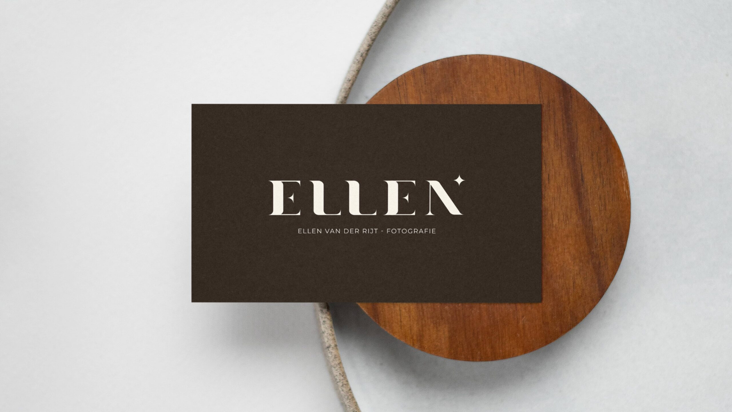


The small star in the logo symbolizes light and comfort. Subtle yet present, just like Ellen’s role during a farewell. It brings balance to the logo and adds a recognizable detail that conveys warmth and softness. The star appears throughout the entire visual identity, from quotation marks to the proportions of the rounded corners.


Because funeral photography is such a sensitive subject, we chose a restrained communication strategy. The branding focuses primarily on personal contact through undertakers and encourages mouth-of-mouth recommendations. The carefully designed brochure and photo books express the quality and empathy in Ellen’s work, both in words and in images.


Because funeral photography is such a sensitive subject, we chose a restrained communication strategy. The branding focuses primarily on personal contact through undertakers and encourages mouth-of-mouth recommendations. The carefully designed brochure and photo books express the quality and empathy in Ellen’s work, both in words and in images.


Brands built on big ideas
Next project
Paper Club shows how paper packaging can contribute to a sustainable yet enjoyable picnic experience.
Zeep transforms daily care into a colorful and joyful experience that is instantly recognizable.
Join our community!
Sign up for our newsletter
Building a strong brand starts with inspiration. With our newsletter, you’ll receive that inspiration right when you need it, in your inbox. At Fraaij Makers, we believe a brand isn’t built in a day. It’s a process of building, adjusting, and continuous learning. Our newsletter is your reminder to pause and reflect on your brand. It offers insights, tips, and ideas to help your brand keep growing.
Contact us: