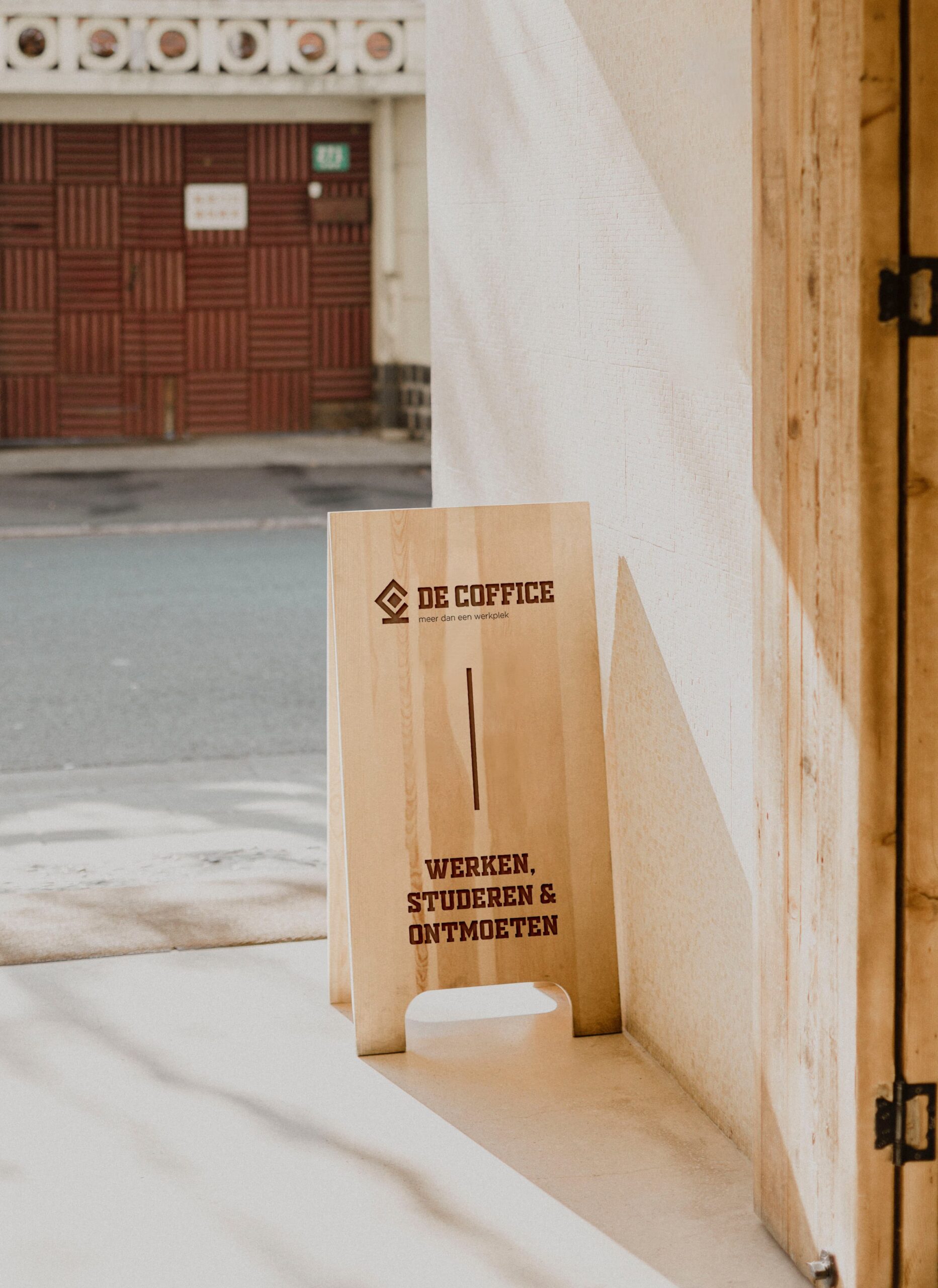
Delivered products
- Brand personality workshop + Brand profile
- Tagline
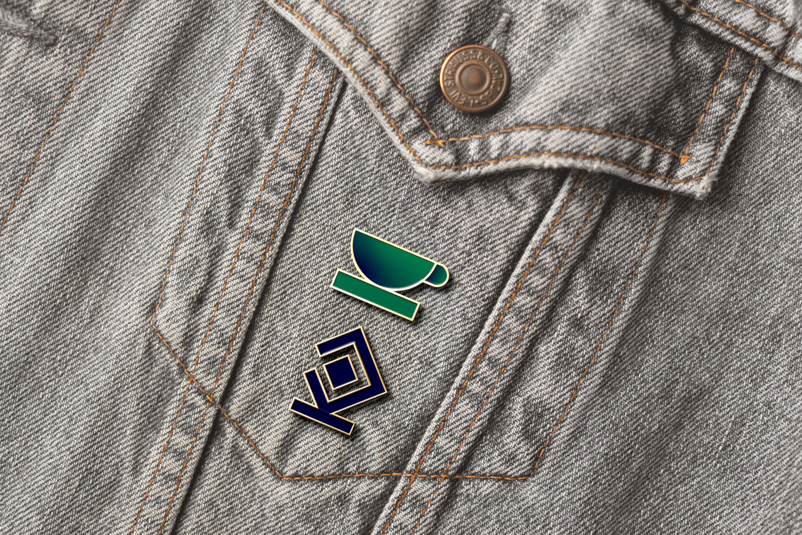
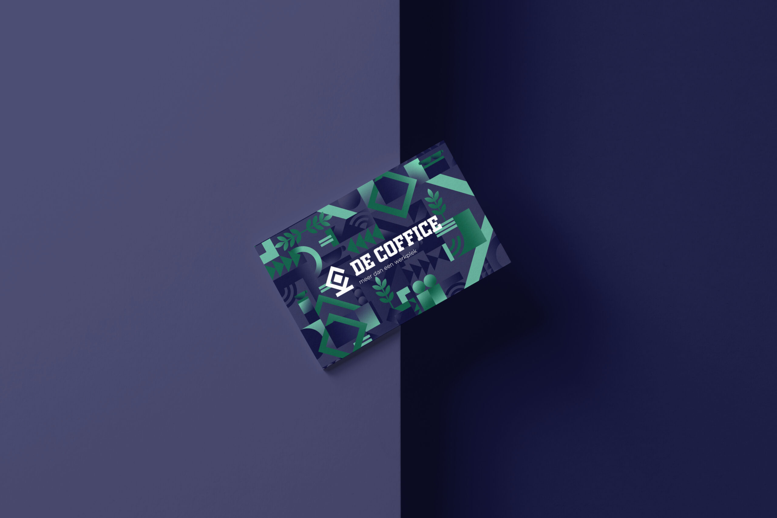
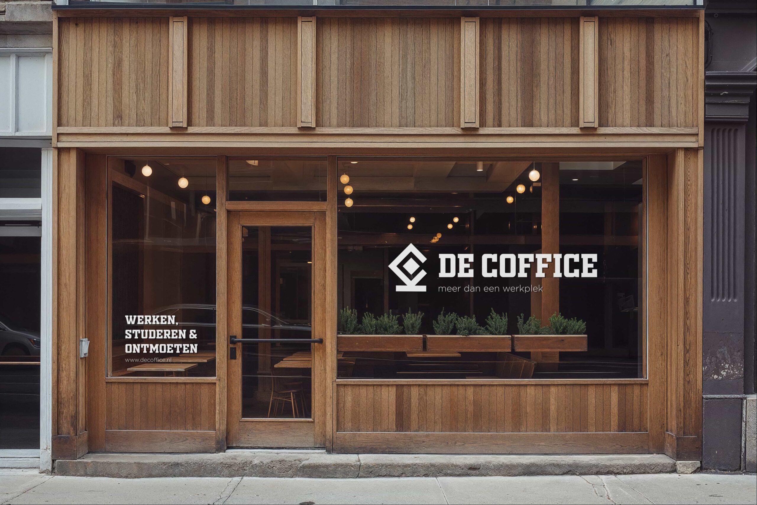
- Logo design
- Color palette & typography
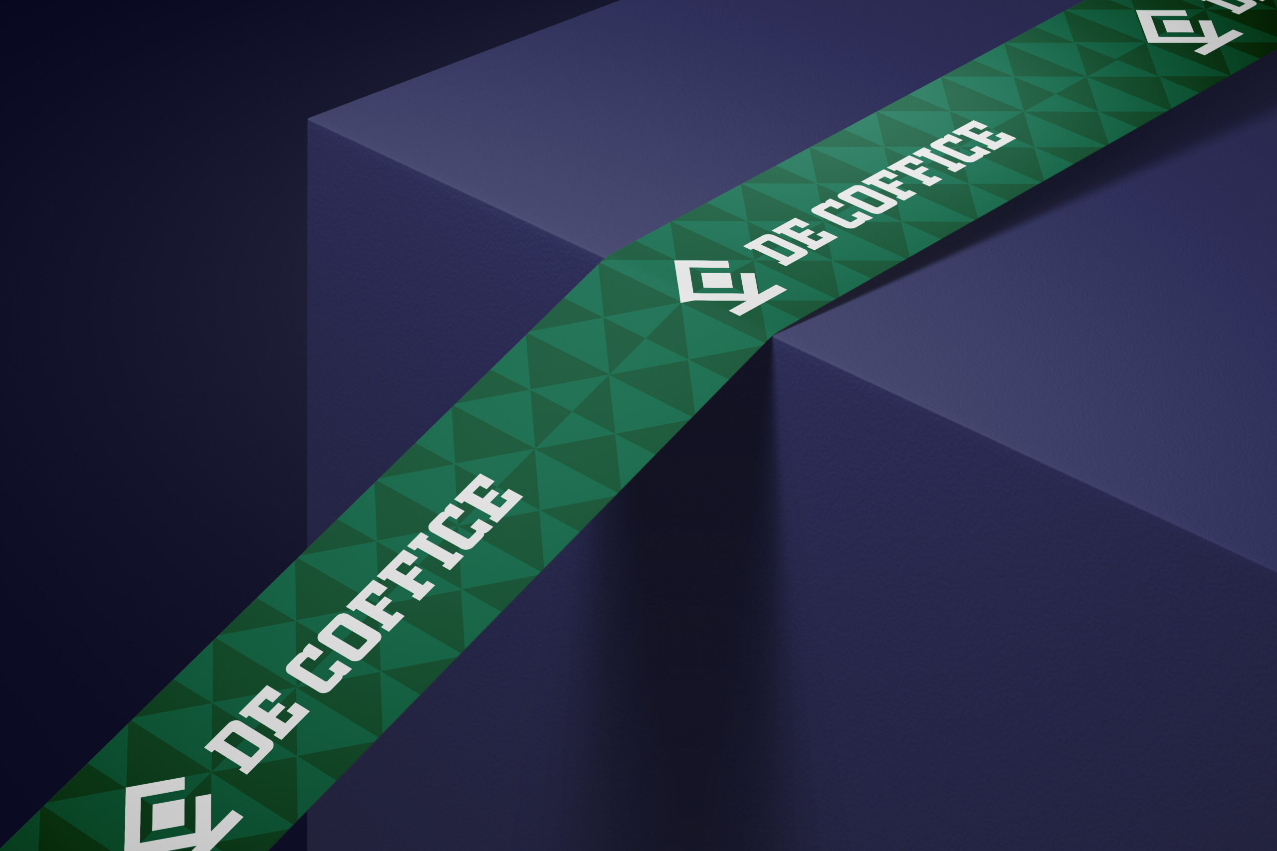
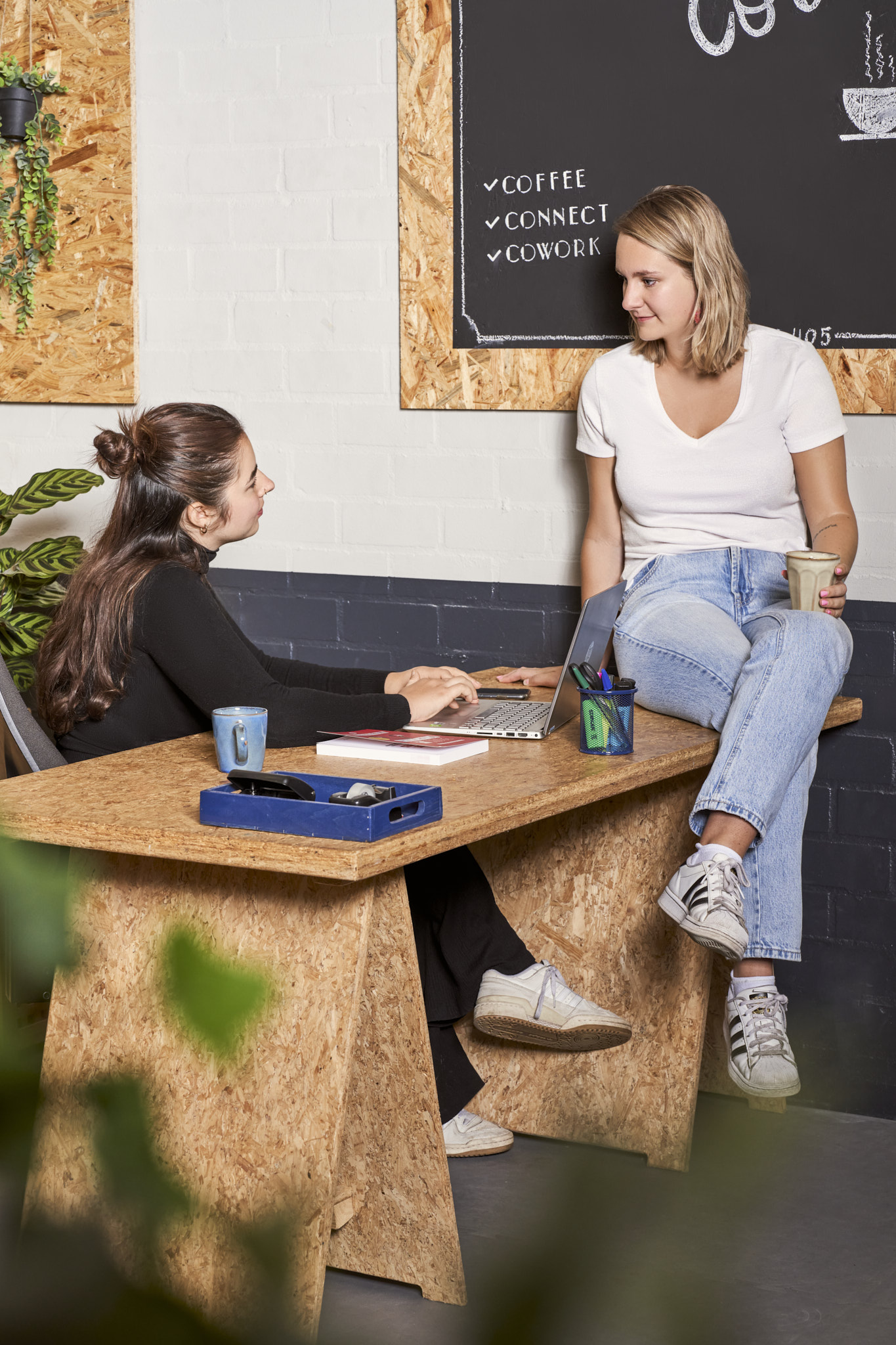
- Design language
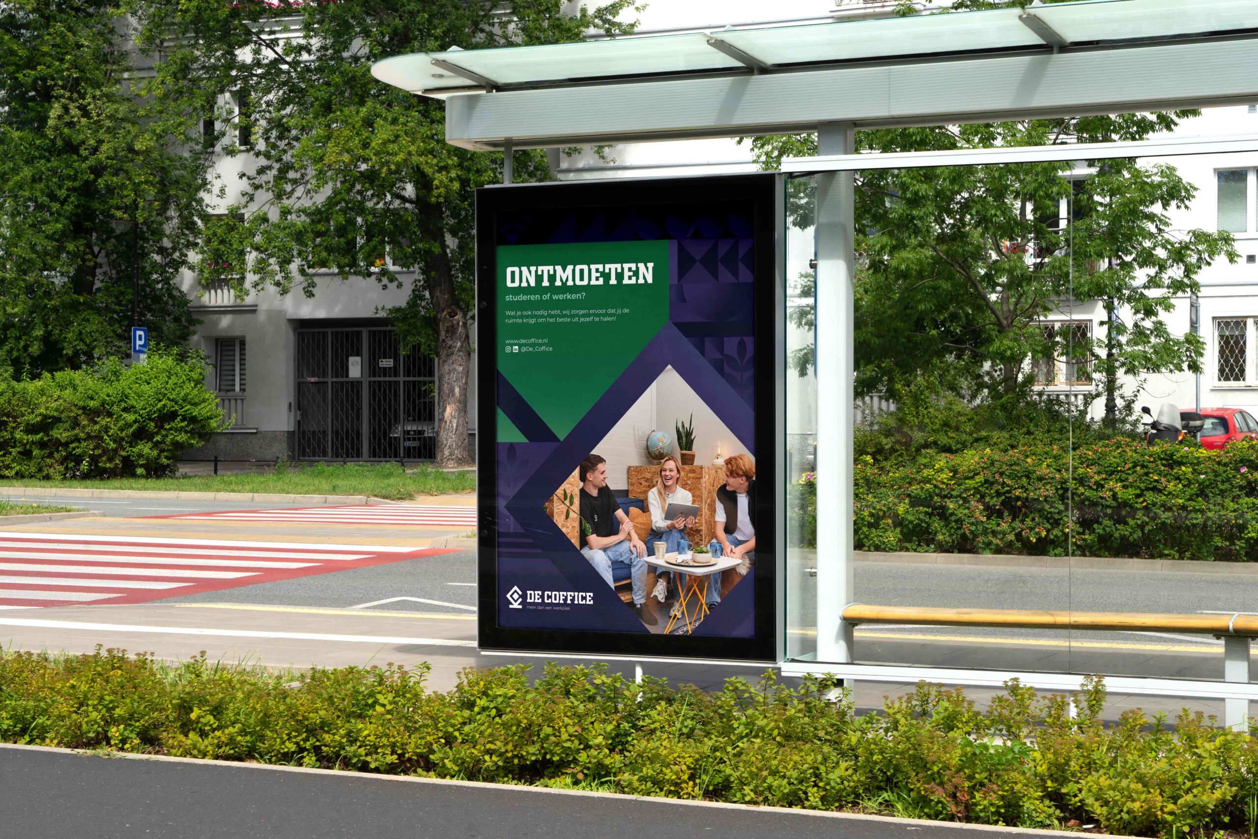
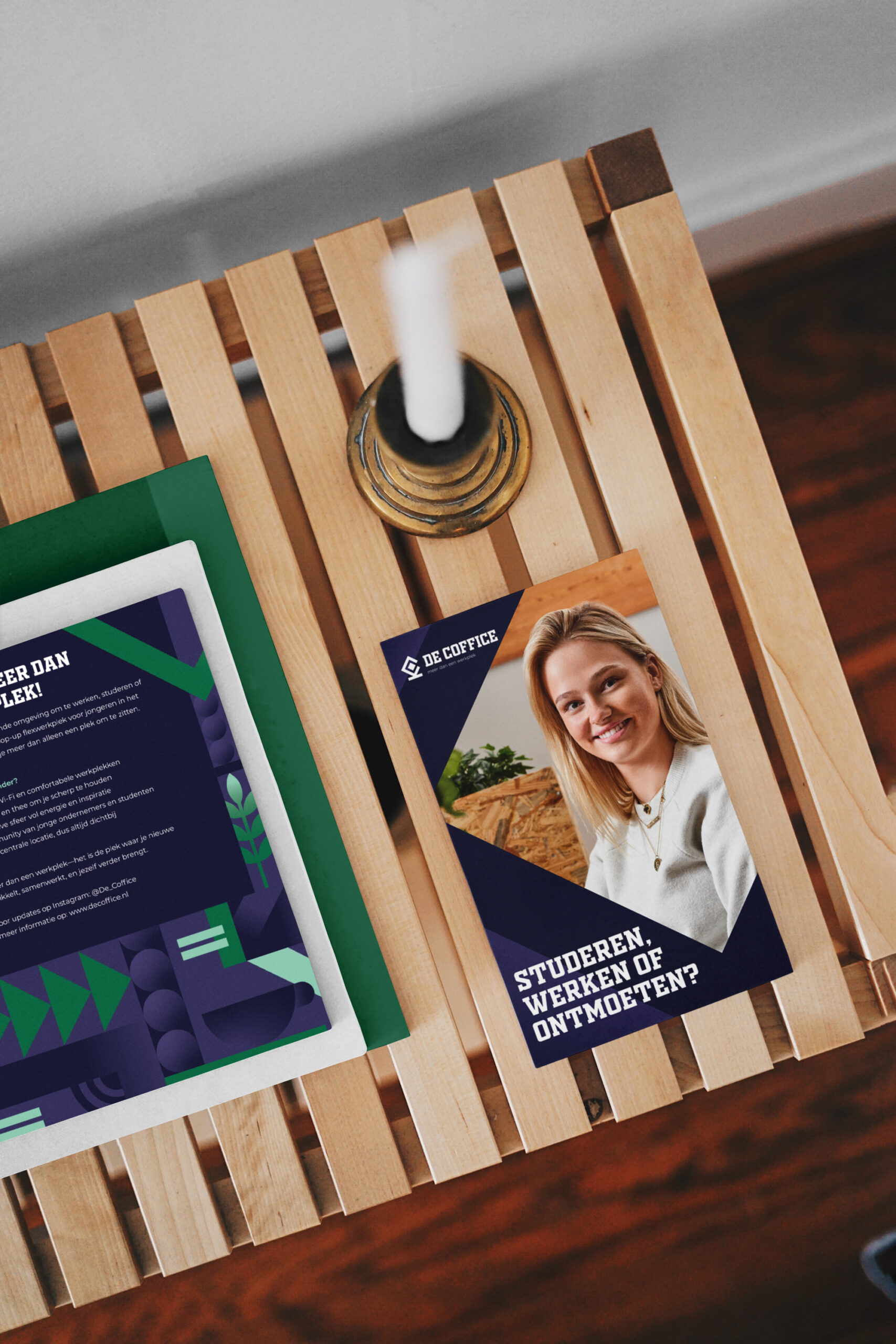
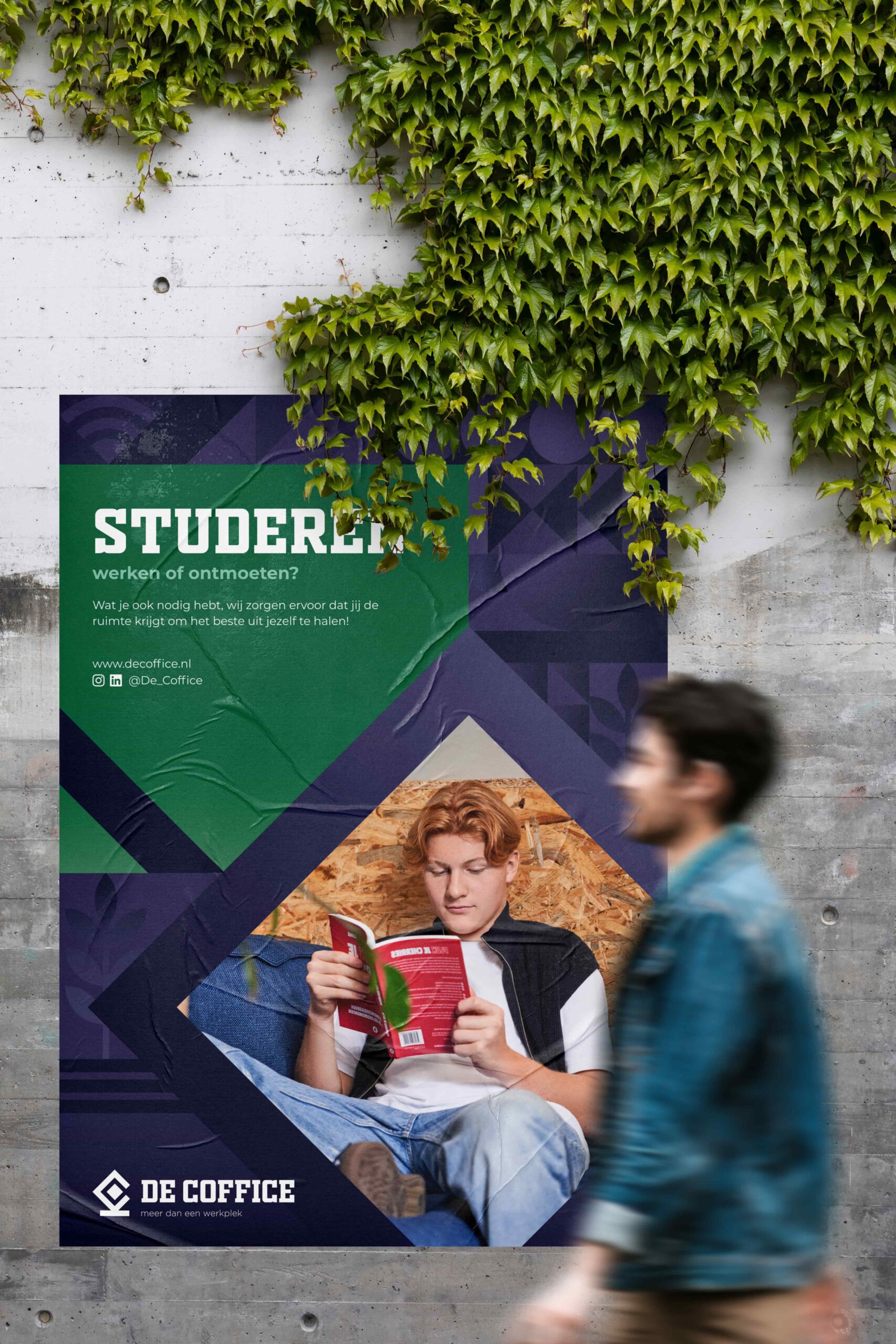
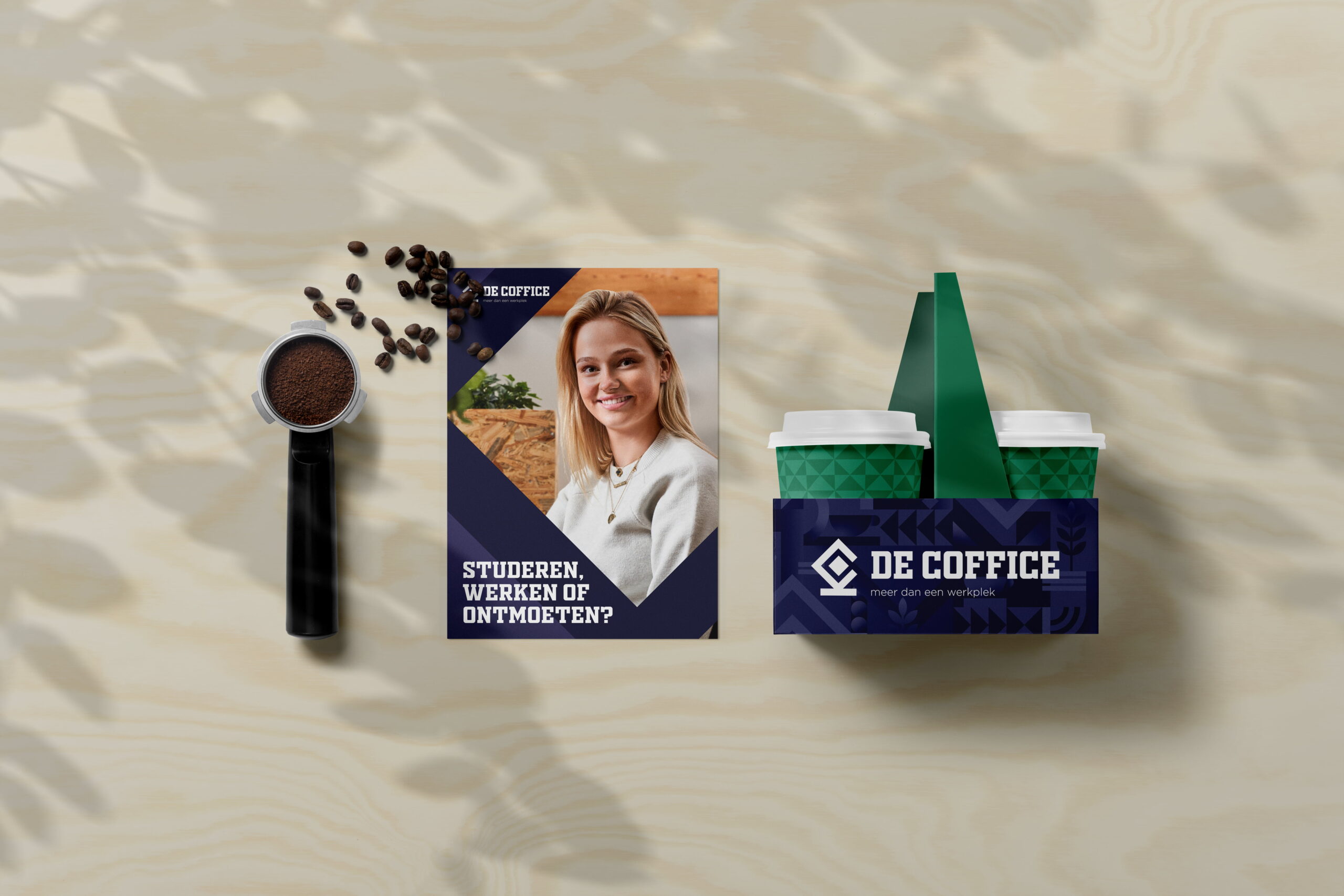
- Posters
- Flyers
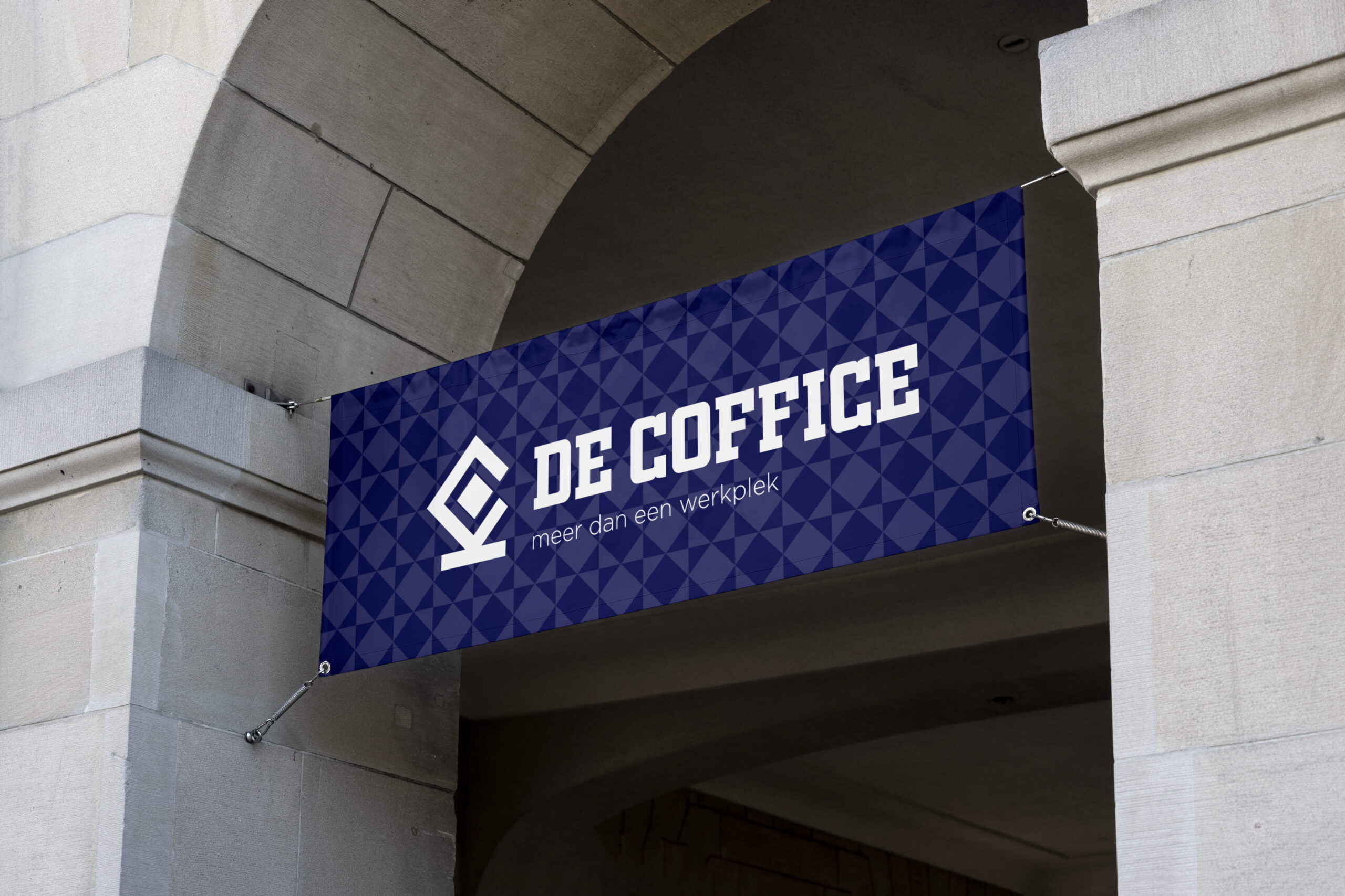
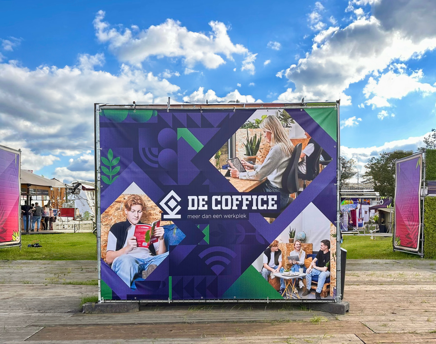
- Banners
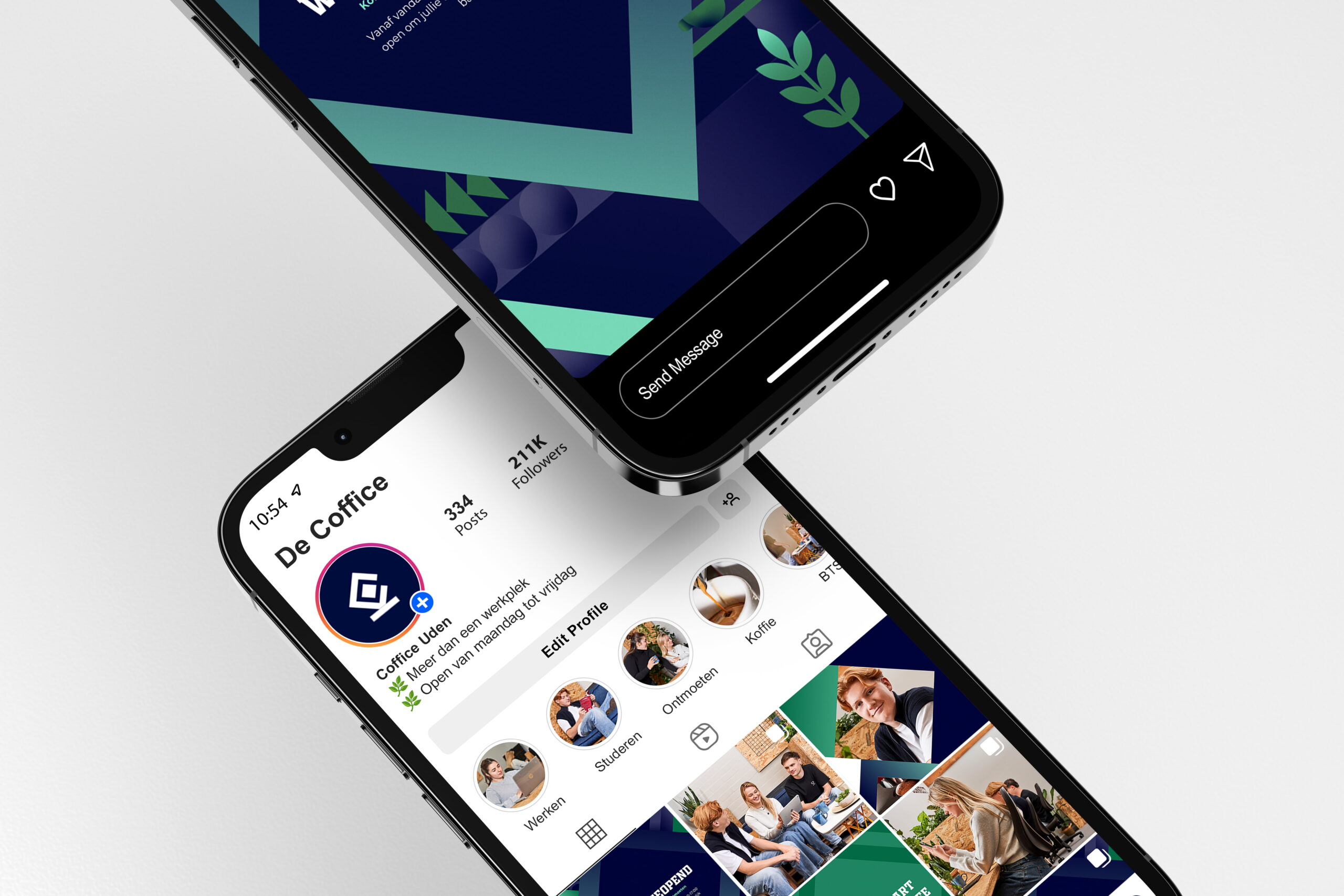
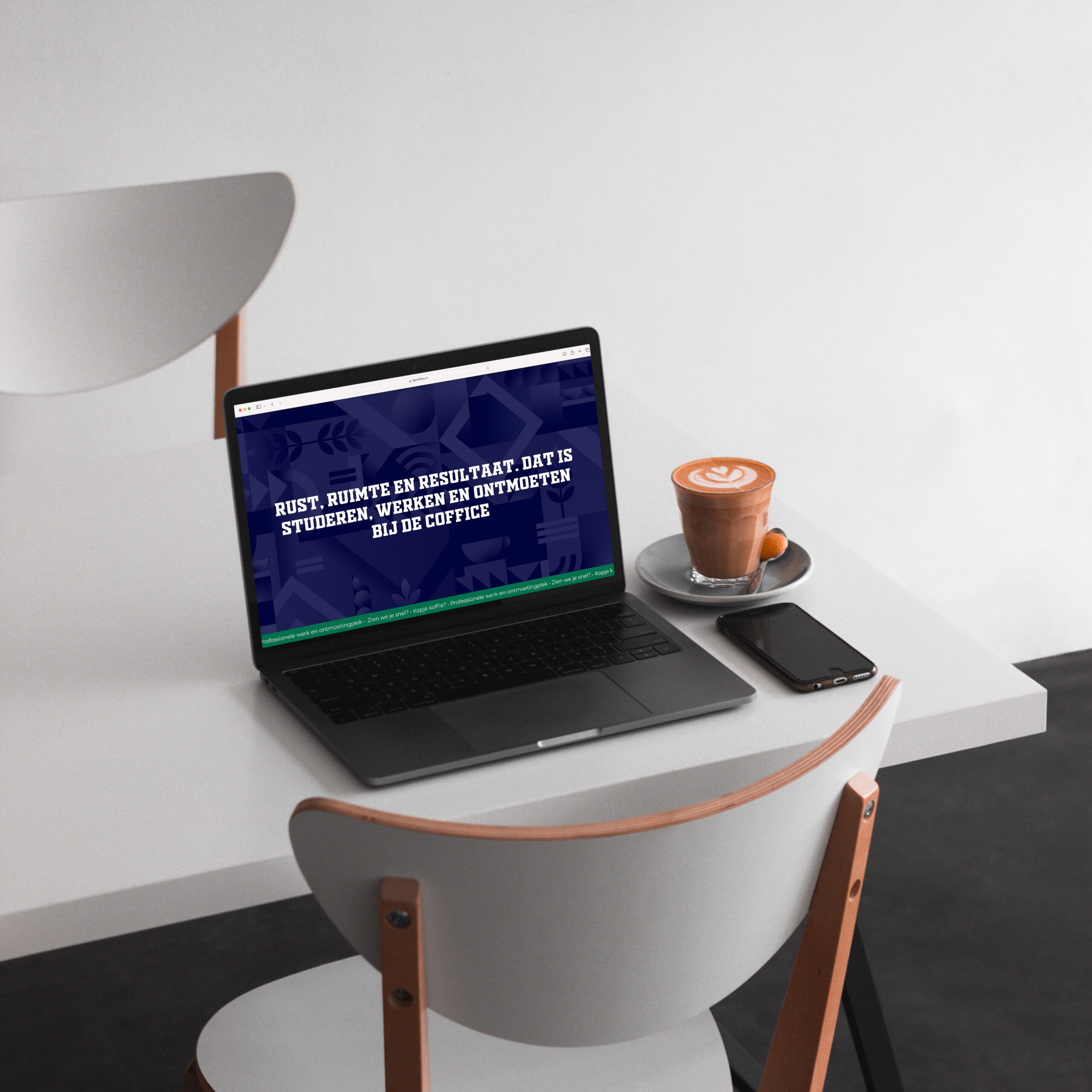
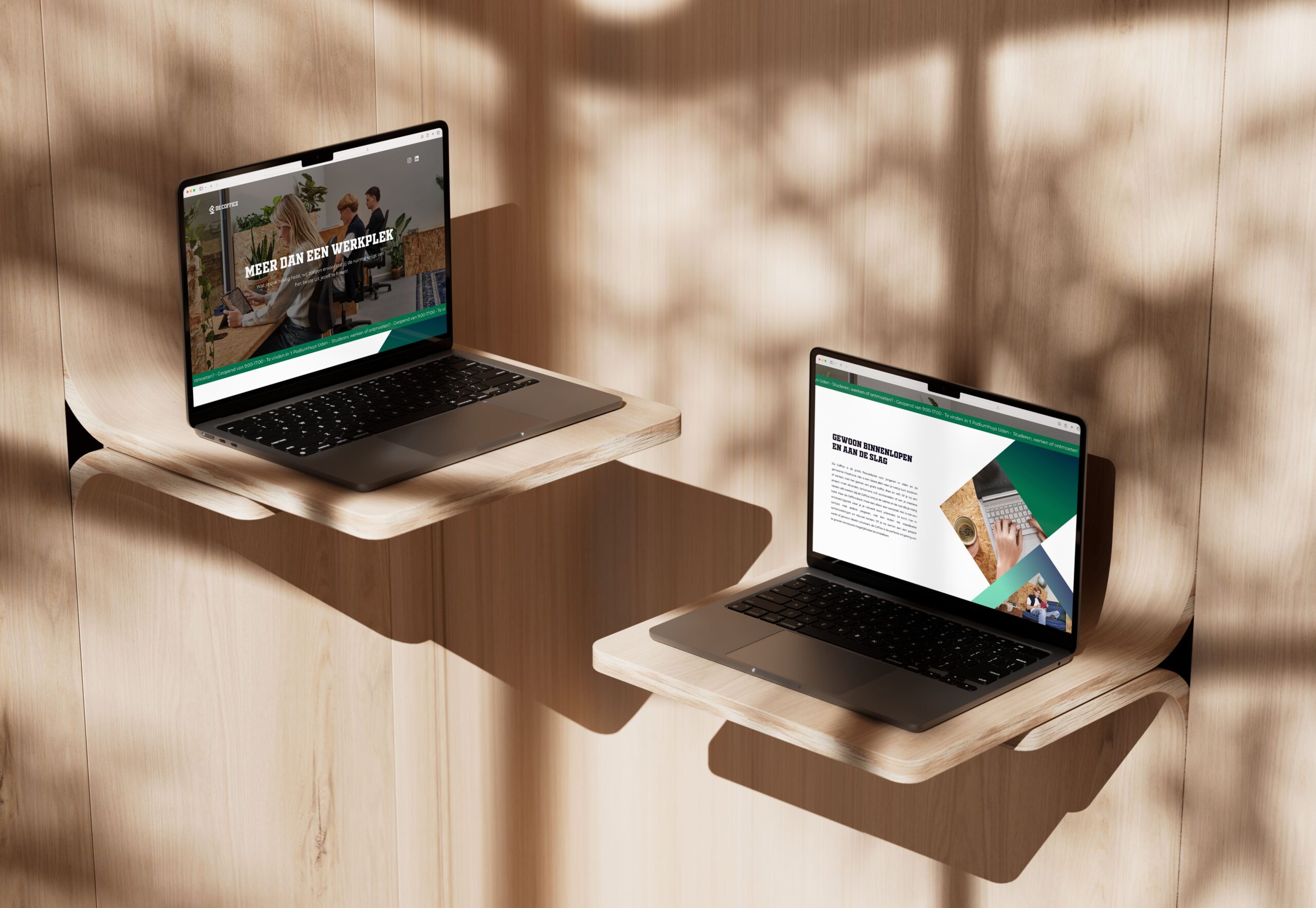
- One-page website
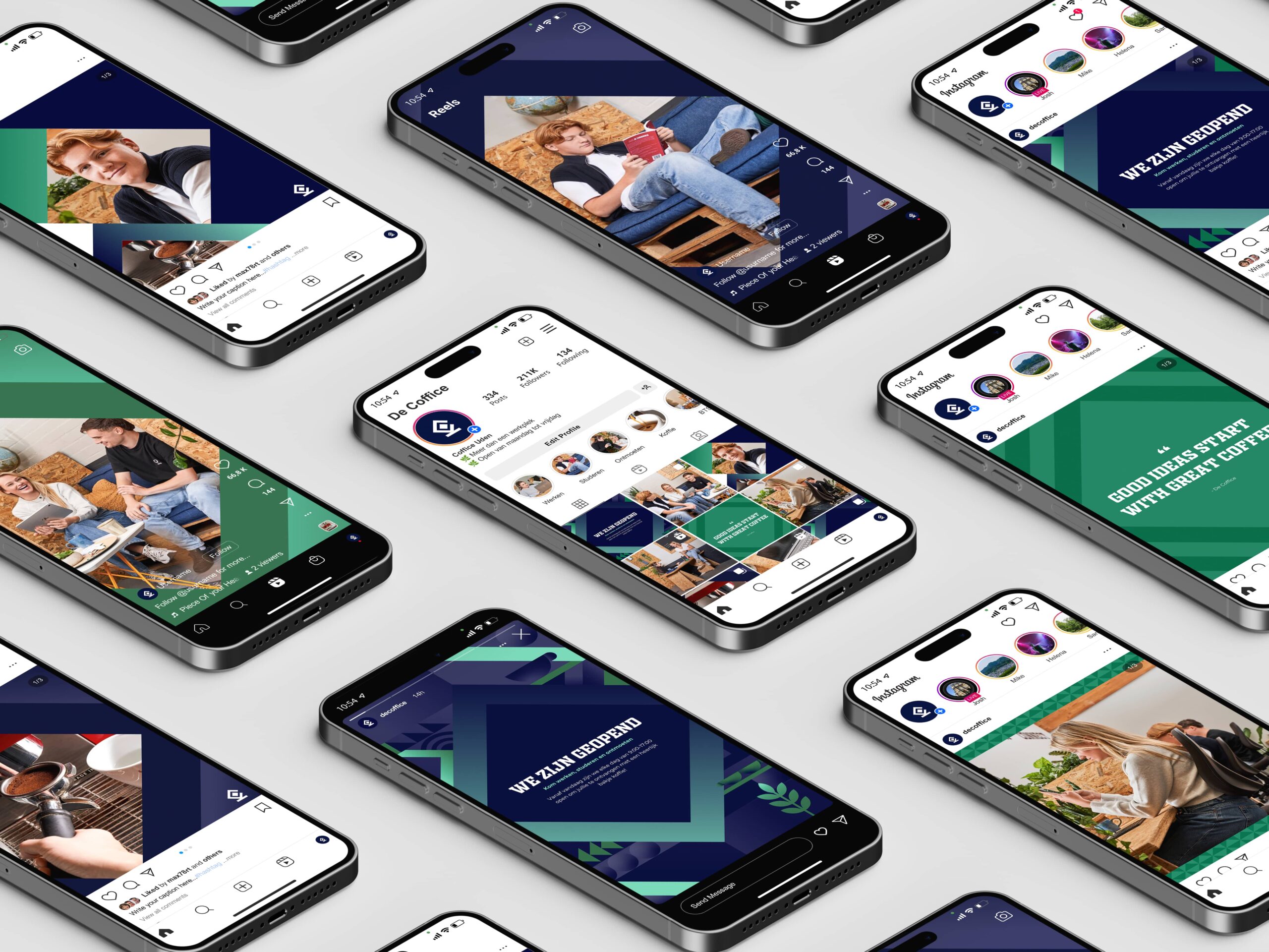
- Social media templates
Client
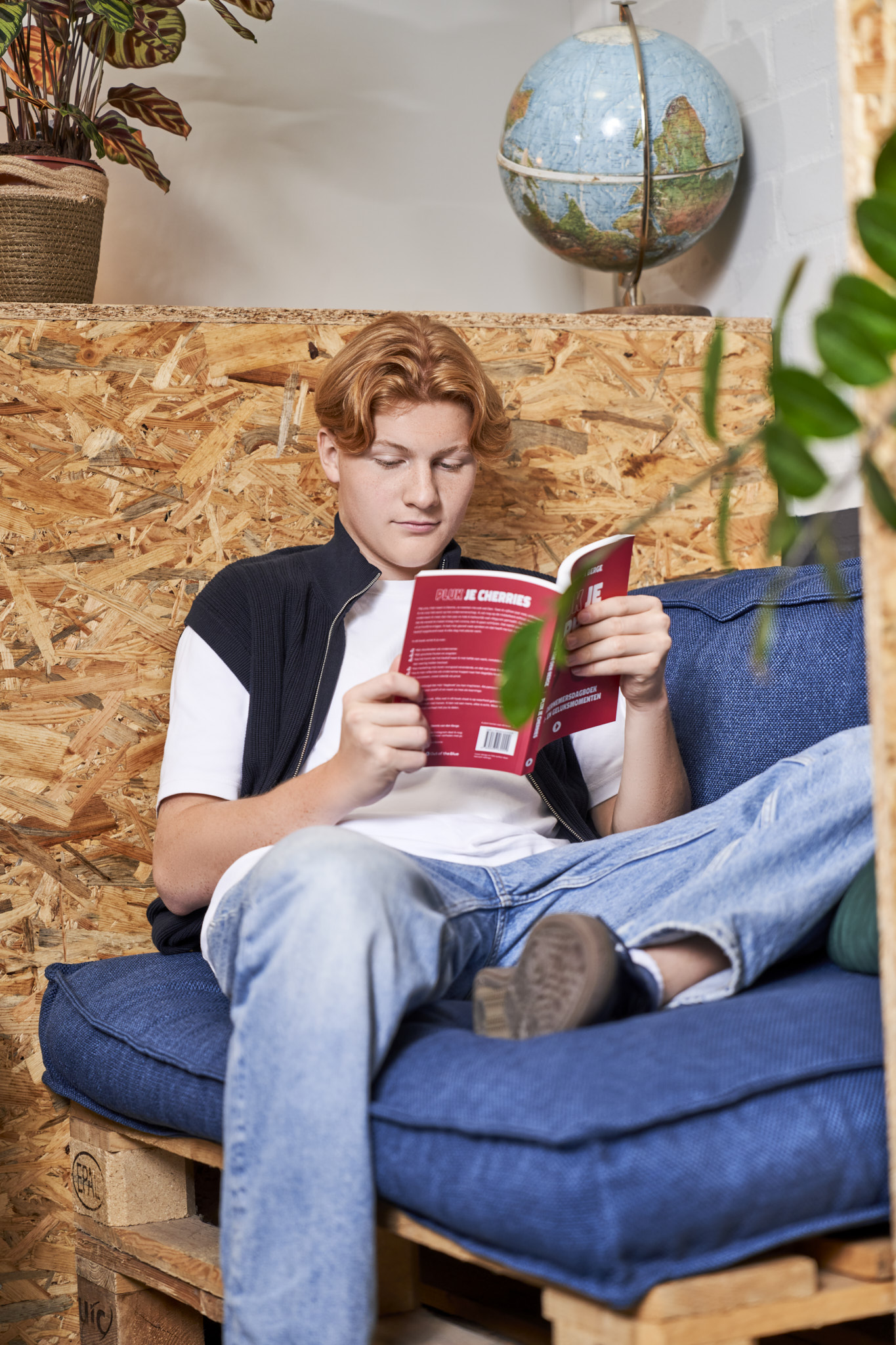
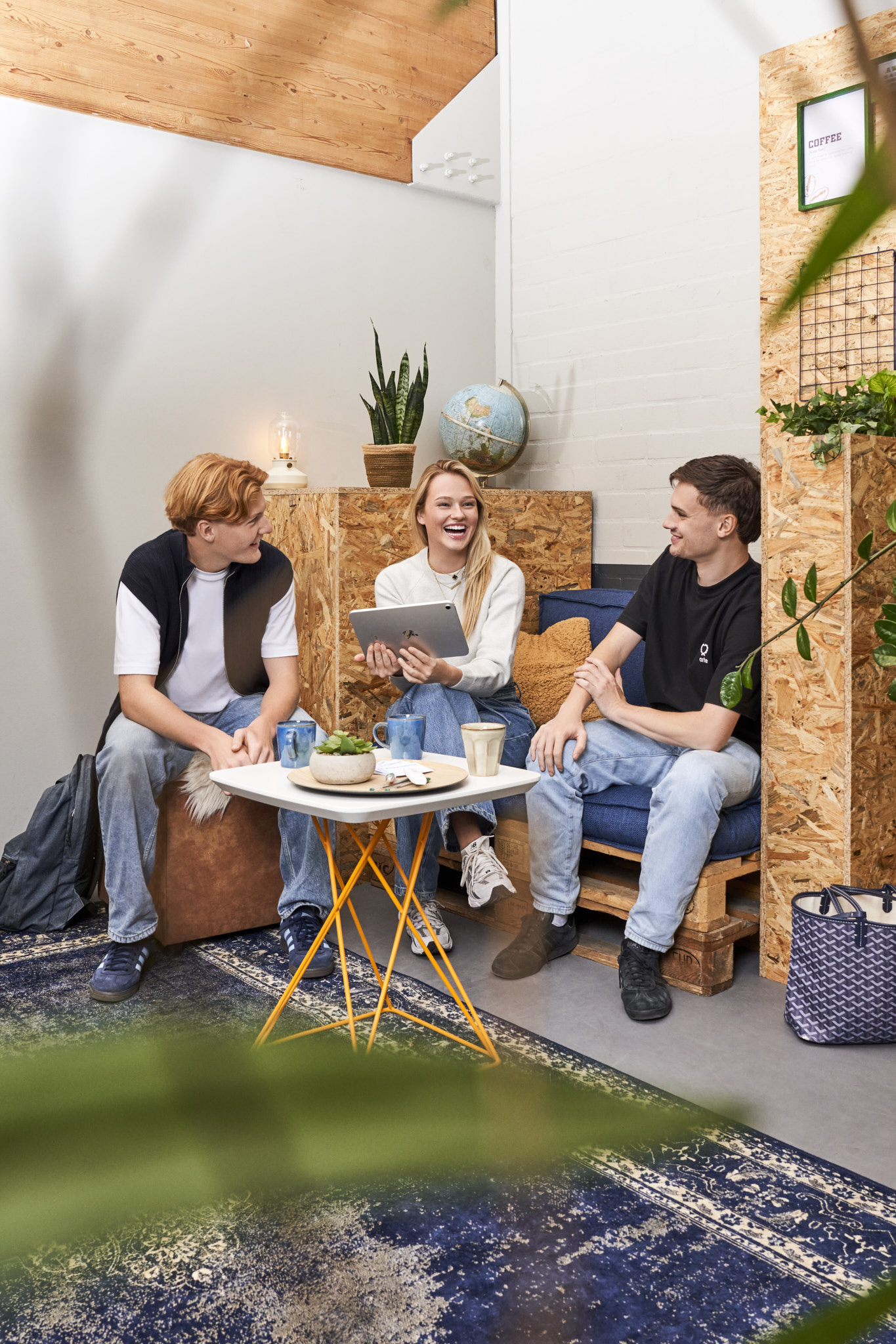
The Coffice is an initiative by Campus. It provides young people with an accessible place to study, work, and connect. The concept needed to feel familiar to those who already knew Campus, while also standing on its own with a unique identity. The goal was to create a space that inspires, welcomes, and brings people together.
Challenge
The main challenge was to create a brand identity that aligned with the existing Campus style, yet could function independently. At the same time, the brand needed to radiate professionalism without losing the accessibility and energy that resonated with its target audience. Recognition, distinction, and approachability formed the foundation for The Coffice’s visual identity.
Partners
Photographer: Lara van den Broek