A dynamic meeting place
Campus
about the project
Delivered products
- Logo design
- Color palette & typography
- Visual language
- Posters
- Social media templates
- Merchandise
- Stationery
Client
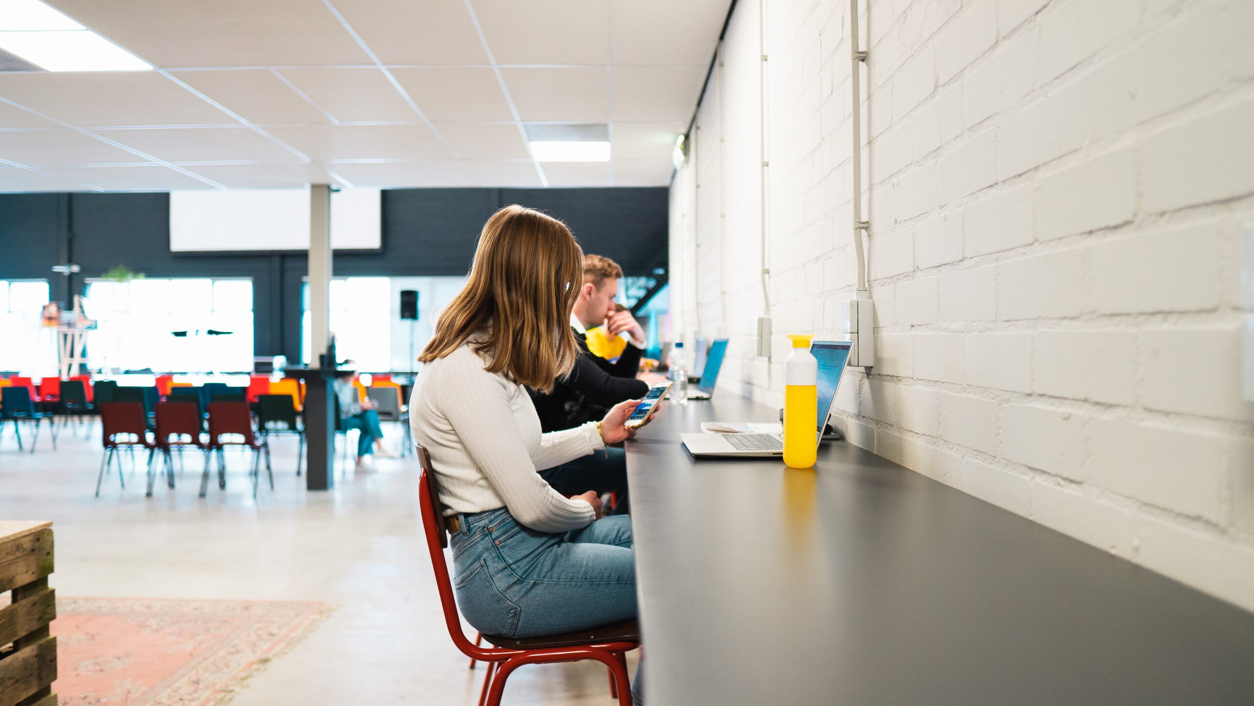
Campus is where education, entrepreneurship, and connection come together. Young people from the region find space here to develop, collaborate, and showcase their talents. The Campus wanted to present itself as a modern and inspiring environment that feels both familiar and energizing to them.
Challenge
The Campus was a new initiative without a clear or recognizable identity. The challenge: how do you give this dynamic meeting place a look and feel that connects with young people while also reflecting the organization’s professional and forward-looking ambitions? We developed branding that radiates energy, collaboration, and growth. A visual identity that positions The Campus as a place where learning, working, and personal development come together.
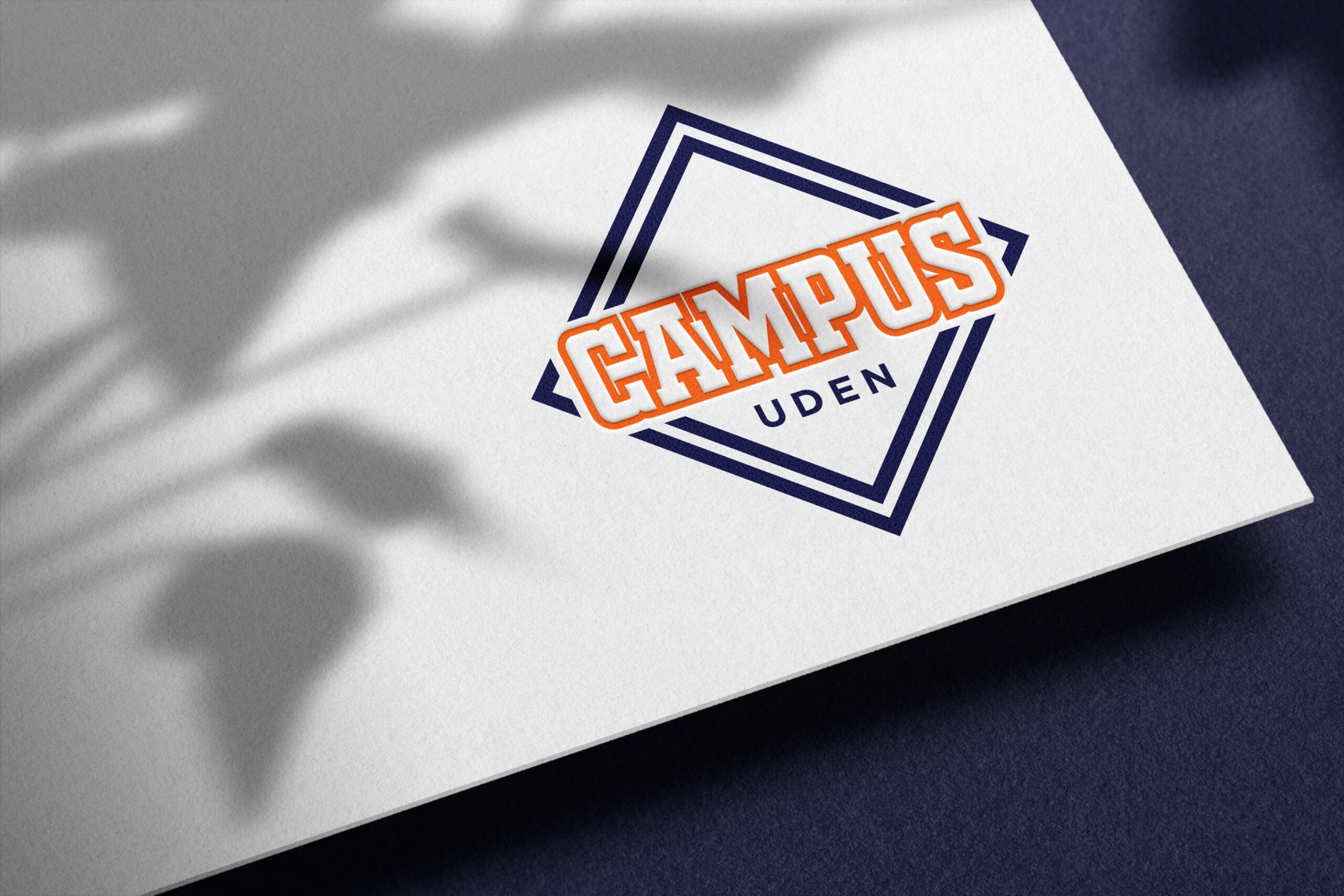

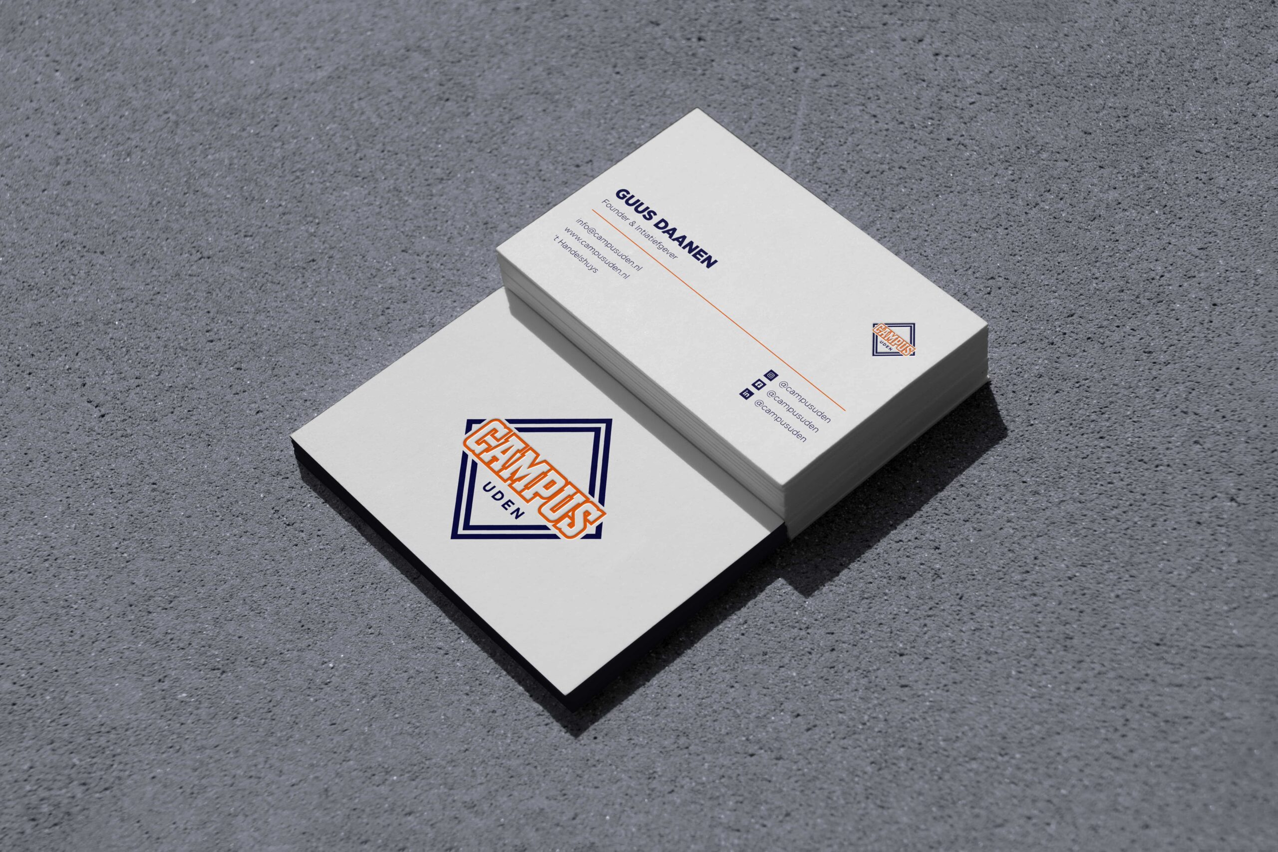
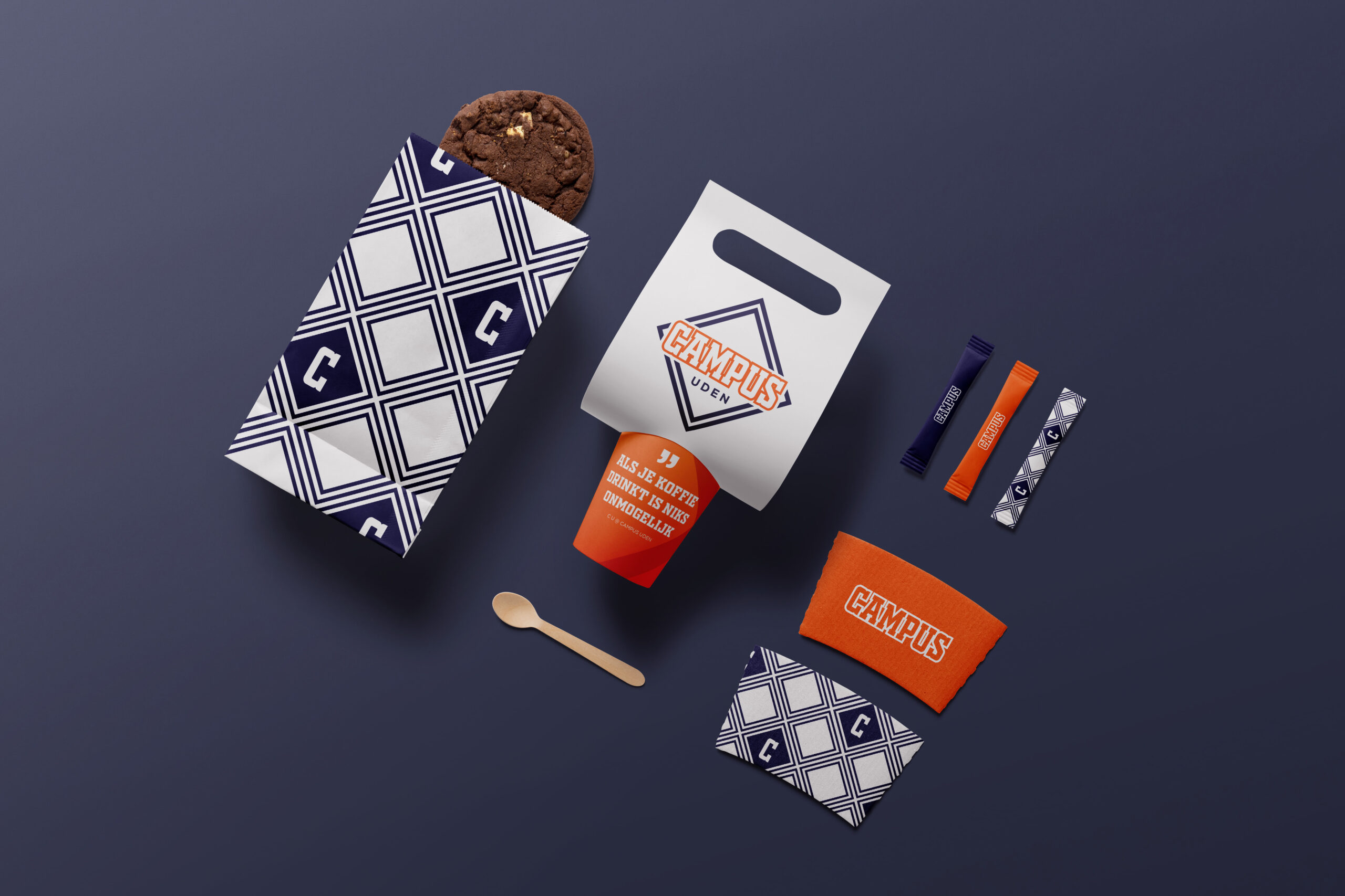
The diamond-shaped logo represents the versatility of the Campus and the space where everything it has to offer comes together. The form symbolizes growth, direction, and collaboration, core values that define the Campus identity and make it tangible across every form of communication.
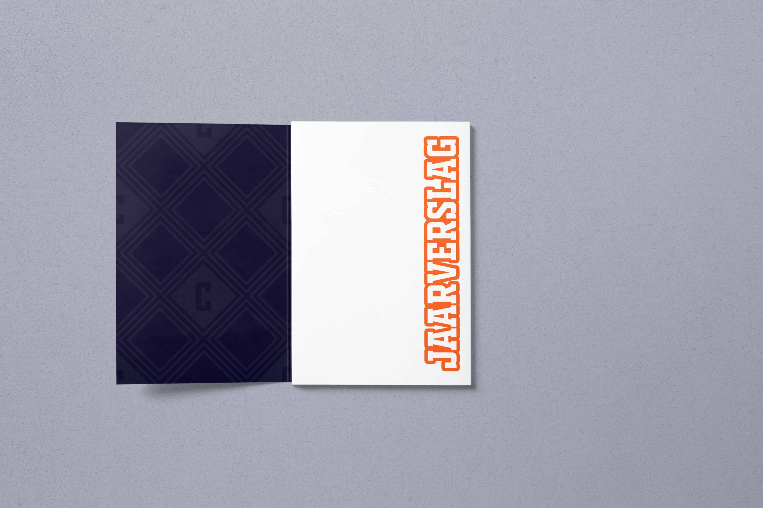
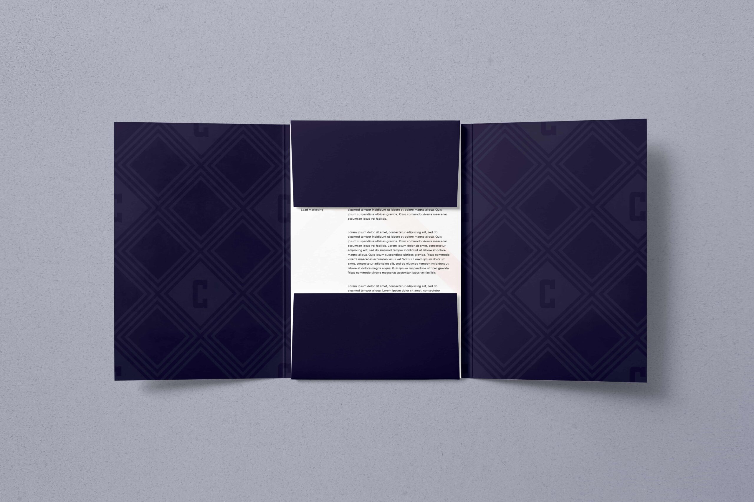
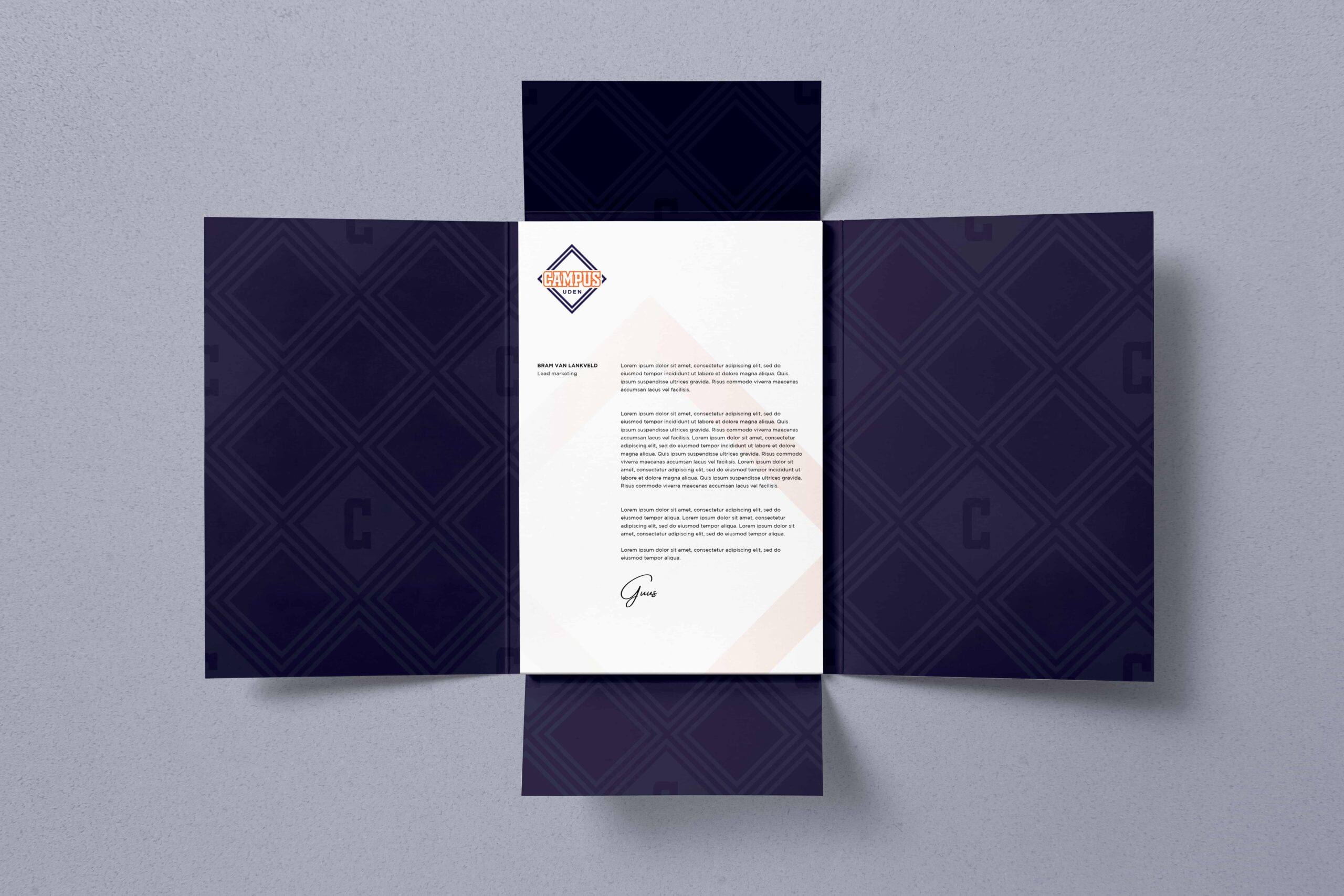
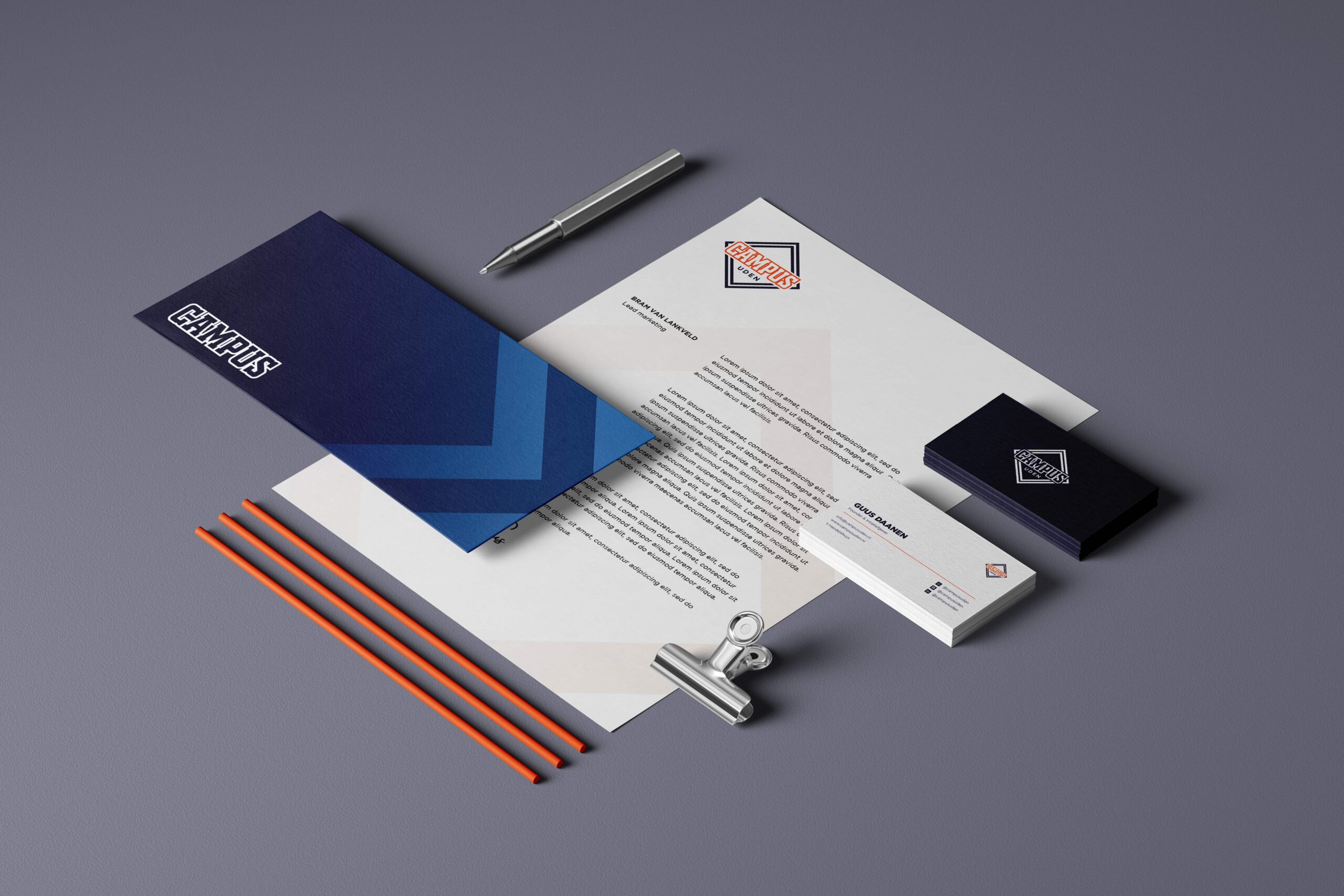
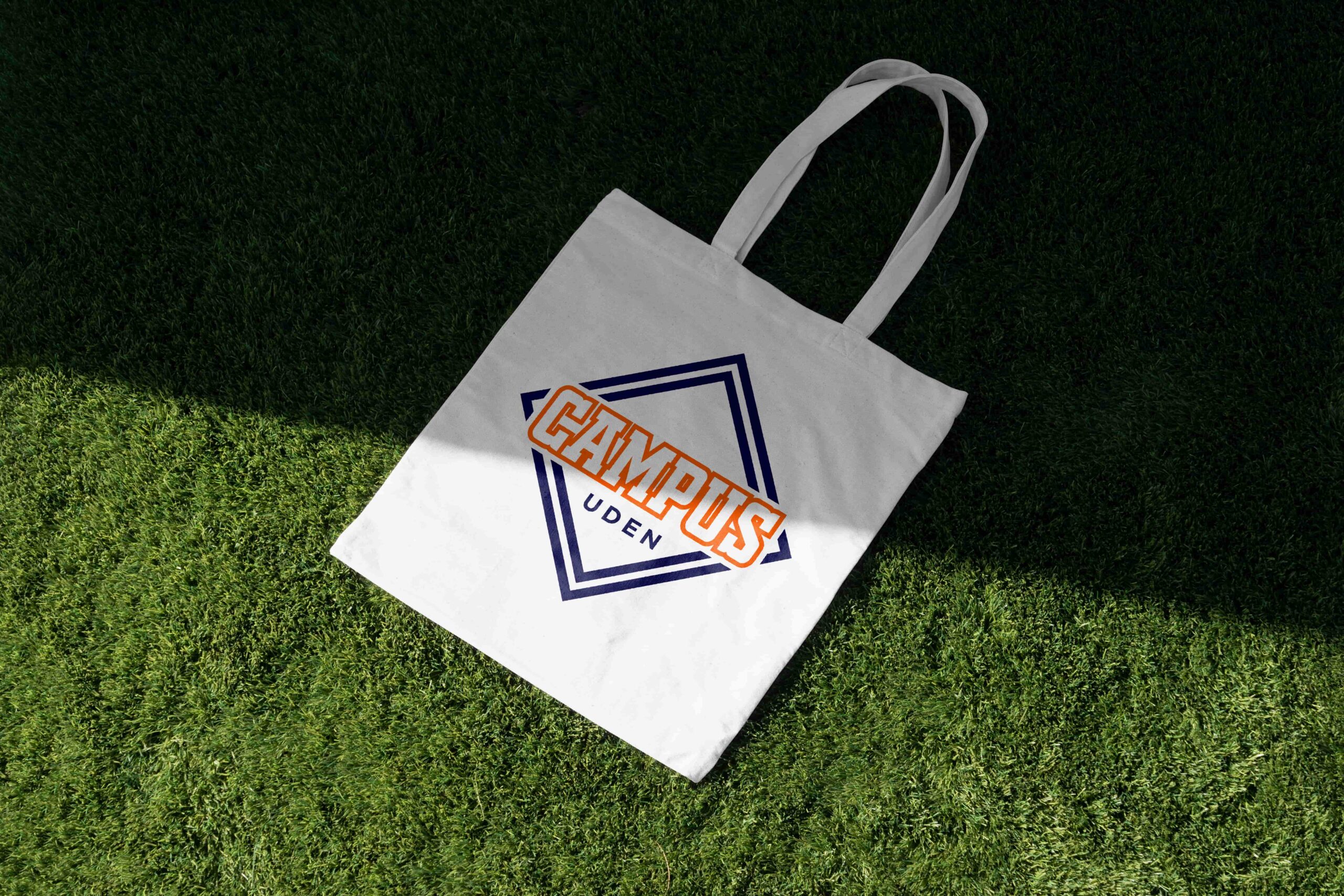

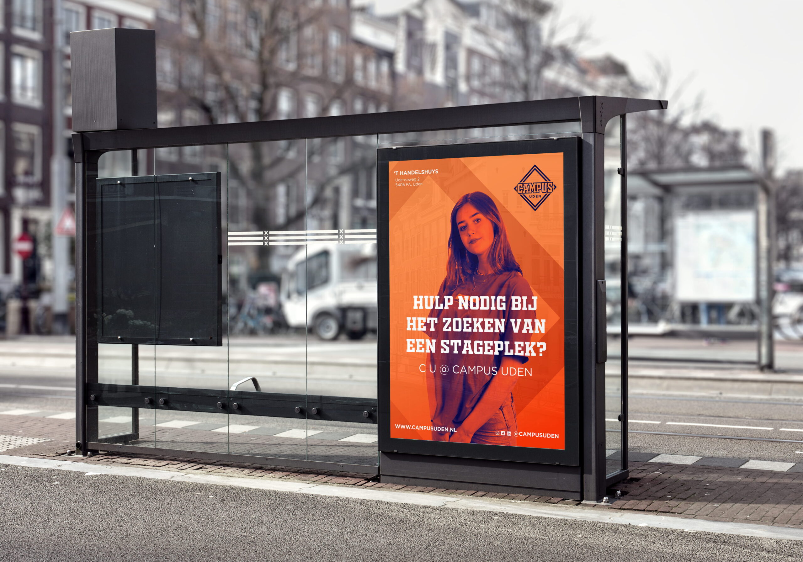
The color palette, built around orange and deep blue, highlights both energy and reliability. Orange adds warmth and vibrancy, while deep blue provides a sense of professionalism and stability. The bold typography reinforces the dynamic “campus” spirit, giving the identity a confident, recognizable look, both online and in physical spaces.
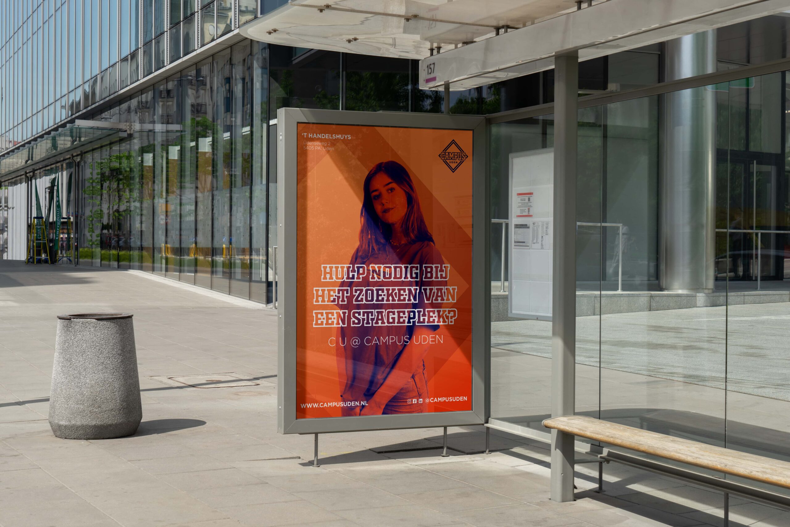
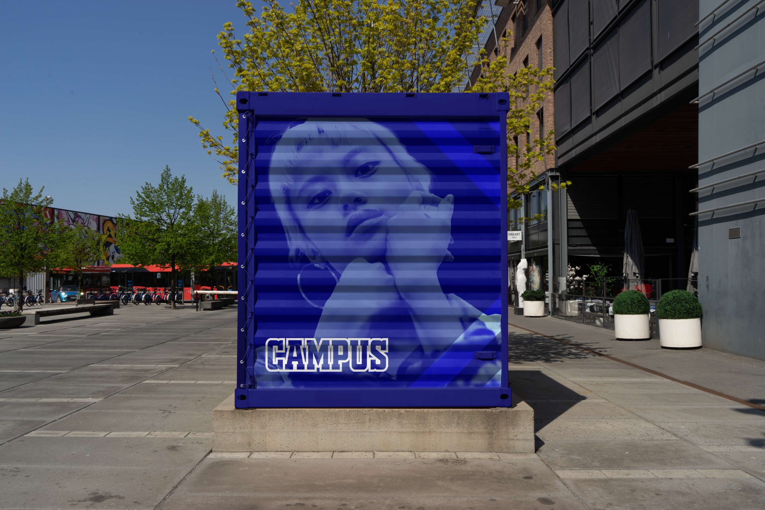
Our co-creation sessions with Campus students enriched the branding with fresh perspectives and creative energy. Their ideas inspired the concept of literally giving students a face in the visual communication. By combining their portraits with bold color fields and graphic shapes, we made it clear that the Campus is all about people and their growth.

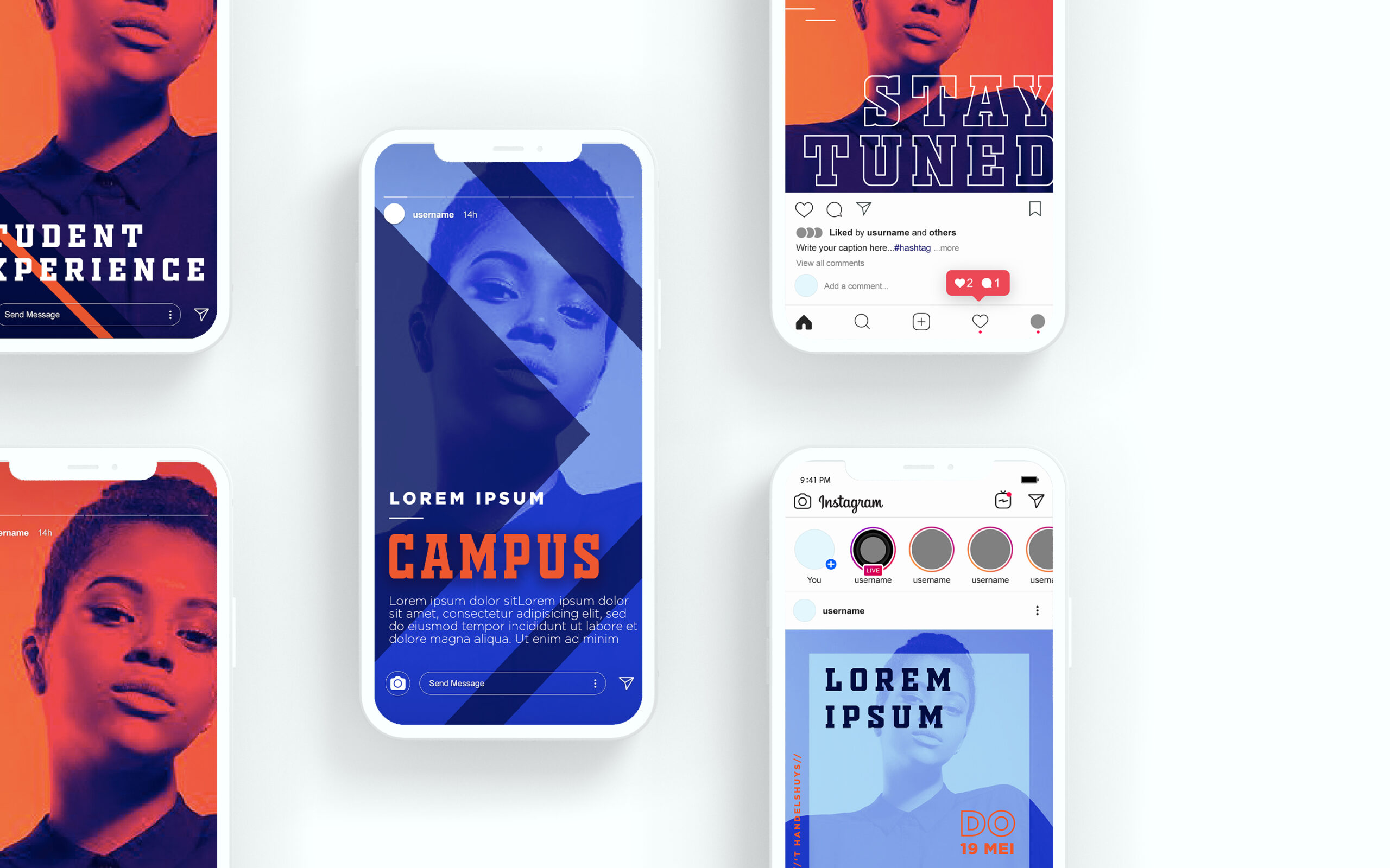
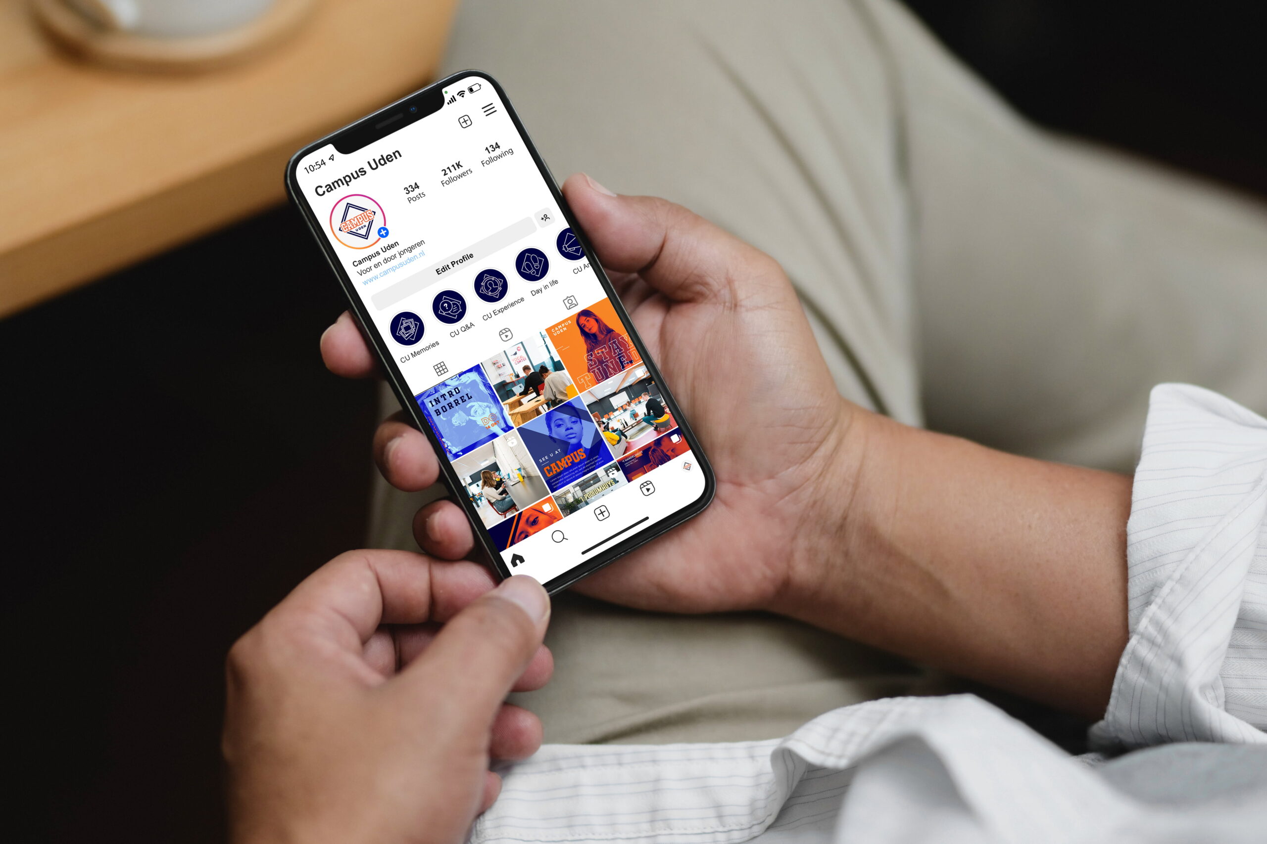
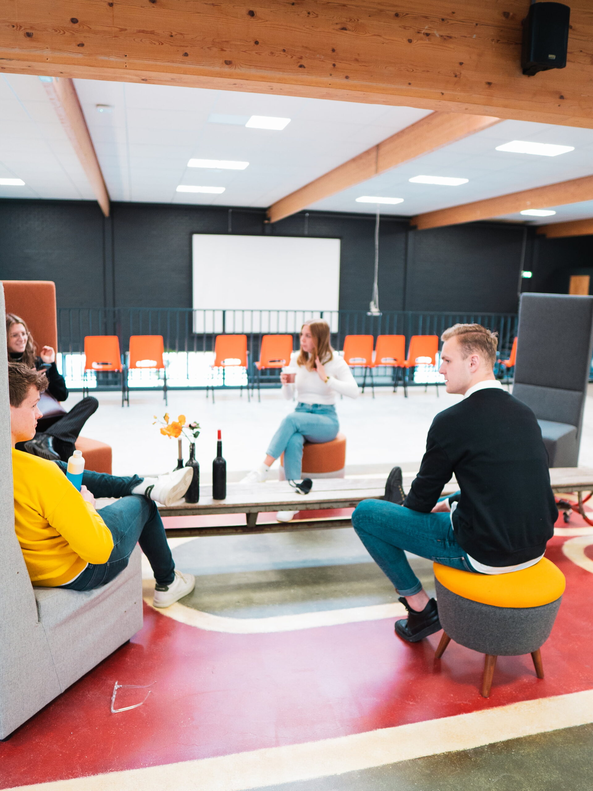
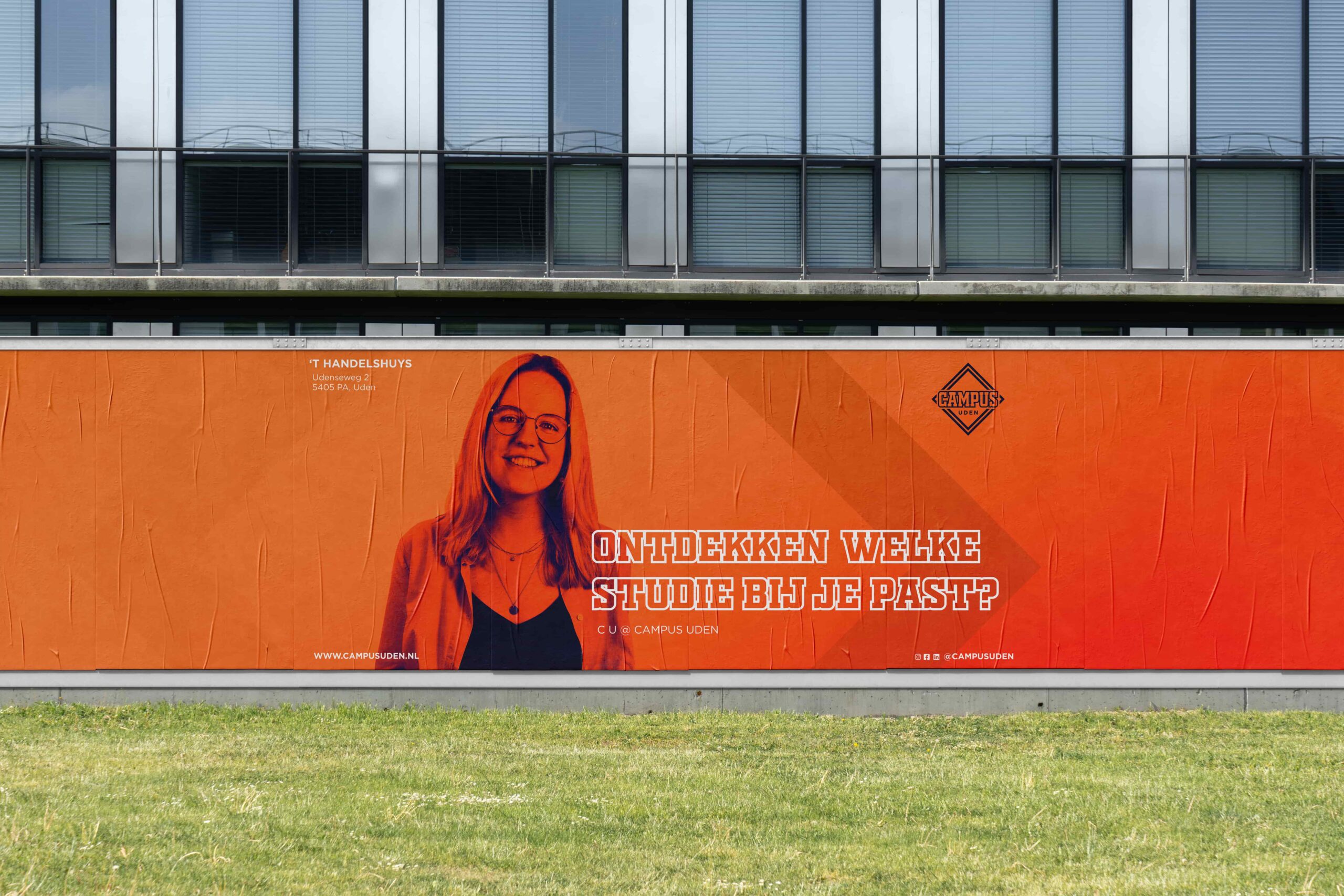
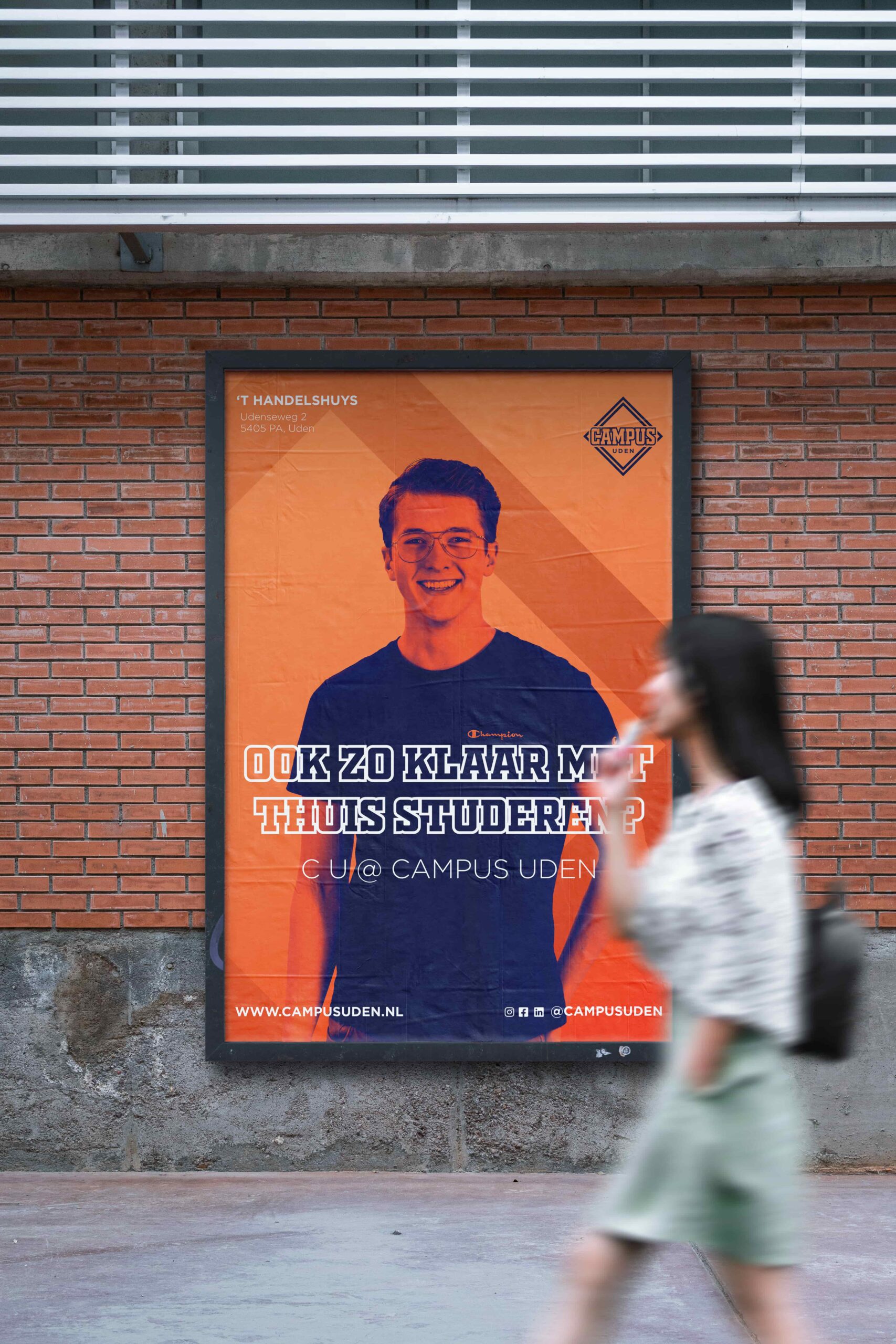
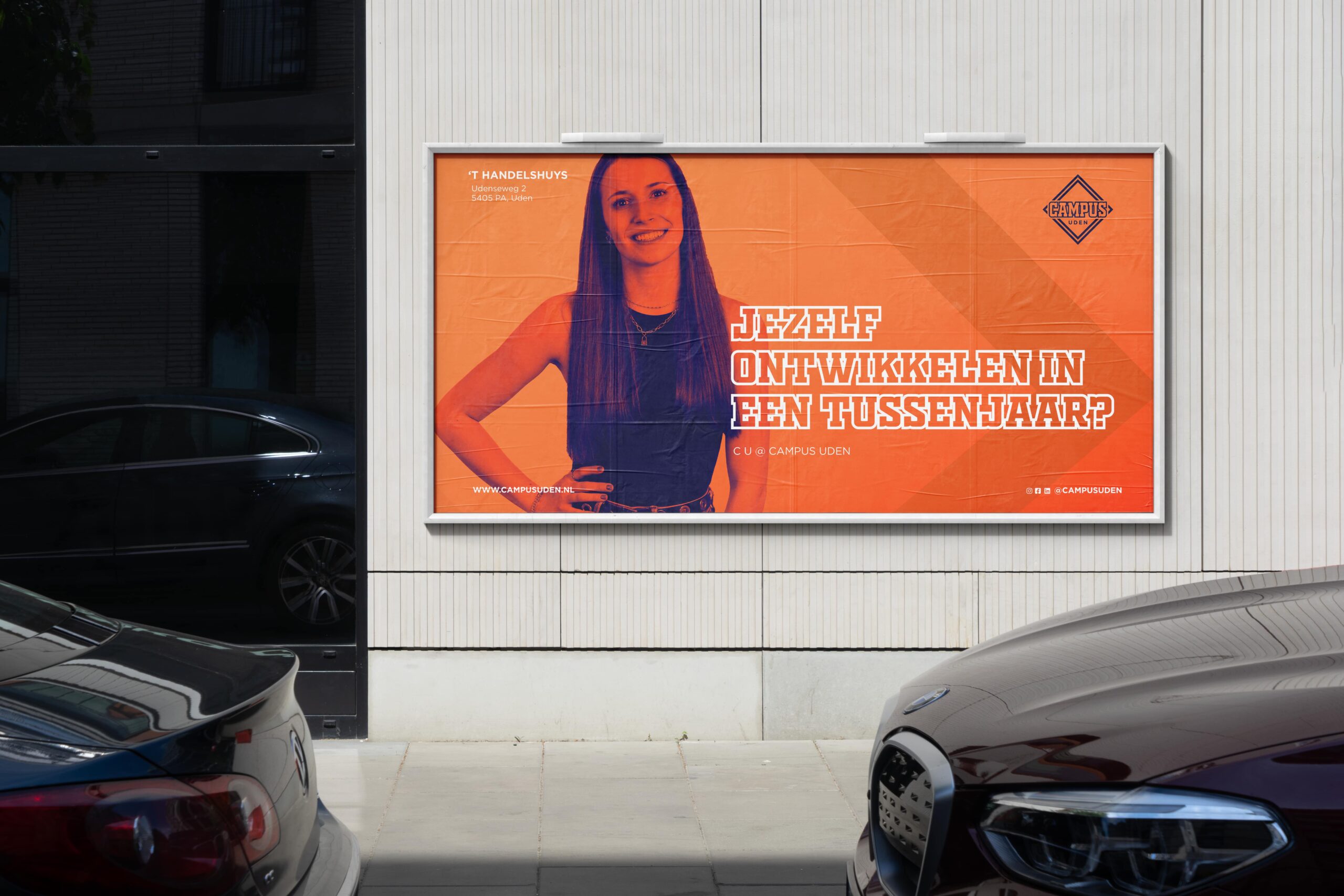
Posters, social campaigns, and merchandise bring the identity to life throughout the city and across digital platforms. The vibrant orange tones and confident, approachable tone of voice speak directly to young people, making the Campus instantly recognizable in the region. The result is more than just a place, it’s a movement where learning, working, and connecting come together.
Brands build on big ideas
Next project
Join our community!
Sign up for our newsletter
Building a strong brand starts with inspiration. With our newsletter, you’ll receive that inspiration right when you need it, in your inbox. At Fraaij Makers, we believe a brand isn’t built in a day. It’s a process of building, adjusting, and continuous learning. Our newsletter is your reminder to pause and reflect on your brand. It offers insights, tips, and ideas to help your brand keep growing.
A dynamic meeting place
Campus
about the project
Delivered products
- Logo design
- Color palette & typography
- Visual language
- Posters
- Social media templates
- Merchandise
- Stationery
Client
Campus is where education, entrepreneurship, and connection come together. Young people from the region find space here to develop, collaborate, and showcase their talents. The Campus wanted to present itself as a modern and inspiring environment that feels both familiar and energizing to them.
Challenge
The Campus was a new initiative without a clear or recognizable identity. The challenge: how do you give this dynamic meeting place a look and feel that connects with young people while also reflecting the organization’s professional and forward-looking ambitions? We developed branding that radiates energy, collaboration, and growth. A visual identity that positions The Campus as a place where learning, working, and personal development come together.


The diamond-shaped logo represents the versatility of the Campus and the space where everything it has to offer comes together. The form symbolizes growth, direction, and collaboration, core values that define the Campus identity and make it tangible across every form of communication.


The color palette, built around orange and deep blue, highlights both energy and reliability. Orange adds warmth and vibrancy, while deep blue provides a sense of professionalism and stability. The bold typography reinforces the dynamic “campus” spirit, giving the identity a confident, recognizable look, both online and in physical spaces.


Our co-creation sessions with Campus students enriched the branding with fresh perspectives and creative energy. Their ideas inspired the concept of literally giving students a face in the visual communication. By combining their portraits with bold color fields and graphic shapes, we made it clear that the Campus is all about people and their growth.


Posters, social campaigns, and merchandise bring the identity to life throughout the city and across digital platforms. The vibrant orange tones and confident, approachable tone of voice speak directly to young people, making the Campus instantly recognizable in the region. The result is more than just a place, it’s a movement where learning, working, and connecting come together.


Brands
Next project
The Coffice offers a flexible workspace, made recognizable and inviting through a fresh identity and its own visual style.
Paper Club laat zien hoe verpakkingen van papier kunnen bijdragen aan een duurzame én plezierige picknickervaring.
Join our community!
Sign up for our newsletter
Building a strong brand starts with inspiration. With our newsletter, you’ll receive that inspiration right when you need it, in your inbox. At Fraaij Makers, we believe a brand isn’t built in a day. It’s a process of building, adjusting, and continuous learning.
Our newsletter is your reminder to pause and reflect on your brand. It offers insights, tips, and ideas to help your brand keep growing.
Een dynamische ontmoetingsplaats
Campus
about the project
Delivered products
- Logo design
- Color palette & typography
- Visual language
- Posters
- Social media templates
- Merchandise
- Stationery
Client
Campus is where education, entrepreneurship, and connection come together. Young people from the region find space here to develop, collaborate, and showcase their talents. The Campus wanted to present itself as a modern and inspiring environment that feels both familiar and energizing to them.
Challenge
The Campus was a new initiative without a clear or recognizable identity. The challenge: how do you give this dynamic meeting place a look and feel that connects with young people while also reflecting the organization’s professional and forward-looking ambitions? We developed branding that radiates energy, collaboration, and growth. A visual identity that positions The Campus as a place where learning, working, and personal development come together.


The diamond-shaped logo represents the versatility of the Campus and the space where everything it has to offer comes together. The form symbolizes growth, direction, and collaboration, core values that define the Campus identity and make it tangible across every form of communication.


The color palette, built around orange and deep blue, highlights both energy and reliability. Orange adds warmth and vibrancy, while deep blue provides a sense of professionalism and stability. The bold typography reinforces the dynamic “campus” spirit, giving the identity a confident, recognizable look — both online and in physical spaces.


Our co-creation sessions with Campus students enriched the branding with fresh perspectives and creative energy. Their ideas inspired the concept of literally giving students a face in the visual communication. By combining their portraits with bold color fields and graphic shapes, we made it clear that the Campus is all about people and their growth.


Posters, social campaigns, and merchandise bring the identity to life throughout the city and across digital platforms. The vibrant orange tones and confident, approachable tone of voice speak directly to young people, making the Campus instantly recognizable in the region. The result is more than just a place, it’s a movement where learning, working, and connecting come together.


Brands build on big ideas
Next project
The Coffice offers a flexible workspace, made recognizable and inviting through a fresh identity and its own visual style.
Paper Club shows how paper packaging can contribute to a sustainable yet enjoyable picnic experience.
Join our community!
Sign up for our newsletter
Building a strong brand starts with inspiration. With our newsletter, you’ll receive that inspiration right when you need it, in your inbox. At Fraaij Makers, we believe a brand isn’t built in a day. It’s a process of building, adjusting, and continuous learning. Our newsletter is your reminder to pause and reflect on your brand. It offers insights, tips, and ideas to help your brand keep growing.
Contact us: